

7 Essential Business Card Design Tips for Creatives
Standing out in the crowded American beauty and lifestyle market is essential for creative entrepreneurs. Almost 80 percent of professionals believe premium business cards help boost first impressions and brand recall. Your business card is more than just contact details it is a symbol of your unique identity and commitment to excellence. Discover how intentional design choices can turn your business card into a powerful tool for connecting with new clients and elevating your brand.
Table of Contents
- 1. Prioritize Readable And Unique Typography
- 2. Choose Premium Materials That Impress
- 3. Use Color To Reflect Your Brand Personality
- 4. Incorporate Strategic White Space
- 5. Add Special Finishing For Extra Appeal
- 6. Design A Memorable Layout And Shape
- 7. Include Only Vital Contact Information
Quick Summary
| Takeaway | Explanation |
|---|---|
| 1. Choose Readable Typography | Select fonts that enhance legibility to effectively communicate your brand’s personality. Sans serif fonts are often preferred for clarity. |
| 2. Use Quality Materials | Premium materials convey professionalism and durability, significantly impacting perceptions of your brand’s quality. Aim for card stock of 350 g/m2 to 100 lb. |
| 3. Strategize Color Choices | Colors should reflect your brand identity and evoke the right emotions. Ensure sufficient contrast for readability and visual harmony. |
| 4. Incorporate White Space | Use white space strategically to improve clarity and guide the viewer’s attention to key information on your card. |
| 5. Keep Contact Details Essential | Include only vital information on your card to maintain clarity and avoid overwhelming your audience. Focus on channels preferred by your target audience. |
1. Prioritize Readable and Unique Typography
Your business card’s typography is far more than just text on paper. Typography communicates your brand’s personality and professionalism before anyone reads a single word. Selecting the right font can transform an ordinary business card into a powerful visual representation of your creative identity.
Readability remains paramount when choosing typography. According to the U.S. Web Design System, professional designers recommend using typefaces that ensure clear communication and easy reading. This means avoiding overly decorative or script fonts that might look interesting but compromise legibility.
Creative professionals should focus on selecting fonts that balance uniqueness with clarity. Sans serif fonts often work best for body text because they provide clean lines and exceptional readability. When selecting your typography, consider how each font weight and style represents your brand’s character.
Accessibility is another critical consideration. Web accessibility guidelines recommend minimum font sizes and appropriate contrast to ensure your business card is readable for everyone. A good rule of thumb is to use fonts sized between 8 and 10 points for business card text while maintaining high contrast between text and background.
Pro tip: Test your selected typography by asking three different people to read your business card quickly and provide feedback on legibility and first impressions.
2. Choose Premium Materials That Impress
Your business card is a tactile representation of your professional brand. Premium materials transform a simple contact card into a memorable experience that communicates quality before a single word is read.
According to materials science research, advanced material selection can significantly enhance brand perception. Business cards printed on high quality stock ranging from 350 g/m2 to 100 lb weight demonstrate professionalism and durability. These specialized substrates provide a tangible signal of your commitment to excellence.
Creative professionals should consider materials that reflect their unique aesthetic. Coated papers, polymer stocks, and specialty substrates offer distinct textures and visual characteristics that set you apart. A photographer might select a translucent material, while a graphic designer could choose a textured paper with subtle metallic threads.
When selecting materials, consider weight, finish, and durability. Business card manufacturing standards recommend cards around 12 pt thickness for optimal rigidity and professional feel. Matte, glossy, and textured finishes each communicate different brand personalities.
Pro tip: Request material samples from your printer to physically compare textures and weights before making a final selection.
3. Use Color to Reflect Your Brand Personality
Color is a powerful communication tool that speaks volumes about your professional identity. Your business card color palette is more than aesthetic decoration it is a strategic visual language that communicates your brand’s core personality and values.
According to design system research, color selection goes beyond simple visual appeal. It serves as an emotional trigger that can draw attention, set a tone, and create immediate psychological associations with your professional brand.
Creative professionals should approach color selection with intentionality. The semantic color palette approach recommends choosing colors that not only look attractive but also communicate specific brand characteristics. A minimalist designer might select cool grays and whites to signal precision, while a vibrant marketing consultant could use bold complementary colors to demonstrate creativity and energy.
When developing your color strategy, consider both aesthetic harmony and accessibility. Ensure sufficient color contrast to maintain readability and inclusivity. Your chosen colors should work together seamlessly while providing clear visual hierarchy and maintaining professional legibility.
Pro tip: Use online color palette generators to experiment with complementary color combinations that accurately represent your brand’s unique personality and emotional tone.
4. Incorporate Strategic White Space
White space is the secret weapon of exceptional design that transforms a crowded business card into a sophisticated communication tool. Far from being empty or wasted space, it is an intentional design strategy that guides viewer attention and creates visual clarity.
Human centered design principles emphasize how strategic white space reduces cognitive load and improves information comprehension. By creating breathing room around text and graphic elements, you help potential contacts process your information more efficiently.
Professional designers understand that white space is not about minimalism but about purposeful visual hierarchy. Think of white space as the frame that highlights your most important information. It creates a natural visual path for the eye, drawing attention to your contact details, logo, or key brand messaging.
When incorporating white space, consider proportion and balance. Too little white space creates visual chaos, while too much can make your card feel disconnected. The goal is to create a design where each element has room to breathe without feeling isolated or lost.
Pro tip: Print multiple drafts and ask colleagues to quickly glance at your business card, then describe what they remember most about the design.
5. Add Special Finishing for Extra Appeal
Special finishing techniques transform an ordinary business card into a memorable sensory experience. These sophisticated design treatments do more than look attractive they communicate your professional commitment and attention to detail.
According to business card manufacturing research, advanced finishing techniques like embossing, foiling, spot UV coating, and textured surfaces have become increasingly accessible. These treatments enhance the perceived value of your card and create a lasting first impression.
Creative professionals can leverage design patent protections to develop unique finishing approaches that distinguish their brand. Techniques like raised metallic foils, soft touch lamination, or laser cutting can turn your business card into a conversation starter that reflects your creative vision.
When selecting special finishes, consider how each technique aligns with your brand personality. A minimalist graphic designer might choose subtle spot UV highlights, while a bold marketing consultant could opt for vibrant gold foil accents. The key is selecting a finishing technique that feels authentic to your professional identity.
Pro tip: Request material samples from your printer to physically experience different finishing techniques and understand how they interact with light and touch.
6. Design a Memorable Layout and Shape
Your business card shape and layout are silent storytellers that communicate your brand’s creative spirit. Breaking away from traditional rectangular formats can transform an ordinary contact card into a memorable brand experience.
Business card design research reveals that unconventional shapes capture attention and embody brand identity far more effectively than standard formats. While practicality remains important, a distinctive layout can make you instantly recognizable in a sea of conventional cards.
Creative professionals have numerous options for unique design approaches. A photographer might select a card shaped like a camera lens, while a graphic designer could create a card that unfolds or includes interactive elements. The key is finding a shape that feels authentic to your professional narrative.
According to the US Patent and Trademark Office Design Search Code Manual, unique design elements can contribute to your brand’s intellectual property. A memorable layout is not just about aesthetics but can also serve as a strategic branding tool that differentiates you from competitors.
Pro tip: Prototype multiple layout concepts and ask trusted colleagues to review which design most effectively communicates your professional identity.
7. Include Only Vital Contact Information
Your business card is a precision communication tool, not a comprehensive biography. Selecting the right contact details requires strategic thinking about how potential connections will actually use your information.
Traditional business card guidelines recommend including essential information such as your name, job title, company, primary phone number, professional email, and website. The goal is crystal clear communication without overwhelming the recipient.
Creative professionals should carefully curate their contact details. A graphic designer might prioritize their portfolio website and professional email, while a consultant could emphasize their phone number and LinkedIn profile. The key is understanding which channels your target audience prefers for initial communication.
Protecting personally identifiable information is crucial when sharing professional contact details. Avoid including home addresses, personal social media accounts, or unnecessary private information that could compromise your professional privacy.
Pro tip: Create a dedicated professional email address that uses your name or brand, separate from personal accounts, to maintain a polished and consistent professional image.
Below is a comprehensive table summarizing the strategies and insights discussed in the article about designing an impactful and professional business card.
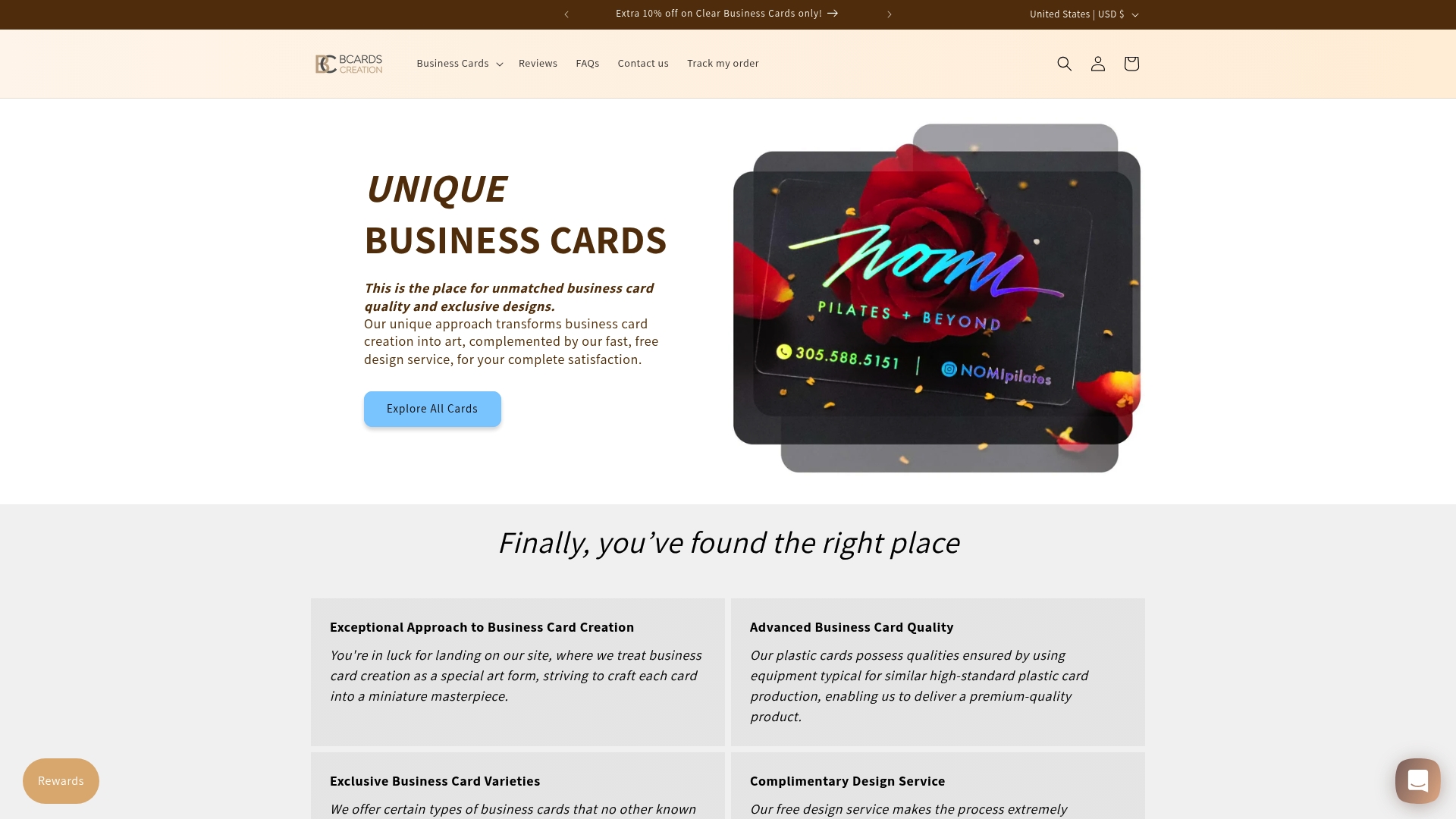
Elevate Your Creative Brand With Custom Business Cards
Designing a business card that truly reflects your creative identity involves mastering typography, material choice, color, and innovative shapes. The challenge lies in balancing readability and uniqueness while selecting premium finishes and essential information to create a memorable impression. At BcardsCreation, we understand these pain points and offer personalized solutions that bring your vision to life with expert design guidance and meticulous craftsmanship.
Discover the impact of Textured Paper Business Cards – BcardsCreation that provide tactile luxury and professional appeal, or explore bold statements with Custom Shaped Business Cards – BcardsCreation that set you apart in any creative industry.
Don’t settle for ordinary when your business card can be a powerful branding tool. Visit BcardsCreation today to start crafting a fully custom, small-batch card that captures your unique personality and excels as a strategic asset. Elevate your first impression now.
Frequently Asked Questions
What typography should I choose for my business card?
Selecting readable and unique typography is essential. Use sans serif fonts for body text to ensure clarity and legibility, aiming for a font size between 8 and 10 points. Test your choices by asking three people for feedback on readability.
How can I choose premium materials for my business card?
Opt for high-quality materials that reflect your brand’s identity and professionalism. Consider card stocks between 350 g/m2 to 100 lb weight, and request samples to compare textures and finishes before making a decision.
What colors should I use on my business card?
Choose colors that align with your brand personality and ensure high contrast for readability. Aim for complementary color combinations that evoke the desired emotions and impressions while maintaining visual harmony.
How do I effectively incorporate white space in my design?
Utilize white space intentionally to guide viewer attention and enhance clarity. Ensure there’s enough space around text and graphics, striking a balance between too much and too little, so each element feels connected yet distinct.
What finishing techniques can enhance my business card?
Consider using advanced finishing techniques like embossing or foiling to create a memorable tactile experience. Experiment with different techniques, and visualize how they align with your brand identity to create a lasting impression.
How do I decide what contact information to include?
Focus on including only essential contact details on your business card to avoid overwhelming recipients. Common items to include are your name, job title, email, phone number, and portfolio website, ensuring clarity and ease of contact.
Recommended
- Acrylic Card Holder | Personalized Business Card Holder for Desk – BcardsCreation
- Diamond Business Cards | Frosted Plastic | Custom shape card – BcardsCreation
- Fine Paper Double layered Business Card with Neon and Purple Foils, Th – BcardsCreation
- Letterpress Business Card with full color print and real foil Rose Gol – BcardsCreation
- Wooden Business Card Holder – Gino’s Awards, Inc.


