

Choosing Colors for Business Cards: Psychology, Contrast, and Materials Guide
Choosing the perfect business card design can feel like a delicate balancing act for ambitious Luxury brand founders and creative professionals across the United States. Your card is more than a contact tool—it becomes a portable symbol of your brand’s values, personality, and promise. By combining strategic color psychology and thoughtful material selection, this guide empowers you to craft cards that create unique emotional connections and amplify your professional identity.
Table of Contents
- Step 1: Clarify Your Brand Message And Audience Focus
- Step 2: Assess Color Psychology In Strategic Context
- Step 3: Evaluate Contrast For Legibility And Impact
- Step 4: Select Materials To Enhance Color Performance
- Step 5: Test Appearance Under Realistic Conditions
Quick Summary
| Key Point | Explanation |
|---|---|
| 1. Define Your Brand Message | Clearly articulate what makes your business unique and the problem you solve for your audience. |
| 2. Utilize Color Psychology | Choose colors strategically based on how they interact with perception in your specific industry and audience context. |
| 3. Ensure Legibility with Contrast | Test color contrasts to guarantee readability and visual impact across various lighting and viewing conditions. |
| 4. Select Optimal Materials | Choose materials that enhance color performance and durability, reflecting your brand’s quality and intent. |
| 5. Conduct Real-World Testing | Assess your business card’s effectiveness under realistic conditions to ensure it communicates your professional identity successfully. |
Step 1: Clarify your brand message and audience focus
Defining your brand message and target audience is fundamental to creating a compelling business identity. This process helps you communicate more effectively and connect with the customers who will most appreciate your unique value.
Start by understanding your core business values and the specific problem you solve. Effective branding helps businesses differentiate by creating a unique emotional connection with potential customers. Ask yourself these critical questions:
- What makes your business unique?
- Who specifically benefits most from your product or service?
- What core problem are you solving?
Next, develop a clear audience profile. This isn’t just demographics - it’s understanding the deeper motivations, challenges, and aspirations of your ideal customers. Research their:
- Professional background
- Primary pain points
- Desired outcomes
- Communication preferences
Your brand strategy should precisely map how your offerings solve real problems for a specific group of people.
Analyzing your audience deeply allows you to craft a targeted brand strategy that resonates authentically. This means moving beyond generic messaging to create communications that feel like they’re speaking directly to your ideal customer.
Pro tip: Create a one-page persona document that captures your ideal customer’s essence, which you can reference during all marketing and communication efforts.
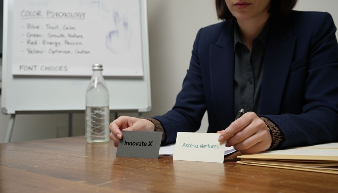
Step 2: Assess color psychology in strategic context
Color selection for business cards goes far beyond aesthetic preference - it’s a strategic communication tool that signals your brand’s personality and values. Understanding how colors interact with perception requires a nuanced approach that considers context, material, and audience.
Start by examining color through a strategic lens, not just emotional associations. Colors communicate differently depending on:
- Industry context
- Material finish
- Lighting conditions
- Target audience expectations
- Cultural background
Color is a language that speaks before words, communicating subtle messages about your brand’s personality and intent.
Analyze your color choices systematically by creating a comparative evaluation matrix. Document how each potential color interacts with:
- Your brand’s core values
- Audience psychological triggers
- Competitive landscape visuals
- Material reflectivity and texture
Remember that colors aren’t universal symbols. A blue that communicates trust in technology might feel cold in creative industries. Lighting, paper texture, and printing technique dramatically transform how a color is perceived.
Pro tip: Test your color selections under multiple lighting conditions and on different material samples to understand their true visual impact.
Step 3: Evaluate contrast for legibility and impact
Understanding contrast is crucial for creating business cards that communicate clearly and capture attention. Your goal is to design a card that reads effortlessly across different lighting conditions and viewing distances.
Effective contrast improves visual hierarchy by making key information immediately recognizable. Start by analyzing your color choices through three critical lenses:
- Readability in direct light
- Legibility at arm’s length
- Visual impact from different angles
Create a systematic contrast evaluation by testing your design with these methods:
- Print multiple versions with varying color combinations
- Examine samples under different light sources
- Get feedback from people with diverse vision capabilities
- Photograph your designs to assess digital and print representations
Contrast is not just about color difference - it’s about creating a visual language that speaks clearly and confidently.
Remember that material interactions matter. A matte paper might require different contrast strategies compared to a glossy or metallic finish. Professional designers understand that contrast is a nuanced tool, not a one-size-fits-all solution.
Pro tip: Use a digital contrast checker tool to mathematically validate your color choices before final printing.
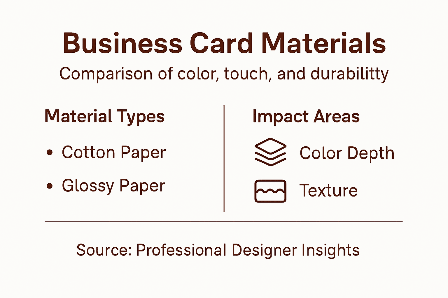
Step 4: Select materials to enhance color performance
Choosing the right material for your business card is more than an aesthetic decision - it’s a strategic communication tool that dramatically influences how your colors and design are perceived. Your material selection will transform how light interacts with your brand’s visual identity.
Understand that different materials interact with color uniquely. Consider these key performance characteristics:
- Light reflection and absorption
- Surface texture and finish
- Durability and tactile experience
- Printing compatibility
- Environmental sustainability
Create a material performance matrix by evaluating options through multiple lenses:
- Test color vibrancy across different materials
- Assess how each material handles gradients and fine details
- Examine color stability under various environmental conditions
- Compare tactile qualities that complement your brand message
Materials are not just surfaces - they are silent communicators of your brand’s quality and intention.
Professional designers recognize that material selection is a nuanced art. A textured cotton paper might mute colors differently than a smooth plastic card, creating entirely distinct visual experiences. Your goal is to select a material that doesn’t just display your colors but actively enhances them.
Here’s a comparison of material options for business cards and their impact on color performance:
| Material Type | Color Impact | Tactile Impression | Durability Level |
|---|---|---|---|
| Glossy Cardstock | Enhances color vibrancy | Sleek and modern feel | Prone to fingerprints |
| Matte Paper | Mutes colors slightly | Soft, premium texture | Moderate durability |
| Textured Cotton | Softens saturation | Luxurious, artisanal touch | Less moisture resistant |
| Plastic | Bold, saturated tones | Smooth, contemporary grip | Highly durable |
Pro tip: Request physical material samples from your printer to conduct comprehensive color and texture evaluations before final production.
Step 5: Test appearance under realistic conditions
Testing your business card design requires more than visual inspection - you need a comprehensive evaluation that mimics real-world interactions and professional environments. Your goal is to understand how your card performs across different scenarios and lighting conditions.
Develop a systematic testing protocol that goes beyond initial impressions. Consider these critical testing environments:
- Professional networking events
- Indoor office lighting
- Outdoor natural daylight
- Evening ambient lighting
- Digital scanning and photography
Create a comprehensive evaluation framework by examining your design through multiple practical scenarios:
- Observe card performance in direct sunlight
- Test readability under fluorescent office lights
- Assess color integrity after handling and transportation
- Verify legibility when photographed or digitized
A business card is not just a piece of paper - it’s a portable representation of your professional identity.
Professional designers understand that visual performance is contextual. A design that looks stunning in one environment might become unreadable in another. Your objective is to create a card that maintains its impact across diverse settings.
The following table summarizes key factors for testing business card appearance in real-world environments:
| Environment | Key Testing Focus | Typical Issue Detected |
|---|---|---|
| Office Fluorescent | Readability under bright light | Washed-out color, glare |
| Outdoor Daylight | Color accuracy in natural light | Fading, loss of contrast |
| Digital Photography | Legibility on screens | Blurred text or color mismatch |
| Networking Events | Impact in social settings | Overlooked among other cards |
Pro tip: Conduct your tests with colleagues from different industries to get diverse perspectives on your design’s real-world effectiveness.
Elevate Your Brand With Business Cards That Speak Boldly and Clearly
Choosing the right colors, contrast, and materials for your business cards is more than just design — it is about crafting a powerful visual message that connects deeply with your audience. The challenge is finding a solution that perfectly balances color psychology, material performance, and legibility so your cards stand out with confidence under every lighting condition and in every professional setting. At BcardsCreation, we specialize in providing exactly this kind of thoughtful, custom-crafted approach.
Whether you need vibrant Colored Paper Business Cards that catch the eye or tactile Textured Paper Business Cards that invite touch, our expert team guides you through material and color decisions tailored to your brand message.

Discover how our premium materials and refined finishing techniques bring your business cards to life with stunning color impact and clear contrast. Don’t let your first impression fall flat. Start your personalized business card journey today at BcardsCreation and make every connection unforgettable.
Frequently Asked Questions
How does color psychology affect my business card design?
Understanding color psychology can help you choose colors that resonate with your audience and reflect your brand identity. Start by researching the emotional responses associated with different colors to select those that best convey your brand’s message.
What are the best practices for ensuring contrast on my business card?
Effective contrast is crucial for readability and visual impact. Test your color combinations in various lighting conditions and at different distances to ensure key information stands out clearly on your card.
How can I select the right materials for my business cards?
Choosing the right material can enhance your card’s color performance and tactile experience. Evaluate options by testing how colors look on different materials and considering their durability and print compatibility before making a final decision.
What should I consider when testing my business card design?
Test your business card design in real-world environments to evaluate its performance. Observe how it looks in different lighting situations and how legible it remains after handling, ensuring it maintains its impact in various settings.
What is the significance of color choices in different industries?
Color significance can vary by industry, affecting how your brand is perceived. Analyze common color trends within your industry to ensure your card aligns with audience expectations while still standing out from competitors.
Recommended
- Top 8 Plastic Business Cards: Clear, Frosted, Shimmer — How to Choose – BcardsCreation
- Top 8 Unique Business Card Solutions for 2026 – BcardsCreation
- Fine Paper Double layered Business Card with Neon and Purple Foils, Th – BcardsCreation
- Letterpress Business Card with full color print and real foil Rose Gol – BcardsCreation


