

Creating Memorable Business Cards for Luxury Brands
Every decision you make as an American luxury brand owner shapes how clients experience your unique value. For beauty and fashion brands, a business card is more than contact details—it is a curated artifact that communicates sophistication, exclusivity, and character from the very first touch. Drawing on Kapferer’s Brand-Identity Prism model, this guide unpacks how to express your distinct brand essence through premium materials, tailored design collaboration, and meticulous production for a truly elevated first impression.
Table of Contents
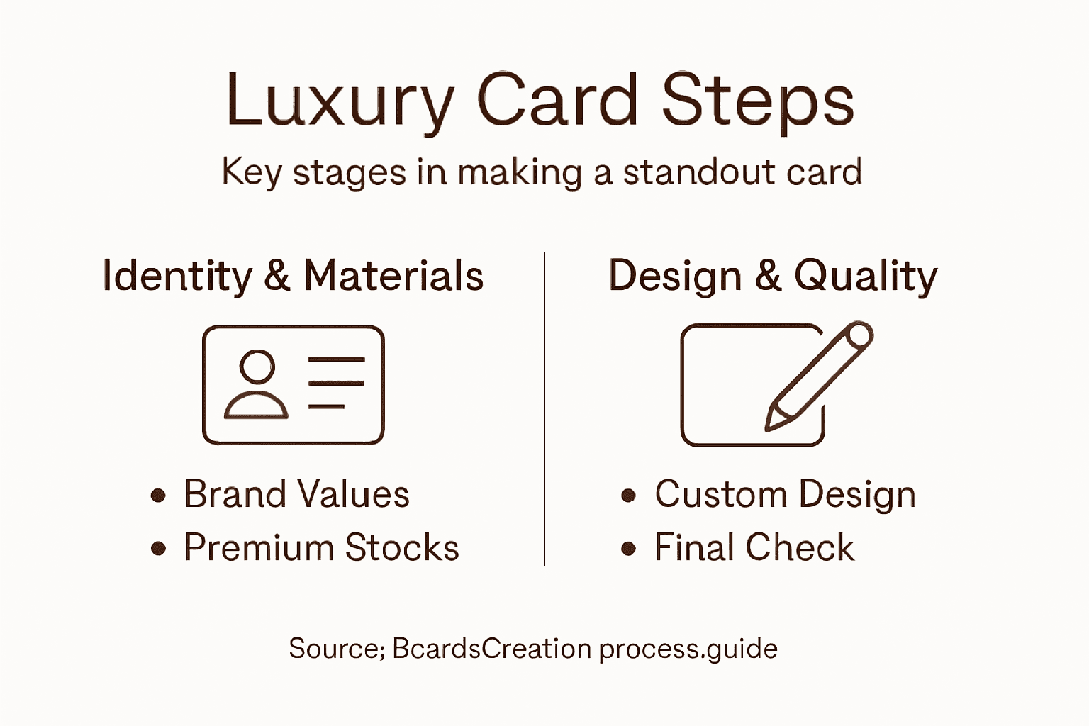
- Step 1: Define Your Luxury Brand’s Identity
- Step 2: Select Premium Materials and Finishes
- Step 3: Collaborate on Bespoke Design Concepts
- Step 4: Approve Prototypes and Final Layouts
- Step 5: Verify Production Quality and Details
Quick Summary
| Main Insight | Detailed Explanation |
|---|---|
| 1. Define Your Brand Identity | Clarify your luxury brand’s voice, values, and positioning before designing your business card. |
| 2. Choose Premium Materials and Finishes | Select materials that enhance the tactile experience and align with your brand’s luxury perception. |
| 3. Collaborate on Customized Design | Work with a skilled designer to create a bespoke business card reflecting your unique brand attributes. |
| 4. Approve Prototypes Thoroughly | Evaluate prototypes for color and tactile quality before production to ensure they meet your expectations. |
| 5. Verify Production Quality | Conduct quality checks and inspections post-production to maintain brand integrity and consistency. |
Step 1: Define your luxury brand’s identity
Your business card carries far more weight than paper and ink. It embodies your brand’s voice, values, and positioning in a format that sits in someone’s pocket. Before you even think about materials or finishes, you need absolute clarity on what your brand actually is. This means understanding the six dimensions that shape how your luxury brand communicates itself to the world.
Think of brand identity as a multifaceted structure. Kapferer’s Brand-Identity Prism model breaks this down into six key aspects: physique (what your brand looks like), personality (how it speaks), culture (what it stands for), relationship (how it connects with clients), reflection (how clients see themselves through your brand), and self-image (how clients want to be perceived). For luxury brands in beauty and fashion, this framework prevents you from designing business cards that feel disconnected from your actual brand promise. A minimalist card with cold typeface contradicts a brand built on warmth and personal connection. A card with ornate flourishes undermines a brand positioned on modern innovation.
Start by articulating what makes your brand distinct. Are you rooted in heritage and craftsmanship, or are you disrupting the category with contemporary approaches? Does your clientele value exclusivity and scarcity, or accessibility with premium quality? Consumer perception of luxury value shapes everything downstream, including how your business card should feel in someone’s hand. Your card becomes a physical representation of the relationship you’re building. When someone holds it, they should immediately sense whether you’re a luxury conglomerate or an independent designer, whether you’re traditional or boundary-pushing. This alignment between brand identity and tangible expression is what separates cards that get kept from cards that get discarded.
Pro tip: Write out your brand’s personality in three short sentences before moving forward—what you stand for, how you’re different, and who you serve. Use these as your North Star when evaluating every design decision and material choice for your business card.
Step 2: Select premium materials and finishes
Material choice is where brand identity becomes tangible. Your business card is one of the few physical objects your clients hold directly, and what it feels like in their hands matters as much as what it looks like. The weight, texture, and finish communicate luxury faster than any design element alone. This step is about moving beyond standard cardstock into territory that reinforces your premium positioning.
Start by understanding the material spectrum available to you. Standard 14pt cardstock is the baseline most printers work with, but luxury brands typically begin at 16pt or 18pt thickness. Heavier stock immediately signals quality and investment. Beyond weight, the paper itself deserves attention. Uncoated papers like cotton blend or linen offer texture and sophistication. Matte finishes feel refined and restrained. Glossy finishes catch light and draw attention. Specialty finishes like embossing, debossing, and foil stamping create depth and tactile interest that make your card memorable. When selecting materials, consider how they align with your brand personality. A heritage beauty brand might choose cotton paper with subtle embossing. A contemporary fashion label might opt for smooth matte black cardstock with metallic foil accents. Thick cardstocks and textured papers directly communicate professionalism and luxury to anyone who handles your card.
Color palette works hand in hand with material choice. Professional color combinations reinforce brand identity and should complement your material selection rather than compete with it. A rich navy on natural white cotton feels different than navy on glossy white. Metallic inks interact with matte and glossy finishes in distinct ways. The combination of material, finish, and color creates the complete sensory experience. Think about your client touchpoints. Your card sits next to business cards from competitors. It lives in wallets and desk drawers. It survives coffee spills and gets passed between people. Premium materials and finishes protect your card’s integrity while building a lasting impression of your brand’s commitment to quality.
Pro tip: Request physical samples of at least three material and finish combinations before committing to full production. Hold them, feel them, place them next to competing cards, and observe which one makes you feel the luxury positioning you’re aiming for.
Here’s a quick reference comparing premium business card materials and their impact on brand perception:
| Material Type | Tactile Feel | Brand Impression |
|---|---|---|
| Cotton Blend | Soft, textured | Heritage, sophistication |
| Linen | Subtle texture | Authenticity, refinement |
| Matte Cardstock | Smooth, elegant | Modern, understated luxury |
| Glossy Cardstock | Shiny, reflective | Attention-grabbing, bold |
| Metallic Foil | Raised, reflective | Prestige, exclusivity |
Step 3: Collaborate on bespoke design concepts
Your business card deserves more than a template or generic design. This is where you work with a designer who understands luxury positioning and can translate your brand identity into a physical artifact. Bespoke design collaboration means moving beyond selecting from pre-made options. It means a deliberate back-and-forth conversation about your vision, your competitors, and what makes your brand distinct enough to warrant a custom card.

Start the collaboration by sharing your brand story, not just your logo. Tell your designer what you stand for, how you’re different, and who your ideal client is. Show them cards you admire and explain why. Point out competitors’ cards and articulate what feels off or what works. A skilled designer working with you will ask questions about your client experience. Where do they first receive your card? What are they doing when they pick it up? Are they comparing it to other luxury brands in your space? This context shapes every decision from typography to whitespace to where your information sits on the card. Collaborations with skilled designers create bespoke concepts that genuinely reflect your brand’s values and differentiate you in the market.
During the design process, expect multiple rounds of exploration. Early concepts should feel experimental. You might see five completely different directions before landing on something that feels right. This isn’t wasted effort. It’s the designer learning your preferences and refining the vision. As concepts evolve, discuss the relationship between design elements and your material choices. A minimalist layout on heavy cotton cardstock conveys different sophistication than the same layout on thin glossy stock. Typography matters enormously. Your typeface choice signals whether you’re traditional, contemporary, or playful. Luxury brands often gravitate toward custom or carefully selected typefaces that feel intentional rather than default. The alignment between design concept, material quality, and craftsmanship is what transforms a business card from promotional item into a brand ambassador. Bespoke design concepts aligned with brand authenticity demonstrate your commitment to quality and resonate with clients who value substance over trends.
Pro tip: Provide your designer with a physical reference board of materials, colors, and design details you connect with, alongside written context about your brand voice and client expectations. This combination of tactile and written reference accelerates the design process and leads to stronger concepts.
Step 4: Approve prototypes and final layouts
Before your cards go into full production, you need to hold prototypes in your hands and examine them under real conditions. This is not a formality. Approving prototypes is where design intent meets physical reality, and small issues caught now prevent larger problems later. Digital renderings can be deceiving. Color looks different on screen than it does on actual paper. Typography that appears crisp in a PDF might feel too small or too large when printed at actual size. Material weight and texture cannot be assessed through a computer monitor.
When you receive prototypes, evaluate them systematically. First, compare the printed color to your approved color specifications. Does the navy feel true, or does it lean too blue or too black? How does your selected foil finish appear on the actual material? Does it feel luxurious or overdone? Check registration, which is the precise alignment of colors and design elements. Examine the edges and corners. Are they sharp, or do they feel rough? For embossed or debossed details, run your fingers across them. Is the depth what you envisioned? Design prototyping methods emphasize testing physical samples to validate design choices before committing to production runs. Typography is critical here. Does your selected typeface feel refined when printed at actual size? Does the tracking between letters feel balanced? Is your contact information legible without compromising design aesthetics? Hold the card at arm’s length and up close. Your clients will experience it both ways.
Provide detailed feedback to your designer and printer. Rather than saying “something feels off,” specify the issue. The foil is too muted. The emboss depth is too shallow. The card stock feels thinner than expected. This precision accelerates refinement rounds and prevents back-and-forth confusion. The prototyping stage in design thinking involves thorough feedback cycles to ensure alignment with aesthetic and functional goals. You may need one or two revisions before approving final layouts. This is normal. Once you approve prototypes and confirm all specifications, production moves forward. At that point, changes become expensive or impossible. Taking time now to evaluate thoroughly protects your investment and ensures the final cards represent your brand accurately.
Pro tip: Request prototypes printed on the exact material and finish you’ve chosen, not on standard stock as a cost-saving measure. Request at least 10 sample cards so you can test them in real scenarios—hand them to colleagues, place them in your wallet, observe how they feel across different lighting conditions.
Step 5: Verify production quality and details
Your cards are in production. The printer is running the job, and you’re waiting for delivery. This is not the time to relax. Quality verification happens during and after production to catch any deviations from your specifications before the entire batch ships. Luxury brands cannot afford inconsistency. A single card with misaligned foil or dull color reaching a client undermines your positioning and damages trust. The verification process protects your brand reputation.
Understand how your printer handles quality control. Most professional operations use sampling methods to inspect production runs, checking random cards from different points in the production process to catch issues early. Ask your printer about their sampling protocol. What percentage of cards do they inspect? What are their acceptance standards for color accuracy, registration, and finish quality? Do they measure card thickness and dimensions? Request that your specific job receives closer attention given its custom nature and luxury positioning. You should also conduct your own inspection when cards arrive. Open the shipment before paying the final invoice. Pull cards from different areas of the boxes. Run your fingers across embossed details. Hold cards up to light to check for color consistency. Examine the edges and corners for damage. Look for printing artifacts, ink spots, or uneven finish application. Compare several cards side by side. Luxury quality means consistency across the entire batch, not just perfection on showcase cards.
Verification and validation processes ensure products meet design specifications and fulfill intended purposes. For your business cards, this means confirming that what you’re receiving matches what you approved in prototypes. If you find issues, document them with photos and communicate them to your printer immediately. Professional printers stand behind their work and will address defects. If a significant portion of the batch is flawed, you may be entitled to a reprint. Catching problems early gives you options. Accepting compromised quality silently sends the wrong message to your team and clients about your brand standards. Quality verification is not nitpicking. It is brand protection.
Pro tip: Request a pre-shipment inspection report from your printer showing quality metrics for your specific job, including color accuracy readings, registration tolerances, and finish consistency checks. This documentation protects you and provides clear evidence if disputes arise.
Below is a summary of business card verification methods and their importance for luxury brands:
| Quality Check | What It Detects | Why It Matters |
|---|---|---|
| Color Accuracy | Misprints, discoloration | Consistent brand image |
| Registration | Misalignment, blur | Professional appearance |
| Edge/Corners | Damage, rough finishes | Premium feel |
| Finish Consistency | Smudges, uneven application | Luxury brand trust |
| Emboss/Deboss Quality | Depth, clarity | Tactile uniqueness |
Elevate Your Luxury Brand with Bespoke Business Cards
Creating memorable luxury business cards is a challenge that requires clarity in brand identity, premium materials, and custom design. The article highlights the importance of aligning your business card with your brand’s personality and using tactile elements like texture and finish to communicate exclusivity and quality. If you want to avoid generic templates and truly embody your brand’s values, personalized solutions are key. Pain points like choosing the right material or collaborating on design concepts can be overwhelming without expert guidance.
Experience the impact of thoughtfully crafted cards that differentiate your brand and leave lasting impressions. Explore our wide range of Textured Paper Business Cards to find materials that feel luxurious and authentic. For truly unique expressions, our Custom Shaped Business Cards help your brand stand out with innovative shapes.
Don’t compromise your brand’s prestige by settling for ordinary cards. Visit BcardsCreation now for expert design collaboration, premium materials, and flawless production control. Elevate your brand’s first impression with business cards that speak volumes before you say a word.
Frequently Asked Questions
How do I define my luxury brand’s identity for a business card?
To define your luxury brand’s identity, articulate what makes your brand distinct, including its values, voice, and positioning. Formulate three concise sentences that represent what you stand for, how you differ from competitors, and who your target audience is. This clarity will serve as your guiding principle in all design decisions.
What materials should I consider for high-quality business cards?
Opt for premium materials like 16pt or 18pt cardstock to signal quality and luxury. Explore options such as uncoated cotton blend or linen papers, which offer a sophisticated texture, and consider finishes like matte or glossy to match your brand personality. Start by requesting physical samples to evaluate how they align with your brand image.
Why is collaborating with a designer important for creating a luxury business card?
Collaborating with a skilled designer is crucial as they can translate your brand identity into a unique design rather than relying on generic templates. Share your brand story, including your differentiating factors and target audience, to ensure the card reflects your values. Engage in multiple design iterations to refine your vision and achieve the perfect balance between design and materials.
What should I check when approving prototypes of my business card?
When approving prototypes, examine the card for color accuracy, typography legibility, and the tactile feel of the materials used. Check for registration, embossing depth, and overall quality, ensuring it meets your luxury standards. Provide specific feedback to address any issues before finalizing your order to safeguard your investment.
How can I ensure consistent quality in my business card production?
To guarantee consistent quality, engage with your printer about their quality control processes and request a detailed inspection of the production samples. Upon receiving your cards, conduct a thorough evaluation for color, registration, and finish consistency. Document any discrepancies immediately to ensure they resolve issues before the entire batch is delivered.
Recommended
- Raised Foil Business Cards | Thick Double-layered Art Paper – BcardsCreation
- Diamond Business Cards | Frosted Plastic | Custom shape card – BcardsCreation
- Letterpress Business Card with full color print and real foil Rose Gol – BcardsCreation
- Fine Paper Double layered Business Card with Neon and Purple Foils, Th – BcardsCreation


