

Role of Design in Business Cards: Elevating Luxury Brands
Standing out as an American luxury brand means every detail matters, right down to your business card. Nearly 90 percent of first impressions are driven by design elements, shaping how your brand is perceived from the first exchange. For beauty and lifestyle leaders who value reputation, purposeful business card design becomes a critical tool to express exclusivity, sophistication, and strategic brand presence in every American market encounter.
Table of Contents
- Defining Purposeful Business Card Design
- Communication Hierarchy and What Not to Print
- Typography, Spacing, and Restraint Explained
- Silence, White Space, and Visual Balance
- Minimalism That Amplifies Brand Tone
- Avoiding Common Design Mistakes
Key Takeaways
| Point | Details |
|---|---|
| Purposeful Design | Business card design should serve as a strategic communication tool that reflects the brand narrative through thoughtful elements such as typography and material choice. |
| Communication Hierarchy | Key information must be prominently displayed while secondary details are minimized to create a focused, memorable visual experience. |
| Emphasis on Minimalism | Successful design embraces minimalism, eliminating clutter to enhance brand sophistication and invite curiosity. |
| Avoid Design Pitfalls | Common mistakes like overcrowding and poor typography detract from brand perception; a rigorous review process helps maintain focus and clarity. |
Defining Purposeful Business Card Design
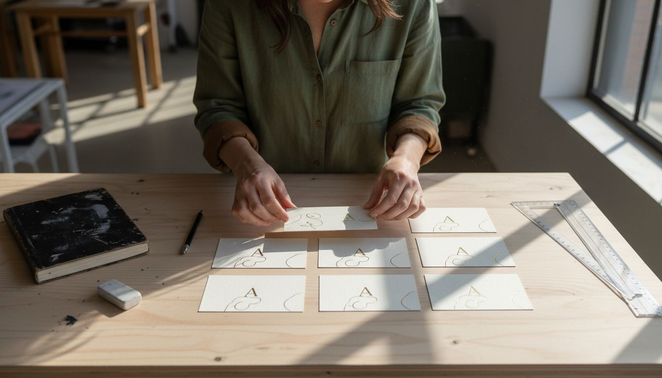
Purposeful business card design transcends mere aesthetic decoration. It represents a strategic communication tool where every visual and tactile element serves a deliberate brand narrative. Purposeful design principles demand a holistic approach that transforms business cards from passive information carriers to active brand ambassadors.
At its core, strategic design requires understanding that business cards communicate far more than contact details. Typography, whitespace, material selection, and visual hierarchy work together to convey brand personality, professional competence, and subtle emotional signals. A minimalist design for a technology startup will differ dramatically from an ornate card representing a luxury fashion house, with each approach deliberately engineered to reflect core brand values.
The communication hierarchy in business card design involves carefully curated visual weight. Critical information like name and primary contact method receive prominence, while secondary details are strategically subordinated. This isn’t about cramming maximum information, but creating a balanced composition that guides the viewer’s eye and creates a memorable interaction. Restraint becomes a powerful design language - communicating confidence through intentional simplicity.
Pro tip: Select business card materials and finishes that physically reinforce your brand’s tactile narrative, transforming a simple exchange into a memorable sensory experience.
Here’s a comparison of key elements in luxury versus standard business card design:
| Design Element | Luxury Approach | Standard Approach |
|---|---|---|
| Typography | Refined, purpose-driven, limited selection | Functional, often generic |
| Material Choice | High-quality, textured, tactile materials | Ordinary paper stock |
| White Space Usage | Strategic, ample for emphasis and balance | Minimal, often crowded |
| Information Load | Minimal, prioritizes essential brand details | Often includes exhaustive details |
| Visual Hierarchy | Subtle, elegant, guides eye to key info | Basic, less emphasis on flow |
Communication Hierarchy and What Not to Print
Effective business card design is fundamentally about strategic information management. Visual hierarchy principles guide designers in creating a clear communication flow that instantly directs the viewer’s attention to the most critical details. The goal is not to overwhelm with information, but to create a precise, purposeful visual narrative that communicates professionalism and brand identity.
Understanding what to omit is equally important as deciding what to include. Excessive contact details, redundant job titles, or cluttered personal descriptions can dilute the card’s impact. Luxury brands particularly benefit from a minimalist approach that suggests exclusivity through restraint. This means eliminating unnecessary text, avoiding generic descriptions, and focusing on elements that truly differentiate the professional or brand.
The communication hierarchy follows a strategic logic: primary contact information receives visual prominence, while secondary details are subtly integrated or strategically minimized. Typography plays a crucial role, with font sizes, weights, and spacing creating a natural reading progression. White space becomes an active design element - not empty space, but a deliberate visual tool that creates breathing room, emphasizes key information, and communicates sophistication.
Pro tip: Conduct a ruthless edit of your business card content, removing every word that does not directly contribute to your professional positioning or brand narrative.
Typography, Spacing, and Restraint Explained
Luxury brand business cards demand a sophisticated approach to typography that transcends mere text placement. Typography and spacing techniques transform letters from simple communication tools into strategic brand expressions. The selection of typefaces becomes an art form where each letterform communicates subtle narrative nuances about professional identity and brand positioning.
Typographic restraint involves making intentional choices that prioritize clarity and elegance. This means selecting fonts with purposeful character - perhaps a refined serif that suggests tradition, or a clean sans-serif that communicates modern precision. Professional designers understand that font weight, size, and spacing are not decorative elements but critical communication mechanisms. A carefully chosen typeface can convey sophistication, while poor typography can instantly diminish perceived brand value.
Spacing emerges as a powerful design language in its own right. Negative space becomes an active design element, not merely an absence but a deliberate compositional strategy. Generous margins, strategic kerning, and thoughtful line spacing create visual breathing room that elevates the entire design. For luxury brands, this approach transforms a business card from a simple information carrier into a tactile, visual experience that communicates refinement through what is elegantly omitted.
Pro tip: Select no more than two complementary typefaces and establish strict rules for their application to maintain consistent brand communication across all materials.
Silence, White Space, and Visual Balance
In the realm of luxury brand design, white space functions as strategic silence, creating a profound visual dialogue that speaks volumes through intentional emptiness. Like a carefully orchestrated musical composition, the absence of visual elements becomes as meaningful as the elements themselves, guiding the viewer’s perception and emphasizing critical brand messages with remarkable subtlety.
Visual balance emerges from a nuanced interplay between content and negative space. Professional designers understand that white space is not merely empty area, but an active compositional element that creates breathing room, establishes hierarchy, and communicates sophisticated restraint. Margins, padding, and strategic emptiness become powerful tools for directing attention, creating visual pauses that allow important information to resonate more deeply.
Luxury brands leverage white space as a communication strategy, transforming the business card from a mere information carrier into a curated visual experience. The deliberate use of space signals confidence, suggesting that the brand is secure enough to embrace simplicity. By reducing visual clutter and allowing each design element to breathe, designers create a sense of exclusivity and refinement that transcends traditional graphic approaches.
Pro tip: Treat white space as a design element, not an afterthought - measure and plan your margins and empty areas with the same precision you apply to your typography and logo placement.
Minimalism That Amplifies Brand Tone
Minimalism in luxury business card design is not about absence, but intentional presence. Minimalist design research reveals that true sophistication emerges through strategic reduction, where every remaining element carries profound significance. It is a deliberate practice of distilling brand essence into its most powerful, concentrated form.
The power of minimalism lies in its ability to communicate more by showing less. Negative space becomes a storytelling mechanism, transforming the business card from a mere information carrier into a nuanced brand statement. Each design choice - from subtle typography to carefully selected materials - becomes an intentional signal of the brand’s confidence, expertise, and refined sensibility. A single elegant typeface, precise margins, and a restrained color palette can speak volumes more effectively than cluttered, overwrought designs.
For luxury brands, minimalism is not a trend but a philosophical approach to communication. By eliminating visual noise and focusing on essential elements, designers create a sense of exclusivity and sophistication. The minimalist business card becomes a curated artifact that invites closer examination, suggesting that true value lies not in ostentation, but in thoughtful, purposeful design that respects the viewer’s intelligence and aesthetic sensibility.
Pro tip: Approach minimalist design as an act of curation: every element must earn its place on the business card through clear, strategic purpose.
Avoiding Common Design Mistakes
Typography mistakes can silently undermine the most sophisticated business card design. Professional designers recognize that each typographic choice carries significant weight, transforming what could be a remarkable brand artifact into a forgettable piece of paper. The most common errors emerge from misunderstanding the delicate balance between information, aesthetics, and brand communication.
Information hierarchy represents the critical foundation of effective design. Overcrowding becomes the primary visual sin, where designers attempt to include every possible detail, resulting in a chaotic visual experience that diminishes brand perception. Luxury brands understand that restraint communicates more powerfully than exhaustive information. Strategic omission - knowing precisely what to leave out - becomes as important as selecting what to include. A business card should invite curiosity, not overwhelm the recipient with unnecessary details.
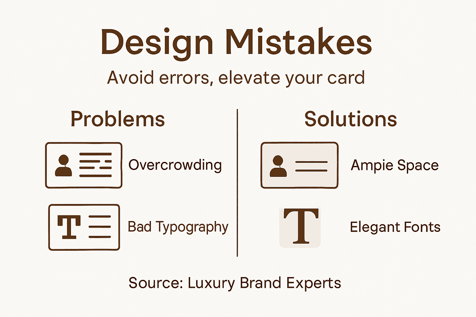
Color, contrast, and material selection introduce additional layers of potential design failure. Inappropriate color combinations can create visual discord, while poor material choices can compromise the card’s perceived value. Professional designers approach each element as an intentional communication tool, understanding that every texture, shade, and finish contributes to the overall brand narrative. The goal is not perfection, but purposeful, strategic design that reflects the brand’s unique identity and professional ethos.
Pro tip: Develop a rigorous design review process where each element must justify its existence through clear strategic purpose before being included on the business card.
Consider these common business card design pitfalls and their professional solutions:
| Common Mistake | Impact on Brand | Effective Solution |
|---|---|---|
| Overcrowded Layout | Causes confusion, looks cheap | Edit ruthlessly, focus on key info |
| Poor Typography Choices | Reduces readability | Use clear, purposeful fonts |
| Inconsistent Spacing | Creates visual imbalance | Standardize margins and alignment |
| Inappropriate Materials | Lowers perceived value | Choose quality, brand-aligned finishes |
| Excessive Colors | Distracts from core message | Limit palette to 2-3 strategic hues |
Elevate Your Brand with Purposeful Luxury Business Card Design
The article highlights how luxury brands must embrace strategic design choices such as refined typography, ample white space, and selective material use to transform business cards into powerful brand ambassadors. If you are striving to communicate exclusivity and professionalism, a carefully crafted business card that embodies minimalism and tactile quality is essential. At BcardsCreation, we understand the challenge of balancing bold brand statements with subtle design restraint to create a memorable first impression.
Experience the impact of exquisite textures and expert craftsmanship with our Textured Paper Business Cards or explore the elegance of craftsmanship through our Letterpress Business Cards.
Unlock the potential of your business cards to communicate sophistication and confidence today. Visit BcardsCreation to begin your custom design journey and set your luxury brand apart with compelling and purposeful business cards crafted just for you.
Frequently Asked Questions
How does purposeful design enhance the effectiveness of a business card?
Purposeful design transforms business cards from mere information carriers to strategic communication tools, ensuring that every element aligns with the brand’s narrative and personality.
What are the key elements of luxury business card design?
Key elements include refined typography, high-quality materials, strategic use of white space, minimal information load, and a balanced visual hierarchy that conveys sophistication and brand identity.
Why is white space important in business card design?
White space acts as an active design element that creates breathing room, emphasizes important information, and communicates professionalism and restraint, ultimately enhancing the overall aesthetic.
How can minimalism improve brand perception in business cards?
Minimalism communicates confidence and exclusivity by prioritizing essential elements and eliminating visual clutter, allowing the design to convey more through fewer, but more impactful, components.
Recommended
- Raised Foil Business Cards | Thick Double-layered Art Paper – BcardsCreation
- Diamond Business Cards | Frosted Plastic | Custom shape card – BcardsCreation
- Letterpress Business Card with full color print and real foil Rose Gol – BcardsCreation
- Acrylic Card Holder | Personalized Business Card Holder for Desk – BcardsCreation


