

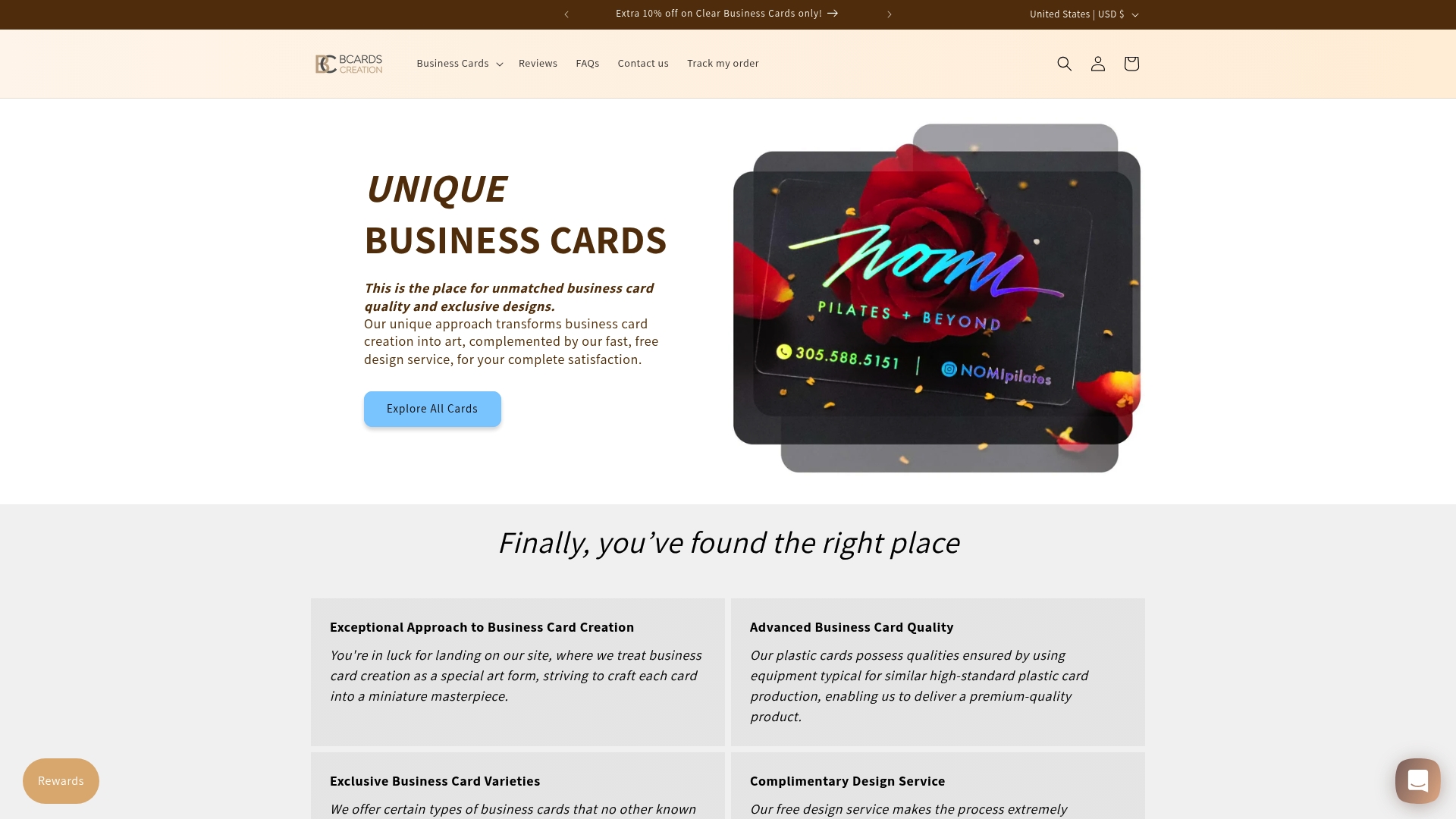
7 Luxury Business Card Ideas to Elevate Your Brand
Over 60 percent of American professionals say that a premium business card leaves a lasting impression. In a world of digital connections, the right card is still a powerful branding tool that instantly reflects your commitment to quality. From sleek minimalist layouts to innovative materials like frosted plastics or metallic foils, thoughtful choices communicate sophistication long before a word is spoken.
Table of Contents
- 1. Mastering Minimalism With Premium Materials
- 2. Using Letterpress For A Tactile Impression
- 3. Employing Metallic Foil For Targeted Impact
- 4. Choosing Specialty Papers For Subtle Sophistication
- 5. Embracing Edge Painting For Subdued Detail
- 6. Incorporating Translucent Or Frosted Plastics
- 7. Crafting Multi-Layered Structures For Depth
Quick Summary
| Takeaway | Explanation |
|---|---|
| 1. Use Premium Materials | Select high-quality materials like heavyweight paper or plastics to enhance the sophistication of your business cards. |
| 2. Opt for Letterpress Printing | Incorporate letterpress techniques for a tactile experience that communicates luxury and craftsmanship effectively. |
| 3. Implement Metallic Foil Strategically | Use metallic foiling to highlight key elements of your design, adding subtlety and elegance without overwhelming. |
| 4. Choose Speciality Papers | Select textured and weighted specialty papers that communicate refined professionalism and create a strong impression. |
| 5. Consider Translucent Plastics | Use translucent or frosted plastic for a modern design approach that adds intrigue and visual depth to your cards. |
1. Mastering Minimalism with Premium Materials
Minimalist business card design transforms simplicity into a powerful branding statement. By focusing on refined materials and intentional design, professionals can create a visual identity that speaks volumes through understated elegance.
The art of minimalist design hinges on thoughtful material selection and precision. Modern luxury business card designs emphasize clean layouts and sophisticated typography, creating an exclusive visual language that communicates professionalism without unnecessary complexity.
Premium materials like heavyweight cotton paper, translucent plastics, or metallic substrates elevate minimalism from basic to extraordinary. The goal is not emptiness but purposeful restraint. Each design element must earn its place through strategic visual weight and considered negative space.
Typographic choices become critical in minimalist design. Select fonts with balanced proportions and clean lines. Sans serif typefaces work exceptionally well, offering crisp readability and contemporary sophistication. Consider neutral color palettes like soft grays, deep blacks, or muted neutrals that communicate refinement.
When implementing minimalist design, remember that every millimeter matters. Precise margins, strategic alignment, and subtle texture variations transform a simple card into a tactile experience. Laser etching, letterpress impressions, and spot UV treatments can add dimensionality without compromising the minimalist aesthetic.
Pro tip: Select materials that complement your professional identity. A law firm might choose heavyweight cotton paper with subtle embossing, while a graphic design studio could opt for translucent plastic with precise laser cutting.
2. Using Letterpress for a Tactile Impression
Letterpress printing transforms business cards from mere contact information into refined artistic statements. This centuries old technique creates a distinctive tactile experience that communicates luxury through physical sensation and visual depth.
Letterpress business cards utilize traditional pressed print using an antique printing press, resulting in a unique debossed texture that immediately signals premium quality. The process involves pressing custom designed plates directly into thick paper stocks, creating subtle indentations that catch light and invite touch.
The magic of letterpress lies in its deliberate imperfection. Unlike digital printing which produces flat surfaces, letterpress creates gentle depressions that become part of the card’s character. Each impression reveals the depth and weight of the paper, turning a simple card into a sensory experience.
Strategic material selection becomes crucial in letterpress design. Heavyweight cotton papers with substantial fiber content respond best to the pressing technique. Soft white, cream, or muted neutral tones work exceptionally well, allowing the precise impressions to stand out with understated elegance.
For professionals in creative fields like design, architecture, or luxury consulting, letterpress business cards communicate a commitment to craftsmanship. The technique suggests meticulous attention to detail and an appreciation for traditional production methods.
Pro tip: Choose paper weights between 110 and 220 pounds for optimal letterpress results, ensuring your cards feel substantial without becoming overly thick.
3. Employing Metallic Foil for Targeted Impact
Metallic foil transforms business cards from standard communication tools into sophisticated brand statements. This precision technique allows professionals to strategically highlight specific design elements with luminous, reflective accents.
Metallic foiling creates visual depth through controlled metallic applications. Gold, silver, and rose gold foils offer nuanced ways to communicate brand personality without overwhelming the card’s overall design. The technique works best when used sparingly, turning select typography or graphic elements into focal points.
Strategic foil placement determines the card’s emotional impact. Subtle gold accents can suggest luxury and heritage, while silver foils communicate modern precision. Rose gold provides a softer, more contemporary feel that bridges traditional elegance with current design trends.
The technical process involves applying metallic leaf through specialized heat transfer techniques. Professional printers use custom dies and precise temperature controls to ensure crisp, clean foil applications that maintain sharp edges and consistent metallic sheen.
For creative professionals like designers, architects, and luxury brand managers, metallic foiling offers a powerful nonverbal communication tool. A single strategically placed gold line can convey more about your brand’s sophistication than paragraphs of descriptive text.
Raised foil business cards on thick art paper demonstrate how dimensional metallic elements can transform a simple card into a memorable brand touchpoint. The interplay of light, texture, and metallic reflection creates an sensory experience that lingers in a recipient’s memory.
Pro tip: Select foil colors that complement your brand palette and use them to highlight your logo, name, or a single critical design element for maximum visual impact.
4. Choosing Specialty Papers for Subtle Sophistication
Specialty paper selection transforms business cards from simple contact information into sophisticated brand artifacts. The tactile quality of your paper communicates volumes about your professional identity before a single word is read.
Understanding paper characteristics requires moving beyond standard white stock. Texture, weight, and subtle material properties become critical communication tools. Cotton papers with soft deckled edges suggest artisan quality, while linen textured stocks convey refined professionalism.
Professionals in design, consulting, and creative industries benefit most from nuanced paper selections. A photographer might choose fine paper with double layered construction and metallic foil accents to showcase visual sophistication, while an architect could select heavyweight cotton paper with minimal texture to reflect precision.
Material weight plays a crucial role in perception. Papers between 110 and 220 pounds communicate substance without feeling unnecessarily heavy. Soft whites, warm cream, and muted neutral tones work exceptionally well, allowing subtle design elements to breathe.
Consider paper families that offer consistent visual language. Japanese mulberry papers provide delicate translucency. European cotton stocks deliver classic elegance. Recycled papers with visible fiber patterns communicate environmental consciousness.
Color and texture interact dynamically. Soft gray papers with slight cotton texture suggest understated intelligence. Warm ivory stocks with minimal texture communicate timeless professionalism. Each selection tells a nuanced story about your brand identity.
Pro tip: Request paper sample books from premium print studios to physically experience different textures and weights before making your final business card selection.
5. Embracing Edge Painting for Subdued Detail
Edge painting represents a sophisticated design technique that transforms ordinary business cards into extraordinary brand statements. This precise method involves applying color to the card’s edges, creating an unexpected visual dimension that reveals itself only upon closer inspection.
Subtle color selection becomes critical in edge painting. Professionals can choose colors that complement their brand palette or create intentional contrast. A deep navy blue edge on crisp white paper communicates quiet confidence, while a soft metallic gold edge suggests luxury without appearing ostentatious.
The technical process requires exceptional precision. Printers must align cards perfectly, applying uniform color across all edges with razor sharp accuracy. Unlike standard printing techniques, edge painting demands specialized equipment and expert craftsmanship.
Creative professionals like designers, architects, and brand strategists can leverage edge painting to communicate nuanced brand personality. A muted sage green edge might suggest environmental consciousness, while a deep charcoal edge implies sophisticated minimalism.
Gold foil business cards with carefully selected edge treatments demonstrate how this technique can elevate a simple card into a memorable brand touchpoint. The interplay of color, texture, and subtle visual hints creates a multisensory experience.
Material selection amplifies edge painting’s impact. Thick cotton papers and specialty stocks provide the ideal canvas, allowing color to appear rich and consistent. Thinner papers can look uneven or transparent, diminishing the technique’s sophistication.
Pro tip: Select edge colors that are one to two shades deeper or more saturated than your primary brand colors to create a subtle yet intentional visual connection.
6. Incorporating Translucent or Frosted Plastics
Translucent and frosted plastic business cards represent the pinnacle of modern design innovation, transforming traditional contact information into an interactive visual experience. These sophisticated materials create an immediate sense of intrigue and professional refinement.
Material complexity becomes a powerful communication tool with plastic business cards. Unlike traditional paper, translucent plastics allow for layered design approaches where information can be strategically revealed or obscured, creating depth and visual interest.
Professionals in technology, design, architecture, and creative industries benefit most from these sophisticated material choices. Marble business cards with frosted transparent plastic demonstrate how innovative materials can become a statement of brand identity.
Technical considerations are paramount when selecting plastic business cards. High quality polycarbonate and polyester variants offer durability and precise printing capabilities. Frosted finishes can be achieved through chemical etching or specialized printing techniques that create a soft matte appearance.
Color interactions become particularly fascinating with translucent materials. Subtle tints can transform the card’s appearance depending on lighting conditions, creating a dynamic visual experience. Soft pastels and muted metallic undertones work exceptionally well, suggesting sophistication without appearing excessive.
Design strategies for plastic cards require a minimalist approach. Typography must be carefully considered, with clean sans serif fonts performing best against translucent backgrounds. Negative space becomes as important as printed elements, allowing the material itself to communicate brand elegance.
Pro tip: Select plastic thicknesses between 0.3 and 0.5 millimeters to balance durability with a delicate, refined feel that does not compromise the card’s structural integrity.
7. Crafting Multi-Layered Structures for Depth
Multi-layered business card design transforms a simple contact medium into a sophisticated brand narrative. By strategically combining materials, textures, and printing techniques, professionals can create cards that communicate complexity and intentionality.
Dimensional design principles elevate business cards from flat information carriers to interactive brand experiences. Layering allows for strategic revelation of information, creating visual intrigue and tactile engagement that transforms a first impression.
The most compelling multi-layered designs leverage contrast in material, transparency, and texture. Fine paper double layered business cards with real gold and silver foils demonstrate how carefully constructed layers can create depth and visual complexity.
Professionals in architecture, design, and luxury branding can use multi-layered approaches to communicate brand sophistication. A translucent plastic overlay atop textured cotton paper might reveal partial information, creating a sense of discovery. Alternatively, offsetting layers with subtle color variations can produce nuanced visual effects.
Technical execution requires precision. Each layer must align perfectly, with minimal tolerance for misregistration. Laser cutting, specialized adhesives, and expert assembly transform conceptual designs into tangible artifacts.
Material selection becomes a critical design consideration. Combining papers with different weights and textures creates intentional visual tension. A heavyweight cotton base with a thin translucent polymer overlay can suggest both substance and innovation.
Pro tip: When designing multi-layered cards, consider how light interacts with different materials, using transparency and opacity to create dynamic visual experiences that change depending on viewing angle.
This table summarizes the key strategies and techniques for creating impactful minimalist business cards using premium materials and design methods.
| Technique | Description | Considerations |
|---|---|---|
| Mastering Minimalism | Focus on simplicity, refined materials, and intentional design to create a sophisticated brand identity. | Choose heavyweight cotton paper, metallic substrates, and soft neutral colors. |
| Using Letterpress | Transforms cards into tactile artistic statements with debossed textures. | Best executed on heavyweight cotton paper; paper weight should be 110-220 pounds. |
| Employing Metallic Foil | Adds reflective accents to enhance design with depth and personality. | Use sparingly on typography or graphics; select foil colors that match brand palettes. |
| Choosing Specialty Papers | Elevates cards beyond simple stock with texture and material quality. | Opt for cotton papers or linen textures; consider environmental consciousness with recycled options. |
| Embracing Edge Painting | Adds color to card edges for unexpected visual sophistication. | Choose subtle colors that create visual connections with brand identity. |
| Incorporating Translucent Plastics | Offers modern design with layered visual effects for added depth. | Use high-quality polycarbonate or polyester; ensure clean sans serif font use. |
| Crafting Multi-Layered Structures | Combines materials and techniques to communicate brand complexity. | Align layers precisely with strategic material choices; leverage transparency for effect. |
Elevate Your Brand with Luxury Business Cards That Speak Volumes
Creating a luxury business card that truly represents your brand involves mastering material choices and sophisticated finishing techniques like letterpress and textured papers. If you want a business card that embodies refinement and craftsmanship instead of blending into the crowd, comprehensive design guidance and premium materials are key. The challenge is balancing minimalist elegance with tactile impact through strategic elements such as paper texture, foil accents, or edge painting to make your card memorable.
Discover how Letterpress Business Cards and Textured Paper Business Cards from BcardsCreation bring these luxurious ideas to life by combining expert design with material excellence for a tactile experience that speaks to your professional integrity.
Ready to translate these luxury business card ideas into a distinctive brand asset that stands apart? Visit BcardsCreation now for a personalized consultation and expert craftsmanship that will transform your first impression into lasting impact. Your brand deserves more than a generic card—create a memorable statement today.
Frequently Asked Questions
How can premium materials elevate my business card design?
Using premium materials, such as heavyweight cotton paper or metallic substrates, can dramatically enhance the perception of your business card. Opt for high-quality materials to create a tactile experience that reflects your professionalism.
What typographic choices work best for minimalist business cards?
Sans serif typefaces with balanced proportions are ideal for minimalist business card designs, ensuring crisp readability and a contemporary look. Choose clean fonts that align with your brand identity to strengthen your overall visual impact.
Why should I consider letterpress printing for my business cards?
Letterpress printing creates a unique tactile experience due to its debossed texture, signaling luxury and craftsmanship. Select a heavyweight cotton paper to maximize the visual depth and premium feel of your cards.
How do I effectively use metallic foil in my business card design?
Strategically applying metallic foil can highlight key design elements, drawing attention to specific typography or graphics. Use foils sparingly to enhance your brand’s personality without overwhelming the overall design.
What are the benefits of incorporating translucent or frosted plastic in my business cards?
Translucent and frosted plastic business cards add a modern touch and allow for layered designs that create depth. Experiment with colors and designs to make your card an interactive visual experience that stands out to recipients.
How can I create a multi-layered business card to enhance its sophistication?
A multi-layered business card can communicate complexity and intentionality by combining different materials, textures, and printing techniques. Focus on aligning each layer perfectly to transform your card into an engaging brand narrative.
Recommended
- Diamond Business Cards | Frosted Plastic | Custom shape card – BcardsCreation
- Raised Foil Business Cards | Thick Double-layered Art Paper – BcardsCreation
- Acrylic Card Holder | Personalized Business Card Holder for Desk – BcardsCreation
- Fine Paper Double layered Business Card with Neon and Purple Foils, Th – BcardsCreation
- 7 przykładów fotografia wizerunkowa – praktyczne inspiracje - Coolheads - Fotografia biznesowa


