

Raised Print, Embossing, Debossing: Tactile Luxury Unveiled
Every luxury beauty founder knows the impact of a first touch—a business card should feel as memorable as it looks. For brands in the United States, tactile finishes like physical texture are more than decoration; they signal authenticity and sophistication by shaping how your card feels in hand. This article reveals how raised print, embossing, and debossing create depth that communicates brand quality, guiding your choice to craft a card that speaks premium before a word is read.
Table of Contents
- Raised Print, Embossing, Debossing Defined
- Why This Matters to Your Brand
- The Tactile Hierarchy
- Material Matters More Than You’d Think
- Common Misconceptions
- Experiencing Depth—What Hands Really Feel
- How Raised Texture Communicates
- The Subtlety of Debossing
- What Research Reveals About Tactile Perception
- Pressure and Perception
- Restraint Creates Stronger Sensation
- Premium Effects: Subtlety Versus Decorative
- The Restraint Principle
- What Research Shows About Perception
- Material Choices Drive Perception
- Production Quality and Repeatability
- Cost Transparency
- Choosing Tactile Finishes for Luxury Brands
- The Selection Framework
- Key Decision Points
- Material Choice Drives Everything
- Production Quality and Repeatability
- Cost Transparency
Key Takeaways
| Point | Details |
|---|---|
| Tactile Techniques Matter | Raised print, embossing, and debossing create unique textures that impact brand perception. Choose the right technique to communicate your brand’s identity effectively. |
| Restraint Enhances Luxury | Minimal use of texture elevates the perception of quality. Focus on key elements to avoid overwhelming the design. |
| Material Selection is Key | The type of paper used influences the effectiveness of tactile finishes. Thicker stocks yield sharper impressions, enhancing luxury perception. |
| Test Before Committing | Always test embossing and debossing on sample cards to ensure the tactile effect aligns with your brand standards and expectations. |
Raised Print, Embossing, Debossing Defined
These three finishing techniques create physical texture on business cards by altering the paper surface itself. Unlike printing, they’re not about color—they’re about depth, dimension, and how a card feels in your hand.
Each technique works differently, but all three transform a flat surface into something three-dimensional. That transformation is where the luxury lives.
What Each Technique Actually Does
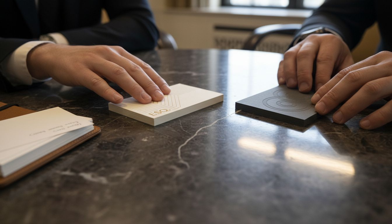
Raised print (also called embossing) pushes design elements upward from the card surface. Your fingertip literally touches a raised ridge when you run it across the design. The effect is subtle but unmistakable—there’s a physical bump where the image sits.
Embossing creates the same raised effect. Embossing applies pressure with a die to permanently alter the paper shape, pushing material upward. The process compresses the card stock, creating permanent texture.
Debossing works in reverse. Instead of pushing up, it pushes down into the surface, creating a recessed impression. Your finger traces into a depression rather than over a ridge. The visual effect appears inset, as though the design sinks into the card.
The core difference is direction: raised elements project forward; debossed elements recede backward.
Why This Matters to Your Brand
For luxury beauty brands, tactile experience signals quality instantly. A prospect holding your card feels the difference before they read a single word. That moment—when fingertips encounter unexpected texture—creates a sensory memory.
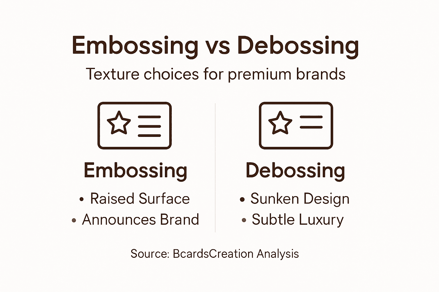
Raised finishes feel active and present. They announce themselves. Debossing feels refined and subtle, inviting closer inspection. One demands attention; the other rewards it.
The Tactile Hierarchy
Not all textures read the same:
- Raised elements appear bolder, more dimensional, stand-out
- Debossed elements feel restrained, sophisticated, understated
- Blind stamping (uncolored embossing or debossing) conveys maximum restraint
- Colored embossing adds visual weight to the tactile effect
The choice between raised and recessed isn’t aesthetic alone—it’s about brand positioning. Aggressive texture projecting outward. Subtle depth drawing inward.
Material Matters More Than You’d Think
Thicker, denser papers accept deeper embossing and debossing. Luxury card stocks—cotton blends, velvet finishes, heavyweight papers—hold texture crisply. Thinner stock can buckle or lose definition.
White velvet business cards with blind debossing demonstrate how material and technique amplify restraint. The soft nap of velvet diffuses light across debossed surfaces, creating shadowing that speaks through touch alone.
Common Misconceptions
Many assume raised print and embossing are different. They’re the same. Raised print is embossing—the term “raised” just emphasizes the physical effect you feel.
Debossing isn’t “less impressive” than embossing. It’s a different choice. Debossed business cards often feel more premium because they demand attention through subtlety rather than projection.
Here’s a concise comparison of embossing and debossing regarding tactile impact and brand perception:
| Attribute | Embossing (Raised) | Debossing (Recessed) |
|---|---|---|
| Tactile Experience | Finger passes over distinct ridge | Finger settles into defined groove |
| First Impression | Immediate, bold presence | Subtle, invites closer inspection |
| Brand Signal | Assertive, confident | Refined, understated |
| Best Material Pairing | Thicker, smooth or cotton stock | Velvet, linen, or heavyweight cards |
| Strategic Use | Calls attention to key details | Highlights restraint and focus |
Pro tip: Test embossing and debossing on sample cards using your brand’s actual card stock before committing to full production—the tactile effect varies significantly by material weight and finish.
Experiencing Depth—What Hands Really Feel
Your hand knows the difference between embossed and debossed before your brain processes it. Texture isn’t visual—it’s tactile data arriving through fingertips at the moment of contact.
When someone holds your business card, they’re reading it with more than their eyes. They’re gathering information through pressure, resistance, and spatial awareness.
How Raised Texture Communicates
Raised embossing creates a physical ridge your finger encounters. The ridge has height—dimension that extends upward from the card surface. When you drag your fingertip across raised lettering or a logo, you feel an obstruction.
That obstruction sends a clear signal: This matters. This is intentional. Raised elements announce themselves through presence.
The height of the emboss affects perception directly. Detecting variations in embossed line heights reveals how sensitive touch really is—even minor dimensional changes register as distinct tactile events.
The Subtlety of Debossing
Debossing works oppositely. Instead of a ridge, your finger finds a depression—a shallow canyon pressed into the card. Your fingertip traces inward, following the recessed surface.
This creates a fundamentally different experience:
- Raised: Finger meets resistance and passes over it
- Debossed: Finger descends into the surface and traces within it
One feels active. The other feels receptive. The same information conveyed through opposite directions.
What Research Reveals About Tactile Perception
Embossings on flat surfaces restrict comprehensive tactile exploration because fingers encounter the raised element but can’t fully assess its depth or form without lifting and repositioning. Debossing allows fingers to settle into the recess, creating fuller sensory contact.
For business cards, this matters. A debossed logo invites your finger to linger. An embossed one asks you to notice and move on.
Pressure and Perception
How hard someone presses their finger against the card changes what they feel. Light touch reveals fine detail. Firm pressure provides structural information.
Luxury materials amplify both:
- Thick card stock maintains crisp embossing or debossing edges
- Soft finishes (velvet, linen) diffuse the tactile signal across a broader area
- Smooth finishes create sharp, precise tactile contrast
The best tactile designs reward both light exploration and firm pressure with consistent, intentional texture.
Restraint Creates Stronger Sensation
Overembossing—too much height or too many elements—dilutes the effect. Your hand experiences chaos instead of clarity.
Minimal embossing or debossing creates stronger perception because fingers isolate the texture. Negative space around a single embossed element makes that element feel bolder.
Restraint in texture design mirrors restraint in visual design. Both communicate confidence.
Pro tip: Limit embossing or debossing to one or two key design elements—typically the brand name or logo—to maximize tactile impact and ensure the texture feels intentional rather than decorative.
Premium Effects: Subtlety Versus Decorative
Not all embossing and debossing feels the same. The difference between premium and decorative isn’t about technique—it’s about restraint.
Decorative texture announces itself loudly. Premium texture whispers. One demands admiration. The other earns it.
The Restraint Principle
Decorative embossing covers too much real estate. Multiple elements, varying heights, busy patterns—the card becomes a tactile landscape instead of a strategic statement.
Premium embossing focuses. One logo. One name. Negative space around the texture so your finger finds it deliberately, not accidentally.
When you encounter a single debossed element on a minimal card, your hand pauses. You notice. That pause is luxury.
What Research Shows About Perception
Subtle tactile effects engage emotional memory centers without overwhelming with decorative excess, reinforcing premium brand perception through understated sophistication.
This matters for luxury beauty brands. Your prospect already expects visual refinement. Texture should amplify that expectation, not contradict it.
Overembossing signals uncertainty—as if the designer didn’t trust the design alone. Minimal embossing signals confidence.
Material Choices Drive Perception
The substrate you choose determines whether texture reads as premium or decorative:
- Thick, weighted stock makes minimal embossing feel intentional and luxurious
- Luxury papers (cotton, linen, velvet) elevate even simple texture into sophistication
- Thin stock makes embossing look like an afterthought, decorative rather than essential
- Matte finishes absorb light across embossed surfaces, creating subtle shadowing
Industry research shows Soft Touch coatings convey warmth and luxury, while raised tactile finishes enhance visual and tactile aesthetics when aligned with brand messaging.
The Hierarchy of Texture
Think of embossing and debossing as typography for touch. You wouldn’t bold every word. You’d bold selectively for emphasis.
Apply the same logic:
Premium approach:
- Single focal point (brand name or emblem)
- Consistent depth (no varying heights)
- Intentional white space around the texture
- Alignment with overall design restraint
Decorative approach:
- Multiple textured elements competing for attention
- Varied depths creating visual noise
- Texture covering significant card surface
- Details that feel added rather than essential
Premium texture is invisible until touched. Decorative texture announces itself visually before your hand even arrives.
Cost Versus Perceived Value
CounterIntuitively, minimal embossing often costs more because it requires precision and perfect alignment. More texture doesn’t mean higher value—better execution does.
For luxury beauty brands, this is strategic. A single debossed brand name on thick velvet stock communicates control, precision, and investment in quality. That signal costs less than busy embossing but feels substantially more premium.
Pro tip: Design your embossing or debossing as a single, strategically placed element no larger than your brand mark—treat it as a signature, not decoration, and your card will feel unmistakably premium.
Micro-Design, Restraint, and Brand Perception
Micro-design isn’t about adding detail. It’s about controlling exactly what the hand encounters. Every millimeter of embossing or debossing sends a message about your brand.
When restraint guides your texture choices, the result feels intentional. Calculated. Premium.
The Power of Controlled Micro-Scale Texture
Controlled micro-scale surface textures strongly influence tactile perception and thereby brand perception. Precise embossing patterns correlate with increased material identification and consumer engagement.
This means a single debossed logo, perfectly executed, communicates more than elaborate embossing across the entire card. The hand recognizes precision. Precision signals luxury.
Micro-design decisions compound. Depth consistency. Edge sharpness. Alignment precision. Each element reinforces the others, creating a coherent tactile experience.
How Restraint Reinforces Brand Identity
Your brand identity doesn’t live in texture alone. Texture should amplify what your visual design already communicates.
If your brand is minimalist, your texture should be minimal. If your aesthetic is bold, your embossing can be deeper. Alignment matters more than execution difficulty.
When texture contradicts your visual messaging, it creates cognitive dissonance. Your prospect’s hand and eyes send conflicting signals about your brand.
The Authenticity Signal
Restrained tactile design reinforces brand authenticity and sophistication through carefully engineered micro-patterns that communicate quality and craftsmanship.
Luxury beauty brands understand this intuitively. Your packaging, your website, your imagery all suggest precision and control. Your business card should match that tone.
Overembossing suggests the opposite—uncertainty masked by decoration.
Micro-Decisions That Matter
Each choice shapes perception:
- Depth precision (consistent 0.2mm embossing vs. variable depth) signals craftsmanship
- Edge clarity (crisp vs. soft edges) affects perceived quality
- White space ratio (texture isolation vs. crowding) influences sophistication level
- Alignment tolerance (pixel-perfect vs. approximate) communicates attention to detail
Your prospect won’t consciously analyze these choices. Their hand will register them as quality signals.
Less Becomes More
A single micro-embossed detail—your initials, a symbol, a geometric accent—creates stronger brand memory than busy texture.
This isn’t minimalism for aesthetic reasons. It’s strategic. Isolation creates focus. Focus creates perception of intentionality. Intentionality communicates premium positioning.
Micro-design succeeds when every tactile element feels essential, not additive. When restraint becomes a signature.
Real-World Application
Consider a debossed brand name, 0.3mm depth, on thick cotton stock. The hand finds it. The depth is barely perceptible but distinctly present.
Compare that to embossed lettering covering 40% of the card. The hand encounters texture immediately, everywhere. The experience feels busy rather than curated.
One reads as considered. The other reads as decorated.
Pro tip: Plan your texture as you would your typography hierarchy—identify one primary focal point for embossing or debossing, specify consistent depth across all elements, and ensure at least 30% card surface remains untextured to let the texture breathe.
Choosing Tactile Finishes for Luxury Brands
Selecting the right tactile finish isn’t about picking the fanciest option. It’s about strategic alignment—ensuring your texture reinforces your brand identity and justifies your positioning.
For luxury beauty brands, this decision shapes how clients perceive value before they ever experience your products.
The Selection Framework
Start with your brand promise. What does your brand communicate visually? Minimalist elegance. Bold innovation. Organic refinement. Your tactile finish should amplify that message, not contradict it.
Selecting tactile finishes involves balancing appeal with cost, price sensitivity, and brand congruency. Consumer studies reveal preferences for finishes that evoke luxury without compromising quality perception.
This means choosing texture that feels intentional to your specific brand, not whatever technique costs the least.
Key Decision Points
Four factors determine your choice:
- Brand identity alignment — Does the texture match your visual and tonal messaging?
- Tactile consistency — Will production maintain consistent quality across all cards?
- Perceived value — Does the finish elevate or diminish how clients assess your brand positioning?
- Cost-to-impact ratio — Does the investment in texture match client expectations of your price tier?
These factors interact. A premium finish on thin stock can cheapen perception. A restrained approach on luxury material amplifies sophistication.
Material Choice Drives Everything
The substrate you select determines which tactile finishes work effectively:
- Thick cotton blend accepts embossing and debossing beautifully; supports premium pricing
- Velvet finish diffuses light across debossed surfaces; creates sophisticated shadowing
- Linen texture pairs well with minimal embossing; feels organic and refined
- Smooth, weighted stock showcases sharp embossing edges; feels precise and controlled
- Plastic substrates allow different tactile approaches; communicate modern or experimental positioning
Material and technique must work together. A thin stock with deep embossing signals cost-cutting. Thick stock with subtle debossing signals investment in quality.
The following table summarizes how material selection influences the effectiveness and perception of tactile finishes:
| Material Type | Tactile Effect Quality | Luxury Perception |
|---|---|---|
| Thick cotton blend | Crisp, deep impressions | Highest—premium, refined |
| Velvet finish | Soft, diffused texture | Elegant, contemporary |
| Linen texture | Subtle, organic feel | Natural, upscale |
| Thin card stock | Weak, prone to distortion | Low—feels inexpensive |
| Plastic substrate | Unique, modern textures | Innovative, niche |
Production Quality and Repeatability
Embossing depth, material choice, and production technology impact tactile quality with high importance for repeatability and quality control across all cards.
This is where execution separates premium from decorative. If your embossing depth varies card-to-card, the inconsistency signals poor control. Consistent, precise texture signals craftsmanship.
Before committing to full production, test samples with your actual material. Verify the finish meets your standards across the entire batch.
Cost Transparency
Understand the real costs:
- Embossing costs more on thicker stock but looks sharper
- Debossing can cost less but requires perfect design alignment for visual impact
- Blind stamping (uncolored texture) costs less than colored embossing
- Material choice often impacts total cost more than technique selection
Budget accordingly, but remember: a cheaper finish that contradicts your brand positioning costs more in lost perception than the material savings.
The right tactile finish feels inevitable—like the only choice that makes sense for your brand.
Pro tip: Request sample cards showing your chosen finish on three substrate options before committing to production, and have team members assess them blindly to gauge whether the texture reads as premium, decorative, or misaligned with your brand positioning.
Elevate Your Brand with Tactile Luxury Business Cards
Understanding the power of raised print, embossing, and debossing reveals why tactile texture matters so much in luxury branding. These finishing techniques do more than add depth — they create a sensory experience that signals confidence, precision, and sophistication from the very first touch. If your goal is to make a lasting tactile impression that aligns perfectly with your brand identity, you need a business card solution that embraces restraint and material excellence.
At BcardsCreation, we specialize in crafting fully custom, small-batch business cards that harness the subtle yet powerful effect of embossing and debossing on premium substrates. Whether you prefer the bold presence of Letterpress Business Cards or the refined nuance of Textured Paper Business Cards, our expert designers guide you through selecting the perfect materials and finishes. We combine expert consultation with flawless production control to ensure your card feels intentional, precise, and undeniably premium.

Discover how strategic tactile design can transform your business card from ordinary to exceptional. Visit our full collection at BcardsCreation and start a conversation with our team today. Your brand deserves a card that speaks through touch—make sure it’s unmistakable.
Frequently Asked Questions
What is the difference between raised print and embossing?
Raised print and embossing refer to the same technique of creating a physical texture on paper by pushing design elements upward from the surface. The term “raised print” emphasizes the tactile effect you can feel.
How does debossing differ from embossing?
Debossing creates a recessed impression by pushing design elements downward into the card surface, resulting in a subtle texture that invites closer examination, while embossing elevates the design elements above the card surface.
Why are tactile finishes important for luxury brands?
Tactile finishes enhance the sensory experience, creating a strong first impression that signals quality and sophistication. The feel of a business card can influence a prospect’s perception of the brand before they even read the information on it.
What materials are best for embossing and debossing?
Thicker and higher-quality materials, such as cotton blends or heavyweight papers, work best for embossing and debossing as they hold texture crisply. Luxury card stocks like velvet or linen enhance the effectiveness of tactile finishes, adding to the overall premium feel.
Recommended
- Raised Foil Business Cards | Thick Double-layered Art Paper – BcardsCreation
- Letterpress Business Card with full color print and real foil Rose Gol – BcardsCreation
- Thick WHITE VELVET Multilayer Business cards Blind Debossing – BcardsCreation
- Top 8 Plastic Business Cards: Clear, Frosted, Shimmer — How to Choose – BcardsCreation


