

Why Choose Transparent Business Cards for Luxury Brands
It is easy to see why so many American luxury brands in beauty and fashion are rethinking what a business card can be. In a market where every detail shapes perception, the shift from traditional paper to distinctive transparent business cards instantly signals innovation and quality. With finishes like frosted, gloss, or matte and standout details such as foil stamping or artful embossing, these cards turn first impressions into lasting brand statements that capture attention well before any conversation begins.
Table of Contents
- Defining Transparent Business Cards And Common Myths
- Types Of Transparent Business Cards And Materials
- Design Features That Enhance Brand Prestige
- Practical Branding Benefits For Beauty And Fashion
- Comparing Transparent Cards With Traditional Options
Key Takeaways
| Point | Details |
|---|---|
| Transparent Business Cards Enhance Brand Perception | They convey innovation and sophistication in industries like beauty and fashion, setting a premium tone before any words are read. |
| Custom Design is Essential | Quality transparent cards require precise design considerations to leverage their unique visual and tactile qualities effectively. |
| Distinctive Features Drive Memory Recall | Features like foil stamping and embossing create memorable sensory experiences, increasing the likelihood that recipients will retain and reference the card. |
| Strategic Positioning Matters | Brands should choose transparent cards for innovation and aesthetic appeal, while traditional cards may suit those emphasizing reliability and professional standards. |
Defining Transparent Business Cards and Common Myths
Transparent business cards represent a distinct departure from conventional cardstock. They are crafted from durable materials like PVC or specialized plastic polymers, creating a see-through aesthetic that ranges from crystal clear to frosted finishes. Unlike standard paper cards, transparent options come in various finishes such as glossy, matte, or frosted surfaces, each producing a different visual effect and tactile experience when held. For luxury brands in beauty and fashion, this material choice signals sophistication immediately upon contact. The card itself becomes a statement before a single word is read.
Several persistent myths surround transparent business cards, and understanding what separates fact from fiction matters when making strategic decisions about your brand’s positioning. The most common misconception is that transparent cards cannot accommodate double-sided printing without visibility issues. In reality, manufacturers can employ carefully positioned white backing layers or specialized printing techniques that prevent image bleed-through while maintaining the transparency aesthetic you want. Another widespread assumption is that transparent cards lack the tactile refinement of luxury materials. This couldn’t be further from the truth. Premium transparent cards can feature embossed details, foil stamping, and other specialty finishes that enhance both visual appeal and the physical experience of holding the card. A third myth claims transparent cards are impractical for professional use because they lack the visual weight of traditional cardstock. However, the distinctiveness of transparent cards often creates stronger brand recall. When a prospective client or collaborator receives a transparent card at an industry event, it stands apart in their pocket or wallet, becoming a memorable touchpoint for your brand.
The defining characteristic of quality transparent business cards is the precision required in their production. The clarity of the material means every printing imperfection becomes visible, every color choice reads differently than it would on opaque surfaces, and every design decision carries magnified impact. This is precisely why transparent cards demand custom design thinking rather than template solutions. For luxury beauty and fashion brands, transparency can emphasize minimalism, create layered visual effects when printed elements interact with whatever surface lies beneath the card, or showcase brand colors in unexpected ways. The frosted finish variant, for instance, diffuses light and creates a sophisticated, understated appearance that appeals strongly to high-end aesthetics. The glossy version delivers visual pop and can amplify metallics or vibrant color palettes. Each finish serves a strategic purpose in communicating your brand’s identity and values.
Understanding transparent business cards also means recognizing what they communicate nonverbally about your brand. They suggest innovation without shouting it. They demonstrate attention to detail because they must be manufactured with precision. They indicate a willingness to invest in distinctive materials that create genuine differentiation in a crowded luxury market. For brands in beauty and fashion, where visual presentation directly influences perception, the choice of transparent cards says you understand the power of materials, finishes, and sensory experience in branding.
Pro tip: Request physical samples of different transparent finishes and print techniques before finalizing your design. The way a frosted card feels in hand versus a glossy version, and how your brand colors appear when printed on each, will reveal which option best reinforces your brand positioning.
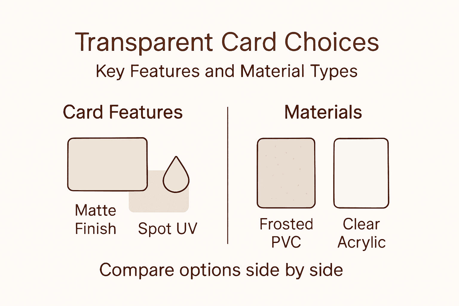
Types of Transparent Business Cards and Materials
The material foundation of transparent business cards determines everything from how light passes through them to how your design reads across different viewing angles. The most common material choice is PVC (polyvinyl chloride), a durable plastic polymer that offers excellent clarity and can be produced in varying thicknesses to match the weight and feel you want your brand to communicate. PVC cards provide superior durability compared to paper alternatives, resisting bending, moisture, and wear that would compromise traditional cardstock. For luxury beauty and fashion brands, this longevity matters because the card represents a lasting impression. A frosted PVC card, for instance, diffuses light softly while maintaining structural integrity through years of handling. Beyond PVC, some manufacturers offer polycarbonate materials, which deliver even greater clarity and impact resistance, though they typically command higher production costs. The choice between these materials hinges on your specific design vision and how precisely you want colors and imagery to translate.
Within the transparent category, finish variations create dramatically different aesthetics and user experiences. Frosted finishes scatter light across the card surface, creating a sophisticated, understated appearance that suits minimalist design approaches and high-end beauty brands favoring subtlety. The frosted effect also masks minor production variations that might otherwise be visible on crystal-clear materials. Glossy transparent cards maintain full clarity while adding a reflective quality that amplifies color saturation and creates visual impact, making them ideal for brands with bold color palettes or metallic elements. Matte finishes on transparent materials are less common but offer a middle ground, reducing glare while preserving transparency. The tactile difference between these finishes significantly affects brand perception. A frosted card feels understated and refined. A glossy card communicates boldness and contemporary energy. Your choice should align directly with your brand personality and the message you want the physical card itself to communicate before anyone reads the text.
Beyond the base material and finish, several technical variations expand your options. Dual-layer construction allows you to combine transparent and opaque layers strategically, perhaps using white printing on clear plastic to create contrast and ensure legibility while maintaining transparency elsewhere on the card. Specialty printing techniques like silkscreen, foil stamping, and embossing elevate transparent cards beyond basic full-color printing, adding tactile depth that luxury positioning demands. Some manufacturers offer edge treatments, such as rounded or beveled edges, that enhance the finished quality and prevent the card from feeling raw or unrefined. The thickness of the material itself, typically ranging from 0.76mm to 1.52mm, affects both the feel of the card and production possibilities. Thicker cards command attention and feel substantial in hand, while thinner versions maintain delicate, minimalist aesthetics. For luxury brands, thickness choices communicate intentionality. A premium beauty brand might choose thicker, weighted cards that feel luxurious. A fashion brand might select thinner options that emphasize contemporary sophistication.
The interaction between material, finish, and printing technique creates unique design possibilities unavailable with traditional cardstock. A clear PVC card with foil stamping can layer metallic elements over transparent sections, creating visual complexity and sensory richness. A frosted card with white silkscreen printing delivers bold legibility with understated elegance. Dual-sided printing with strategic white backing lets you use transparency as a design element rather than a limitation. Understanding these combinations helps you make informed choices that serve your brand strategy rather than defaulting to standard options. The material you select becomes part of your brand’s story, communicating the care and intention behind every touchpoint.
Here is a summary of material and finish options for transparent business cards:
| Material/Finish | Visual Effect | Tactile Impact | Typical Usage in Luxury Brands |
|---|---|---|---|
| Clear PVC | Highly transparent | Smooth and firm | Contemporary, high-clarity |
| Frosted PVC | Soft light diffusion | Silky and refined | Minimalist, understated |
| Polycarbonate | Exceptional clarity, durable | Sturdy and premium | Ultra-premium, fashion |
| Glossy Finish | Shiny surface, vibrant color | Slick and reflective | Bold, metallic elements |
| Matte Finish | Reduced glare, subtle color | Soft and muted | Sophisticated simplicity |
Pro tip: Compare material options by holding samples under different lighting conditions and against various background colors. The way frosted PVC reads in daylight, under office fluorescents, and against your brand’s primary color palette will reveal which material best serves your design vision and brand positioning.
Design Features That Enhance Brand Prestige
The difference between a transparent business card that fades into a wallet and one that commands attention lies in deliberate design feature selection. Luxury brands understand that every surface, texture, and finish element communicates value before conversation begins. Foil stamping stands as one of the most powerful prestige indicators available on transparent cards. When gold, silver, or copper foil interacts with transparent plastic, it creates a layered visual effect impossible to achieve on opaque materials. The metallic element catches light and reflects differently depending on viewing angle, making the card feel dynamic and tactile in hand. For beauty and fashion brands, foil stamping signals investment in premium production and attention to detail that aligns with luxury positioning. The cost is higher than standard printing, which itself communicates exclusivity. Brands that opt for foil stamping are saying their business cards deserve special treatment.

Embossing and debossing create three-dimensional texture on transparent cards that adds sensory richness to the experience. Embossing raises certain design elements above the card surface, creating tactile bumps that engage the recipient’s fingers. Debossing presses elements inward, creating recessed details that catch shadow and light. On transparent materials, these techniques perform differently than on paper. An embossed element on a clear PVC card casts shadows through the transparency, creating visual complexity that draws the eye. Combined with strategic foil stamping applications, embossing transforms a simple card into a multisensory brand experience. A fashion brand might emboss a logo on a frosted card, creating understated sophistication. A beauty brand might emboss intricate patterns that become visible only when light hits the card at specific angles, rewarding closer inspection and conversation. These details matter because they signal that your brand respects the recipient enough to invest in their experience.
Spot UV coating applies a glossy, raised layer to specific card areas, creating contrast between matte and reflective surfaces. On transparent cards, spot UV can highlight text, emphasize design elements, or create visual separation between card sections. The technique works particularly well on frosted transparent cards, where the matte base emphasizes the glossy accents. A beauty brand might apply spot UV to a product illustration, making it pop forward. A fashion brand might use spot UV to frame contact information, drawing focus to the most important details. White backing strategically placed on double-sided transparent cards prevents text bleed-through while maintaining transparency where it serves the design. Rather than backing the entire card with white, premium applications use white only where needed, preserving transparency and visual interest elsewhere. This controlled approach demonstrates design sophistication and understanding of how materials function.
Custom shapes and die-cuts elevate transparent cards beyond standard rectangles. A diamond-shaped card, a card with rounded corners that extend differently on each edge, or a card with a notch cut reveals another dimension of brand personality. These shapes must serve design purpose rather than feel gimmicky. For a luxury jewelry brand, a diamond shaped card creates immediate brand reinforcement. For a fashion brand, an asymmetrical die-cut might echo a signature design element from your collections. Custom shapes increase production complexity and cost, which communicates exclusivity and intentionality. Signature or scratch elements allow recipients to customize the card slightly, creating interaction and engagement. A beauty brand might include a small scratch panel revealing a hidden code or message, turning the card into an experience rather than information delivery. These features work because they invite engagement and create conversation starters.
The most prestigious transparent cards layer multiple design features thoughtfully. Combining frosted finish with white backing, foil stamping, and subtle embossing creates a card that performs on multiple sensory levels. Each element must earn its place through design purpose rather than decoration. Accumulation without intention reads as confused. Strategic layering of two or three premium features feels deliberate and powerful. The material itself becomes invisible to the user, replaced by pure brand experience.
Pro tip: Select design features based on your brand’s primary sensory identity. If your brand emphasizes visual impact, prioritize foil stamping and spot UV. If tactile experience matters most, emphasize embossing and premium material thickness. Avoid combining all available techniques unless each serves a specific communication goal.
Practical Branding Benefits for Beauty and Fashion
Transparent business cards deliver concrete branding advantages specifically suited to beauty and fashion industries, where visual presentation and material quality directly influence brand perception and customer confidence. In beauty, where clients evaluate products based on packaging, ingredient transparency, and professional presentation, a transparent card reinforces brand values around clarity and premium quality. A skincare brand emphasizing clean ingredients might use a clear card with minimal printing, letting the transparency itself communicate openness and purity. A makeup artist or beauty consultant using transparent cards signals contemporary sophistication and attention to aesthetic detail. The material choice itself becomes marketing communication. When a potential client receives a transparent card, they experience tactile evidence that this brand invests in distinctive presentation. That experience happens in the moment of exchange, creating an immediate impression that lingers longer than standard cardstock ever could. Fashion brands benefit similarly. In an industry built on visual impact and material innovation, transparent cards demonstrate understanding of current design trends and willingness to move beyond convention. A fashion consultant, boutique owner, or designer presenting a transparent card is communicating that they stay current with industry aesthetics. The card becomes a conversation starter at fashion events, trade shows, and networking situations where differentiation matters enormously.
Brand recall represents another critical practical benefit. People receive dozens of business cards weekly. Most vanish into recycling or wallets, forgotten within days. A transparent card, particularly one with thoughtful design features like foil stamping or embossing, creates memorable sensory impact that increases the likelihood someone will keep it, reference it later, and think of your brand when they need your services. Research on tactile experience confirms that physical distinctiveness drives memory formation. When someone holds a transparent card with metallic accents and frosted finish, they engage multiple senses simultaneously. That multisensory experience creates neural pathways that strengthen memory. A beauty brand owner mentioned that clients began referencing her transparent cards months after receiving them, saying they kept them on bathroom counters as aesthetic objects. That’s brand recall translating into genuine business benefit. Fashion industry professionals report similar experiences, with transparent cards becoming conversation pieces at industry events and on social media when clients photograph and share them. The cards become extensions of your brand aesthetic rather than disposable paper products.
Transparent cards also communicate professionalism and investment in brand positioning. In competitive industries like beauty and fashion, where numerous practitioners offer similar services, material choices signal confidence and commitment. Investing in distinctive business cards suggests you’re serious about your business and view your brand as worth the additional investment. This perception matters when potential clients or collaborators evaluate whether to work with you. The card becomes tangible proof that you value your brand enough to invest in premium materials and custom production. For beauty professionals, this builds client confidence that your services will reflect the same attention to quality and detail. For fashion professionals, it demonstrates understanding of brand presentation standards within the industry. Additionally, transparent cards function effectively in luxury brand contexts where price points are higher and client expectations for premium experience are significant. Someone willing to pay premium prices for services expects all touchpoints, including business cards, to reflect that investment. Transparent cards meet and exceed those expectations. They work across both digital and physical networking contexts. When photographed for social media or professional portfolios, transparent cards photograph distinctively. They stand apart in flat-lay styling, product photography, and networking event documentation. This additional visibility extends your branding beyond direct card exchange into digital contexts where your target audience increasingly makes purchasing decisions.
The sustainability perception associated with transparent cards offers another practical advantage in contemporary beauty and fashion markets. Younger consumers and industry professionals increasingly consider environmental impact when evaluating brands. While transparent PVC cards aren’t inherently more sustainable than paper, the durability and longevity of plastic means recipients keep them longer and discard them less frequently than traditional cardstock. A card that stays in someone’s wallet for years rather than days represents reduced overall waste from frequent card replacement. Additionally, the distinctiveness of transparent cards means people reference them repeatedly rather than requesting new ones. This reduced replacement cycle provides environmental benefit that resonates with sustainability conscious consumers increasingly common in beauty and fashion industries. The perception of premium quality associated with transparent cards also supports premium pricing strategies. Brands using transparent cards position themselves in luxury segments, justifying higher service or product prices. Clients who receive transparent cards perceive higher value, making them more willing to invest in premium service tiers. This positioning advantage proves particularly valuable for independent beauty professionals and emerging fashion brands competing against larger establishments. The material choice becomes a positioning strategy that influences pricing psychology and client perception of brand value.
Pro tip: Distribute transparent cards strategically at moments when brand impression matters most. Give them during initial consultations, at the end of successful projects, and at networking events where your target audience concentrates. The distinctiveness means fewer cards accomplish more, allowing you to invest in higher quality production while maintaining reasonable distribution costs.
Comparing Transparent Cards with Traditional Options
When evaluating business card choices, understanding the functional and perceptual differences between transparent and traditional options helps you make decisions aligned with your brand strategy. Traditional cardstock, typically ranging from 14pt to 32pt thickness, provides familiar weight and texture that most professionals recognize as standard. These cards feel substantial, stack neatly in wallets, and integrate seamlessly into conventional business card holders. The printing process is straightforward, costs are predictable, and production timelines move quickly. For decades, cardstock has been the default choice because it works reliably. But traditional doesn’t mean optimal, particularly for luxury brands competing in saturated markets where differentiation determines success. Transparent cards operate from an entirely different strategic premise. Rather than providing a neutral background for information, the material itself becomes part of the design. Light passes through the card, background surfaces show through printed elements, and the viewing experience changes depending on context and angle. This fundamental difference creates advantages and trade-offs worth examining carefully.
Visual and Perceptual Impact represents perhaps the most obvious distinction. Traditional cardstock delivers information clearly and predictably. A cream colored card with black text reads consistently whether in sunlight or indoors, in a wallet or on a desk. Transparency introduces variables. A frosted transparent card photographed against a colored background reads differently than the same card held against skin tone. A glossy transparent card reflects light differently under fluorescent office lighting versus natural daylight. These variables aren’t limitations but opportunities for sophisticated design thinking. Beauty and fashion professionals understand that context shapes perception. A transparent card with a brand logo printed on frosted finish reads distinctly different from a traditional card with identical logo and text. The transparency communicates something immediately about the brand’s design philosophy and willingness to move beyond conventional choices. Traditional cardstock communicates competence and professionalism. Transparent cards communicate innovation, design awareness, and premium positioning. For luxury brands, this perceptual advantage proves valuable. When a prospective client holds a clear PVC plastic card, they’re experiencing evidence that this brand invests in distinctive materials and understands contemporary aesthetics.
Tactile Experience and Durability differ significantly between options. Traditional cardstock engages touch through paper texture and weight. Glossy cardstock feels slick and reflective. Matte cardstock feels refined and understated. Textured finishes like linen or embossed patterns add tactile complexity. Transparent cards offer different tactile sensations. The smooth feel of PVC plastic differs fundamentally from paper. Embossing on transparent material creates shadows and visual effects impossible on opaque surfaces. The thickness of transparent cards typically ranges from 0.76mm to 1.52mm, creating weight and presence in hand that communicates premium quality. Durability tilts toward transparent materials. Traditional cardstock degrades with moisture, corner bending, and handling wear. After months in a wallet, a traditional card shows signs of age. Transparent PVC cards resist moisture, bending, and visible wear. A card that maintains visual and structural integrity for years creates different brand impressions than a card showing deterioration. For clients evaluating luxury service providers, card durability signals that the brand delivers long-term value rather than disposable experiences. Fashion and beauty professionals who maintain their cards in pristine condition benefit from transparency’s durability advantage. Traditional cardstock edges fray, colors fade, and corners bend. Transparent cards maintain original appearance across extended use periods.
Practical Considerations affect decision-making beyond aesthetic factors. Cost represents the primary practical difference. Traditional cardstock typically costs less per unit because the production process is standardized and widely available. Transparent cards command higher per-unit costs due to specialized materials and production techniques. For high-volume distribution, this cost difference accumulates significantly. However, luxury brands often optimize for impact rather than volume. Distributing 500 distinctive transparent cards accomplishes more than distributing 5000 standard cards that recipients discard immediately. Design flexibility varies between options. Traditional cardstock accommodates any design, color, and text treatment without technical constraints. Transparent materials introduce considerations about background visibility, printing opacity, and how elements interact with light. This constraint actually benefits thoughtful designers, forcing intentional decisions rather than defaulting to conventional layouts. Integration with digital contexts differs meaningfully. Traditional cards photograph similarly across contexts, delivering consistent visual results in digital sharing. Transparent cards photograph distinctly based on background and lighting, creating visual variability that can photograph beautifully or confusingly depending on context. For brands leveraging social media and digital networking, this variability requires consideration. A transparent card that photographs beautifully against a marble background might read confusingly against other surfaces. Professional styling and photography become more important when using transparent materials. From a pure functionality standpoint, traditional cards store and distribute more easily. They stack predictably in standard card holders and wallets. Transparent cards, depending on thickness and material, may not fit standard holders perfectly. This practical consideration matters less for luxury brands positioned around differentiation and more for high-volume corporate distribution.
Strategic Positioning ultimately determines which option serves your brand better. Choose traditional cardstock when your brand positioning emphasizes reliability, accessibility, and universal professional standards. Choose transparent materials when your brand positions itself around innovation, aesthetic sophistication, and premium differentiation. Beauty and fashion brands frequently align with the latter positioning, making transparent cards strategically appropriate. The comparison isn’t about which option is objectively better but rather which option communicates your brand’s values and positioning more effectively to your target audience. A luxury skincare brand might choose transparent cards to communicate ingredient transparency and contemporary design sensibility. A traditional medical spa might choose refined traditional cardstock to emphasize clinical credibility and established expertise. Both choices communicate something true about the brand. Transparent cards aren’t universally superior. They’re strategically superior for brands positioning themselves around design innovation, material quality, and premium differentiation.
This table compares key factors of transparent business cards versus traditional cardstock:
| Factor | Transparent Cards | Traditional Cardstock | Business Impact |
|---|---|---|---|
| Visual Distinction | Memorable, unique look | Conventional, familiar | Increases brand recall |
| Durability | Resistant to wear, moisture | Prone to damage, fading | Prolonged brand exposure |
| Customization | Advanced techniques possible | Standard options available | Enables luxury features |
| Distribution Cost | Higher per card | Lower per card | Suited for targeted strategy |
Pro tip: Request side-by-side samples of transparent and traditional options printed with your actual design. Hold them in natural light, under indoor lighting, against various surfaces, and photograph them for social media comparison. This experiential evaluation reveals which option communicates your brand’s positioning more effectively than theoretical comparison ever could.
Elevate Your Luxury Brand with Premium Transparent Business Cards
If your goal is to capture immediate attention and create lasting impressions through innovative and sophisticated design, transparent business cards are your answer. These cards communicate innovation, attention to detail, and a deep commitment to premium branding—just as the article explains. For luxury beauty and fashion brands, the tactile refinement and visual distinctiveness of materials like clear PVC perfectly align with a high-end identity. Overcome common challenges like color visibility and legibility with expert design and specialized printing techniques that make your cards stand out without compromise.
Experience firsthand how expertly crafted transparent cards can transform your brand presence by exploring our range of Clear Plastic Business Cards and Plastic Business Cards.
Don’t let your business card be an afterthought. At BcardsCreation, we specialize in fully custom, small-batch cards designed uniquely for your brand strategy—no templates, no compromise. Make your first tactile touchpoint a powerful brand statement that clients will remember. Start your transformation today and connect with us to create your distinctive, elegant transparent business cards that truly reflect your luxury brand ethos.
Frequently Asked Questions
What are the benefits of using transparent business cards for luxury brands?
Transparent business cards offer sophistication and innovation, immediately communicating premium quality. Their unique designs can create memorable impressions, enhance brand recall, and reflect a brand’s aesthetic sensibility.
How do transparent business cards differ from traditional cardstock?
Transparent business cards are made from materials like PVC, offering durability and a unique translucent look, while traditional cardstock provides familiar weight and texture. Transparent cards often allow for more creative designs but may require more thoughtful production choices.
Can transparent business cards be printed on both sides?
Yes, transparent business cards can accommodate double-sided printing using specialized techniques to prevent bleed-through, maintaining a clear visual effect without compromising design.
What design features enhance the appeal of transparent business cards?
Design features such as foil stamping, embossing, and spot UV coating can significantly elevate the prestige of transparent business cards. These techniques create tactile and visual complexities that engage recipients and enhance the overall brand experience.
Recommended
- Diamond Business Cards | Frosted Plastic | Custom shape card – BcardsCreation
- Raised Foil Business Cards | Thick Double-layered Art Paper – BcardsCreation
- SHIMMER Business Card | Silver Gold Holographic Foil Stamped – BcardsCreation
- Acrylic Card Holder | Personalized Business Card Holder for Desk – BcardsCreation


