

Business Card Branding Process: A Pro's Guide
TL;DR:
- A well-designed business card transforms a fleeting encounter into lasting brand recognition by emphasizing consistent identity and quality materials. Proper preparation of assets, strategic layout, and careful production are essential to ensure the card accurately reflects your brand and leaves a memorable impression. Ignoring these details risks costly mistakes and diminishes the card’s potential to enhance credibility, recall, and long-term networking success.
Most business cards get forgotten within 24 hours. Not because the person wasn’t worth remembering, but because the card itself gave no reason to remember them. The business card branding process is where that problem gets solved. Done right, it turns a 3.5 x 2 inch rectangle into a physical piece of your brand that people keep, reference, and act on. Done wrong, it produces something generic that signals you didn’t think carefully about your own brand. This guide walks you through every step, from brand preparation to final print production, with no shortcuts.
Table of Contents
- Key Takeaways
- The business card branding process: what to prepare first
- Executing the design: translating strategy into layout
- Production and quality assurance
- Common errors that compromise the result
- What a well-branded card actually delivers
- My take on what actually matters in this process
- Get cards that match your brand, exactly
- FAQ
Key Takeaways
| Point | Details |
|---|---|
| Prepare brand assets first | Gather your CMYK color values, logo files, and typography specs before starting any design work. |
| Information hierarchy drives recall | Structure name, role, and contact details in descending visual weight for immediate recognition. |
| CMYK is non-negotiable for print | Files built in RGB will produce dull, inaccurate colors when printed, undermining your brand. |
| Materials communicate brand values | Paper weight, finish, and texture affect perception just as much as the visual design does. |
| Proof before full production | Always test print and scan QR codes across multiple devices before committing to a full run. |
The business card branding process: what to prepare first
Before you open a design application, you need three things locked down: your brand assets, your content, and your print specifications. Skipping this step is why most cards end up looking off-brand or printing incorrectly.
Brand assets to collect:
- Logo in vector format (.ai, .eps, or .svg), including all approved versions (horizontal, stacked, icon-only)
- CMYK color values for every brand color, not hex codes, not RGB values
- Approved typefaces with their exact weights and sizes as used across other brand materials
- Any approved brand patterns, secondary graphics, or iconography
Inconsistent brand elements across collateral — including business cards — directly undermine professionalism and trust. If your card uses a slightly different shade of blue than your website or brochure, people notice, even when they can’t explain why.
Content to finalize before design:
Your name, title, phone number, email, and website URL are the core. Decide early whether you’re including a physical address, a QR code, or a social handle. Every element you add competes for space and attention. Be selective.
Pro Tip: Before you start the design, print your existing brand materials and compare them side by side. Any color inconsistency you see there will be magnified on a business card.
Technical print specifications to know
| Spec | Standard Requirement |
|---|---|
| Card size | 3.5 x 2 inches (US standard) |
| Bleed | 3mm beyond the trim line |
| Safe zone | 3-5mm inside the trim line |
| Resolution | 300 DPI minimum for all images |
| Color mode | CMYK for all print files |
All critical text and logos must stay within the safe zone, 3-5mm inside the trim line, while background colors must extend 3mm beyond trim. These numbers are not suggestions. Printers cut in batches, and even minor shifts can slice off a logo or a phone number.
Paper stock matters more than most people expect. A 350 to 400gsm cardstock with soft touch lamination signals quality through touch alone, before the recipient has read a single word. Heavier stock with a tactile finish moves a card from disposable to something worth keeping.

Executing the design: translating strategy into layout
Good business card identity design is not decoration. Professional business cards require mastery of typography hierarchy, print physics, and tactile psychology working together. Here is how to approach the execution step by step.
1. Set your information hierarchy. Lead with your name and logo at the highest visual weight. Follow with your title at a secondary weight. Place contact details last, in the smallest legible size. This structure mirrors how the human eye scans unfamiliar content and gives the reader exactly what they need in the order they need it.
2. Choose typography with legibility in mind. Minimum font size for body text on a business card is 8pt. Below that, you risk illegibility, especially on textured or colored stock. Stick to one or two typefaces. Using your brand’s approved fonts also keeps the card consistent with your other materials.
3. Manage color intentionally. Use your confirmed CMYK values. Printing RGB files produces dull, shifted colors that rarely match your brand. This is one of the most common and most preventable mistakes in custom business card branding. Run your file through a soft-proof in your design software before sending it anywhere.
4. Integrate QR codes correctly. A QR code only works if it scans reliably. The minimum size for a scannable QR code is approximately 2cm x 2cm. A quiet zone of at least 4 modules must surround the code on all sides, and contrast between the code and background must be sufficient. Adding a short call-to-action phrase beneath the code, something like “Scan to connect,” can boost scan rates by up to 50%. For more on this, Bcardscreation covers QR code strategy in depth for professional contexts.
5. Select finishes that match your brand positioning. Matte lamination projects calm and sophistication. Gloss lamination is high-impact and vivid. Soft touch creates a velvet feel that signals luxury. Spot UV adds contrast by highlighting specific design elements. Foil stamping catches light and draws attention to logos or names. None of these are purely aesthetic choices. Each one sends a signal about who you are and how seriously you take your brand.
Design comparison: common finishes and their brand signals
| Finish | Brand Signal | Best For |
|---|---|---|
| Soft touch lamination | Premium, refined | Consultants, luxury brands |
| Gloss lamination | Bold, energetic | Creative agencies, retail |
| Matte lamination | Understated, serious | Finance, legal, B2B |
| Spot UV | Detail-oriented | Architects, designers |
| Foil stamping | High-end, memorable | Executives, luxury services |
Pro Tip: Order a printed sample of your chosen stock and finish before approving the final design. Colors and textures look different in person than on screen, and you want to approve the physical result, not a digital simulation.
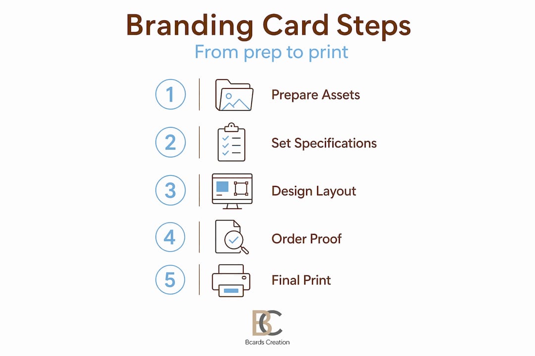
Production and quality assurance
The branding tips for business cards you follow during design only matter if production executes them correctly. This stage is where careful preparation pays off.
File preparation checklist before sending to print:
- All logos in vector format (not embedded JPEGs)
- Document color mode set to CMYK throughout
- All images at 300 DPI or higher
- Bleeds extended 3mm beyond the trim on all sides
- Text and logos inside the 3-5mm safe zone
- Fonts outlined or embedded to prevent substitution
- A final PDF export checked in Acrobat for errors
Work with a printer that specializes in premium small-batch production and will review your file before printing. Automated online printers rarely flag issues. A human review catches problems that cost money and time to correct later.
Proofing is not optional. Request a physical proof before approving a full run. Review it under natural light, not just overhead fluorescents. Check every piece of contact information, verify that the QR code scans correctly on at least three different smartphones, and confirm the colors match your brand standards.
Testing a proof across multiple smartphones before a full print run can prevent costly reprints caused by QR code failures. This takes ten minutes and eliminates a very avoidable problem.
On QR code technology: dynamic QR codes let you update the destination URL without reprinting your cards, which makes them worth the subscription cost if your contact information changes often. Static codes are simpler and work offline permanently, but they lock in the destination at print time.
Pro Tip: If you’re including a QR code, always test it in poor lighting conditions, not just at your desk. That’s closer to real-world use.
Common errors that compromise the result
Even well-prepared projects run into issues. These are the most frequent problems in the business card branding process and what to do about each one.
-
Bleed and margin errors. Text or logos sitting too close to the trim edge get cut off in production. Follow the 3-5mm safe zone rule without exception.
-
RGB color mode in print files. The color shift from RGB to CMYK often makes brand colors look flat or muddy. Build everything in CMYK from the start.
-
QR codes that won’t scan. Insufficient quiet zone, low contrast, or printing the code too small are the main causes. Adhere to the 4-module quiet zone and minimum size requirements.
-
Overcrowded layouts. More information does not mean more value. A card crammed with social handles, multiple phone numbers, and a lengthy tagline reads as noise. Cut anything that isn’t directly useful to the person receiving the card.
-
Wrong material for your brand. A luxury consultancy handing out thin, glossy cards sends a conflicting message. Your material choice needs to match the positioning you want to project.
The most expensive mistake in custom business card branding is discovering a preventable error after 500 cards have been printed. Preparation and proofing are not extra steps. They are the steps that determine whether the result reflects your brand or works against it.
What a well-branded card actually delivers
Following a real business card branding process produces outcomes that extend well beyond a good-looking card.
-
Stronger brand recall. A business card’s primary purpose is to solve the recipient’s memory problem. A card that combines consistent visual identity with quality materials gives people a reason to remember you after the meeting ends.
-
Professional credibility. A card that feels considered signals that you run your business the same way. That impression transfers to how potential clients perceive your work.
-
Networking follow-up. Business cards enable mental connections that last days after an encounter. That staying power is what converts a handshake into a follow-up call or email.
-
Coherent brand presence. Brand consistency across offline and online collateral builds the trust that supports business growth. Your card should look like it belongs to the same family as your website, your email signature, and your packaging.
-
Tactile differentiation. In a competitive market where most cards are forgettable, a premium finish on quality stock makes yours the one that stays in the holder instead of the recycling bin.
My take on what actually matters in this process
I’ve worked through enough business card projects to know where the real problems live. And it’s almost never the logo or the tagline.
It’s the preparation. Clients arrive with logos that exist only as low-resolution PNGs saved from their website. They have hex codes but no CMYK equivalents. They haven’t thought about whether the deep forest green they love on screen will hold up on a dark textured stock. These gaps don’t show up until the proof comes back looking wrong, and at that point you’re already behind schedule.
The other thing most people undervalue is material selection. I’ve seen beautifully designed cards printed on standard 300gsm stock with no finish, and they disappear into a pile. I’ve also seen fairly simple designs on 400gsm soft touch that people hold onto for months because the thing just feels intentional. The tactile experience is part of the brand message. It’s not separate from it.
My honest advice on QR codes: use them, but integrate them deliberately. A code dropped into a corner as an afterthought is worse than no code at all. It needs adequate space, a clear call-to-action, and enough contrast to scan in real-world lighting. When it’s done right, it connects a physical card to a living digital presence. That’s a real advantage.
Finally, treat your business cards as something you revisit. When your role changes, when your brand evolves, when you move offices, update your cards. A card with outdated information works against you. Dynamic QR codes help with some of this, but the physical card itself needs to stay current.
— Kostiantyn
Get cards that match your brand, exactly
If you’ve worked through this process and you want the final product to reflect that effort, Bcardscreation builds cards for exactly this situation.

Every project at Bcardscreation is handled individually, with no templates and no automated editors. The team works through design, material selection, and production with you, matching the card to your brand rather than fitting your brand into a preset format. Whether you need letterpress texture, foil stamping, or a clear card that stands apart visually, the production is controlled and small-batch. For a fully tailored result, explore custom business card design at Bcardscreation and start with a brief or a consultation.
FAQ
What is business card branding?
Business card branding is the process of designing a card that consistently represents your visual identity, including logo, colors, typography, and materials, to create a memorable and professional impression.
Why does CMYK matter for business card design?
Printers operate in CMYK, not RGB. Files submitted in RGB often produce dull or inaccurate colors when printed, which can make your brand colors look different from your intended identity.
How big does a QR code need to be on a business card?
The minimum reliable size is approximately 2cm x 2cm, with a quiet zone of at least 4 modules on all sides and sufficient contrast between the code and background to scan consistently.
What paper weight should I use for a premium business card?
350 to 400gsm cardstock is the standard for premium cards. Paired with a tactile finish like soft touch lamination or foil, it signals quality before the recipient reads a single word.
What is the difference between a static and dynamic QR code on a card?
Static QR codes are permanent and work offline but cannot be updated after printing. Dynamic codes allow you to change the destination URL without reprinting, making them a better choice for cards that may need future updates.
Recommended
- Professional Business Card Design: A Step-by-Step Framework – BcardsCreation
- Build a winning branding workflow for custom business cards – BcardsCreation
- How We Turn an Idea Into a Finished Business Card: Inside Our Process – BcardsCreation
- Business Card Printing Process for Luxury Branding – BcardsCreation


