

Build a winning branding workflow for custom business cards
TL;DR:
- Most business cards fail because they lack a clear strategy and structured workflow. Implementing a standardized process improves consistency, reduces revisions, and enhances brand perception. Proper planning, technical precision, and material choices are essential for creating impactful, memorable cards.
You hand out a business card. The person glances at it, pockets it, and you never hear back. Sound familiar? Most cards fail not because of bad luck but because they were designed without a clear strategy. A structured branding workflow changes that. It takes your card from forgettable to purposeful, cutting down on wasted revisions and producing a result that actually represents your brand. This article walks you through every step, from brand audit to final proof, so your next card works as hard as you do.
Table of Contents
- Why workflow matters for business card branding
- Preparing for your branding workflow: audit, analysis, and ideation
- Step-by-step design workflow: from concept to finished card
- Troubleshooting and common mistakes in the workflow
- What most entrepreneurs get wrong about business card branding
- Elevate your brand with premium custom business cards
- Frequently asked questions
Key Takeaways
| Point | Details |
|---|---|
| Workflow reduces revisions | Following a branding workflow cuts design trial runs from 10 to 3, saving time and money. |
| Audit defines brand direction | A thorough brand audit and competitive analysis guide design choices that set your cards apart. |
| Technical prep prevents mistakes | Using proper settings for color and size ensures your cards print perfectly every time. |
| Materials boost brand impact | Careful selection of materials and finishes makes your cards memorable and reinforces your brand’s values. |
| Proofing avoids costly errors | Reviewing and testing before final print saves money and ensures brand consistency. |
Why workflow matters for business card branding
Ad-hoc design is expensive. Most entrepreneurs approach business card design the same way they approach a quick errand: pick a template, swap in their logo, and order 500 copies. The problem shows up when the cards arrive and the color looks off, the font feels wrong, or the card just does not feel like the brand. Then comes the second round of revisions, and sometimes a third.
A business card design framework eliminates most of that back-and-forth before it starts. A standard workflow reduces iteration cycles by 30%, cutting trial print runs from 10 down to 3. That is time and money staying in your pocket.
Here is a quick comparison to show the difference:
| Approach | Avg. revision rounds | Cost exposure | Consistency |
|---|---|---|---|
| Ad-hoc (template-based) | 7 to 10 | High | Low |
| Structured branding workflow | 2 to 3 | Low | High |
| Agency-managed workflow | 2 to 4 | Medium to High | High |
The numbers are clear. Workflow-driven design produces better results with fewer rounds of changes.
What does a strong workflow actually give you?
- Consistency across every card variation (staff cards, appointment cards, specialty cards)
- Faster production because decisions are made early, not mid-print
- Higher perceived quality because every element is chosen with intent
- Better ROI because the card does its job from day one
“Your business card is the first physical touchpoint of your brand. Getting it wrong is not just a design failure. It is a branding failure.”
A luxury card workflow follows this logic especially well. Premium clients expect consistency. They notice when something is slightly off. Following a workflow makes sure nothing is slightly off.
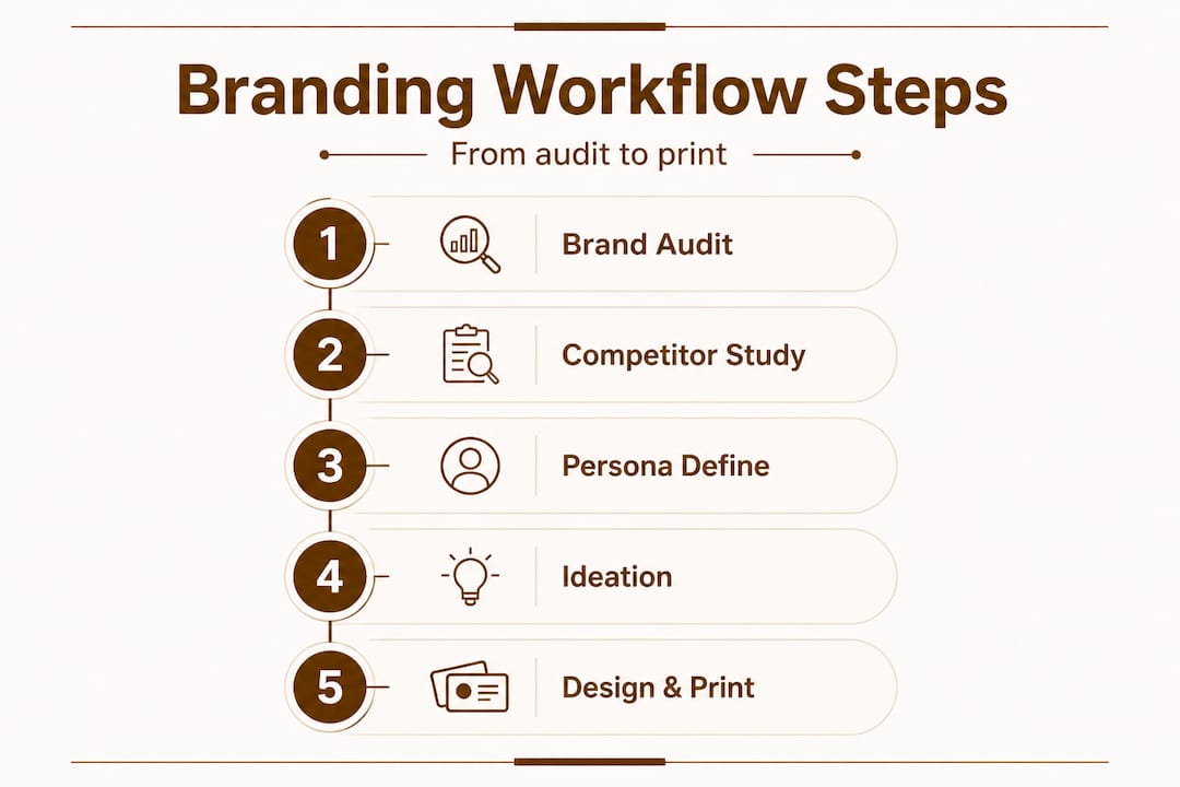
Preparing for your branding workflow: audit, analysis, and ideation
Understanding why workflow matters sets the stage for preparing the right foundation. Before any designer opens a file, you need three things in place: a brand audit, a competitor analysis, and a clear audience persona. Skip any of these and you are guessing.
The standard workflow starts with a brand audit and competitor analysis, followed by persona development. Each step feeds the next.
Brand audit
A brand audit answers one question: what does your brand actually look like right now? Pull together your existing logo files, brand colors (with exact hex or Pantone codes), fonts, and any existing printed materials. Look for inconsistencies. Does your website use a different blue than your previous card? Does your logo appear in multiple versions without clear rules for use? These inconsistencies will show up on your card if you do not resolve them first.
Competitor analysis
Go collect business cards from your top five competitors. If you cannot get the actual cards, find high-resolution images online. Ask yourself: what shapes do they use? What colors dominate? What do they all avoid? The goal is to identify what is standard in your space and then find the opening where your card can stand apart. This is not about copying. It is about knowing the field before you play.
Persona development
Who is receiving this card? A tech executive at a conference expects something different than a retail buyer at a trade show. Age, industry, setting, expectations. All of it matters. Your card needs to speak directly to that person in three seconds.
Ideation
Once you have your audit, analysis, and persona, ideation becomes focused and fast. You are not brainstorming in the dark. You know what your brand stands for, what competitors look like, and who you are designing for. Sketch concepts or gather visual references that fit. Even a rough direction gives your designer a solid target.
Here is a quick planning reference for this stage:
| Prep step | Key output | Time investment |
|---|---|---|
| Brand audit | Verified brand assets | 2 to 4 hours |
| Competitor analysis | Differentiation notes | 2 to 3 hours |
| Persona development | Target audience profile | 1 to 2 hours |
| Ideation | Visual direction / moodboard | 1 to 3 hours |
Pro Tip: Before briefing your designer, read through designer briefing tips to make sure you can communicate your direction clearly. A well-written brief cuts revision time in half.
Also consider your contact details strategically. Easy dial numbers contribute to brand recall, meaning a memorable phone number can actually boost the effectiveness of a card even before design plays a role. Small details like this make a bigger difference than most people expect.
Following these business card design steps as a checklist keeps you on track without missing anything that will cost you later.
Step-by-step design workflow: from concept to finished card
With your groundwork complete, let’s guide you through the exact steps for designing and producing business cards that reflect your brand. This is where preparation turns into production.
The full design workflow covers design with brand elements, technical prep for print, material and finish selection, proofing, and testing. Each step matters.
Step 1: Apply your brand elements with discipline
Open your design file and bring in only approved brand elements: logo, brand colors, and brand fonts. No substitutions. No creative shortcuts. Your card is not the place to introduce a new color you like. Stick to the system. Use your primary brand color as the dominant palette and let typography create hierarchy. A clean, on-brand layout communicates professionalism before anyone reads a word.
Step 2: Technical prep for print
This step is where many DIY designs fail. For print-ready files, you need:
- Color mode: CMYK (not RGB, which is for screens)
- Resolution: 300 DPI minimum (72 DPI is for web only)
- Bleed: 3mm on all sides (extends design past the cut line so no white edges appear)
- Safe zone: keep text and logos at least 3mm inside the trim line
- Fonts: embed or outline all fonts so they do not reformat on a different machine
If you skip any of these, results in print can be unpredictable. Colors shift, edges look choppy, and text can get clipped. Do not assume a printer will fix these issues for you.
Step 3: Select materials and finishes
Material choice is a branding decision, not just a production one. A thin, flimsy card says something about your brand. So does a thick, textured card with a matte soft-touch finish. The premium finishes guide breaks down options like soft touch, spot UV, and foil stamping, each of which adds a layer of tactile quality that digital impressions simply cannot replicate.

Luxury card materials like metal, thick cotton paper, and frosted plastic deliver a physical experience that stays with people. When someone picks up your card and it feels different, they notice. That noticing is a branding moment.
Step 4: Proof and test
Never approve a card based on a screen view alone. Request a physical proof before your full print run. Check:
- Color accuracy vs. your brand standards
- Font rendering and legibility at actual card size
- Finish quality (does the foil align with design? Does the UV coat pop correctly?)
- Bleed and trim accuracy
Pro Tip: Print a test card and carry it with you for a day. Hand it to a few trusted contacts and watch their reaction. Immediate, unfiltered feedback from real people is more reliable than your own eye after staring at the design for hours.
A key insight worth noting: unique card designs are most effective when both the design and the material reinforce the same brand message. A bold, modern design on a standard paper stock sends mixed signals. Alignment between all elements is what creates impact.
Troubleshooting and common mistakes in the workflow
After learning each step, it is crucial to sidestep common workflow errors that can ruin your cards or your timeline. Most mistakes are preventable. Here are the ones that come up most often.
Color mismatch between screen and print
RGB colors look vivid on a monitor. CMYK printing cannot reproduce all of them. Bright neon tones almost always dull in print. If your brand color is defined only as a hex code, convert it to a Pantone reference before sending files to print. Pantone color matching gives you a reliable, predictable result across print runs.
Ignoring bleed and DPI requirements
This is the most common technical failure. A file submitted without a 3mm bleed will show white edges on the cut card. A file at 72 DPI will print blurry. These are not things a printer can fix after the fact. Your luxury printing process should always begin with spec-checked files.
Rushing material selection
Choosing a material quickly because you want to move fast is a common trap. The wrong material undermines even a great design. A thin, coated card does not communicate luxury. A matte black card with debossed text does. Spend the time. Get samples if possible.
Skipping the proof stage
A structured workflow reduces costly iteration cycles by 30%, but only if every step is completed. Skipping the proof to save time or money often results in a full print run that needs to be redone. That is far more expensive than a single proof.
Not aligning your card with your full brand presence
Your card exists alongside your website, your social profiles, and your packaging. If the card uses a slightly different logo version or a slightly different font weight, it breaks the brand chain. The inside our process approach at professional studios always starts with verifying brand consistency across all existing touchpoints.
Pro Tip: Create a simple checklist of the five technical specs (CMYK, 300 DPI, 3mm bleed, safe zone, outlined fonts) and verify each one before sending any file to print. Five minutes of checking saves days of reprinting.
One often-overlooked branding detail: your phone number on the card. Golden digits are increasingly used as a branding tool because a memorable number reinforces recall. If your contact information is hard to remember, even a perfect card loses some of its effectiveness.
What most entrepreneurs get wrong about business card branding
Here is an honest take on where most people go wrong. They treat business card design as an afterthought. They see it as a checkbox item before an event or a launch. They pick a template because it looks “clean enough,” enter their details, and click order. The result is a card that looks like everyone else’s card in the pile.
The belief that business cards are a commodity is one of the most expensive mistakes a small business owner can make. A card is not just contact information on paper. It is a physical representation of how much you care about your brand. The moment someone holds it, they are forming an opinion about you.
The workflow described in this article is not about aesthetics. It is about strategy. Every step, from the brand audit to the material choice, is a decision about how you want to be perceived. And perception drives purchase decisions.
The entrepreneurs who stand out are the ones who treat their card like a unique branding asset. They think about who is receiving the card and what that person should feel when they hold it. They select materials that match the promise their brand makes. They proof carefully because they know that a single blurry line of text or a color that is slightly off gray instead of warm white signals carelessness.
Shortcutting any stage of the workflow does not save time. It costs credibility. And in competitive markets, credibility is the difference between a follow-up call and a forgotten card in a drawer.
Elevate your brand with premium custom business cards
Now that you understand the power of a strong branding workflow, here is where to take your next steps for professional results.
At BcardsCreation, every card is developed individually. No templates. No automated editors. Just expert design guidance, material consultation, and controlled small-batch production built around your brand.

Explore custom card design for a fully tailored approach from concept to final proof. For high-impact options, check out luxury creative cards featuring foil stamping, premium finishes, and standout formats. Want something truly distinctive? Clear business cards deliver a modern, transparent aesthetic that gets noticed immediately. Whatever your brand needs, the right card is one workflow away.
Frequently asked questions
What is the first step in branding workflow for business cards?
A brand audit followed by competitor analysis sets the foundation for impactful business card design, as the standard workflow begins with identifying your existing brand assets and points of differentiation.
Why are technical settings like CMYK and DPI important for custom business cards?
Technical specs ensure colors print accurately and details remain sharp. Technical preparation including CMYK color mode, 300 DPI resolution, and 3mm bleed is a non-negotiable workflow step for print-ready files.
How does following a workflow reduce business card design revisions?
Structured workflows cut trial runs from 10 to 3, reducing iteration cycles by 30% and saving meaningful time and budget on each project.
What are common mistakes in custom business card workflows?
Neglecting bleed, DPI settings, and the proofing stage are the most frequent errors. Skipping technical prep and proofing often results in costly reprints or cards that do not match brand standards.
How do material and finish choices impact business card branding?
The right materials and finishes create a tactile experience that reinforces your brand’s quality level. Material and finish selection is a dedicated workflow stage specifically aimed at maximizing brand impact through physical experience.
Recommended
- Design a unique business card that sets your brand apart – BcardsCreation
- How We Turn an Idea Into a Finished Business Card: Inside Our Process – BcardsCreation
- Luxury Business Card Workflow for Brand Impact – BcardsCreation
- Professional Business Card Design: A Step-by-Step Framework – BcardsCreation
- Your Vision, Our Craft: A Deep Dive into Designing Your Custom Document Cover | Honor U


