

Business card color guide for luxury brands 2026
Your business card lands in a prospect’s hand, but the colors scream discount bin instead of premium brand. Color selection separates luxury brands from commodity competitors, yet most professionals choose colors based on guesswork rather than psychology and proven trust factors. This guide reveals expert-backed color insights and actionable selection steps tailored for creative professionals and luxury brands in 2026. You’ll learn which colors build trust, how to align your palette with brand identity, and practical steps to execute a color strategy that elevates your brand positioning and drives memorable first impressions.
Table of Contents
- Why Business Card Color Matters For Luxury Brands
- Preparing To Select Your Business Card Colors: Key Considerations
- Step-By-Step Guide To Choosing And Applying Your Business Card Colors
- Common Mistakes And How To Avoid Them In Business Card Color Selection
- Explore Premium Business Card Designs To Elevate Your Brand
- Frequently Asked Questions About Business Card Color Selection
Key takeaways
| Point | Details |
|---|---|
| Trusted color palette | White, black, and navy blue are rated most trustworthy for business cards by over half of surveyed professionals. |
| Luxury color philosophy | Premium brands favor restrained, subtle color use over bold vibrancy to convey exclusivity and sophistication. |
| Color impact on recall | Strategic color choices improve brand recognition and audience perception significantly compared to random selections. |
| Psychological messaging | Colors communicate specific brand values like trust, exclusivity, and professionalism without words. |
Why business card color matters for luxury brands
Color shapes first impressions faster than any other design element. When someone receives your business card, their brain processes color before reading text or analyzing layout. For luxury and lifestyle brands, this split-second reaction determines whether you’re perceived as premium or pedestrian. White (54%), black (30%), and navy blue (24%) are rated the most trustworthy colors for business cards according to Adobe’s 2025 survey of professionals. These findings align perfectly with luxury brand positioning because trust forms the foundation of premium pricing and client relationships.
Luxury brands face a unique challenge. Bright, saturated colors might grab attention, but they often undermine the sophisticated restraint that defines premium positioning. The psychology is clear: luxury favors whispering restraint over bold vibrancy, balancing subtle elegance with strategic color psychology. Navy and blue convey trust and stability, black signals exclusivity and power, while white communicates purity and minimalism. When creative professionals choose colors that contradict their brand values, they create cognitive dissonance that weakens positioning.
Color selection becomes even more critical when you consider memory and differentiation. Your prospects collect dozens of business cards at networking events and conferences. The right color palette helps your card stand out in that stack while reinforcing your brand identity. Colors trigger emotional responses and associations that text alone cannot achieve. A wealth management advisor using neon green might attract attention, but the color contradicts the stability and trust clients expect. Meanwhile, a creative agency using sophisticated charcoal gray with metallic accents communicates innovation within professional boundaries.
Pro Tip: Map your color choices to specific brand attributes you want to emphasize. If exclusivity matters most, lean toward black and deep charcoal. If approachability within luxury is your angle, consider warm neutrals with subtle accent colors. Understanding color psychology across different industries helps you make strategic rather than aesthetic decisions.
The material and finish you select amplifies or diminishes color impact. Matte black on thick cotton stock creates a completely different impression than glossy black on standard cardstock. Luxury brands must consider how printing techniques, paper texture, and finishing options interact with color choices. A poorly executed color on cheap materials destroys premium positioning faster than any other design mistake.
Preparing to select your business card colors: key considerations
Before choosing specific colors, assess your brand’s personality and market position. Are you positioning as classic and timeless or contemporary and bold? Your color palette must align with this identity consistently. A brand promising cutting-edge innovation but using traditional navy and gray creates confusion. Conversely, a luxury law firm using bright orange undermines credibility. Write down three to five adjectives that describe your brand essence, then research which colors historically communicate those qualities.

Your target audience’s expectations and psychology shape effective color choices. Creative professionals in luxury and lifestyle sectors respond differently to color than corporate executives or tech entrepreneurs. Research your specific audience’s preferences and the visual language dominant in your niche. If you serve high-net-worth individuals, study the color palettes used by established luxury brands they already trust. If you work with creative directors, explore contemporary design trends while maintaining sophistication. The goal is differentiation within familiar territory, not shock value.
Printing materials and finishes dramatically affect color appearance and luxury perception. Color retention favors certain materials, with empirical data showing 10x better retention for color over black and white, but luxury brands must choose restrained colors that maintain this advantage without sacrificing sophistication. Thick cotton paper absorbs ink differently than smooth plastic cards. Metallic finishes alter color perception entirely. Matte coatings create subdued elegance while gloss amplifies vibrancy. Before finalizing colors, understand which materials and finishes you’ll use, then test how your chosen colors perform on those substrates.
Material and color compatibility factors:
- Paper weight and texture affect ink absorption and color saturation
- Plastic cards display colors with higher vibrancy than paper stocks
- Metallic and foil finishes work best with specific color backgrounds
- Matte coatings reduce color intensity while adding sophistication
- Specialty papers like linen or laid introduce texture that changes color perception
| Consideration | Luxury Approach | Common Mistake |
|---|---|---|
| Color saturation | Muted, sophisticated tones | Overly bright, saturated colors |
| Palette complexity | 2-3 colors maximum | 4+ colors creating visual clutter |
| Contrast ratio | High contrast for readability | Low contrast sacrificing legibility |
| Material pairing | Colors matched to substrate | Generic colors ignoring material |
Pro Tip: Order sample packs from premium printers showing different colors on various materials. Physical samples reveal subtleties digital mockups miss, especially how lighting conditions affect color perception. What looks elegant on screen might appear washed out in natural light or overly dark under office fluorescents.
Balance color visibility with subtle luxury aesthetics. Your card needs to be noticed in a stack without screaming for attention. This tension defines luxury color strategy. Consider using a restrained primary color palette with a single strategic accent. A cream card with deep navy text and a subtle copper foil detail creates interest without abandoning sophistication. Plan for consistency across all brand touchpoints. Your business card colors should coordinate with your website, packaging, and other marketing materials to build cohesive brand recognition.
Step-by-step guide to choosing and applying your business card colors
1. Define your primary brand color aligned with luxury positioning. Start with one dominant color that will occupy the largest visual space on your card. For luxury brands, this often means sophisticated neutrals like charcoal, navy, cream, or black. This primary color should reflect your core brand attribute. If trust and stability matter most, navy or deep blue works. If exclusivity and power define your brand, black or charcoal delivers. Choose a specific shade rather than a generic color family, considering how it appears on your chosen material.
2. Select one or two complementary secondary colors. These colors provide visual interest and hierarchy without creating chaos. Secondary colors might appear in logos, accent lines, or specific text elements. Maintain restraint by choosing muted or desaturated versions of bolder colors. A luxury real estate brand might pair cream primary color with forest green and gold accents. A creative agency could use charcoal with rust orange and warm gray. Test combinations using the 60-30-10 rule: 60% primary color, 30% secondary, 10% accent.
3. Test color combinations under various lighting and on actual materials. Digital screens display colors differently than printed cards. Request printed proofs on your chosen material before committing to large orders. View these proofs under natural daylight, office fluorescent lighting, and evening ambient light. Colors shift dramatically across these conditions. What appears sophisticated in daylight might look muddy under fluorescents. Bring proofs to typical networking environments where you’ll distribute cards to ensure colors perform as intended.
4. Incorporate functional elements like QR codes with strategic contrast. QR codes boost contact capture by 69% when integrated effectively into business card designs. Place QR codes against backgrounds with strong contrast to ensure scannability. A black QR code on a cream background works perfectly. If your primary color is dark, create a light-colored box or panel for the QR code. Consider how QR code placement affects overall color balance and visual hierarchy.
5. Compare monochrome versus muted color approaches for luxury impact. Monochrome designs using variations of a single color create sophisticated, cohesive impressions. A card using only shades of navy from pale to deep creates elegance through restraint. Alternatively, muted color palettes combining desaturated complementary colors offer visual interest while maintaining luxury positioning. Test both approaches with your target audience to determine which resonates more strongly with your brand personality.
| Approach | Best For | Visual Impact | Luxury Factor |
|---|---|---|---|
| Monochrome | Timeless, classic brands | Cohesive, sophisticated | Very high |
| Muted palette | Contemporary luxury | Balanced, refined | High |
| Bold accent | Creative differentiation | Dynamic, memorable | Medium to high |
6. Finalize with professional print proofs and gather feedback. Order small batches for testing before committing to full production runs. Distribute test cards to trusted colleagues, existing clients, and design professionals for honest feedback. Ask specific questions about color perception: Does this feel premium? Does it match your understanding of our brand? Is anything hard to read? Iterate based on feedback, making subtle adjustments to shades or contrast ratios. Professional designers can help refine colors to achieve your exact vision while maintaining printability.
Pro Tip: Create a brand color guide documenting exact color specifications across different formats (Pantone for print, RGB for digital, CMYK for standard printing). This ensures consistency when you reorder cards or expand to other branded materials. Include notes about approved material pairings and finishing techniques that work with your colors. Exploring luxury business card design principles helps you understand how color integrates with layout, typography, and finishing for maximum brand impact.
Common mistakes and how to avoid them in business card color selection
Overly saturated or neon colors destroy luxury positioning faster than any other design choice. Bright magenta, electric blue, or lime green might grab attention, but they communicate discount and desperation rather than premium value. Luxury clients expect visual restraint that signals confidence and exclusivity. If you want to use a bold color, desaturate it significantly. A muted coral works where bright orange fails. A deep forest green succeeds where neon lime alienates. Luxury brands favor restrained color use rather than bold vibrancy because sophistication whispers while desperation shouts.
Sacrificing readability for aesthetic appeal undermines your card’s primary function: sharing contact information. Low contrast between text and background creates elegant visuals but frustrated recipients. Light gray text on white backgrounds looks sophisticated in design software but becomes invisible in dim lighting or for recipients with vision challenges. Ensure text contrasts strongly with backgrounds, especially for critical information like names and phone numbers. Test readability by viewing cards at arm’s length and in poor lighting conditions.
Readability killers to avoid:
- Light text on light backgrounds or dark text on dark backgrounds
- Busy background patterns competing with text
- Overly thin fonts in low-contrast color combinations
- Small text in colors that blend with background tones
Chasing trendy colors that don’t align with brand identity creates short-term novelty but long-term regret. Millennial pink might be having a moment, but if your brand values are traditional and established, the disconnect confuses prospects. Choose colors based on strategic brand positioning rather than current design trends. Timeless color choices remain effective for years, while trendy selections date your cards quickly. If you must incorporate trending colors, use them as subtle accents rather than primary palette choices.
Cluttered color schemes confuse brand messages and weaken visual impact. Using four or more distinct colors creates visual chaos that prevents any single element from dominating. Luxury brands succeed through focused, intentional design choices. Limit your palette to two or three colors maximum, allowing each to serve a specific purpose. More colors don’t create more interest; they create more confusion. Simplicity and restraint communicate confidence and sophistication.
“The most elegant business cards use color sparingly and strategically. When every element competes for attention, nothing stands out. Luxury is about knowing what to remove, not what to add.” — Design principle from leading brand consultancies
Failing to test print early catches many professionals with expensive mistakes. Colors on screens never match printed results exactly. What appears as sophisticated charcoal on your monitor might print as flat gray or too-dark black. Different printers and paper stocks produce varying results from identical color specifications. Order test prints on your chosen material before finalizing designs or committing to large quantities. This small investment prevents costly reprints and ensures your colors perform as intended. Learning seven proven ways to stand out with business cards helps you avoid common pitfalls while maximizing color impact through strategic design choices.
Pro Tip: Keep a physical swatch library of printed color samples on different materials. When designing new cards or branded materials, reference actual printed colors rather than relying on screen representations. This practice ensures consistency across all touchpoints and prevents color drift over time.
Explore premium business card designs to elevate your brand
Now that you understand the psychology and strategy behind luxury business card color selection, bringing your vision to life requires expert execution and premium materials. BcardsCreation specializes in custom business card design that translates color strategy into tangible brand assets. Every project receives individual attention, combining design expertise with material consultation to ensure your chosen colors perform beautifully on the perfect substrate.

Explore creative business cards with printing and foiling options that amplify your color choices through metallic accents, spot UV, and specialty finishes. For maximum differentiation and durability, plastic business cards offer vibrant color reproduction and premium tactile experiences that paper cannot match. Each material option interacts differently with color, and expert guidance ensures you select the combination that best represents your luxury brand positioning. Transform color strategy into cards that open doors and create lasting impressions.
Frequently asked questions about business card color selection
What are the top color trends for luxury business cards in 2026?
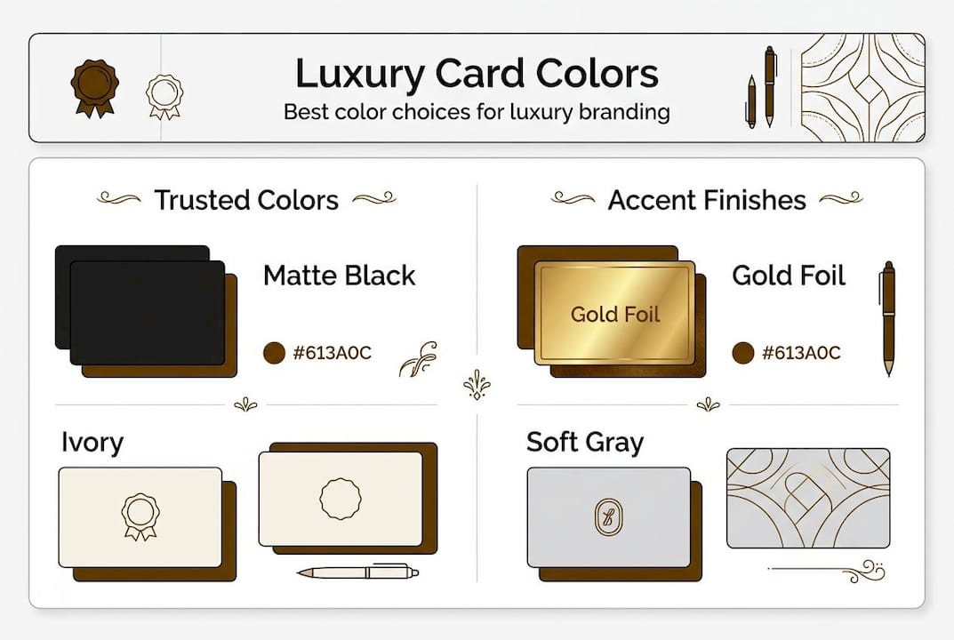
Sophisticated neutrals dominate luxury business card design in 2026, with charcoal gray, navy, deep forest green, and warm cream leading the palette. Metallic accents in copper, rose gold, and brushed silver add premium touches without overwhelming restraint. Monochrome designs using tonal variations of a single color create timeless elegance that transcends temporary trends.
How do I coordinate colors between digital branding and print cards?
Create a comprehensive brand color guide specifying exact values across all formats: Pantone for premium printing, CMYK for standard print, RGB for digital, and HEX for web. Order printed samples of your digital colors to see how they translate to physical materials. Expect slight variations between mediums and choose the version that works best for each application rather than forcing perfect matches that compromise quality.
What if I have no design experience but need to select effective colors?
Start by identifying three luxury brands you admire and analyze their color palettes. Look for patterns in how they use color for sophistication and trust. Use online color palette generators to create harmonious combinations, then test them on actual card mockups. Consider working with professional designers who understand luxury positioning and can translate your brand values into strategic color choices that perform across materials.
How significantly does color impact audience recall and brand perception?
Color increases brand recognition by up to 80% compared to designs relying solely on typography and layout. The right colors trigger emotional associations that reinforce your brand positioning, while poor color choices create cognitive dissonance that weakens credibility. For luxury brands, restrained color use signals confidence and exclusivity, directly impacting how prospects perceive your value and professionalism.
What role do texture and finish play in complementing color choices?
Texture and finish dramatically alter color perception and luxury impact. Matte finishes create subdued, sophisticated color presentations perfect for professional services and established brands. Gloss finishes amplify color vibrancy and work well for creative industries. Metallic and foil elements add dimension and premium tactile experiences. Textured papers like linen or cotton introduce subtle visual interest that enhances color depth. Always test your chosen colors on actual materials with intended finishes before final production.
Recommended
- 7 Essentials for Luxury Business Cards in 2025: Materials, Finishes, a – BcardsCreation
- Luxury Business Card Design Guide for Brand Impact – BcardsCreation
- Color Psychology in Business Cards: Industry Impact – BcardsCreation
- Luxury Business Card Printing Guide for Brands – BcardsCreation
- 7 Expert Wall Art Color Tips for Luxury Interiors


