

Color Psychology in Business Cards: Industry Impact
Every detail counts when your business card is meant to convey prestige and originality. For luxury brand owners and creative professionals in the United States, color psychology studies how colors affect human behavior, perception, and emotion, making your card more than just a networking tool. The right color choice not only amplifies your brand message but also builds immediate emotional connections, unlocking opportunities to stand out in markets where first impressions mean everything.
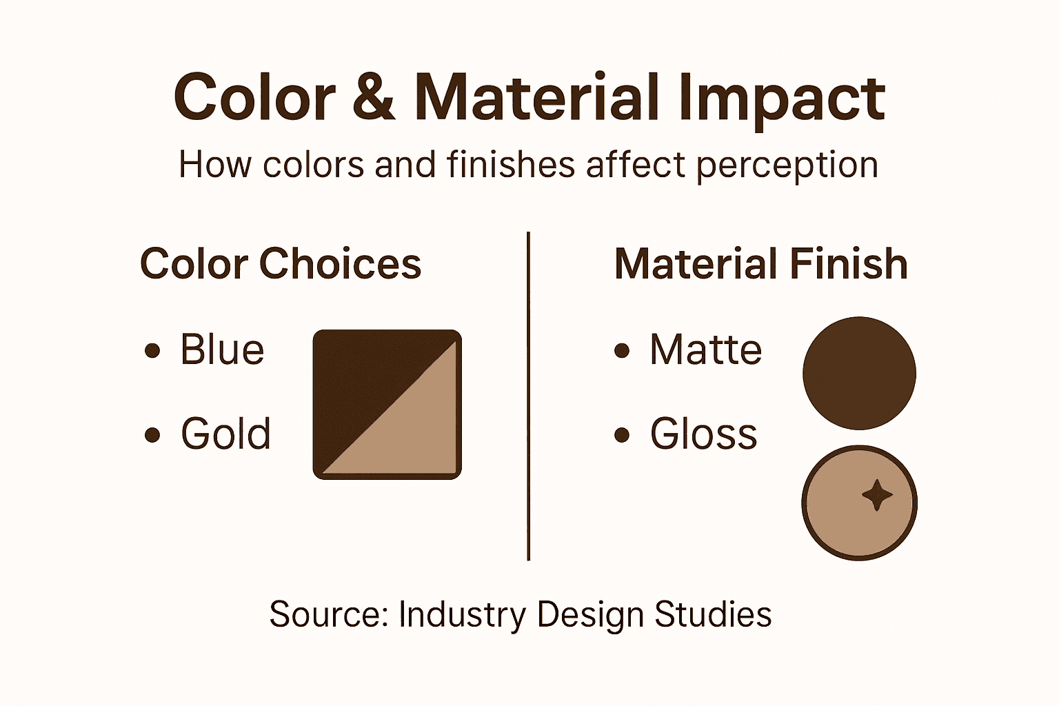
Table of Contents
- Defining Color Psychology In Business Cards
- How Industry Norms Shape Color Perception
- Luxury Branding And Color Decision Logic
- Material Selection And Color Interaction
- Common Color Pitfalls Across Industries
Key Takeaways
| Point | Details |
|---|---|
| Color Psychology Matters | The color of your business card influences first impressions and can communicate trust, creativity, or professionalism. |
| Industry Norms Influential | Adhering to industry color conventions builds credibility while strategic deviations can highlight innovation. |
| Material Interaction is Key | The finish and material of your card significantly affect how colors are perceived, impacting overall impression. |
| Avoid Common Mistakes | Prioritize audience expectations and readability over personal preference to enhance the effectiveness of your design. |
Defining Color Psychology in Business Cards
Color psychology in business cards goes beyond aesthetics. It’s about understanding how specific hues influence perception, trust, and decision-making the moment someone holds your card.
Color psychology studies how colors affect human behavior, perception, and emotion, making it a fundamental tool in business card design. When you choose a color, you’re not just picking a shade—you’re sending a signal about who you are and what your brand stands for.
Consider the basic mechanics. A prospect receives your card at a networking event. Within seconds, color registers before text does. That initial impression shapes whether they view you as trustworthy, creative, energetic, or professional. Different industries expect different signals.
Here’s what makes this strategic:
- Red triggers urgency, passion, and excitement—powerful for creative industries or luxury brands
- Blue conveys trust, stability, and professionalism—dominant in finance and corporate sectors
- Green suggests growth, health, and sustainability—expected in wellness and eco-conscious fields
- Black communicates sophistication, authority, and exclusivity—standard in luxury and consulting
- Gold or metallic adds prestige and high-end positioning—common in luxury services
The complexity increases when you layer in cultural influences. What reads as positive in one market may carry different weight elsewhere. A Western luxury brand and an Asian one may use the same color but interpret it through different cultural lenses.
Your card’s color choice should reinforce industry expectations while creating enough distinction to be memorable.
Beyond single colors, color combinations matter significantly. Pairing complementary or analogous colors creates visual hierarchy and guides the eye. Contrast levels affect readability and perceived quality. The relationship between your card’s color and its material finish—whether matte, glossy, or textured through embossing or debossing—compounds the psychological impact.
This is why informed color selection requires more than preference. You’re aligning color choice with your industry’s implicit rules while creating strategic differentiation. A financial advisor using deep navy signals stability and competence. A creative strategist using charcoal with an unexpected accent color signals both professionalism and innovation.
The goal isn’t to break convention recklessly. It’s to understand the convention, recognize why it exists, and decide whether to align with it or deliberately diverge for competitive advantage.
Pro tip: Test your card color choice by viewing it in natural light, artificial office light, and outdoors—perception shifts across lighting conditions, and your color should read consistently across all three.
How Industry Norms Shape Color Perception
Every industry develops an unspoken color vocabulary. Prospects expect certain colors from certain professions, and when your card defies those expectations, you signal either innovation or inexperience depending on context.
Industry color norms exist because they work. They’ve been tested, refined, and reinforced over years of market behavior. A financial advisor in bright orange raises questions. A wellness practitioner in pure black feels cold. These reactions aren’t random—they’re shaped by collective industry practice.
How color norms function:
- Establish trust through consistency with category expectations
- Create immediate professional recognition within your field
- Signal credibility by aligning with proven category standards
- Reduce cognitive friction when prospects evaluate your positioning
- Build emotional associations tied to your industry’s values
Research shows that product category color norms influence branding strategies significantly. When an industry develops dominant color conventions, adhering to them reinforces your legitimacy. A corporate law firm in navy and white signals competence. A creative agency in similar colors signals tradition and safety.
The strategic question isn’t whether to follow norms—it’s when. Alignment builds trust through predictability. Deviation attracts attention, but only if executed deliberately and supported by strong brand strategy.
Consider these industry patterns:
- Finance and consulting: Deep blue, charcoal, silver, gold accents
- Healthcare and wellness: Green, white, soft blue, earth tones
- Creative and design: Black, white, unexpected accent colors, bold contrasts
- Real estate and luxury: Gold, cream, deep jewel tones, premium finishes
- Tech and startups: Bold primary colors, high contrast, minimalist approach
Deviation from industry norms works only when it’s intentional, supported by strong visual design, and reinforces your competitive positioning.
Misalignment without strategy damages credibility. A financial advisor using hot pink without clear brand reasoning appears unprofessional. A creative agency using navy without distinctive design elements gets lost among competitors.

The most effective approach: understand your industry’s color conventions deeply, then decide whether alignment or deliberate divergence serves your brand better. This requires analyzing what your peers do, recognizing why those choices persist, and evaluating whether you’re stronger by following the same path or standing apart.
To clarify how industries use color in business cards, here’s a comparison of typical color approaches and their intended impressions:
| Industry | Common Colors | Intended Impression |
|---|---|---|
| Finance & Consulting | Deep blue, charcoal | Trust, professionalism |
| Healthcare & Wellness | Green, earth tones | Growth, care, sustainability |
| Creative & Design | Bold accents, black | Innovation, uniqueness |
| Luxury & High-End | Black, gold, cream | Exclusivity, sophistication |
| Tech & Startups | Bright primaries, white | Energy, modernity |
Pro tip: Research the top five competitors in your industry and document their card colors, then ask yourself: Does matching them reinforce my credibility or make me indistinguishable from the crowd?
Luxury Branding and Color Decision Logic
Luxury branding demands a fundamentally different color approach than mass-market positioning. Your color choices communicate value, exclusivity, and status before a single word is read.
Luxury brands operate in a psychology of restraint. While mainstream brands shout through bright, attention-grabbing colors, luxury brands whisper through understated sophistication. This distinction isn’t accidental—it’s rooted in how affluent consumers perceive value and status.
Research shows that luxury brands employ distinctive color strategies that evoke exclusivity and prestige. Black, deep purple, charcoal, and muted earth tones dominate luxury positioning. These colors signal control, refinement, and a brand secure enough to avoid visual noise.
Consider the decision logic:
- Restraint signals confidence: Luxury brands don’t need to fight for attention
- Subtlety suggests sophistication: Understated color choices appeal to educated, discerning audiences
- Timelessness matters: Trendy colors date quickly; restrained palettes age gracefully
- Exclusivity through limitation: Fewer, more carefully chosen colors increase perceived value
- Quality partnership: Premium color choices align with premium materials and finishes
A luxury financial advisor doesn’t use bright blue—they use deep, almost-navy charcoal or classic black. A luxury wellness brand avoids vibrant green for muted sage or soft bronze. The shift is subtle but profound in how it’s received.
This is where premium materials and finishes become inseparable from color strategy. A luxe color palette printed on standard cardstock weakens the entire effect. Deep black on matte cotton paper with embossed typography amplifies luxury perception. The same black on glossy stock reads differently—potentially cheaper. Material choice validates color choice.
Decision logic in luxury branding follows this framework:
- Start with color psychology aligned to your market positioning
- Evaluate how that color reads across premium material options
- Test the color with finishes that reflect your brand’s positioning
- Ensure the combination feels intentional and deliberate, never random
Luxury color choices succeed when they feel inevitable—like the only logical expression of your brand’s identity.
Where many brands fail: they choose a luxury color palette without matching execution. Deep purple on thin, bright-white cardstock screams “we tried luxury but cut corners.” Deep purple on luxe textured paper with refined typography whispers sophistication.
Your color decision in luxury branding answers a single question: Does this color choice prove we understand what exclusivity means? If the answer requires explanation, you’ve already lost the advantage.
Pro tip: Request material samples in your preferred color before finalizing your design—luxury color perception shifts dramatically across different paper weights, finishes, and tactile qualities.
Material Selection and Color Interaction
Color doesn’t exist in isolation. The surface it’s printed or embossed onto fundamentally changes how that color is perceived, received, and remembered.
This is where many brands make their critical mistake. They finalize a color palette on screen, then print it on whatever material is cheapest or most available. The result: the color you designed never appears the way you intended.
Material properties directly influence color perception. Texture, weight, finish, and surface structure all interact with color to create the final visual and tactile experience. A deep charcoal on matte cotton paper whispers luxury. The same charcoal on glossy cardstock shouts commerciality.
Material properties and color appearance significantly influence how colors are reproduced and perceived in design applications. Different surface finishes affect light reflection, color vibrancy, and overall brand impression. Your material choice either enhances or diminishes your color strategy.
How materials shift color perception:
- Matte finishes: Soften and subdue colors, creating sophistication and refinement
- Glossy finishes: Amplify color vibrancy and brightness, increasing visual impact
- Textured surfaces: Add depth and complexity, making colors feel more refined and tactile
- Heavier weight stocks: Enhance perceived value and quality of color choices
- Specialty papers: Create unique interactions—uncoated papers absorb ink differently than coated options
Consider a luxury brand’s black business card. On standard 80-pound cardstock with a gloss finish, it reads as generic. On 130-pound matte cotton with subtle embossing, the same black becomes a statement of restraint and confidence.
The relationship works in reverse too. A vibrant brand color on a heavy, matte material softens into something unrecognizable. That same color on glossy cardstock with higher saturation maintains its energy.
Material and color integration creates tactile memory and emotional engagement. Prospects don’t just see your card—they feel it, and that tactile experience reinforces color psychology. Matte finishes invite touch. Glossy surfaces reflect light. Textured papers create visual interest.
The strategic framework:
- Choose your color based on brand positioning
- Evaluate that color across at least three different materials
- Test finishes that align with your color psychology
- Select the material-finish combination that most powerfully expresses your intended message
The wrong material makes even the right color strategy feel off. The right material transforms good color choices into unforgettable brand experiences.
Many designers reverse-engineer this. They start with a material because it’s available or affordable, then try to make color work around it. Strategic thinking begins with color psychology, validates against material options, and only then makes the final material decision.
Your business card exists in your prospect’s hand, not on your screen. That physical reality demands material-conscious color strategy.
Understanding how materials interact with color can help avoid common design errors. Here’s a summary of material influences on business card color perception:
| Material Finish | Impact on Color | Best For |
|---|---|---|
| Matte | Softens, adds refinement | Luxury, high-end brands |
| Glossy | Amplifies vibrancy | Startups, creative fields |
| Textured | Adds depth and tactile feel | Wellness, premium brands |
| Heavy Stock | Conveys quality, stability | Finance, consulting |
Pro tip: Request actual printed samples on three different material options before finalizing your color decision—screen colors shift dramatically under different lighting and surfaces.
Common Color Pitfalls Across Industries
Color mistakes are predictable. They follow patterns across industries because brands make the same strategic errors repeatedly, often without realizing the damage until the cards are in circulation.
The most damaging pitfall: choosing color for personal preference rather than audience expectation. You love that shade of teal, so you build your entire card around it. Your target audience—corporate executives—sees teal and questions your professionalism.
Common business card color mistakes include using colors that lack contrast, which makes text difficult to read, and selecting unconventional colors that misalign with industry expectations. These errors undermine credibility and create confusion about brand positioning.
Industry-specific pitfalls emerge consistently:
Finance and Consulting:
- Too many accent colors dilute authority
- Trendy colors date the card within months
- Insufficient contrast between text and background reduces readability
- Bright colors contradict stability messaging
Creative and Design:
- Overly complex color combinations confuse the eye
- Black text on dark color backgrounds fails readability tests
- Rainbow palettes suggest chaos, not creativity
- Weak contrast between card color and typography
Healthcare and Wellness:
- Using only bright green reads as generic, not professional
- Pastels on light backgrounds disappear entirely
- Too-saturated colors feel artificial or clinical
- Ignoring contrast needs for accessibility
Luxury and High-End Services:
- Too much color competing for attention
- Glossy finishes on materials that feel cheap
- Colors that feel trendy rather than timeless
- Insufficient restraint in the palette
A critical mistake spans all industries: testing color only on screen. Your monitor displays color under ideal lighting conditions with maximum saturation. Your business card exists in natural light, office lighting, and wallets. Those same colors shift dramatically in real conditions.
Another widespread error: ignoring readability for aesthetics. A sophisticated card with light gray text on white background might look refined on your monitor. In a conference room with fluorescent lighting, it’s nearly illegible. Contrast matters more than sophistication.
The wrong color choice damages first impressions before a word is read. Poor contrast makes your message invisible. Testing only on screen guarantees disappointment in reality.
Brand misalignment causes silent rejection. A tech startup in traditional navy and gold looks conservative, not innovative. A financial advisor in hot pink and orange looks unstable, not trustworthy. Your color choice either reinforces your positioning or contradicts it.
The solution requires humility. Test your color choices across materials, under different lighting, and against industry expectations. Ask whether the color enhances readability or weakens it. Verify that your palette aligns with your industry and differentiates from competitors meaningfully.
Pro tip: Print test samples and view them in natural light, office lighting, and outdoors before approving your final color—your monitor’s color accuracy is nearly worthless for predicting real-world perception.
Elevate Your Brand with Color and Material Expertise
Choosing the right colors for your business card is only the first step in creating a powerful, memorable impression. The challenge lies in aligning your color psychology with the perfect materials and finishes to truly reflect your industry standards and brand personality. Many professionals struggle with ensuring that their cards convey trust, sophistication, and differentiation without sacrificing readability or quality.
At BcardsCreation, we understand these pain points and bring your vision to life through expert guidance in color choice and material selection. Explore our Colored Paper Business Cards and Textured Paper Business Cards collections to find combinations that reinforce your credibility and captivate your audience. Our fully custom, small-batch approach guarantees that every detail—from color psychology to tactile finishes—works harmoniously to position your brand strategically.

Don’t let your business card fade into the background. Visit BcardsCreation business cards today to start crafting a card that commands attention and builds lasting emotional connections. Take control of your brand’s first impression now.
Frequently Asked Questions
What is color psychology in business cards?
Color psychology refers to the study of how specific colors influence perception, trust, and decision-making. In business cards, the choice of color sends signals about your brand’s identity and values, affecting how individuals perceive you at first glance.
How do colors differ in their impact across various industries?
Different colors evoke distinct emotions and expectations that align with specific industries. For example, blue is often associated with trust and professionalism in finance, while green conveys growth and health in wellness fields. Understanding industry norms helps ensure your card communicates effectively.
Why is material selection important for business cards in relation to color?
Material choice alters how colors are perceived. Different finishes (matte, glossy, textured) can enhance or diminish the intended impact of the color. For instance, a matte finish may convey sophistication, while a glossy one might amplify vibrancy, both changing how your brand is viewed.
What common mistakes should I avoid when choosing colors for my business card?
Common pitfalls include selecting colors based on personal preference instead of audience expectations, using colors that lack contrast which hinders readability, and ignoring the impact of different materials and lighting on the perceived color. Testing your designs in real conditions is essential to avoid these errors.
Recommended
- Top 8 Unique Business Card Solutions for 2026 – BcardsCreation
- Top 8 Plastic Business Cards: Clear, Frosted, Shimmer — How to Choose – BcardsCreation
- Fine Paper Double layered Business Card with Neon and Purple Foils, Th – BcardsCreation
- Raised Print, Embossing, Debossing: Tactile Luxury Unveiled – BcardsCreation


