

Why Expensive Business Cards Miss the Mark
Standing out in a competitive field like American luxury beauty often begins with something as simple as a business card. Competition is fierce, and every detail influences how others remember your brand. Understanding the strategic value of clarity and restraint over excessive design reveals why card effectiveness is less about price and more about trust. This insight helps you make informed decisions about which type of card truly supports your brand and drives results.
Table of Contents
- What Makes A Business Card Effective
- Common Pitfalls Of High-End Business Cards
- How Affordable Cards Outperform Expectation
- Perception, Restraint, And Strategic Value
Key Takeaways
| Point | Details |
|---|---|
| Clarity and Accuracy Matter | Ensure your contact information is current and easily readable to project professionalism. |
| Design Restraint is Crucial | A clean, simple design focuses attention and avoids confusion, enhancing memorability. |
| Affordable Cards Can Be Effective | Lower-cost cards encourage frequent distribution and updates, maximizing networking potential. |
| Strategic Value Over Cost | Meaningful design aligns with brand identity and goals, proving more effective than merely expensive cards. |
What Makes a Business Card Effective
A business card’s primary job is simple: create a connection and preserve contact information. But effectiveness goes beyond listing your name and phone number on cardstock. The best cards bridge the gap between your brand story and the moment you hand it to someone.
Effectiveness starts with clarity and accuracy. Your contact information must be current, readable, and presented in a way that matches your professional identity. When proper contact information is current and accurate, it signals professionalism and care. Someone should never question whether your details are outdated or illegible.
A card that works actually gets used. This means:
- Easy to read—legible typefaces at a glance
- Comfortable to hold—appropriate weight and finish
- Memorable to receive—something visually distinct without being chaotic
- Simple to store—standard dimensions that fit wallets and cardholders
- Clear hierarchy—the most important information (name, title, contact) stands out first
Design clarity matters more than decoration. A card with three typefaces, multiple colors, and cluttered imagery confuses the eye. A card with restrained typography, thoughtful spacing, and a single focal point directs attention and stays memorable.
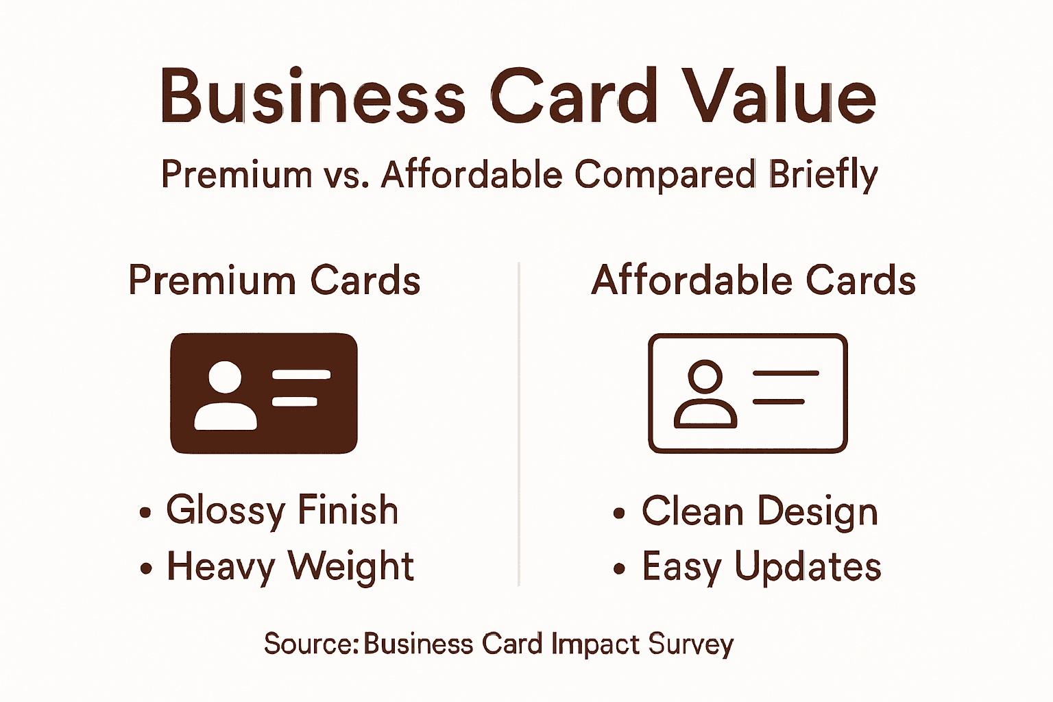
Material choice affects perception directly. The weight of the cardstock, the feel of the finish, and the quality of printing all communicate something about your brand before anyone reads a single word. Thin, flimsy cards suggest budget constraints. Premium weight and refined finishing suggest investment in quality.
A business card is a physical extension of your professional identity—it should look and feel like it belongs to you.
Context matters too. The card you hand out at a trade show faces different demands than one left on a coffee table or passed during a formal introduction. Consider where your card will spend its life and design accordingly.
Pro tip: Test your card in real-world conditions—hand it to someone, watch how they receive it, observe if they read it immediately or pocket it without looking. That moment reveals whether your design actually works.
Common Pitfalls of High-End Business Cards
High price tags don’t guarantee effectiveness. In fact, expensive business cards often fail for the same reasons budget cards do—and sometimes worse, because the cost creates false confidence about their impact.
The first mistake is visual overload disguised as premium design. When visual salience overwhelms decision-making, recipients focus on flashy elements instead of your actual contact information. A card with embossed foil, raised ink, and multiple textures might look striking in your hand—but confuses the person trying to read it or type your email address.
Misalignment between cost and purpose creates another trap. You may invest heavily in premium materials for a card that will be handed out at volume events where people collect dozens. The recipient values clarity and retention, not tactile luxury in that moment.
Common high-end pitfalls include:
- Oversized or oddly shaped cards that don’t fit standard wallets or holders
- Elaborate finishes that obscure text readability
- Excessive design elements competing for attention
- Expensive materials chosen for status, not functionality
- Complex production methods that delay delivery when speed matters
Another pitfall is resource misallocation. Money spent on premium cards often represents resources that could have gone toward relationship-building strategies that actually generate business. High-end cards alone don’t create connections; the conversation does.
Personalization without purpose wastes expense. A card with your photo, company logo, and decorative background might cost more—but adds no functional value if it obscures essential details.
Expensive doesn’t mean effective. A premium card that fails to communicate clearly is simply a costly mistake.
The best high-end cards look expensive because they’re restrained. They use quality materials thoughtfully. They prioritize legibility and usability. The cost becomes invisible because the card simply works.
Pro tip: Before approving an expensive design, imagine handing it to someone in a noisy networking event. Can they read it in five seconds? If the answer is no, the cost doesn’t matter.
How Affordable Cards Outperform Expectation
Affordable cards often outperform expensive ones because they align cost with actual utility. When you remove the premium price tag, you’re forced to focus on what actually matters: clarity, relevance, and consistent use.
The first advantage is frequency and availability. Affordable cards let you distribute freely without hesitation. You hand them out generously at networking events, leave them on desks, include them in packages. This consistent, practical approach to professional presence builds familiarity far more effectively than hoarding a small stack of expensive cards you’re reluctant to give away.
Affordable cards encourage updates. Your title changed. Your contact info shifted. With budget-friendly pricing, you reorder without guilt and stay current. Expensive cards often sit in boxes because you feel obligated to use them until they’re gone—sometimes long after your information becomes outdated.

Another advantage is psychological freedom. You’re not worried about whether each card is “worthy” of being handed out. This removes decision fatigue. You simply give your card to everyone you meet, which is how networking actually works.
Key benefits of affordable cards:
- Frequent distribution without financial friction
- Easy updates when your situation changes
- No anxiety about “wasting” premium materials
- Focus on substance over appearance
- Reduced opportunity cost compared to luxury spending
Research shows that quality interactions matter more than material appearance in building professional networks. A simple, clean card handed out confidently opens doors. An expensive card handed out hesitantly does not.
Affordable cards also reduce decision complexity. You’re less tempted to add unnecessary design elements, excessive embossing, or unusual formats. The constraint forces you toward clarity.
The most effective business card is the one you actually give away. Affordability removes the barrier.
This doesn’t mean cheap looks cheap. Affordable cards can still project professionalism through clean design, readable typography, and quality paper stock. The difference is intention: you’re optimizing for function, not for visible expense.
Pro tip: Order your affordable cards in quantities that you’ll actually use within six months, so you stay motivated to distribute and refresh regularly.
Here’s how premium and affordable business cards differ in practical impact:
| Aspect | Premium Cards | Affordable Cards |
|---|---|---|
| Cost Implications | Higher upfront investment | Lower expense, easy to reprint |
| Willingness to Share | Reluctant due to cost | Freely distributed |
| Update Flexibility | Hesitation to reorder | Update details any time |
| Risk of Overdesign | High (temptation to show off) | Low (focus on essentials) |
Perception, Restraint, and Strategic Value
Perception isn’t built by spending more. It’s built by spending wisely. A business card that signals restraint actually conveys more confidence than one that screams expense.
When you choose a quality paper over embossing, a clean layout over decoration, you’re communicating something powerful: you don’t need to prove yourself through excess. This is the opposite of insecurity disguised as luxury.
Professional perception depends on credibility and competence, not material costliness. A designer who hands you a minimalist card on excellent stock suggests mastery. A designer who hands you a card dripping with special finishes suggests doubt about the work itself.
Restraint builds trust. When your card aligns with your actual brand values and communication style, recipients notice the consistency. If you’re a luxury beauty brand positioned on elegance, a quiet, sophisticated card reinforces that position. An over-designed card undermines it.
Strategic value means alignment:
- Does your card match your brand positioning?
- Does it support your stated values?
- Does it feel authentic to who you are?
- Does it serve your actual business goals?
- Does the cost reflect real value, not just appearance?
Expensive cards often fail because they exist in isolation. You invested in premium cardstock and special finishing but haven’t aligned the card with broader brand strategy. Strategic value emerges when communication tools align with organizational goals and authentic messaging.
Restraint also signals resource intelligence. If you’re a startup founder or luxury brand manager, recipients understand that you prioritize impact over ostentation. This builds respect, not skepticism.
The most valuable business cards are invisible in their excellence. Someone receives your card, reads it effortlessly, pockets it, and later references it without thinking twice about the material. That’s strategic value.
Perception is shaped by fit, not cost. A restrained card that reflects your true identity outperforms an expensive card that doesn’t.
Consider what your card communicates about your decision-making. Does it say “I think clearly” or “I need to impress”? The answer matters more than the price tag.
Pro tip: Before finalizing your design, remove one element. Then remove another. Stop when the card starts to feel sparse—you’ve found your restraint point.
Key elements for strategic business card value at a glance:
| Element | Why It Matters | Ideal Outcome |
|---|---|---|
| Brand Alignment | Matches overall image and message | Consistent presentation |
| Material Choice | Affects touch and perception | Professional and memorable |
| Information Clarity | Ensures critical details stand out | Easy contact and recall |
| Design Restraint | Avoids unnecessary distraction | Focuses attention efficiently |
Discover Business Cards That Balance Cost and Impact
The article highlights how expensive business cards often miss the mark by focusing on flashy design over clear communication and strategic value. If you recognize the pitfalls of overdesign or costly materials that do not serve your actual branding goals then it is time to consider a solution that combines smart restraint with high-quality craftsmanship. Your business card should present your professional identity confidently without overwhelming your recipient or breaking your budget.
At BcardsCreation we specialize in small-batch, fully custom business cards designed to enhance your brand thoughtfully. Whether you prefer subtle tactile effects seen in our Embossed & Debossed Business Cards or the elegant texture options available in our Textured Paper Business Cards collection we help you create cards that strike the perfect balance between sophistication and clarity.

Elevate your professional presence now by choosing a card that works as hard as you do. Explore our full range of options at BcardsCreation Business Cards and experience the power of design-driven clarity. Order your custom cards today and make every connection count.
Frequently Asked Questions
Why can expensive business cards be ineffective?
Expensive business cards can be ineffective due to visual overload, where flashy elements distract from important contact information. Additionally, high costs may lead to misalignment with the card’s purpose, especially in situations where clarity and usability are more important than luxury aesthetics.
What are common pitfalls of high-end business cards?
Common pitfalls include oversized or oddly shaped designs that don’t fit standard wallets, elaborate finishes that hinder readability, and excessive design elements that compete for attention. These issues can detract from the card’s primary function of providing clear and accessible contact information.
How can affordable business cards outperform expensive ones?
Affordable business cards often outperform expensive ones because they encourage frequent distribution and easy updates. This practicality allows for broader networking opportunities without the fear of wasting materials, ultimately making them more effective in real-world scenarios.
What does a business card’s design reveal about professional perception?
A business card’s design can convey professionalism and confidence. A restrained design that prioritizes clarity and easy readability suggests mastery and aligns with brand values, while an overly elaborate card may signal insecurity or an emphasis on appearance over function.


