

What Makes a Card Luxurious: Materials & Design
TL;DR:
- Luxury cards rely on weight, material, and design restraint to signal prestige before reading. They feature deliberate choices like single finishing techniques, restrained color palettes, and limited runs to emphasize exclusivity and brand identity. Overuse of effects or competing design elements diminishes the card’s sophistication and impact.
A luxurious card is defined by its physical weight, material quality, and design restraint working together to signal prestige before a single word is read. Most people assume luxury is about decoration. The reality is the opposite. What makes a card luxurious is the precision of what you leave out, the density of what you hold, and the craftsmanship behind every surface detail. This article breaks down the exact elements of a luxury card, from material thickness and tactile finish to color discipline and exclusivity, so you can make informed choices that align with your brand.
What makes a card luxurious: weight, material, and touch
The first thing a recipient notices about a premium card is its weight. Luxury cards use materials 3–5 times heavier than standard plastic cards, with thickness ranging from 32pt to 48pt compared to the standard 14pt. That physical difference registers instantly and sets the tone for everything that follows.
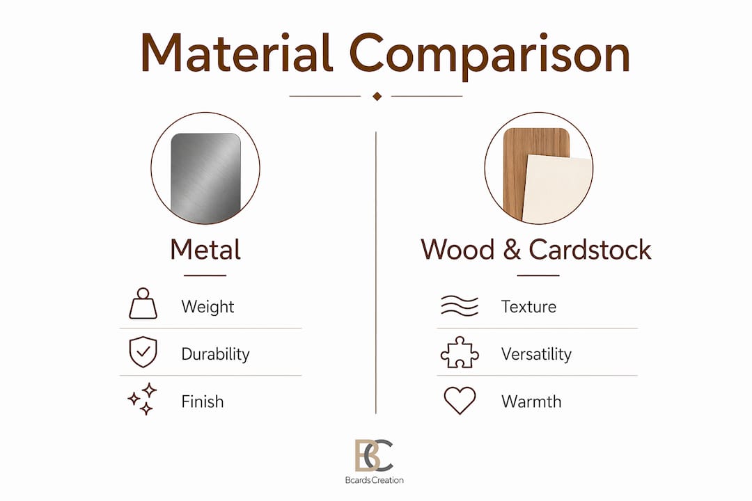
Metal, wood, and anodized aluminum are the materials most associated with premium card production. Metal cards weigh 15–25g versus 3–5g for standard PVC cards. That weight difference is not cosmetic. It communicates permanence, investment, and seriousness in a way that paper cannot replicate.
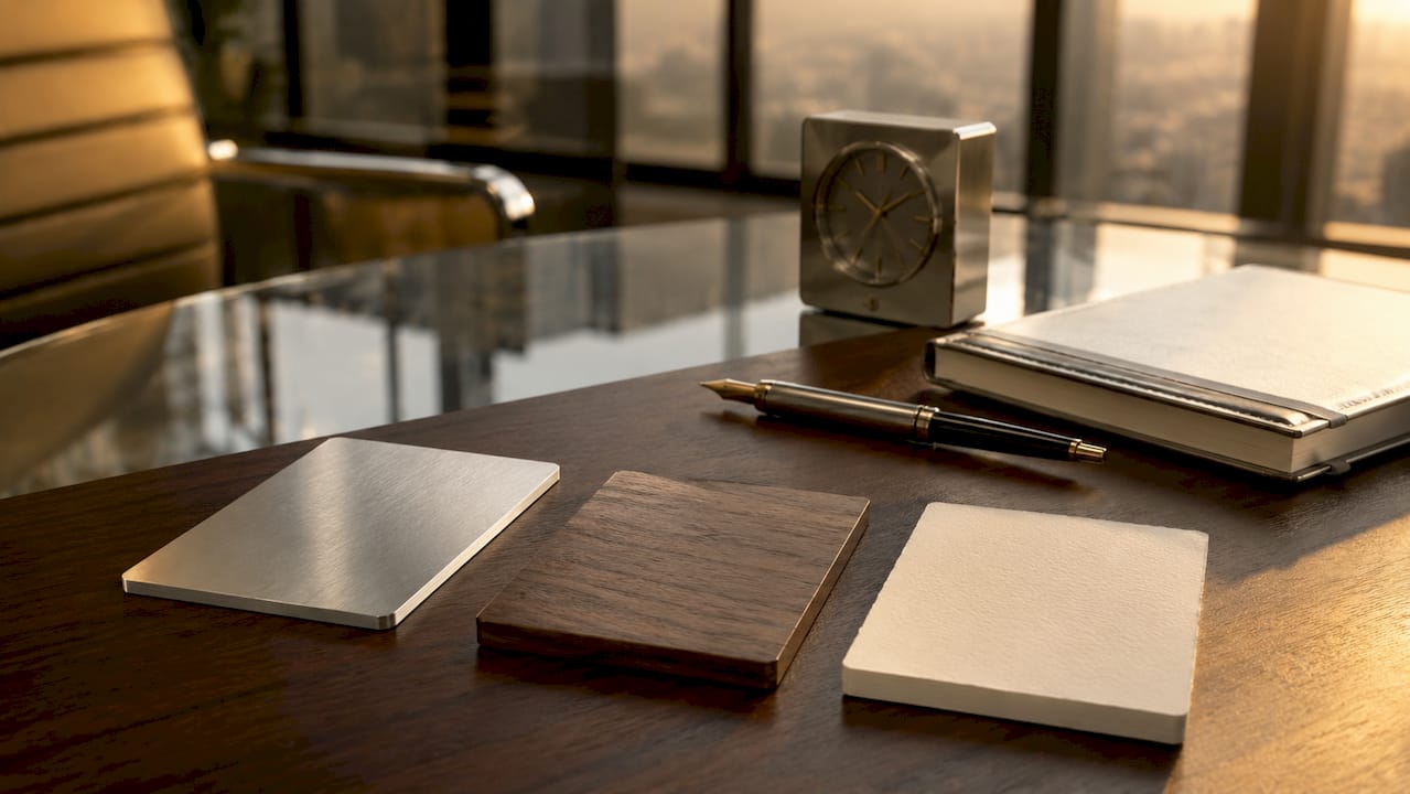
Expert Nar Galvez notes that material choice communicates strategic brand investment and quality beyond mere appearance. A metal card tells the recipient you operate at a level where details matter. A wood card signals craft and authenticity. Each material carries its own message, and choosing the right one requires understanding what your brand actually stands for.
Specialty cardstock in the 32pt–48pt range offers a middle path. It delivers substantial weight and a refined tactile experience without the production complexity of metal or wood. Soft-touch lamination, linen textures, and cotton-fiber papers all add dimension that standard 14pt stock simply cannot achieve.
Pro Tip: Request physical samples before committing to a material. Weight and texture read very differently in person than in product photos, and the tactile experience is what your recipient will remember.
| Material | Typical Weight | Thickness Range | Key Tactile Quality |
|---|---|---|---|
| Standard PVC | 3–5g | 14pt | Lightweight, smooth |
| Specialty Cardstock | 8–12g | 32pt–48pt | Substantial, textured |
| Metal (Stainless Steel) | 15–25g | 24pt–32pt | Heavy, rigid, cold |
| Wood | 10–18g | 28pt–40pt | Warm, grainy, artisanal |
| Anodized Aluminum | 12–20g | 20pt–28pt | Smooth, matte, durable |
Which design features define a luxury card’s appearance?
Luxurious card design is built on restraint, not abundance. The most effective luxury cards use a single dominant visual or tactile feature and let everything else recede. A single high-quality feature like blind embossing or edge painting commands more respect than multiple competing effects. Visual clutter is the fastest way to undermine a premium positioning.
Color is the first signal your card sends. Color drives up to 90% of immediate snap judgments, which means your palette is doing most of the work before anyone reads your name. Luxury cards rely on deep blacks, rose gold, metallic silver, and consistent Pantone palettes to signal exclusivity. These are not arbitrary choices. They are calibrated to trigger specific associations with quality and rarity.
Typography and negative space work the same way. A name set in a well-spaced serif or geometric sans-serif on a card with generous margins reads as confident. A card crowded with logos, taglines, social handles, and QR codes reads as insecure. Luxury design trusts the recipient to want more information.
The finishing techniques that most reliably signal premium quality include:
- Blind embossing: Raises a logo or pattern without ink, creating a tactile impression visible only under light
- Edge painting: Applies color to the card’s side profile, invisible at a glance but striking when held
- Spot UV coating: Applies a high-gloss layer to selected areas, creating contrast against a matte background
- Real foil stamping: Bonds metallic foil to the surface using heat and pressure, producing a reflective finish that cannot be replicated digitally
- Soft-touch lamination: Adds a velvety matte surface that feels deliberate and refined
Pro Tip: Pick one finishing technique and commit to it fully. A card with edge painting, foil, embossing, and spot UV all at once reads as overworked. One technique executed perfectly reads as intentional.
Strategic restraint in design and focusing on one primary feature leads to stronger brand impressions than overuse of specialty finishes. This is the principle that separates cards that feel expensive from cards that merely look busy.
For a deeper look at how typography and color choices translate into brand authority, the luxury business card design guide from Bcardscreation covers the full framework.
How exclusivity and branding define card status
Materials and finishes create the physical experience. Exclusivity creates the psychological one. A card produced in a limited run of 50 carries a different weight than one printed in batches of 10,000, even if the stock and finish are identical. Scarcity signals that the person handing you the card operates in a world where quantity is not the goal.
Here is how brands build exclusivity into their card programs:
- Serialized or limited runs: Numbering cards (e.g., 12 of 50) transforms a business card into a collectible object. This works particularly well for creative professionals and luxury service providers.
- Bespoke packaging: Delivering cards in a custom sleeve, box, or envelope shifts the entire interaction. The unboxing moment becomes part of the brand experience.
- Personalized details: Variable data printing allows each card in a run to carry a unique element, such as a recipient’s name, a custom color, or a distinct design variation.
- Material alignment with brand narrative: A law firm using heavy cotton-fiber stock signals tradition and permanence. A tech founder using matte black metal signals precision and modernity. The material must match the story.
Luxury cards signal status through physical cues like gold plating or carbon coating, and the same logic applies to business cards. The card is not just contact information. It is a physical argument for why someone should take you seriously.
Luxury card design balances practical function with status signaling. A card that looks extraordinary but is impossible to write on, scan, or store fails its basic purpose. The best luxury cards solve both problems at once.
Metal vs. wood vs. specialty cardstock: which is right for you?
Choosing between luxury card materials requires understanding what each one communicates and what it costs in production complexity.
| Feature | Metal | Wood | Specialty Cardstock |
|---|---|---|---|
| Weight | 15–25g | 10–18g | 8–12g |
| Durability | Very high | Moderate | Moderate |
| Tactile Feel | Cold, rigid, heavy | Warm, grainy, natural | Smooth, textured, or velvety |
| Visual Impact | High contrast, reflective | Organic, artisanal | Versatile, finish-dependent |
| Production Complexity | High | High | Moderate |
| Best Brand Fit | Finance, tech, luxury services | Creative, artisan, wellness | Any sector |
| Compatible Finishes | Laser engraving, anodizing | Laser engraving, natural grain | Foil, embossing, UV, edge paint |
Metal cards use stainless steel for heft and titanium for strength-to-weight ratio. Matte anodized surfaces resist fingerprints and scratches better than glossy coatings. That durability matters because a metal card will outlast any paper card by years, which reinforces the permanence message.
Wood cards offer warmth and visible grain that creates a tactile experience that feels artisanal and crafted. No two wood cards are identical because natural grain variation makes each piece unique. That natural variation is a feature, not a flaw. It reinforces the handcrafted narrative. Wood requires specialized cutting techniques to prevent splintering and to highlight the grain, which adds to production time and cost.
Specialty cardstock is the most versatile option. It accepts the widest range of finishing techniques, from real foil stamping to colored edge painting, and it works across virtually every industry and brand personality. For brands that want maximum design flexibility without the weight of metal or the fragility concerns of wood, thick specialty cardstock is often the most practical path to a genuinely premium result.
For a full breakdown of how these materials perform across different brand contexts, the luxury business card materials guide from Bcardscreation covers selection logic in detail.
Key takeaways
A card’s luxury is determined by material weight, design restraint, and the deliberate use of one dominant finishing technique that reinforces brand identity.
| Point | Details |
|---|---|
| Weight signals quality | Luxury cards range from 32pt to 48pt, compared to the standard 14pt stock. |
| One finish, executed well | A single technique like blind embossing or edge painting outperforms multiple competing effects. |
| Color drives first impressions | Deep blacks, metallic tones, and consistent Pantone palettes signal exclusivity before words are read. |
| Material carries a message | Metal signals precision, wood signals craft, and specialty cardstock offers the widest design flexibility. |
| Exclusivity multiplies impact | Limited runs, bespoke packaging, and personalized details transform a card into a status object. |
Why most luxury cards miss the point
I have reviewed hundreds of card projects over the years, and the most common mistake is not choosing the wrong material. It is choosing too many right things at once. A client comes in wanting foil, embossing, edge painting, and a die-cut shape, all on a single card. Each element is defensible on its own. Together, they cancel each other out.
The cards that actually impress people are the ones with a clear point of view. One material chosen deliberately. One finish that earns its place. Typography that does not compete with the texture. The restraint is what makes the card feel considered rather than assembled.
The second mistake I see regularly is treating the card as a design exercise rather than a brand tool. A card that wins a design award but confuses recipients about what you do has failed. The best luxury cards communicate your positioning instantly, before the recipient has read a single word, through weight, color, and surface alone.
My practical advice: identify the one thing you want someone to feel when they hold your card. Permanence. Warmth. Precision. Creativity. Then choose the single material and finish that delivers that feeling most directly. Everything else is noise.
— Kostiantyn
How Bcardscreation builds luxury cards for your brand
Bcardscreation works with founders, executives, and creative professionals who treat their business card as a positioning tool, not a commodity print job.

Every project at Bcardscreation starts with a material and design consultation, not a template. The team works through your brand positioning, your audience, and the physical experience you want to create before a single design decision is made. Production runs are small by design, which means quality control is tight and each card receives the attention a luxury object requires. Whether you are exploring custom business card design with specialty finishes or looking at options like double-layered fine paper with real foils, Bcardscreation builds each project from scratch to match your brand exactly.
FAQ
What thickness defines a luxury business card?
Luxury business cards typically range from 32pt to 48pt in thickness, compared to the standard 14pt. That additional weight creates an immediate tactile signal of quality.
Is metal or cardstock better for a luxury card?
Metal delivers the highest weight and durability, making it ideal for finance and luxury services. Specialty cardstock offers more design flexibility and works across a wider range of industries and finishing techniques.
How many finishing effects should a luxury card use?
One dominant finishing technique, such as blind embossing, real foil, or edge painting, produces a stronger impression than combining multiple effects. Visual restraint is a core element of luxury card design.
What colors signal luxury on a business card?
Deep blacks, metallic silver, rose gold, and consistent Pantone palettes are the most reliable color choices for signaling exclusivity. Color drives up to 90% of immediate snap judgments, making palette selection one of the highest-impact decisions in card design.
Does a limited print run make a card more luxurious?
Yes. Serialized or small-batch production adds exclusivity that materials alone cannot create. A card produced in a run of 50 carries a different perceived value than one printed in the thousands, even when the physical specifications are identical.


