

Master the role of color psychology in business cards
You choose navy blue for your business card because it looks professional, but did you know that specific shade could be signaling cold detachment instead of trustworthy expertise? Most professionals select colors based on personal preference or vague notions of what looks good, missing the strategic opportunity to leverage color psychology impact for measurable brand advantage. Understanding how colors trigger specific emotional responses transforms your business card from a contact detail carrier into a calculated brand positioning tool that influences perception before you even speak.
Table of Contents
- Key takeaways
- How color psychology shapes brand perception through business cards
- A strategic 5-step methodology for selecting business card colors
- Navigating cultural nuances and materials: avoiding pitfalls in international business card color design
- Balancing industry norms with creative color approaches for standout business cards
- Explore custom business card design options with expert color psychology
- Frequently asked questions about color psychology in business cards
Key Takeaways
| Point | Details |
|---|---|
| Color signals brand personality | Color choices shape impressions of professionalism and trust before anyone speaks. |
| Test color contrast | Test contrast and readability across print and digital conditions to ensure legibility in varied lighting. |
| Global color customization | Regional color meanings vary, so local customization strengthens global brand resonance. |
| Align with brand message | Define core attributes and let their signals guide color decisions and audience expectations. |
| Balance norms and creativity | Mix industry conventions with creative variation to boost memorability and differentiation. |
How color psychology shapes brand perception through business cards
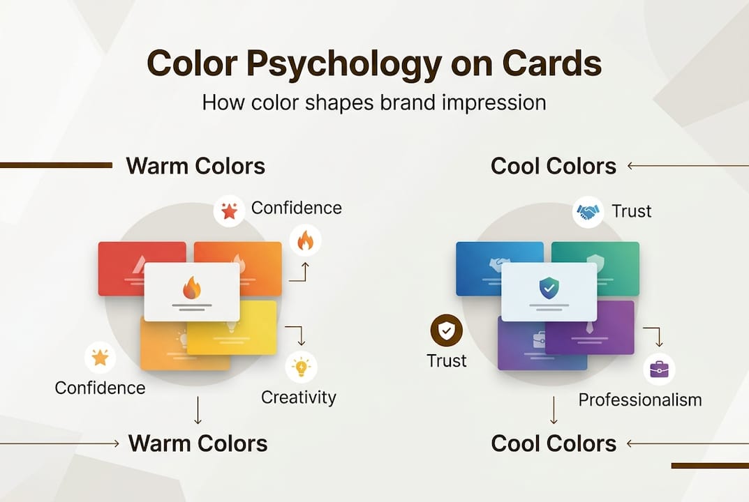
Color psychology in business cards leverages emotional associations to signal brand personality instantly. Blue instills trust, making it dominant in finance and healthcare where credibility matters most. Black paired with gold suggests luxury and exclusivity, explaining why premium brands gravitate toward this combination. Green conveys growth, health, and sustainability, positioning it as the natural choice for wellness and environmental sectors.
Research confirms these associations carry measurable impact. Studies examining low saturation colors demonstrate they boost luxury status perception across seven independent experiments. This explains why high-end brands favor muted tones over vibrant primaries. The saturation level you select communicates as much as the hue itself.
Color choices influence first impressions within milliseconds of visual contact. Your recipient forms judgments about your professionalism, creativity, and reliability before reading a single word on your card. This snap assessment stems from deeply embedded psychological associations that transcend individual preference.
Consider these core color meanings:
- Blue radiates competence and stability, ideal for consultants and financial advisors
- Red energizes and demands attention, perfect for creative agencies and entertainment
- Purple blends creativity with sophistication, serving design studios and luxury services
- Orange projects approachability and enthusiasm, fitting coaching and hospitality brands
- Gray conveys neutrality and professionalism, anchoring corporate and legal identities
Pro Tip: Avoid selecting colors based solely on personal preference. Your target audience’s psychological response matters more than your favorite shade. Test color combinations with actual prospects before committing to print.
Understanding these psychological foundations allows you to align your business card with your desired brand identity strategically. The colors you choose either reinforce or contradict your verbal brand message. When alignment occurs, you amplify brand recognition and memorability. When contradiction happens, you create cognitive dissonance that weakens your positioning.
A strategic 5-step methodology for selecting business card colors
Applying color psychology effectively requires systematic methodology rather than intuitive guesswork. This five-step framework transforms abstract psychological principles into concrete design decisions that enhance card effectiveness.
-
Define your core brand message with precision. Identify the three primary attributes you want prospects to associate with your brand. Are you positioning as innovative and bold, or established and trustworthy? Write down specific adjectives that capture your brand essence. These descriptors become your color selection criteria.
-
Map psychology to industry and audience expectations. Research color conventions in your sector while noting successful deviations. Finance professionals typically use blue and gray, but a wealth manager targeting creative entrepreneurs might strategically incorporate purple to signal understanding of artistic clients. Your audience’s expectations matter as much as industry norms.
-
Test contrast and readability across conditions. Print test samples and evaluate them under office fluorescent lighting, natural daylight, and dim restaurant conditions where networking happens. Check legibility at arm’s length, the typical distance for card exchange. Poor contrast sabotages even perfect color psychology.
-
Evaluate how materials alter color perception. The same Pantone color appears dramatically different on matte versus glossy stock. Foil stamping intensifies colors while adding metallic shimmer. Transparent or translucent materials shift hues entirely based on what sits behind them. Request physical samples before approving final designs.
-
Validate with real-world testing and feedback. Distribute prototype cards to trusted colleagues and ideal client representatives. Ask specific questions about the emotions and brand attributes the colors evoke. Adjust based on consistent patterns in responses, not isolated opinions.
Pro Tip: Create a simple decision matrix listing your brand attributes in one column and potential color combinations in others. Rate each combination’s alignment with each attribute on a 1-5 scale. This quantifies subjective decisions and reveals the strongest strategic match.
| Color Combination | Trust Score | Creativity Score | Luxury Score | Best Application |
|---|---|---|---|---|
| Navy + White | 5 | 2 | 3 | Financial services, consulting |
| Black + Gold | 3 | 3 | 5 | Luxury goods, premium services |
| Teal + Coral | 3 | 5 | 2 | Creative agencies, design studios |
| Charcoal + Silver | 4 | 3 | 4 | Technology, corporate services |
| Forest Green + Cream | 4 | 3 | 3 | Wellness, sustainability sectors |
This methodology prevents costly mistakes that require reprinting entire batches. Testing investments pay for themselves by ensuring your cards deliver the psychological impact you intend. Strategic color selection becomes repeatable and defensible rather than arbitrary.

Navigating cultural nuances and materials: avoiding pitfalls in international business card color design
Color meanings shift dramatically across cultural contexts, creating risks for professionals operating internationally. Red means luck and prosperity in China, making it popular for business cards targeting Chinese markets. That same red signals mourning and death in South Africa, creating inappropriate associations. White represents purity and weddings in Western cultures but symbolizes death and funerals throughout much of Asia.
Global branding requires adapting palettes culturally while maintaining brand consistency. Advanced approaches use emotion prediction models trained on regional data to forecast how specific color combinations will resonate across different markets. This precision prevents embarrassing cultural missteps that damage credibility.
Beyond cultural considerations, material and lighting effects alter color perception substantially:
- Matte finishes absorb light, softening colors and creating sophisticated, understated impressions
- Glossy coatings reflect light, intensifying colors and adding vibrancy that attracts attention
- Foil stamping creates metallic shimmer that elevates perceived luxury and craftsmanship
- Transparent stocks allow background colors to show through, shifting hues based on context
- Textured papers create shadows that deepen colors in recessed areas
Lighting conditions matter equally. Fluorescent office lighting skews cool, making warm colors appear duller. Natural daylight provides the most accurate color rendering. Incandescent bulbs add warmth, intensifying reds and oranges while muting blues. Your card will be viewed under all these conditions, requiring contrast levels that maintain legibility across environments.
Poor contrast creates more than aesthetic problems. It reduces readability, forcing recipients to squint or strain to extract contact information. This friction weakens your professional impression and decreases the likelihood they’ll retain your card. Understanding color psychology basics includes recognizing that legibility always trumps artistic expression.
| Region | Red Meaning | White Meaning | Yellow Meaning | Blue Meaning |
|---|---|---|---|---|
| Western | Passion, urgency | Purity, cleanliness | Optimism, caution | Trust, stability |
| China | Luck, prosperity | Death, mourning | Royalty, power | Immortality, healing |
| Middle East | Danger, caution | Purity, mourning | Prosperity, happiness | Protection, spirituality |
| India | Purity, fertility | Peace, mourning | Learning, knowledge | Courage, masculinity |
| South Africa | Mourning, death | Purity, peace | Wealth, fertility | Authority, stability |
This cultural complexity explains why international brands often default to neutral palettes like black, white, and gray. These colors carry fewer culturally specific meanings, reducing misinterpretation risk. However, this safety comes at the cost of emotional impact and memorability.
Balancing industry norms with creative color approaches for standout business cards
Industry color conventions exist because they communicate expected brand signals efficiently. Finance professionals use blue because it instantly conveys the trust and stability clients seek. Healthcare providers favor green and blue because these colors signal healing and calm. Legal professionals gravitate toward black, navy, and burgundy to project authority and tradition.
Following these norms provides immediate credibility. Recipients subconsciously recognize your card as belonging to your industry category, reducing cognitive friction. This familiarity builds trust faster than unconventional choices that require mental processing.
Yet strategic deviation differentiates when executed thoughtfully. A tax accountant using unexpected coral and navy stands out in a sea of conservative blue cards while maintaining professionalism through the navy anchor. A personal injury attorney incorporating warm orange alongside traditional burgundy signals approachability that contradicts the intimidating lawyer stereotype.
Testing colors on physical materials prevents screen-based design errors. Digital displays emit light while printed cards reflect it, creating significant appearance differences. That vibrant teal glowing on your monitor may print as muddy blue-green on uncoated stock. Request printed proofs on your actual chosen material before approving production.
Harmonious color combinations enhance visual appeal while maintaining psychological impact:
- Analogous schemes use adjacent colors on the color wheel, creating cohesive, harmonious impressions perfect for wellness and creative brands
- Complementary pairings place opposite colors together, generating dynamic contrast ideal for energetic, bold positioning
- Triadic combinations space three colors evenly around the wheel, offering vibrant diversity suited to innovative, multifaceted brands
- Monochromatic palettes vary saturation and brightness of a single hue, achieving sophisticated cohesion for luxury and minimalist identities
“Color psychology provides valuable guidelines, but personal preference and strategic positioning sometimes outweigh rigid rules. The most memorable cards balance industry expectations with distinctive creative choices that reflect authentic brand personality. Test boldly, but validate thoroughly before committing to production.”
Pro Tip: Create two card versions, one following industry norms and one incorporating creative deviation. Distribute equal quantities and track which version generates more follow-up conversations. Let real-world results guide your final decision rather than design theory alone.
Monochromatic schemes deserve special attention for their versatility. Using varying shades of a single color creates visual interest without the complexity of multi-color coordination. This approach works exceptionally well for minimalist brands and luxury positioning where restraint signals confidence. A charcoal-to-silver gradient conveys sophistication while maintaining perfect harmony.
The balance between convention and creativity ultimately depends on your competitive positioning. If you compete on trust and stability, lean toward industry norms with subtle distinctive touches. If differentiation drives your value proposition, embrace bolder color choices while maintaining professional polish through material quality and design execution.
Explore custom business card design options with expert color psychology
Applying these color psychology principles requires both strategic thinking and technical execution expertise. Custom business card design services integrate psychological insights with material knowledge to create cards that deliver measurable brand impact. Rather than selecting from templates, you develop individualized solutions that align color choices with your specific positioning goals and target audience psychology.

Creative luxury business cards combine advanced color techniques with specialty finishes like foil stamping, spot UV, and edge painting. These material choices amplify color psychology by adding tactile and visual dimensions that reinforce your brand message. Fine paper business cards offer substrate variety that dramatically alters color perception, from soft cotton stocks that create warmth to crisp premium papers that project precision. Expert consultation ensures your color selections work harmoniously with material properties rather than fighting against them.
Frequently asked questions about color psychology in business cards
What colors best convey trustworthiness in finance cards?
Navy blue and darker blue shades consistently rank highest for conveying trust and financial stability. Pairing blue with white or light gray creates professional contrast while reinforcing credibility. Avoid bright or neon variations that undermine serious positioning.
How can I test color contrast effectively before printing?
Print test samples on your actual chosen stock and view them under multiple lighting conditions including office fluorescent, natural daylight, and dim ambient light. Check readability at arm’s length and photograph them to see how they appear in digital contexts. Request physical proofs from your printer rather than relying on screen previews.
Are there colors I should avoid for international business cards?
Red and white carry dramatically different meanings across cultures, requiring careful consideration for global use. Research specific color symbolism for your target markets or default to neutral palettes like black, gray, and navy that translate more consistently. Color selection guidance helps navigate cultural nuances.
Can I break industry color norms successfully?
Yes, but strategic deviation requires purpose and testing. Ensure your creative choice still communicates appropriate professionalism for your sector. Use one unexpected color paired with traditional anchors rather than abandoning conventions entirely. Validate with target audience feedback before full production.
What role do card materials play in color perception?
Materials dramatically alter how colors appear and feel. Matte stocks soften colors and create sophisticated impressions while glossy finishes intensify vibrancy. Textured papers add depth through shadows, and transparent materials shift hues based on background. Always test colors on your actual chosen material before approving designs.
How many colors should I use on my business card?
Two to three colors typically provide optimal impact without visual chaos. One dominant color establishes your primary brand association, a secondary color creates contrast and hierarchy, and an optional accent color adds distinctive personality. More colors risk diluting your psychological message and complicating production.
Recommended
- Choosing Colors for Business Cards: Psychology, Contrast, and Material – BcardsCreation
- Color Psychology in Business Cards: Industry Impact – BcardsCreation
- Business card color guide for luxury brands 2026 – BcardsCreation
- Master the creative business card design process in 2026 – BcardsCreation
- Colour Psychology and The Use of Colour – OnlyRoses - UK


