

Master the creative business card design process in 2026
Your business card is often the first tangible impression you make, yet many professionals struggle to create designs that truly reflect their brand’s personality. A poorly executed card can undermine your credibility, while a thoughtfully designed one opens doors and builds lasting connections. This guide walks you through a proven creative business card design process tailored for beauty, fashion, and lifestyle professionals who want cards that command attention and respect.
Table of Contents
- Understanding The Importance Of Business Card Design In Modern Branding
- Preparing For The Creative Business Card Design Process
- Executing Your Creative Business Card Design: Step-By-Step Guide
- Edge Cases And Advanced Tips: Materials, Readability, And Brand Consistency
- Explore Custom Business Card Design Options At Bcardscreation
- FAQ
Key takeaways
| Point | Details |
|---|---|
| Information hierarchy | Prioritize name, role, and contact details within safe print margins for instant recognition. |
| Print readiness | Use CMYK color mode, 300 DPI resolution, and vector graphics to ensure sharp, accurate printing. |
| Material alignment | Select cardstock weight and finishes that reinforce your brand values and industry positioning. |
| Brand consistency | Maintain cohesive typography, colors, and logo treatment across all brand touchpoints. |
| Readability balance | Avoid overcomplicating designs that sacrifice legibility for visual flair. |
Understanding the importance of business card design in modern branding
In an era dominated by digital exchanges, you might question whether physical business cards still matter. The answer is a resounding yes. The digitization of business has made the physical business card more valuable, not less, precisely because tangible interactions stand out in a sea of forgettable LinkedIn requests and email signatures.
Business cards function as a strategic subset of your brand identity. They combine visual design with essential contact information to create a compact representation of who you are and what you offer. For professionals in beauty, fashion, and lifestyle industries, cards do more than share phone numbers. They communicate taste, attention to detail, and brand personality in a single glance.
The physical quality of your card directly influences how others perceive your brand’s value. A flimsy, generic card suggests commodity thinking, while a carefully crafted piece using premium materials signals that you treat your brand as seriously as you treat your clients. This perception gap matters enormously when competing for attention in crowded creative markets.
Pro Tip: Think of your business card as a miniature brand experience. Every choice, from paper weight to color saturation, should reinforce the same brand story you tell through your website, social media, and client interactions.
When you design business cards that align with your brand identity, you create a physical artifact that recipients keep, reference, and remember. Unlike digital contacts that disappear into databases, a well-designed card sits on desks, gets pinned to mood boards, and sparks conversations weeks or months after your initial meeting.
Preparing for the creative business card design process
Before opening design software, you need solid preparation. Start by clarifying your brand personality and target audience. Are you positioning as edgy and experimental, or refined and understated? Your answer guides every subsequent design decision, from color palettes to material choices.
Next, plan your information hierarchy. Prioritize name, role, and direct contact within safe margins for instant recognition and readability. Business cards fail when recipients can’t immediately identify who you are or how to reach you. Every element competes for limited space, so ruthless prioritization separates effective cards from cluttered disasters.
Technical specifications matter more than many designers realize. Use CMYK color mode instead of RGB to match how commercial printers reproduce colors. Set your resolution to 300 DPI minimum to ensure crisp text and graphics. Convert logos and icons to vector format so they scale without pixelation. These technical foundations prevent disappointing surprises when your beautifully designed screen mockup arrives from the printer looking muddy or misaligned.
Safe margins and bleed areas protect your content from being cut off during the trimming process. Standard safe zones sit at least 3mm from all edges, while bleed extends 3mm beyond the final trim size. Ignoring these specifications results in awkwardly cropped text or unintended white borders that cheapen your card’s appearance.
Font size selection directly impacts readability. Minimum 6 to 7 point fonts work for essential details, but larger sizes improve legibility for contact information, especially for older recipients. Tiny type might look sleek on screen but becomes illegible in real-world lighting conditions.
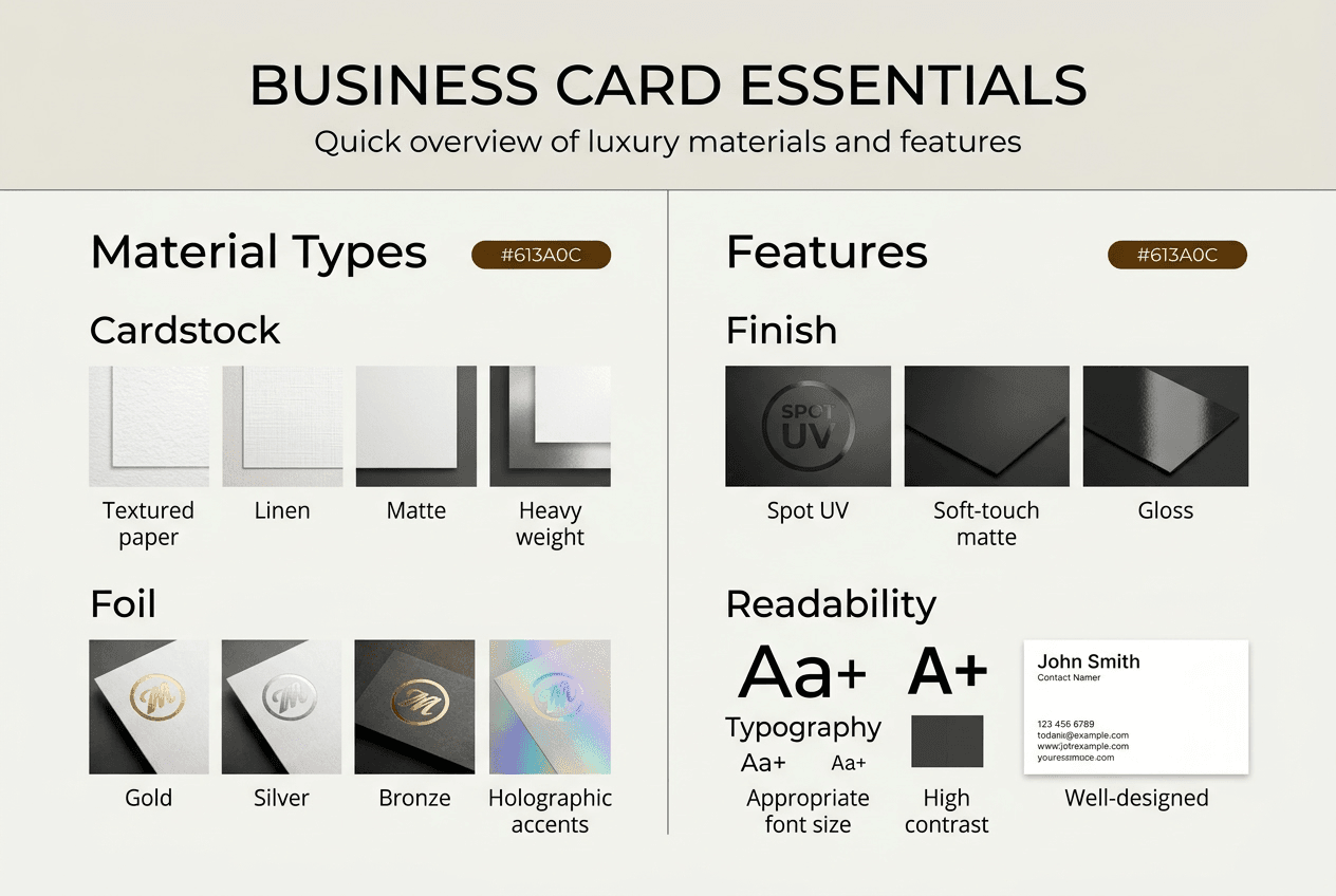
Material options comparison:
| Material Type | Weight Range | Best For | Considerations |
|---|---|---|---|
| Standard cardstock | 14-16pt | Budget-conscious projects | Familiar feel, limited premium perception |
| Heavyweight uncoated | 18-24pt | Natural, artisanal brands | Excellent for letterpress, absorbs ink |
| Coated cardstock | 16-18pt | Vibrant color reproduction | Smooth finish enhances photo quality |
| Eco-friendly paper | 14-18pt | Sustainability-focused brands | Appeals to environmentally conscious clients |
| Plastic cards | 20-30mil | Durability and luxury | Waterproof, premium feel, higher cost |
Pro Tip: Order small test batches of different materials before committing to large runs. What looks perfect on screen often feels completely different in hand, and tactile quality drives much of the luxury perception you’re aiming for.
Explore business card design tips for creatives and learn how to brief a designer for business cards to ensure your preparation translates into actionable design direction.
Executing your creative business card design: step-by-step guide
With preparation complete, you’re ready for the creative execution phase. Follow these steps to transform planning into print-ready files:
-
Select your design concept. Choose a visual direction that authentically reflects your brand personality. Sophisticated professionals might opt for minimalist layouts with generous white space, while expressive creatives can embrace bold typography and unexpected color combinations.
-
Balance creativity with readability. Intricate design elements add visual interest but can reduce clarity. Test your design by viewing it at actual size on screen, then step back three feet. If you can’t immediately read the name and contact details, simplify.
-
Choose appropriate design software. Use tools that support vector graphics and CMYK color profiles. Adobe Illustrator and InDesign remain industry standards, while Affinity Designer offers a capable alternative at lower cost.
-
Incorporate brand elements consistently. Apply your brand’s colors, typography, and logo exactly as they appear across other materials. Inconsistent treatment confuses recipients and weakens brand recognition.
-
Design for print specifications by using CMYK, 300 DPI, correct bleed and trim marks, and vector logos to avoid color shifts and pixelation. Set up your document with proper dimensions including bleed from the start.
-
Export final files correctly. Save as high-resolution PDFs with fonts embedded or outlined. Include crop marks and bleed in your export settings. Confirm color mode remains CMYK throughout.
The ELUXX brand identity was designed to be flexible and extend across various platforms, including beauty and skincare lines, digital products, and retail. This approach demonstrates how thoughtful brand systems maintain coherence while adapting to different contexts, a principle equally valuable for business card design.

Finish effects comparison:
| Finish Type | Visual Impact | Tactile Quality | Cost Factor | Best Applications |
|---|---|---|---|---|
| Matte lamination | Subtle, sophisticated | Smooth, non-reflective | Moderate | Professional services, minimalist brands |
| Spot UV | High contrast, dramatic | Glossy accents on matte base | Higher | Highlighting logos, creating texture contrast |
| Foil stamping | Luxurious, eye-catching | Metallic, slightly raised | Premium | Luxury brands, special occasions |
| Embossing | Elegant, tactile | Dimensional, textured | Premium | Traditional luxury, formal branding |
| Soft touch | Modern, premium | Velvety, warm | Moderate-high | Contemporary luxury, fashion brands |
Pro Tip: Common pitfalls include forgetting to convert text to outlines (causing font substitution errors) and using RGB images that shift dramatically when converted to CMYK. Always request a physical proof before approving large print runs.
Review the professional business card design framework and explore impactful business card features for additional execution insights. Study the ELUXX brand identity case study to see how premium brands balance flexibility with consistent identity.
Edge cases and advanced tips: materials, readability, and brand consistency
Even experienced designers encounter challenges that require nuanced solutions. Avoiding overcomplicating designs that reduce readability becomes critical when working with intricate patterns or bold color schemes. Research suggests complex designs can reduce readability by up to 40%, forcing recipients to work harder to extract basic information.
Material selection carries strategic implications beyond aesthetics. Choose materials aligned with brand values, such as eco-friendly paper for sustainable brands. This alignment reinforces authenticity and appeals to clients who share those values. Conversely, material mismatches create cognitive dissonance that undermines your positioning.
Consider how your business card integrates with digital and physical brand touchpoints. Color reproduction varies between screens and print, so test physical samples against your website and marketing materials. Typography should remain consistent in style and hierarchy across all platforms.
Practical tips for maintaining readability and material selection:
- Test designs with actual target audience members, not just design peers who may prioritize aesthetics over function
- Avoid reversed type (light text on dark backgrounds) smaller than 8 points, which becomes illegible in poor lighting
- Select paper finishes that complement your industry: matte for understated elegance, gloss for vibrant energy
- Consider special accommodations like larger type or high-contrast colors for accessibility
- Request printed proofs on actual production materials before approving full runs
The ELUXX brand emphasizes smooth interactions, intentional motion, and a sense of restraint to reinforce its luxury positioning in digital products. This philosophy of purposeful minimalism translates beautifully to business card design, where every element must justify its presence through functional or strategic value.
Explore luxury business card materials for premium options, review choosing colors for business cards for color psychology insights, and check luxury business cards 2026 essentials for current trends in high-end card design.
Explore custom business card design options at BcardsCreation
Transforming your creative vision into premium printed reality requires expertise, specialized materials, and attention to detail that goes beyond standard print shops. BcardsCreation offers custom business card design services specifically tailored for beauty, fashion, and lifestyle professionals who demand cards that match their brand’s sophistication.

Every project receives individual attention without templates or automated tools. You’ll work directly with design experts who understand material properties, finishing techniques, and how to balance creative ambition with print realities. Options include creative business cards with printing and foiling that incorporate luxury finishes like real foils, specialty papers, and advanced treatments unavailable through commodity printers.
Browse the complete business cards collection to see examples of what’s possible when you prioritize quality and customization. Whether you need minimalist elegance or bold creative statements, BcardsCreation delivers cards that position you as the premium choice in your market.
FAQ
What is the ideal font size for essential information on a business card?
Essentials like your name and contact information should use minimum 6 to 7 point fonts for instant recognition and readability. Larger fonts work better for contact details to accommodate older readers or low-light viewing conditions. Test physical samples at actual size rather than relying on screen previews.
How can I ensure my business card design aligns with my brand identity?
Use your brand’s colors, typography, and logo consistently on the card exactly as they appear in other materials. Reflect brand personality traits like sophistication or minimalism through design choices including layout, spacing, and material selection. Consult your brand identity guidelines and consider professional design services for complex branding challenges.
What materials are best for luxury business cards in the beauty and fashion industry?
Heavyweight cardstock with finishes like foil stamping or soft touch lamination creates an immediately premium feel that matches beauty and fashion industry expectations. Eco-friendly papers suit sustainable brand values increasingly favored in these sectors. Material choice directly impacts perceived brand value, so select options that reinforce your positioning. Explore luxury business card materials for detailed comparisons.
How do I prepare design files for professional printing?
Set up documents in CMYK color mode at 300 DPI resolution with proper bleed and trim marks from the start. Convert all text to outlines and use vector graphics for logos to prevent font substitution or pixelation. Export as high-resolution PDFs with embedded fonts and confirm your printer’s specific file requirements before submitting.
Can intricate designs work on business cards without sacrificing readability?
Intricate designs can work when you maintain clear information hierarchy and sufficient contrast between text and backgrounds. Test designs by viewing at actual size from normal reading distance. If name and contact details aren’t immediately legible, simplify decorative elements or increase type size. Balance creativity with the card’s primary function of sharing information quickly and clearly.
Recommended
- How We Turn an Idea Into a Finished Business Card: Inside Our Process – BcardsCreation
- 7 Essentials for Luxury Business Cards in 2025: Materials, Finishes, a – BcardsCreation
- 7 Essential Business Card Design Tips for Creatives – BcardsCreation
- Professional Business Card Design: A Step-by-Step Framework – BcardsCreation
- Robert Rupp | Fractional CMO & Marketing Consultant


