

Industry Terminology for Business Cards: A Pro's Guide
TL;DR:
- The terminology used in business card printing is essential for making informed decisions and ensuring high-quality results. Understanding codes like 4/4, bleed, safe zones, and paper choices enables professionals to communicate effectively with printers and designers. Proper application of this vocabulary leads to better-designed cards that reflect brand professionalism and cultural sensitivities, especially in international contexts.
You hand someone your card, and what they see in the next three seconds shapes their first impression of your brand. But ordering or designing that card often means wading through a wall of unexplained industry terminology for business cards. What does 4/4 mean? What is a bleed? Why does your printer keep asking about safe zones? Most professionals guess their way through these terms, and the results show up as off-center logos, color mismatches, and cards that feel wrong in the hand. This guide gives you the vocabulary to make better decisions and communicate with printers and designers like someone who knows what they want.
Table of Contents
- Key Takeaways
- Industry terminology for business cards: printing and production
- Layout and design terminology
- Cultural and executive title terminology
- Applying terminology to real print decisions
- My perspective on what professionals get wrong
- Custom cards that speak your brand’s language
- FAQ
Key Takeaways
| Point | Details |
|---|---|
| Printing codes define color setup | Shorthand like 4/4 or 4/0 tells your printer how many colors go on each side, directly affecting cost and output. |
| Bleed and safe zone prevent cut errors | Adding 3mm bleed and keeping content inside safe margins stops text and logos from being trimmed off accidentally. |
| Card size varies by region and context | US standard is 3.5x2 inches; Japanese meishi follow different dimensions and require bilingual text for proper professional use. |
| Titles are a branding decision | Your job title on a business card signals authority and shapes perception, not just identity, especially at the executive level. |
| Terminology knowledge improves supplier communication | Knowing the right vocabulary helps you order confidently, avoid reprints, and get exactly what you expect from production. |
Industry terminology for business cards: printing and production
If you have ever received a quote from a printer and felt lost reading the specs, you are not alone. This area of business card jargon is dense, but the logic behind it is straightforward.
Color codes: 4/4, 4/1, 4/0, 1/1, and 1/0
These shorthand codes tell the printer how many ink colors to use on each side of the card. As a guide to printing shorthand explains, the number before the slash refers to the front, and the number after refers to the back:
- 4/4: Full color (CMYK) on both sides. Most common for branded cards with images or rich color.
- 4/0: Full color front, blank back. Good when you want the back left clean or printed separately.
- 4/1: Full color front, single color back. Useful for adding a logo or URL on the back without full print cost.
- 1/1: One color on both sides. Professional for minimalist or typographic designs.
- 1/0: One color front, blank back. Budget-conscious and clean.
Understanding these codes means you can align print expectations before you order, rather than after you receive 500 cards that look nothing like what you imagined.
CMYK stands for Cyan, Magenta, Yellow, and Key (Black). It is the standard four-color process used in commercial printing. Spot colors, by contrast, are premixed inks matched to specific Pantone references. If your brand has an exact color that must remain consistent across all materials, spot color is worth the added cost.
Paper stock, weight, and coating
Paper stock weight has a direct impact on how a card feels. Typical professional cards use 14pt stock, roughly 350 gsm. Lighter stock feels flimsy. Heavier stock communicates quality and durability before a word is read.
Coating refers to the surface finish applied after printing:
- Gloss: Shiny and vibrant. Good for photo-heavy or color-saturated designs.
- Matte: Flat, refined, and easy to write on. Preferred for premium and minimalist brands.
- Soft-touch lamination: A matte coating with a velvety texture. Memorable and tactile.
- UV coating: A high-gloss protective layer, often applied as spot UV to highlight specific areas like a logo.
Coated stock affects how ink bonds to the surface. Uncoated paper absorbs ink more, which can cause color to look slightly duller but often feels more organic.
Bleed, trim, and safe area
Bleed and safe zone terminology exists to prevent predictable production errors. Bleed is the extra artwork that extends beyond the trim line. The standard bleed allowance is 3mm on each side. When the card is cut, minor shifts in the blade mean that without bleed, you risk a thin white border on one edge.
The trim line is where the final cut happens. The safe area (also called the safe zone or live area) is the inner boundary where all critical content should live. Maintain 3 to 5mm margins inside the trim line to keep text and logos from being cut off.
Imposition and gang run printing
Imposition is the process of arranging multiple cards on a single larger sheet for efficient printing and cutting. A common layout for standard US cards is a 4x2 grid of 8 cards per sheet. This affects paper usage, cutting accuracy, and ultimately cost.
Gang run printing groups multiple clients’ jobs onto one sheet to reduce setup costs. It keeps unit prices low but limits your control over exact color calibration. If your brand has precise color requirements, a dedicated press run is the better choice.
Pro Tip: Ask your printer whether your job is going on a gang run or a dedicated run before you commit. The difference affects color consistency more than any other single factor.
| Term | What it means | Why it matters |
|---|---|---|
| 4/4 printing | Full CMYK color on both sides | Sets full color expectations and price |
| Bleed | Artwork extending 3mm past trim | Prevents white edges after cutting |
| Safe zone | Inner margin 3-5mm from trim | Protects text and logos from being cut |
| Imposition | Multiple cards arranged on one sheet | Affects accuracy and production efficiency |
| Gang run | Shared press run with other print jobs | Lower cost, less color control |
Layout and design terminology
The vocabulary for business cards shifts when you move from production to design. These terms help you communicate clearly with a designer and evaluate whether a layout actually serves your brand.
Standard card sizes and regional differences
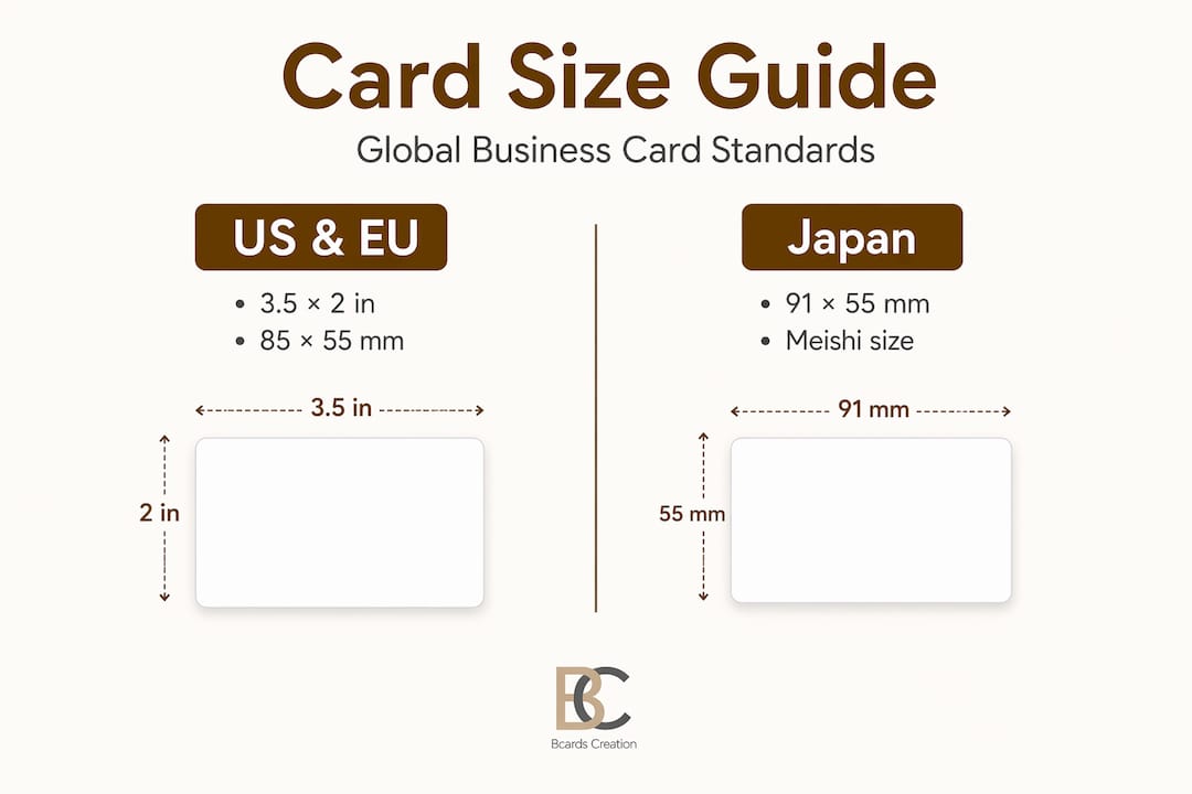
The US standard size is 3.5 by 2 inches (88.9mm x 50.8mm). Japanese meishi use 91mm x 55mm, which is slightly larger. European cards typically follow 85mm x 55mm, closer to a credit card format. If you work internationally, size matters. A card designed to US specs may look mismatched in a Japanese context where the slightly larger format is the norm.
Layout elements and their placement
Good layout is not just about aesthetics. Each element has a function:
- Logo: Usually positioned top-left or centered. Anchors brand identity immediately.
- Job title: Placed directly below or beside your name. Not just a label. See the titles section below for more on why this matters.
- Contact information: Typically grouped together. Email, phone, and website should be readable at a glance, not scattered.
- Tagline: Optional but powerful. If it fits in one short line and adds real meaning, include it. If it needs explaining, leave it off.
- QR code: Increasingly standard on back-of-card layouts. Links to a portfolio, LinkedIn profile, or booking page.
Pro Tip: Vector files (.ai or .eps) are required for sharp logo reproduction at any size. Never submit a logo as a JPEG or PNG if you want clean edges, especially on small card formats.
Resolution is measured in dots per inch (DPI). Print requires 300 DPI minimum. Anything lower results in blurry text or soft edges, which signals amateur production regardless of how good the paper feels.
Front vs. back design and double-sided printing
Double-sided printing, also described as a business card branding process, gives you a second surface to use deliberately. The front typically carries identity. The back can carry a tagline, a map, a QR code, or remain clean as a writing surface. Each choice communicates something about how you view your brand.
Cultural and executive title terminology
Japanese meishi and meishi koukan
In Japan, the business card is not just contact information. It is an extension of your professional identity and your company’s standing. Meishi koukan, the formal exchange ritual, involves presenting the card with both hands, bowing, and displaying received cards on the table during the meeting to show respect. Pocketing a card too quickly or writing on it are considered serious breaches of etiquette.
For professionals working with Japanese clients or partners, this cultural context changes how you approach your card entirely. The vocabulary around meishi extends to how the card is designed. Bilingual text, with Japanese on one side and English on the other, is standard practice. Getting the dimensions right matters too, since 91mm x 55mm is the accepted format, and presenting an oddly sized card in that context reads as unprepared.
Executive titles as branding tools
The title you place on a card is both an HR classification and a positioning statement. Executive titles like CEO, CFO, COO, and CMO define both function and organizational stature. At mid-level tiers, Vice President and Director carry different weight depending on industry and company size. A VP title at a 10-person startup reads very differently than the same title at a Fortune 500 company.
Title selection on business cards is a branding decision, not just a label. Founders often face a specific choice: do you go with “Founder,” “CEO,” or “Principal”? Each sends a different signal. “Founder” positions you as a builder. “CEO” signals scale and hierarchy. “Principal” reads as specialized and service-oriented, common in consulting, law, and architecture. The right choice depends on who is receiving your card and what impression you want to leave.
For more context on what to avoid, the guide on what not to put on a business card covers title choices that undermine credibility.
Applying terminology to real print decisions
Understanding the vocabulary is one thing. Using it to make better choices is the point. Here is how to apply it when you are actually ordering cards.
- Define your print spec using codes. Decide whether you need 4/4, 4/1, or 4/0 before you contact a printer. This tells them your color intent and lets them quote accurately. Showing up to a conversation without this ready adds rounds of back-and-forth.
- Set up your file with correct bleed and safe zone. Add 3mm bleed beyond your trim line on all four sides. Keep all text and logos at least 3mm inside the trim. This is non-negotiable if you want clean results.
- Choose stock weight for the experience you want to create. A 16pt or 18pt card signals quality before it is read. Pair it with a soft-touch lamination for a memorable tactile effect. Match the finish to your brand tone, not just your budget.
- Run a preflight check before sending files. A preflight checklist should confirm: trim edge placement, bleed presence, safe zone margins, image resolution at 300 DPI, and color mode set to CMYK. Missing any of these causes production errors that no one catches until the cards are in your hands.
- Communicate clearly with your designer or printer. Using correct vocabulary shortens the feedback loop significantly. Saying “I need a 4/4 card at 14pt with soft-touch lamination and spot UV on the logo” tells a professional everything they need to start. Saying “I want it to look nice and feel premium” tells them almost nothing.
Pro Tip: If you are ordering for the first time from a new printer, request a hard copy proof before approving the full run. A digital proof cannot show you how the finish feels or how a color reads under different lighting.
My perspective on what professionals get wrong
I have worked with hundreds of clients who came in after a bad print experience somewhere else. The pattern is almost always the same. They did not know enough vocabulary to catch problems early, so they approved files or specs that were wrong, and they only found out when the cards arrived.
The term I see cause the most damage is “safe zone.” Designers who are not print-experienced often treat the trim line as the boundary for content. It is not. The trim line is where the blade cuts. The safe zone is where your content should live. That gap is small, roughly 3mm, but it is the difference between a card that looks sharp and one where your phone number or logo edge gets clipped.
The second issue is color mode. Clients design in RGB because their screens display in RGB. Files sent to a printer in RGB mode get converted automatically, and the conversion is rarely accurate. Blues shift. Blacks flatten. The card looks nothing like the screen preview. Setting up in CMYK from the start is the single easiest fix, and it is also one of the most overlooked steps.
What I find genuinely underestimated is how much the title line affects perception. I have seen founders use “Owner” on a card and wonder why enterprise clients do not take them seriously. The word “Owner” sounds like a local shop. “Principal” or “Managing Director” reframes the same person completely. The design of a business card is not separate from the words on it. They work together.
Terminology is not trivia. It is the shared language between you, your designer, and your printer. The professionals who get the best results are the ones who show up to those conversations prepared.
— Kostiantyn
Custom cards that speak your brand’s language

At Bcardscreation, every card is built from scratch. No templates. No automated editors. Just direct design work guided by your brand, your materials, and your goals. When you know the terminology, you can direct the process. When you do not, Bcardscreation’s team walks you through every decision, from print spec and paper weight to finish and title placement, so nothing gets left to guesswork. Explore custom business card design built around your exact needs, or take a look at luxury foil options for cards that make a lasting physical impression.
FAQ
What does 4/4 mean in business card printing?
4/4 means full color on both the front and back of the card using CMYK process printing. It is the standard specification for most branded business cards with rich color or photography.
What is a bleed in business card design?
Bleed is artwork that extends 3mm beyond the trim line on all sides. It prevents white edges from appearing if the card shifts slightly during cutting.
What is the standard business card size in the US?
The US standard is 3.5 x 2 inches (88.9mm x 50.8mm). Japanese meishi are slightly larger at 91mm x 55mm, and European cards typically follow credit card dimensions at 85mm x 55mm.
What is the difference between CMYK and spot color?
CMYK uses four process inks mixed during printing to create a wide range of colors. Spot color uses a single premixed ink matched to a Pantone reference for precise, consistent color reproduction across print runs.
How should you choose a job title for your business card?
Your title should reflect both your actual role and the impression you want to make. Title choice affects brand perception significantly, so consider your audience, industry, and how the title positions you relative to the people you are meeting.


