

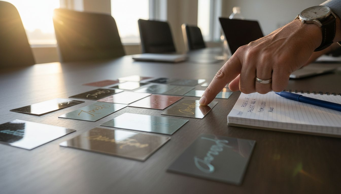
Avoid design mistakes that ruin mirror business cards
Mirror business cards can deliver unmatched luxury and visual impact, but poor design choices turn these premium materials into unreadable disappointments. Reflective surfaces amplify every design decision, for better or worse, making contrast, spacing, and typography critical. This article reveals the most common design mistakes that undermine mirror card effectiveness and shows you how to avoid them for cards that command attention and communicate clearly.
Table of Contents
- How To Choose The Right Design Approach For Mirror Business Cards
- Contrast And Text Visibility On Reflective Mirror Cards
- Choosing Materials And Finishes To Preserve Visual Appeal
- Typography And Layout Errors That Undermine Mirror Card Legibility
- Color Palette Mistakes That Dramatically Affect Mirror Card Perception
- Environmental Considerations: Lighting And Placement Impact
- Summary Comparison And Situational Recommendations
- Get Premium Custom Mirror Business Cards With Bcardscreation
- Frequently Asked Questions About Mirror Business Cards
Key takeaways
| Point | Details |
|---|---|
| High contrast improves readability | Contrast ratios of 7:1 or higher ensure text remains legible on reflective surfaces. |
| Material choice affects durability | Plastic mirror cards offer superior longevity, while hybrid materials reduce damage risks by 35%. |
| Avoid overcrowded layouts | Reflective surfaces magnify visual clutter, reducing clarity and brand impact. |
| Dark text on light backgrounds works best | This pairing maintains visibility across varied lighting conditions. |
| Anti-glare coatings improve usability | Coatings reduce glare intensity by up to 40%, enhancing text legibility. |
How to choose the right design approach for mirror business cards
Selecting the right design approach for mirror business cards starts with understanding how reflective surfaces behave differently from traditional materials. Mirror cards demand intentional design choices that prioritize clarity over decoration.
Your first consideration should be contrast. High contrast between text and mirror background significantly improves readability on reflective business cards. Without sufficient contrast, text disappears under ambient light, defeating the purpose of your card.
Material selection directly influences both durability and visual quality. Plastic mirror cards withstand frequent handling better than paper-based alternatives, while hybrid materials balance premium appearance with practical longevity. Finish choices like matte lamination or anti-glare coatings reduce unwanted reflections that interfere with text visibility.
Typography requires careful calibration on mirror surfaces. Font size and weight must be substantial enough to remain legible despite reflection interference. Thin or decorative fonts that work beautifully on matte paper often fail on reflective materials, creating frustrating reading experiences.
Lighting environment plays a larger role than most designers anticipate. Mirror cards behave differently under direct sunlight, office fluorescents, or dim restaurant lighting. Your design must account for varied viewing conditions rather than optimizing for a single scenario.
Cluttered layouts become exponentially worse on reflective surfaces. Every element competes for attention while also creating additional reflection points. Minimalist approaches consistently outperform busy designs on mirror cards.
Pro Tip: Test your mirror card design under at least three different lighting conditions before finalizing. What looks perfect under soft studio lighting may become unreadable in bright conference rooms or outdoor networking events.
Key design criteria for successful mirror cards:
- Maintain contrast ratios of 7:1 or higher between text and background
- Select materials that balance durability with printability for your specific needs
- Choose typography weights and sizes that withstand reflection interference
- Design for multiple lighting environments, not ideal conditions only
- Prioritize visual simplicity to reduce reflection confusion
Contrast and text visibility on reflective mirror cards
Contrast determines whether your mirror business card communicates effectively or frustrates recipients. Reflective surfaces reduce perceived contrast by introducing environmental elements like ceiling lights, windows, and surrounding objects into the visual field.
Dark text on light or reflective backgrounds delivers the strongest visibility across varied conditions. This pairing works because it leverages natural reading patterns while minimizing the impact of ambient reflections. Your recipients can read the card quickly without tilting or repositioning it constantly.
Light or pastel text colors on mirror surfaces create readability disasters. These choices disappear under most lighting conditions, forcing recipients to struggle with your card. Even metallic inks in gold or silver, while visually appealing, can reduce legibility if they lack sufficient contrast with the background.
Premium mirror-effect business cards succeed when designers respect contrast fundamentals. The most effective examples use bold, dark typography against reflective backgrounds or employ negative space strategically to maintain visual hierarchy.
Foil stamping adds luxury but introduces contrast challenges. Excessive foil coverage, particularly metallic foils over reflective surfaces, creates competing reflection patterns that reduce readability by up to 25%. Strategic use of foil for accents or logos works well, but covering large text blocks undermines legibility.
“High contrast ratios of 7:1 or higher are necessary for clear text on reflective surfaces, ensuring readability across diverse viewing environments.”
Effective contrast strategies for mirror cards:
- Use solid black or dark navy text on reflective silver or white backgrounds
- Limit metallic foil to accent elements rather than primary text
- Test designs under bright overhead lighting to identify contrast failures
- Consider how color choice for business cards interacts with reflective properties
- Reserve light colors for backgrounds, never for critical text elements
Choosing materials and finishes to preserve visual appeal
Material selection determines both the durability and visual performance of your mirror business cards. Each option presents distinct tradeoffs between appearance, longevity, and printability.
Plastic mirror cards offer the highest durability for professionals who exchange cards frequently or in demanding environments. These cards resist bending, moisture, and wear better than paper alternatives. However, untreated plastic surfaces can produce intense glare that makes text difficult to read under bright lighting.
Hybrid materials reduce card damage risks by 35% compared to paper-only mirror cards. These constructions combine paper bases with plastic or metallic layers, balancing premium appearance with practical durability. They require advanced printing techniques but deliver excellent results when executed properly.
Matte lamination and anti-glare coatings represent the most effective solution for glare problems. Anti-glare finishes reduce glare intensity by up to 40% compared to untreated surfaces, dramatically improving usability without sacrificing the luxury appearance that attracted you to mirror cards initially.
Metallic foil stamping enhances perceived value but demands restraint. Foil works beautifully for logos, borders, or accent elements that complement rather than overwhelm your design. Overusing foil reduces text clarity while adding production costs that may not improve overall impact.
Pro Tip: Request physical samples of your chosen material under realistic lighting before committing to a full print run. Digital proofs cannot accurately represent how reflective surfaces behave under varied conditions.
| Material Type | Durability | Print Clarity | Glare Level | Best Use Case |
|---|---|---|---|---|
| Plastic mirror | Excellent | Good with coating | High without treatment | High-frequency networking, outdoor events |
| Hybrid paper-plastic | Very good | Excellent | Moderate | Professional services, creative industries |
| Metallic foil on paper | Moderate | Variable | Low to moderate | Luxury brands, special occasions |
| Matte laminated mirror | Good | Excellent | Low | Client-facing roles, indoor networking |
Material considerations for optimal results:
- Plastic mirror effect business cards excel for durability but require anti-glare treatment
- Hybrid options balance mirror cards durability with print quality
- Matte finishes sacrifice some mirror intensity but gain significant usability
- Glossy plastic business cards with selective foiling offer controlled luxury impact
Typography and layout errors that undermine mirror card legibility
Typography mistakes destroy otherwise well-conceived mirror card designs. Reflective surfaces magnify every font choice, making size, weight, and spacing critical factors you cannot afford to misjudge.
Overcrowding creates the single most damaging layout problem on mirror cards. When you pack too many elements into limited space, reflections multiply visual confusion exponentially. Recipients struggle to identify which information matters most, reducing the card’s effectiveness as a networking tool.
Complex overlays and layered graphics produce distracting reflection patterns that compete with your actual content. Each additional design layer introduces another surface that catches and redirects light, creating visual noise that obscures your message.
Embossing and debossing reduce readability on reflective surfaces more than on matte materials. While these techniques add tactile interest, they create shadows and highlights that interfere with text visibility under varied lighting. Use them sparingly for decorative elements, not critical information.
Font weight and size demand more consideration on mirror cards than traditional business cards. Thin or light font weights disappear under bright lighting or strong reflections. Medium to bold weights maintain visibility across conditions, while generous sizing ensures legibility without requiring recipients to squint.
Decorative fonts sacrifice clarity for style on reflective surfaces. Script fonts, ornate serifs, or trendy display faces that work beautifully on matte paper become illegible on mirror materials. Reserve decorative typography for small accent text, never for names, titles, or contact information.
Pro Tip: Increase your minimum font size by at least 2 points compared to standard paper business cards. What seems adequately sized on screen often reads smaller on reflective surfaces due to glare and environmental interference.
Typography best practices for mirror cards:
- Use font sizes of 10 points or larger for body text, 14+ points for names
- Select medium or bold font weights rather than light or thin options
- Maintain generous line spacing to prevent text from visually merging
- Limit font families to two maximum, preferably one for hierarchy simplicity
- Reference luxury business card typography principles for refined execution
- Apply embossing on mirror cards only to logos or decorative borders
Color palette mistakes that dramatically affect mirror card perception
Color choices make or break mirror business card effectiveness. Reflective surfaces alter color perception while introducing environmental hues that muddy your intended palette.
Dark colors for text deliver the strongest readability on mirror surfaces. Black, deep navy, or dark charcoal maintain visibility across lighting conditions without requiring recipients to adjust viewing angles. These colors create the high contrast ratios necessary for immediate legibility.
Pastels and light hues blend into reflective backgrounds, becoming nearly invisible under bright lighting. Soft pinks, light blues, or pale yellows that look elegant on paper samples disappear on actual mirror cards when recipients view them in real-world conditions.
Metallic and reflective inks create beautiful effects but must be balanced against contrast requirements. Gold or silver ink on mirror backgrounds produces minimal contrast, forcing recipients to tilt cards at specific angles to read text. Reserve metallic inks for accent elements where reduced legibility does not compromise function.
Consistent color use supports brand recognition and professional appearance. Mirror cards already introduce visual complexity through reflectivity. Adding too many colors creates additional confusion that undermines the premium impression you want to convey.
Effective color strategies for mirror cards:
- Prioritize solid black or dark typography for all essential information
- Use your brand colors selectively for logos or accent borders
- Avoid light text colors entirely, regardless of background treatment
- Test color palette for mirror cards under varied lighting before committing
- Limit your palette to 2-3 colors maximum for visual cohesion
- Remember that mirror surfaces add their own color element through reflection
Environmental considerations: lighting and placement impact
Lighting conditions influence mirror card readability more dramatically than most designers anticipate. Your card must perform across environments from bright conference halls to dimly lit restaurant lounges.
Direct sunlight creates the harshest glare conditions, rendering even well-designed mirror cards difficult to read. Outdoor networking events, trade shows with large windows, or meetings near unshaded windows present maximum challenge. Your design must account for these worst-case scenarios.
Strong overhead lighting in offices or conference rooms produces similar glare problems. Fluorescent lights or bright LED installations reflect directly off mirror surfaces, creating hotspots that obscure text. Cards designed only for soft, indirect lighting fail in these common professional settings.
Matte or anti-glare finishes mitigate environmental lighting challenges without eliminating the premium mirror aesthetic. Anti-glare finishes reduce glare intensity by up to 40%, allowing text to remain legible across varied conditions. This single modification dramatically improves card usability.
Educating clients on optimal presentation improves card effectiveness beyond design choices alone. Recipients who understand to view mirror cards at slight angles or under indirect lighting get better experiences, increasing the likelihood they retain and use your contact information.
Pro Tip: Include a subtle matte spot UV coating on text areas while leaving decorative elements fully reflective. This hybrid approach maintains visual interest while ensuring critical information remains readable under all lighting conditions.
Lighting optimization strategies:
- Specify anti-glare coatings for cards used primarily in bright office environments
- Design with maximum contrast to compensate for glare you cannot control
- Test prototypes under fluorescent, LED, and natural sunlight before production
- Consider seasonal factors like winter sun angles if cards launch in specific months
- Provide brief guidance to recipients on optimal viewing angles if appropriate
Summary comparison and situational recommendations
Different professional contexts demand different mirror card approaches. Understanding which combination of materials, finishes, and design strategies suits your specific needs prevents costly mistakes.
Plastic cards excel for durability and frequent handling. Sales professionals, real estate agents, or consultants who exchange dozens of cards weekly benefit from plastic’s resistance to wear. The investment in anti-glare treatment pays dividends through extended card life and consistent readability.
Hybrid cards balance premium feel with cost effectiveness. Hybrid materials reduce damage risks by 35% while maintaining the elegant appearance that attracts creative professionals to mirror cards. They work well for controlled networking environments where cards face moderate rather than extreme handling.
Metallic foil cards deliver maximum luxury for brand positioning. High-end consultants, luxury goods representatives, or boutique service providers benefit from foil’s elevated perception. However, limiting foil to 15% or less of surface area preserves readability while maintaining impact.
High contrast and finish choices must align with your professional environment. Indoor professionals can accept slightly higher glare levels than those networking outdoors or in bright retail environments. Match your material and finish specifications to actual usage conditions.
| Factor | Conservative Approach | Balanced Approach | Maximum Impact |
|---|---|---|---|
| Contrast ratio | 10:1 or higher | 7:1 to 9:1 | 7:1 minimum |
| Material | Matte laminated hybrid | Plastic with anti-glare | High-gloss plastic |
| Foil coverage | None or logo only | Logo plus accent border | Up to 15% of surface |
| Typography | Bold sans-serif 12pt+ | Medium weight 10pt+ | Medium serif with generous sizing |
| Best for | Bright offices, outdoor events | General professional networking | Controlled lighting, luxury positioning |
Situational recommendations:
- Tech professionals benefit from minimalist designs with maximum contrast and anti-glare plastic
- Creative consultants can push boundaries with business card design ideas while respecting contrast fundamentals
- Real estate agents need durable plastic with conservative layouts for high-volume distribution
- Luxury brand representatives should invest in premium mirror business card recommendations with controlled foil use
Get premium custom mirror business cards with BcardsCreation
Avoiding design mistakes requires expertise that goes beyond templates or automated design tools. BcardsCreation specializes in fully custom business card design services that optimize mirror cards for both visual impact and practical readability.

Our design team understands how reflective surfaces behave under varied lighting and can guide you toward material, finish, and layout choices that deliver results. We offer premium materials from durable plastics to sophisticated hybrid constructions, all with anti-glare and matte finish options that preserve luxury while enhancing usability.
Creative professionals and boutique business owners trust us to create creative luxury business cards that position their brands effectively. Every project receives individual attention, material consultation, and design refinement to ensure your mirror cards avoid common pitfalls while maximizing visual appeal. Explore our full business cards collection to see how we transform reflective materials into powerful networking tools.
Frequently asked questions about mirror business cards
What is the best font size for mirror business cards?
Use minimum 10-point font for body text and 14-point or larger for names and titles on mirror business cards. Reflective surfaces reduce perceived text size due to glare, so increasing font size by 2 points compared to standard paper cards ensures legibility across lighting conditions.
How can I reduce glare on my mirror business cards?
Apply anti-glare or matte laminate coatings to reduce glare intensity by up to 40% without eliminating the mirror effect entirely. Alternatively, use spot UV matte coating on text areas while leaving decorative elements fully reflective for a hybrid approach that balances aesthetics with function.
Are mirror business cards durable for frequent handling?
Plastic mirror cards offer excellent durability for frequent handling and resist bending or moisture damage better than paper alternatives. Hybrid materials provide good durability while maintaining premium appearance, making them suitable for moderate-frequency networking where extreme wear resistance is less critical.
How much foil stamping is optimal for mirror card readability?
Limit foil stamping to 15% or less of the card surface to maintain readability while adding luxury impact. Excessive foil creates competing reflections that reduce text clarity by up to 25%, so reserve foil for logos, borders, or small accent elements rather than covering large text blocks.
Which environments are best for presenting mirror business cards?
Mirror business cards perform best in controlled indoor lighting environments with indirect or moderate illumination. Avoid presenting them in direct sunlight or under harsh overhead fluorescents unless you have specified anti-glare coatings. Understanding mirror business card impact across environments helps you present cards at optimal angles and lighting for maximum effect.


