

Business Card Branding Steps for Professionals
TL;DR:
- Effective business card branding relies on clear goals, correct file specifications, and strategic design steps.
- Skipping these foundational procedures results in generic, forgettable cards that undermine professional identity.
Business card branding steps are the defined sequence of decisions and actions that transform a blank card into a precise representation of your professional identity. Most cards fail not because of bad design, but because they skip the foundational steps: no clear brand goal, no consistent color mode, no hierarchy. The result is a card that looks generic and gets forgotten. Done correctly, these steps produce a card that communicates your positioning before you say a word. Tools like Canva and Inkpress have made design more accessible, but the strategic logic behind effective card branding remains the same regardless of what software you use.
What are the essential prerequisites for branding business cards?
Before you open any design tool, you need three things in place: a clear brand goal, the right file specs, and your core brand assets. Skipping this stage is the most common reason cards end up reprinted.

Brand goal and audience clarity
Define what the card needs to do. A consultant handing cards to C-suite prospects has different priorities than a photographer networking at creative events. Your card’s visual weight, information density, and finish should all reflect that context. The role of business cards in personal branding shifts significantly depending on who receives them.
File specifications
- Card dimensions: 3.5 x 2 inches (final trim size)
- File size with bleed: 3.75 x 2.25 inches, including a 0.125-inch bleed on all sides
- Keep all critical content 0.125 inches inside the trim line to avoid clipping
- Color mode: CMYK, not RGB
- Resolution: 300 DPI minimum for all images and graphics
- Preferred export format: PDF/X-4
Brand assets to gather
- Logo in vector format (.ai, .eps, or .svg)
- Brand color values in CMYK (not just HEX)
- Approved typefaces and their licensed files
- Any secondary graphic elements or patterns
Pro Tip: Never use a logo exported from a website. Screen-resolution logos (72 DPI) will print blurry. Always request the original vector file from your designer or brand guidelines document.
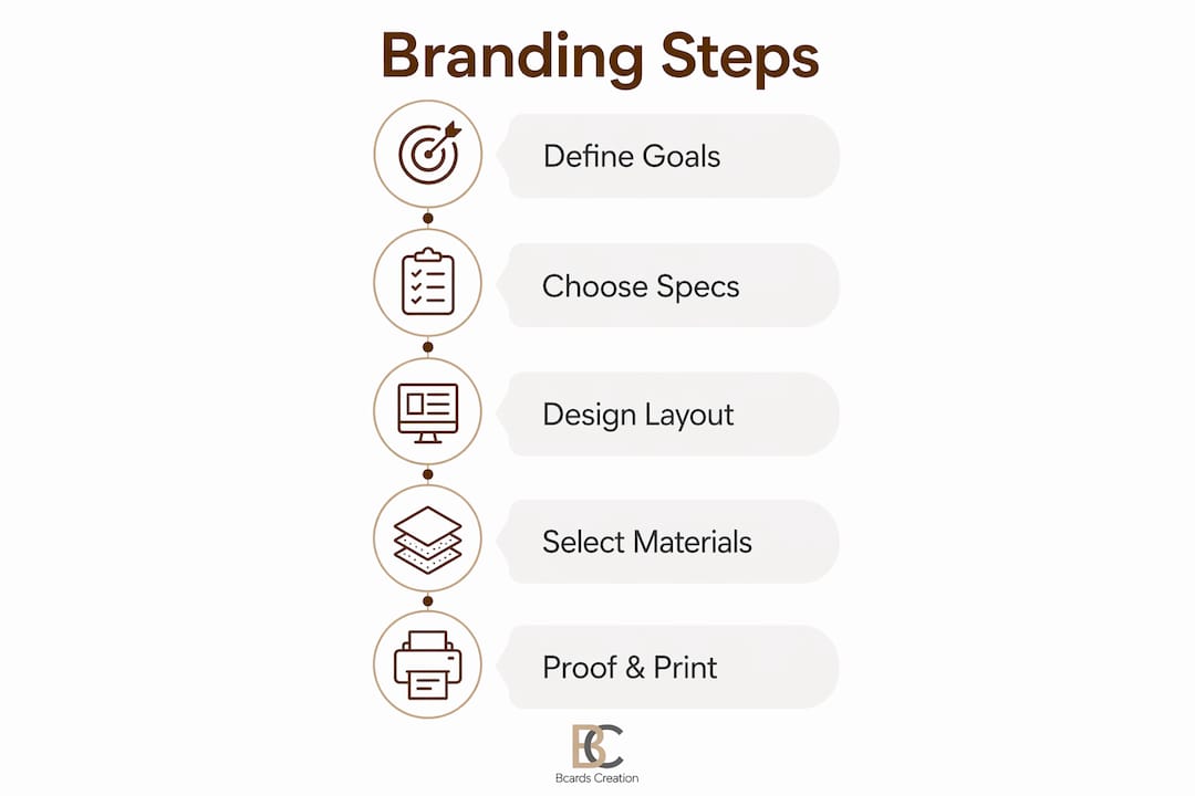
What are the step-by-step business card branding actions?
These seven steps cover the full design process from concept to a print-ready file. Follow them in order. Each step builds on the last.
-
Define the card’s purpose and audience. Decide what one action you want the recipient to take. Call, visit a site, scan a QR code. One clear goal shapes every design decision that follows.
-
Choose size, shape, and orientation. Standard horizontal cards work for most professionals. Vertical layouts signal creativity and work well for designers, photographers, and architects. Square or die-cut shapes add distinction but increase print cost. Whatever you choose, set up your file at 3.75 x 2.25 inches to include the required bleed.
-
Select your content. A well-branded card carries 6–8 pieces of information: name, title, company, logo, phone, email, website, and one call to action. More than eight elements creates clutter. Less than five reduces usefulness.
-
Plan your layout and visual hierarchy. Place your name and logo as the dominant elements. Contact details sit below in a smaller weight. Whitespace is not empty space. Aim for 4–5mm padding around all content to give the layout room to breathe.
-
Set your typography. Use no more than two typefaces per card. Name and title: 14–18pt. Contact information: no smaller than 8pt. Fonts below 8pt appear readable on screen but become illegible in print, especially on textured stock.
-
Apply your color palette. Limit your palette to 2–3 colors: your primary brand color, one accent, and a neutral for body text. High contrast between text and background is non-negotiable for readability. Always work in CMYK. RGB values for purples, oranges, and greens shift significantly when converted at the print stage.
-
Prepare digital assets and finalize the layout. Export all placed images at 300 DPI. Flatten transparency. Outline all fonts before exporting to PDF. AI-assisted tools like Inkpress can speed up layout iterations, but the final file check must be done manually.
Comparison: horizontal vs. vertical card orientation
| Factor | Horizontal | Vertical |
|---|---|---|
| Industry fit | Finance, law, consulting | Design, photography, creative |
| Readability | High for standard layouts | Strong for name-forward designs |
| Perceived style | Traditional, authoritative | Modern, distinctive |
| Printing cost | Standard | Standard |
| Wallet fit | Universal | May require rotation |
Pro Tip: Design your card at 150% zoom in your software. This helps you catch spacing issues and font weight problems that disappear at actual size on screen.
How to finalize and proof business cards for printing
File preparation is where most design errors become expensive. A card that looks perfect on screen can print with clipped text, color shifts, or blurry graphics if the file is not set up correctly.
File setup checklist before sending to print
- Convert all colors to CMYK. RGB causes color shifts in purples, oranges, and greens that are impossible to correct after printing.
- Confirm resolution at 300 DPI for every placed image.
- Include a 0.125-inch bleed on all four sides.
- Keep text and logos inside the safe zone, 0.125 inches from the trim line.
- Outline all fonts to prevent substitution errors.
- Export as PDF/X-4 for maximum print compatibility.
Proofing before bulk printing
Always proof a physical sample before committing to a full print run. Check alignment, color accuracy, and text legibility on the actual stock you selected. What reads clearly on a coated gloss stock may disappear on an uncoated textured paper.
Paper stock and finish selection
| Finish type | Brand tone | Best for |
|---|---|---|
| Matte laminate | Understated, refined | Consultants, lawyers, executives |
| Gloss laminate | Bold, high-contrast | Sales, retail, consumer brands |
| Soft-touch coating | Premium, tactile | Luxury brands, creative directors |
| Foil stamping | High-end, memorable | Founders, premium service providers |
| Uncoated textured | Organic, artisan | Architects, designers, wellness brands |
Custom finishes and quality stock turn a card into a physical brand touchpoint. The tactile experience of a soft-touch card with foil detail communicates quality before the recipient reads a single word.
Common print problems and fixes
- Clipped text or logos: Content placed outside the safe zone. Move all elements 0.125 inches inside the trim line.
- Color looks wrong: File was designed in RGB. Convert to CMYK and re-export.
- Blurry graphics: Image resolution below 300 DPI. Replace with a high-resolution or vector version.
- Font looks different: Fonts were not outlined before export. Outline all text before saving the final PDF.
What are common mistakes in business card branding?
Most branding failures on business cards come from a small set of repeatable errors. Knowing them in advance saves you a reprint.
- Overcrowding the layout. Adding a second phone number, a fax number, three social handles, and a tagline turns a card into a wall of text. Stick to the 6–8 element rule.
- Using low-resolution logos. A logo pulled from a website is typically 72 DPI. At print size, it will appear blurry. Always use vector source files.
- Mixing alignment styles. Left-aligned text on the front and centered text on the back creates visual inconsistency. Pick one alignment and apply it across both sides.
- Ignoring the back of the card. The back is a second branding surface. Use it for a QR code, a short value statement, or a brand graphic. QR codes as a single call to action improve post-networking engagement when sized and placed correctly.
- Inconsistency with other brand materials. Your card should match your website, letterhead, and email signature in color, font, and tone. Inconsistency signals a brand that is still figuring itself out.
- Skipping the physical proof. Approving a card from a screen PDF and printing 500 copies is a risk. One physical proof catches alignment, color, and legibility issues before they multiply.
Pro Tip: Hand your proof card to someone unfamiliar with your brand. Ask them to read it and tell you what you do. If they hesitate, your hierarchy or content needs work.
Key takeaways
Effective business card branding requires defined steps, correct file specs, and material choices that reinforce your brand positioning from the first impression.
| Point | Details |
|---|---|
| Start with specs | Set files at 3.75 x 2.25 inches with 0.125-inch bleed before designing. |
| Limit content to 6–8 elements | Name, title, logo, contact info, and one clear call to action cover everything needed. |
| Use CMYK, not RGB | RGB colors shift at print; always design in CMYK for accurate output. |
| Cap fonts at two | Two typefaces keep the card cohesive and readable at small sizes. |
| Proof before bulk printing | A physical sample catches color, alignment, and legibility errors before they scale. |
Why I think most professionals underestimate the branding steps
I have reviewed hundreds of business card files over the years. The most common problem is not bad taste. It is skipped steps. A founder will spend weeks refining a logo, then hand a card file to a printer without checking the color mode or bleed setup. The card comes back and the logo looks slightly off. The colors are muddy. The text is too close to the edge. None of those problems are design problems. They are process problems.
The step-by-step framework matters because each step removes a category of error. When you skip the proofing step, you are betting that everything upstream was perfect. It rarely is.
The other thing I see professionals underestimate is material. A card printed on premium soft-touch stock with a spot foil detail communicates something that no digital equivalent can replicate. The person receiving it feels the quality before they process the information on it. That physical signal is part of your brand. It is not decoration.
AI tools like Inkpress have made layout iteration faster, and that is genuinely useful. But they do not replace the judgment calls: which finish matches your brand tone, whether your logo holds up at 1 inch wide, whether your color palette reads correctly on an uncoated stock. Those decisions still require human attention and, ideally, a production partner who understands both design and materials.
— Kostiantyn
How Bcardscreation brings your branding vision to print
Bcardscreation works with founders, executives, and creative professionals who treat their business cards as a positioning tool, not a commodity. Every project is developed individually, with no templates and no automated editors.

You get expert design guidance, material consultation, and controlled small-batch production from start to finish. Whether you need custom business card design built from your brand assets or luxury foil and specialty printing that makes a physical impression, Bcardscreation handles the full process. You review a proof before anything goes to press. No surprises, no bulk minimums that force you to compromise on quality.
FAQ
What is the standard business card size in the US?
The standard US business card size is 3.5 x 2 inches. Design files should be set to 3.75 x 2.25 inches to include the required 0.125-inch bleed on all sides.
How many fonts should a business card use?
A business card should use no more than two fonts. More than two typefaces creates visual noise and weakens brand consistency on a small format.
Why does color mode matter for business card printing?
Print requires CMYK color mode. Files designed in RGB produce inaccurate colors at print, particularly in purples, oranges, and greens, which shift noticeably during conversion.
What information belongs on a business card?
A well-branded card carries 6–8 elements: name, title, company, logo, phone, email, website, and one clear call to action. More than eight risks clutter; fewer than five reduces the card’s usefulness.
Should you always proof a business card before bulk printing?
Yes. A physical proof is the only reliable way to check color accuracy, text legibility, and alignment on the actual paper stock. Screen proofs do not replicate how ink and finish interact on the final material.


