

Business card branding guide: craft a premium impression
TL;DR:
- A well-designed business card reflects your brand’s identity and leaves a memorable impression.
- Material choice and tactile quality communicate professionalism and align with brand positioning.
- Avoid generic templates by investing in custom design and thorough verification processes.
A bland business card does more damage than no card at all. It signals that you treat your brand as an afterthought. Yet most professionals hand out cards that look identical to thousands of others, printed from the same templates, on the same thin stock, with the same forgettable layout. That’s a missed opportunity. Your card is often the first physical touchpoint someone has with your brand, and it needs to do real work. This guide walks you through every step, from gathering your brand assets to choosing materials and verifying the final product, so your card commands attention and reflects your actual value.
Table of Contents
- Gather your branding essentials and inspiration
- Select the right materials and print techniques
- Design your business card for maximum brand impact
- Avoid common mistakes and verify professionalism
- Why templates can jeopardize your branding and how to do better
- Get a custom-designed card that speaks your brand
- Frequently asked questions
Key Takeaways
| Point | Details |
|---|---|
| Start with strong branding | Well-prepared brand assets and inspiration lead to a more effective business card design. |
| Choose premium materials | Materials and finishes should match the brand image and elevate the tactile experience. |
| Focus on design clarity | Effective layout and hierarchy ensure your card is both memorable and easy to read. |
| Verify before printing | Carefully check for errors and test in real-world conditions to avoid missteps. |
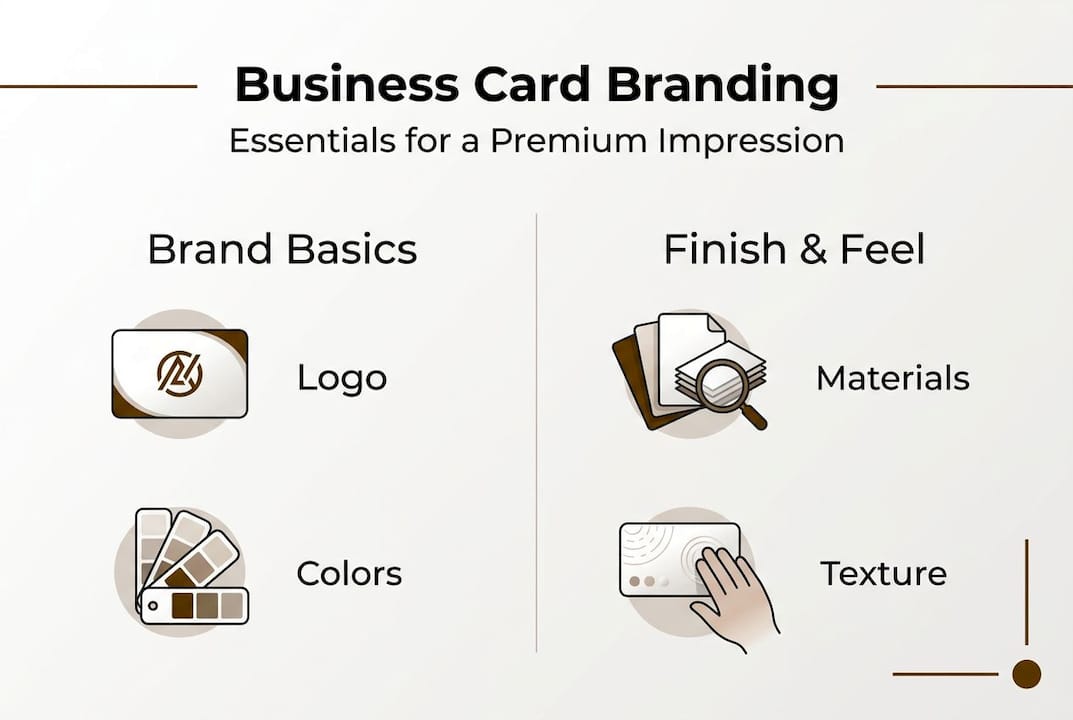
Gather your branding essentials and inspiration
Before you design a single element, you need to know what your brand actually is. That sounds obvious, but many professionals skip this step and end up with cards that feel disconnected from everything else they put out. Start by pinning down your core brand attributes.
Ask yourself: What does my brand stand for? What feeling should it leave? Who is my ideal client? Your answers shape every design decision that follows.
Here’s what to compile before you start:
- Logo files in vector format (.ai, .eps, or .svg) for clean scaling
- Brand color codes in HEX, CMYK, and Pantone where applicable
- Primary and secondary fonts with licensing confirmed for print use
- Tagline or value statement if you use one consistently
- Contact details verified and finalized (no placeholder info)
- Social handles or QR code destination if you plan to include them
Once you have these in hand, spend time researching what great cards look like. Browse design portfolios, look at cards from brands you admire, and save references that match the tone you want. This is how you set your card apart from generic output.
A moodboard helps. Collect images, textures, color palettes, and card examples that feel right for your brand. Share this with whoever handles your design. It removes guesswork and saves rounds of revision.
| Branding essential | Format needed | Why it matters |
|---|---|---|
| Logo | Vector (.ai, .eps, .svg) | Scales without quality loss |
| Brand colors | HEX, CMYK, Pantone | Ensures print color accuracy |
| Fonts | Licensed font files | Avoids substitution errors |
| Tagline | Plain text | Keeps messaging consistent |
| Contact info | Verified text | Prevents costly reprints |
| Inspiration references | Images or links | Guides design direction |
For deeper inspiration, brand designer inspiration resources can help you understand what professional-level creative direction looks like before you brief your designer.
To align business cards with your brand, every element on the card needs to connect back to your broader visual identity, not just look nice in isolation.
Pro Tip: According to Adobe’s design guidance, working with a professional designer rather than relying on templates leads to far better brand alignment. Templates are built for everyone, which means they’re optimized for no one.
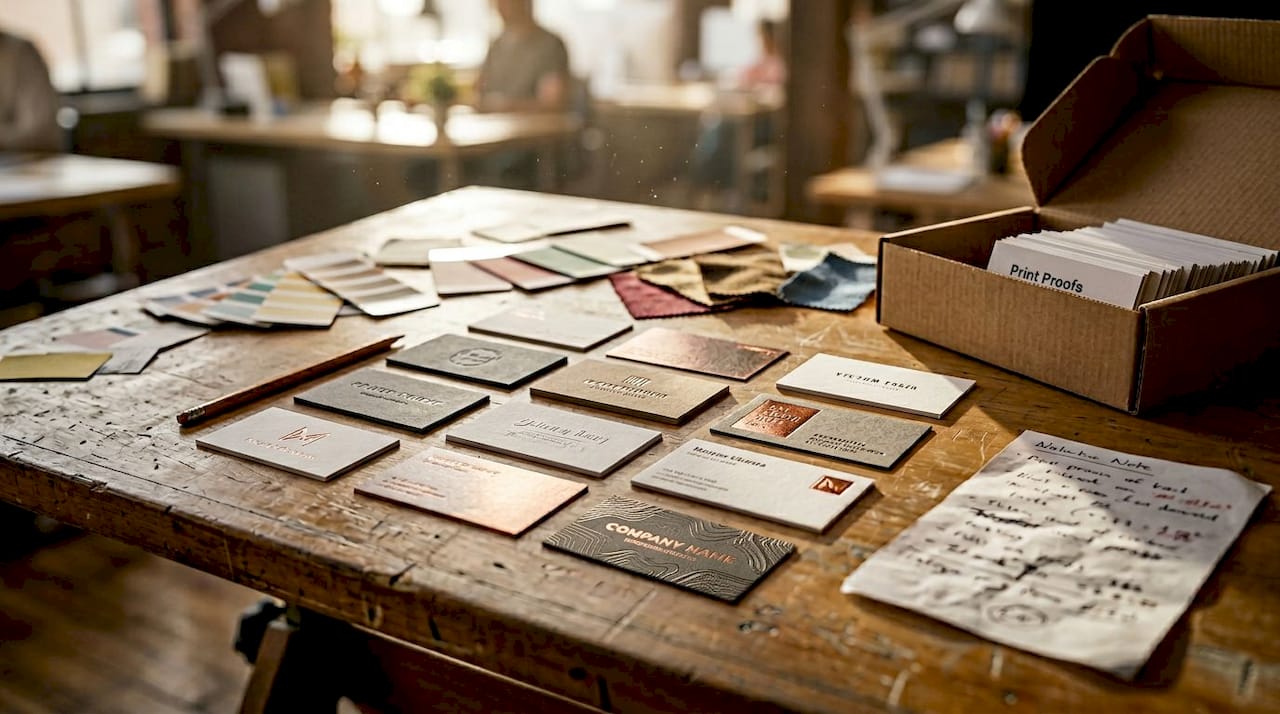
Select the right materials and print techniques
With your assets and vision in place, the next step is choosing the materials that will make your card feel as valuable as your business.
Material choice is not cosmetic. It’s strategic. The weight, texture, and finish of your card communicate things about your brand before anyone reads a word.
| Material or finish | Best for | Key benefit |
|---|---|---|
| Matte laminate | Professional services, law, finance | Clean, serious, easy to write on |
| Gloss laminate | Retail, beauty, consumer brands | Vivid colors, high visual impact |
| Soft-touch coating | Luxury, design, consulting | Premium tactile feel |
| Foil stamping | High-end brands, executives | Metallic shine, instant prestige |
| Textured stock | Creative industries, architects | Distinctive surface, memorable feel |
| Clear plastic | Tech, modern brands | Transparent, contemporary look |
| Letterpress | Premium personal brands | Deep impression, artisan quality |
Different materials support different brand identities. A financial advisor projects trust with a thick, matte card. A creative director signals innovation with a clear plastic card or a letterpress design. The material is part of the message.
Here’s a quick breakdown of print methods worth knowing:
- Digital printing is cost-effective for small runs with full-color designs
- Offset printing delivers sharper results and better color consistency at volume
- Letterpress creates a tactile impression by pressing type into thick paper stock
- Foil stamping applies metallic or colored foil to specific design elements
- Spot UV adds a glossy coating to selected areas, creating contrast against matte surfaces
“The physical feel of a card is part of the brand experience. Requesting tactile samples before committing to a print run is one of the most practical steps you can take.” This is especially relevant for luxury business card designs, where material choice directly reflects brand positioning.
Specialty finishes can elevate business card impact well beyond what standard printing achieves. Always request a physical sample before approving a full run.
Design your business card for maximum brand impact
Once you’ve chosen your materials, it’s time to focus on strategic design for a card that carries your brand forward.
Layout and hierarchy matter more than most people realize. A card can have beautiful materials and still fail if the information is hard to read or the design feels cluttered. Follow these steps:
- Place your logo first. It anchors the card and establishes brand identity immediately. Give it room to breathe.
- Set a clear visual hierarchy. Your name and title should be the next most prominent elements. Contact info follows.
- Use whitespace deliberately. Empty space is not wasted space. It guides the eye and makes the card feel premium.
- Stick to your brand fonts. Use no more than two typefaces. Consistency reinforces recognition.
- Check font sizes. Your smallest text should be no less than 7pt. Anything smaller becomes unreadable in real-world conditions.
- Limit contact details. Include only what’s necessary: phone, email, website, and one or two social handles if relevant. Less is more.
- Consider both sides. The back of the card is valuable real estate. Use it for a tagline, a key service, or a visual element.
- Review must-have card elements before finalizing to confirm nothing critical is missing.
For creative business card tips that push beyond the basics, look at how leading designers balance bold visuals with functional clarity.
If you want a structured approach, a solid business card design framework can walk you through each decision point in sequence.
Pro Tip: Test readability by holding your proof at arm’s length and viewing it in dim light. If you can’t read it easily in those conditions, neither can the person you hand it to at a networking event.
Avoid common mistakes and verify professionalism
A meticulously designed card only reflects quality if it avoids common missteps and is thoroughly checked.
Even well-intentioned designs fall apart at the details. Here are the most frequent errors to watch for:
- Typos and outdated contact info. These are the most damaging. They signal carelessness immediately.
- Low-contrast text. Light gray text on white, or dark text on a dark background, becomes unreadable fast.
- Overused templates. If your card looks like it came from a free online tool, it probably does. That impression sticks.
- Ignoring tactile feel. A card that looks good on screen but feels flimsy in hand undercuts your brand.
- Overcrowding. Too much information removes focus and makes the card harder to use.
- Inconsistent branding. Colors or fonts that don’t match your other materials create confusion, not recognition.
Before you approve any print run, run through this verification checklist:
- Proofread every word, twice, with fresh eyes
- Confirm all contact details are current and correct
- Check color codes against your brand standards
- Test readability in real-world lighting conditions
- Request a physical proof to evaluate tactile quality
- Compare against your other brand materials for consistency
“A card that works in a proof but fails in the hand is not a finished product. Real-world usability is the final test.”
Proof multiple times, test readability, and evaluate tactile samples before committing to a full production run. Professional designer input at this stage is essential.
For a full rundown of what to avoid, the guide on common business card mistakes covers specific errors that even experienced professionals miss.
Why templates can jeopardize your branding and how to do better
Here’s the uncomfortable reality: free templates are designed to look acceptable, not to represent your brand. There’s a difference.
We’ve worked with clients who came to us after years of using template-based cards. The feedback they got wasn’t that the cards looked bad. It was that the cards were forgettable. That’s worse. A forgettable card means the conversation you just had doesn’t get followed up. The contact gets lost.
Custom design signals that you take your brand seriously. Clients and partners sense this. It’s not about being flashy. It’s about coherence. A card that clearly belongs to your brand, uses your actual colors, your actual typography, and reflects your actual positioning, does real work in the world.
Why card design matters goes beyond aesthetics. It’s about whether your card reinforces or undermines the impression you’re trying to make. Templates dilute that. Custom design protects it.
The investment in a properly designed card is small relative to what it represents every time you hand one over.
Get a custom-designed card that speaks your brand
If you’re ready to move from generic to genuinely on-brand, BcardsCreation builds cards that reflect your actual identity.

Every project starts with a design consultation, not a template selector. We work with you on material selection, layout, and finish to produce a card that fits your brand and holds up in real-world use. Browse the full business card collection to see what’s possible, or go straight to custom business card design to start your project. For clients who want elevated materials and specialty finishes, our luxury business cards offer foiling, premium stocks, and refined production from start to finish.
Frequently asked questions
What are the most important elements on a branded business card?
The basics include your logo, brand colors, contact info, and a layout that aligns with your overall visual identity. Professional design guidance consistently points to readability and brand consistency as the top priorities.
How do I pick the best material for a luxury business card?
Match the material to your brand’s positioning and always request physical samples before approving a run. Tactile samples let you evaluate quality in a way that screen proofs simply cannot replicate.
Should I hire a professional designer for business cards?
Yes. A professional ensures your card reinforces your brand and avoids the generic look of off-the-shelf templates. Designer input is especially valuable for brand alignment and print-ready file preparation.
What mistakes should I avoid on my business card?
Avoid typos, cluttered layouts, low-contrast text, and overused templates. Proof carefully and prioritize real-world readability over how the card looks on screen.


