

The Role of Business Cards in Personal Branding
TL;DR:
- Business cards serve as a tactile trust signal that significantly enhances personal branding and consumer confidence. Effective design, layout, and technology integration—such as well-placed QR codes—are crucial for creating credibility and encouraging follow-up. A strategic, well-timed exchange of high-quality cards strengthens professional relationships and leaves a lasting impression.
A business card is a physical representation of your professional identity, and it does something a LinkedIn profile cannot: it transfers trust through touch. The role of business cards in personal branding goes well beyond contact exchange. According to an Adobe Express survey, 62% of consumers are more likely to do business with someone who hands them a physical card. That single statistic reframes the card from a relic to a strategic asset. Physical cards also integrate naturally with digital tools like QR codes and vCard formats, making them relevant in both traditional and modern networking contexts.
How does effective business card design support personal branding?
Design is not decoration on a business card. It is the first signal your brand sends before you say a word. Research from the Adobe Express 2025 survey shows that logo, color, and typography rank as the top three trust drivers, with logos cited by 68% of consumers, color by 54%, and typography by 50%. These numbers confirm that recipients read your card the way they read your brand.

White cards are rated most trustworthy by 54% of respondents in the same survey. Classic palettes, white, black, and navy, consistently outperform novelty color choices when credibility is the goal. This does not mean your card must be plain. It means the color choice must be deliberate and aligned with how you want to be perceived.
Typography carries equal weight. A font that is hard to read at small sizes signals carelessness. A clean, legible typeface signals precision. The must-have branding elements that drive recall are almost always the ones that prioritize clarity over style.
There is a notable gap between what business owners prioritize in card design and what consumers actually respond to. Many owners focus on making cards look distinctive. Consumers respond most to cards that look credible and easy to use. Closing that gap is where effective business card design begins.
Pro Tip: Before finalizing your card design, show a prototype to three people outside your industry and ask them what your job title is. If they cannot answer correctly within five seconds, your hierarchy needs work.
- Use a single typeface family with two weights maximum
- Limit your color palette to two or three colors drawn from your existing brand identity
- Keep the logo proportional, not dominant
- Leave enough white space so the card does not feel crowded
- Align design with brand perception before choosing finishes or materials
Physical vs. digital business cards: which works better for branding?
Physical and digital business cards serve different functions, and the strongest personal branding strategies use both. Understanding where each format excels helps you decide how to allocate your investment.
| Feature | Physical business cards | Digital business cards |
|---|---|---|
| Memorability | High. Tactile experience creates stronger recall | Lower. Easily lost among digital contacts |
| Perceived personal connection | 70% say it feels personal | 45% for LinkedIn connections |
| Updateability | Requires reprint for changes | Instant updates at no cost |
| Integration with digital tools | Via QR codes and vCard links | Native to digital platforms |
| Brand differentiation | Material, finish, and texture add dimension | Limited to screen display |
| Follow-up conversion | Strong when paired with a QR code | Depends on platform engagement |
The data is clear on perceived connection. The Adobe Express survey found that 70% of people feel a physical card exchange is personal, compared to 45% for a LinkedIn connection. That 25-point gap reflects something real: handing someone a card is a deliberate act, and recipients register it as such.
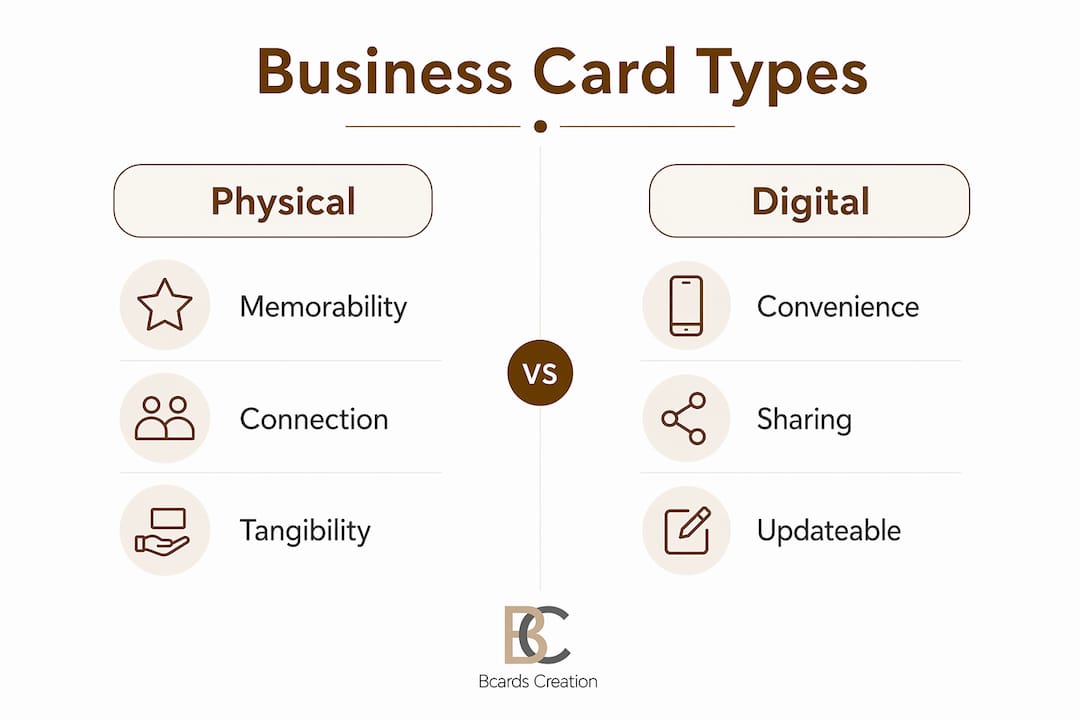
The practical answer for most professionals is a hybrid approach. A well-designed physical card carries your brand identity and creates a memorable first impression. A QR code on the back connects that impression to your digital presence instantly. This combination captures the trust signal of a physical card and the convenience of a digital profile.
Pro Tip: When you add a QR code to your card, include a short line of text next to it, something like “Scan to save my contact.” Clear instructions near QR codes greatly increase scanning rates because recipients need a behavioral prompt, not just a visual cue.
How does layout and information ordering affect personal branding?
A business card layout communicates your professionalism before the recipient reads a single word. Research from a J-STAGE layout study confirms that participants consistently prefer card designs that balance information accuracy, recipient consideration, and functional beauty. Cards that score high on these dimensions are rated as more trustworthy and socially appropriate.
The practical implication is straightforward. Your card should answer three questions instantly: who you are, what you do, and how to reach you. When those answers require effort to find, the card creates cognitive friction. Cognitive friction is the opposite of a good first impression.
Correct information hierarchy follows a consistent pattern. Your name should be the most prominent element. Your title or specialty comes next, slightly smaller. Contact details, email, phone, and website, appear below in a readable but secondary size. The logo anchors the layout without competing with your name. This order mirrors how recipients actually process the card.
The J-STAGE study also found that correct information hierarchy significantly enhances perceived credibility and ease of use. That finding matters because credibility is not just about what you say. It is about how quickly and clearly you say it.
Common layout mistakes that undermine personal branding:
- Placing the logo larger than the name, which shifts focus from person to company
- Using decorative fonts for the name or title, which reduces legibility
- Including too many contact channels, three or more email addresses, multiple phone numbers, and five social handles
- Leaving no visual breathing room, which makes the card feel cluttered and anxious
- Misaligning elements, which signals a lack of attention to detail
A step-by-step design framework can help you sequence these decisions before you commit to print.
What technology best practices maximize follow-up through business cards?
A business card with a QR code that fails to scan is worse than no QR code at all. It signals unreliability at the exact moment you want to signal the opposite. Getting the technology right is part of your personal branding, not a technical afterthought.
The most effective digital integration uses vCard QR codes, which trigger a native “Add to Contacts” prompt on both iOS and Android. This removes friction from the contact-saving process entirely. However, vCard QR code compatibility varies by device and operating system, and many QR business cards fail due to incomplete or incompatible vCard payloads.
Follow these steps to get it right:
- Choose vCard 3.0 as your format. vCard 3.0 offers the broadest device support across iOS and Android without compatibility gaps. vCard 4.0 adds features but introduces compatibility risks on older devices.
- Include only the fields your QR generator supports fully. Incomplete fields cause parsing errors that break the contact-saving prompt.
- Place the QR code on the back center of the card. Back-center placement with a quiet zone maximizes scanning success by giving camera apps enough margin to read the code cleanly.
- Add a short call-to-action next to the code. “Scan to save my contact” outperforms a bare QR code in conversion every time.
- Test the QR code on at least three different devices before sending files to print. Test on an iPhone, an Android device, and a tablet if possible.
- Consider a dynamic QR code if your contact details change frequently. Dynamic codes let you update the destination URL without reprinting the card, and they provide scan analytics so you can measure follow-up rates.
The opportunity here is significant. Adding a QR code increases contact likelihood by 69%, yet only 21% of business owners currently prioritize this feature. That gap represents a real competitive advantage for professionals who get the implementation right.
Pro Tip: Treat the front of your card as a branding surface and the back as a conversion surface. Keep the front clean and identity-focused. Put your tested vCard QR code and call-to-action on the back.
How can professionals use business cards to strengthen their networking reputation?
The most effective use of a business card is not distribution. It is timing. Handing a card at the right moment, after a genuine conversation, reinforces the connection rather than replacing it. Physical cards provide a durable memory cue that digital contact info alone rarely delivers. A card sitting on someone’s desk or in their wallet keeps you present in a way that a saved phone number does not.
Material and finish choices communicate brand values before the recipient reads your name. A thick, uncoated cotton stock signals craft and intentionality. A soft-touch laminate signals precision and modernity. A transparent plastic card signals design confidence. These are not arbitrary choices. They are extensions of your personal brand identity into a physical object.
Practical guidelines for strategic card use:
- Exchange cards after a substantive conversation, not as an opener
- Customize your card to the context when possible. A creative professional meeting a corporate client may want a cleaner, more restrained card than the one they use at design events
- Write a short note on the card before handing it over, a reference to your conversation, to make the follow-up feel personal
- Follow up within 48 hours of the exchange. The card is a memory cue, but the relationship requires your action
- Avoid handing cards to everyone in a room indiscriminately. Selective distribution signals that your attention is worth something
- Choose unique card design elements that reflect your specific industry and audience, not generic templates
The card is an extension of the conversation. Its job is to make the follow-up feel natural and expected, not cold.
Key takeaways
Business cards remain one of the most cost-effective personal branding tools available, provided the design, layout, and technology are executed with intention.
| Point | Details |
|---|---|
| Design drives trust | Logo, color, and typography are the top three factors consumers use to judge credibility from a card. |
| Physical cards outperform digital for connection | 70% of people find physical card exchanges personal, versus 45% for LinkedIn connections. |
| Layout determines recall | Correct information hierarchy reduces cognitive friction and increases perceived professionalism. |
| QR codes require technical precision | vCard 3.0 offers the broadest device compatibility; always test on multiple devices before printing. |
| Timing matters more than volume | Cards exchanged after genuine conversations create stronger follow-up outcomes than mass distribution. |
What I have learned about cards and personal brand strategy
By Kostiantyn
Most professionals underestimate how much a business card communicates before it is even read. The weight of the stock, the texture of the finish, the precision of the print registration: these details register subconsciously in the first two seconds of handling. I have seen well-funded professionals hand over thin, template-printed cards and watch the energy in a conversation shift. The card contradicted everything they had just said about their work.
The research on design trust signals confirms what I have observed directly. White and black cards consistently outperform novelty designs in credibility ratings, not because they are more creative, but because they are easier to trust. Restraint in design is a signal of confidence, not a lack of imagination.
The QR code issue is where I see the most avoidable failures. A broken QR code on a premium card is a branding problem, not just a technical one. It tells the recipient that the details were not checked. For a professional whose brand depends on reliability, that is a costly signal to send. Test every code on every major device before you approve a print run. No exceptions.
My broader view is this: a business card is not a formality. It is a deliberate branding decision. Treat it as one.
— Kostiantyn
Get cards that match your personal brand

If your card does not reflect the quality of your work, it is working against you. Bcardscreation designs and produces fully custom, small-batch business cards for professionals and brands who treat their card as a positioning tool. Every project starts with a design consultation, not a template. Material options include specialty papers, soft-touch laminates, plastic cards, and refined finishing techniques like foil and spot UV. The result is a card that communicates your brand before you say a word. Explore custom business card design options built around your specific identity and audience.
FAQ
Why do business cards still matter for personal branding?
Physical business cards create a personal connection that digital alternatives do not replicate. Research shows 70% of people find a card exchange more personal than a LinkedIn connection, making cards a stronger trust signal in face-to-face networking.
What design elements build the most credibility on a business card?
Logo, color, and typography are the top three trust drivers according to the Adobe Express 2025 survey. White cards are rated most trustworthy by 54% of consumers, and clean typography consistently outperforms decorative fonts for perceived professionalism.
How should I add a QR code to my business card?
Use a vCard 3.0 QR code for the broadest device compatibility, place it on the back center of the card with a clear call-to-action, and test it on multiple iOS and Android devices before printing. A dynamic QR code lets you update contact details without reprinting.
How does card layout affect my professional reputation?
A well-ordered layout, name first, then title, then contact details, reduces cognitive friction and signals professionalism. Studies confirm that recipient-considerate layouts score significantly higher on trust and social appropriateness ratings.
When is the right time to hand out a business card?
Hand your card after a genuine conversation, not as an opener. Cards exchanged at the right moment function as memory cues that make follow-up feel natural. Selective distribution signals that your attention and your card carry real value.


