

Why Design Matters for Physical Brand Touchpoints
Every creative professional knows the power of a memorable first impression, especially when success hinges on physical brand moments. In a market where nearly every interaction happens online, a thoughtfully designed business card becomes more than just a formality—it is a rare and powerful physical touchpoint that signals your brand’s values and quality before any conversation starts. This guide uncovers how intentional design choices can set your American brand apart, turning each card into a decisive expression of reputation and expertise.
Table of Contents
- The Evolving Role of Design As Signal
- How Physical Touchpoints Shape Brand Perception
- The Cumulative Effect of Physical Moments
- Why Tactile Experience Matters More Than Ever
- Signal Clarity and Differentiation in Low-Frequency Moments
- Common Design Missteps in Physical Brand Assets
Key Takeaways
| Point | Details |
|---|---|
| Design as Communication | Design serves as a powerful signal of brand value, creating immediate impressions before any conversation occurs. |
| Importance of Tactile Experience | Physical touchpoints deliver sensory engagement that enhances memorability and differentiation in a digital world. |
| Clear Signaling | Clarity in design is crucial for low-frequency interactions; brands must ensure their physical assets convey unmistakable value. |
| Avoiding Common Mistakes | Attention to production realities and intentional material choices are essential to maintain brand integrity and avoid mixed signals. |
…
The Evolving Role of Design as Signal
Design is no longer decoration. It’s communication. When someone holds your business card, they’re not just receiving contact information—they’re receiving a verdict about your brand before they’ve said a word.
Physical design elements signal organizational competence to customers instantaneously. A matte finish, weight of paper, precision of typography, and whitespace all work together to form a first impression. This isn’t marketing language. It’s cognitive science applied to materials.
In a digital-first world, scarcity makes physicality louder. Everyone has digital touchpoints. Few brands invest in physical ones that feel intentional. That rarity creates signal—the opposite of noise.
Why Design Functions as a Silent Translator
Design doesn’t explain your brand. It demonstrates it. The difference matters.
When you choose a specific paper weight, you’re not choosing aesthetics—you’re choosing what it feels like to interact with your brand. When you select a finish, you’re controlling what people hear when they touch it. These details compound into a complete story about who you are.
Design engages sensory and emotional dimensions that words cannot reach. A business card made from standard cardstock speaks one truth. The same card printed on uncoated cotton with hand-applied foil speaks another. Neither is better—but they signal completely different values.
- First impression formation: Happens before any conversation
- Quality perception: Communicated through tactile experience, not claims
- Brand consistency: Visible in every detail, from edge treatment to ink choice
- Differentiation: Creates memorable contrast in a sea of digital noise
The Shift From Decoration to Strategic Signaling
Design has moved from “making things look nice” to “making things communicate value.” That shift changes everything about how you approach physical touchpoints.
Ten years ago, a business card was a practical object. Today, it’s a positioning tool. Effective design creates experiential touchpoints that distinguish your brand from competitors in seconds, not minutes.
This means every choice matters—and no choice is purely aesthetic.
When design functions as signal, it cuts through the clutter of low-frequency interactions by communicating instantly what your brand stands for.
Brand owners who understand this distinction treat design decisions differently. They ask not “Does it look good?” but “What does this communicate about us?”
Pro tip: Before finalizing any physical touchpoint design, ask yourself what specific value or quality you’re signaling to your audience. If the answer isn’t clear, the design isn’t working.
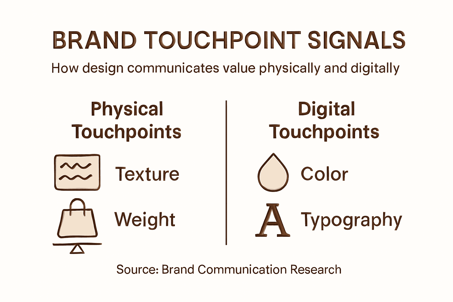
How Physical Touchpoints Shape Brand Perception
Every physical interaction with your brand is a moment of truth. A customer doesn’t think about your business card—they feel it. The weight in their hand, the texture under their thumb, the sound it makes when placed on a desk. These sensory details accumulate into a perception that either confirms or contradicts everything you’ve said about your brand.

Physical touchpoints communicate brand values through tangible environmental cues that shape how customers form their first expectations. There’s no second chance here. The impression forms instantly, and it sticks.
What makes this powerful is that most competitors ignore it. They treat physical items as functional afterthoughts. When you invest in intentional design, you immediately stand apart.
Here’s how physical and digital brand touchpoints differ in shaping perception:
| Aspect | Physical Touchpoints | Digital Touchpoints |
|---|---|---|
| Sensory Engagement | Involves touch and texture | Primarily visual and audio |
| Rarity Value | Increasingly scarce | Ubiquitous and common |
| Memorability | High, due to tactile feel | Lower, easily forgotten |
| First Impressions | Immediate and lasting | Often fleeting |
| Differentiation | High through materiality | Challenging amidst noise |
The Cumulative Effect of Physical Moments
Perception doesn’t build from a single interaction. It builds from patterns.
Customer loyalty develops through repeated positive physical experiences across a journey of multiple touchpoints. Each time someone handles your business card, opens your packaging, or experiences your physical space, they’re collecting evidence about who you are. That evidence either reinforces confidence or introduces doubt.
One mediocre business card at a networking event means little. Ten mediocre moments? That’s a pattern. And patterns shape loyalty.
- First-contact cues: Initial expectations set by physical design
- Repeated exposure: Frequency of positive touchpoints reinforces perception
- Emotional anchoring: Tactile experience creates memory beyond words
- Behavioral impact: Physical experience influences whether customers return
Why Tactile Experience Matters More Than Ever
In a world of screens, anything physical becomes rare. Rarity amplifies impact.
When was the last time you received a business card that surprised you? Not because of the information on it, but because of how it felt? Luxury business cards that use intentional tactile design stop people mid-conversation. They create pause. They create memory.
That pause is your advantage. It’s the moment when perception shifts from “another vendor” to “someone who actually cares.”
Physical touchpoints are perception shortcuts. They communicate quality, intentionality, and respect for the interaction in seconds—before conversation even begins.
Brands that understand this truth build loyalty faster. Not because they’re more likable, but because they’re more credible.
Pro tip: When designing any physical touchpoint, ask: What single word do I want customers to think when they touch this? Build every material choice toward that one perception.
Signal Clarity and Differentiation in Low-Frequency Moments
Most brand interactions happen rarely. A potential client receives your business card once. They walk into your space occasionally. These aren’t frequent touchpoints—they’re infrequent moments that carry disproportionate weight.
When contact is sparse, clarity becomes survival. Clear and distinctive design signals in rare physical touchpoints overcome lack of familiarity and ensure your brand sticks in memory. There’s no second chance to reinforce your message. You get one moment. Make it unmistakable.
This is why generic design is actually dangerous. It blends. In low-frequency interactions, blending equals erasure.
The Problem With Ambiguity
When someone meets your brand once or twice a year, confusion kills momentum. They need to recognize you instantly. They need to understand what you stand for in seconds.
Strong branding signals help consumers recognize and differentiate a brand despite limited exposure. That recognition prevents confusion with competitors and builds the associations you need. Weak signals do the opposite—they leave people unsure whether they’ve met you before.
Think about a business card that sits in someone’s desk for six months. When they pull it out, will they immediately remember you? Or will they squint and wonder if this is the designer, the printer, or someone else entirely?
Signal clarity removes that doubt.
What Clear Signaling Looks Like
Clear signals aren’t complicated. They’re decisive.
- Distinctive color or finish: Instantly recognizable when seen again
- Consistent tactile experience: Memorable feel creates instant recall
- Unambiguous typography: Clarity in how your name and role appear
- Focused visual hierarchy: One idea dominates, not competing messages
- Unique sensory cues: Texture, weight, or sound that only your brand offers
Each of these works because it removes cognitive friction. Someone doesn’t have to think—they instantly know they’ve encountered your brand before.
Why This Matters More Than Frequency
Frequency isn’t your advantage. Clarity is.
You may contact a prospect four times per year. A competitor might contact them weekly. But if your four touches are unmistakable while theirs blur together, you win the perception battle.
Low-frequency doesn’t mean low-impact. It means you need signal precision instead of signal volume.
In moments of rare contact, distinctiveness isn’t optional—it’s the only mechanism you have to stay top-of-mind.
Brands that accept low-frequency contact often resign themselves to low-impact. That’s a choice, not a law. Design clarity inverts that equation.
Pro tip: Before launching any physical touchpoint, show it to someone who hasn’t seen your brand in six months. Can they instantly recognize it? If hesitation appears, your signals aren’t clear enough.
Common Design Missteps in Physical Brand Assets
Most brands fail their physical touchpoints not through ambition, but through carelessness. A business card designed beautifully on screen arrives looking flat. Packaging that looks sharp in mockups feels cheap in hand. These aren’t small problems—they erode trust at the moment it matters most.
Misalignment between physical touchpoints and brand identity confuses customers and reduces loyalty. The damage happens silently. Your prospect doesn’t complain. They just don’t call back.
The good news: these missteps are preventable. Understanding where designers go wrong is the first step to avoiding the trap yourself.
The Design-to-Reality Gap
The biggest mistake is assuming your design file equals your final product. It doesn’t.
What looks crisp on a glowing screen can appear flat or muddy in print. Colors shift. Textures disappear. Finishes interact with light in ways the digital preview never shows. Designers often fail to account for how printing techniques affect the final appearance of their work.
This happens because design and production speak different languages. The designer thinks in pixels and RGB. The printer thinks in halftone dots and CMYK. Without translation, beautiful design becomes disappointing reality.
Common Problems and Their Causes
Design errors in physical brand touchpoints include cluttered layouts and failure to facilitate smooth interactions that customers expect. These problems aren’t accidents—they’re usually the result of specific oversights.
- Overcomplicated visual hierarchy: Too many competing elements confuse the eye
- Ignoring production constraints: Designing without understanding what’s physically possible
- Inconsistent brand signals: Different materials or finishes that don’t reinforce the same story
- Inadequate whitespace: Cramming information that needs breathing room
- Poor material-finish matching: Choosing effects that undermine the paper’s strengths
Each misstep comes from the same root: not thinking like someone who will hold, touch, and experience the final object.
Below is a summary of common physical brand asset pitfalls and their business risks:
| Design Misstep | Underlying Cause | Business Risk |
|---|---|---|
| Design-to-Reality Discrepancy | Ignoring print limitations | Brand trust erosion |
| Overly Complicated Layout | Lack of visual hierarchy | Customer confusion |
| Inconsistent Material Choices | Weak brand standards | Lost brand recognition |
| Poor Material-Finish Pairing | Ignoring tactile experience | Cheapened brand perception |
The Cost of Generic Solutions
When brands use templates or mass-market printers, they inherit everyone else’s mistakes. Stock finishes. Standard fonts. Default layouts.
These choices aren’t neutral—they actively communicate that you didn’t care enough to be intentional. Your competitor’s card sits next to yours, and yours whispers “generic” while theirs says “considered.”
The gap between good design and poor execution often comes from not involving production expertise in the design process itself.
Brands that avoid missteps build design and production together. The designer understands what the printer can do. The printer understands what the brand needs. That alignment is where great physical touchpoints come from.
Pro tip: Before finalizing any design, have a production specialist review it specifically for how it will look and feel in the finished material, not just on screen.
Elevate Your Brand With Physical Design That Speaks Volumes
The article highlights a critical challenge for professionals and brands: how to turn rare physical touchpoints like business cards into powerful signals of your brand’s identity and values. You want every tactile detail—from paper choice to finish—to communicate clarity and differentiate you instantly without confusion or hesitation. This requires moving beyond generic templates to intentional, high-impact design that builds trust and loyalty in a single moment.
At BcardsCreation, we specialize in crafting fully custom business cards that transform your brand signals into unforgettable experiences. Our approach combines expert design guidance, advanced materials, and refined finishing techniques to make sure every card is not just a card but a strategic branding asset. Whether you seek unmistakable tactile cues or a luxurious feel that stops conversations, our small-batch process ensures no detail is left to chance.
Explore our premium collection to start designing physical touchpoints that reflect your brand’s true value.
Discover how we differentiate through design-driven solutions and experience why your business card should be viewed as a positioning tool rather than just a contact detail.
Make your next physical interaction count with BcardsCreation. Act now to turn low-frequency brand moments into high-impact perception wins.
Frequently Asked Questions
What is the role of design in physical brand touchpoints?
Design in physical brand touchpoints serves as a form of communication, conveying the brand’s values and quality through sensory experiences rather than just aesthetics.
How does tactile experience influence brand perception?
Tactile experience plays a critical role in shaping brand perception. The weight, texture, and even the sound of physical touchpoints contribute to how customers feel about a brand, reinforcing or contradicting its messaging.
Why is first impression formation important for brand touchpoints?
First impressions formed through physical touchpoints occur instantly, often before any conversation. These impressions are lasting and can significantly impact a customer’s perception and decision-making process regarding the brand.
What are common design mistakes to avoid in physical brand assets?
Common mistakes include cluttered layouts, inconsistent material choices, poor material-finish pairing, and failing to consider production constraints, all of which can undermine brand credibility and trust.
Recommended
- 7 Details Clients Notice First: Micro-Design Elements That Change Perc – BcardsCreation
- Business Card Design Is Brand Engineering – BcardsCreation
- Why Invest in Unique Business Cards for Beauty Brands – BcardsCreation
- Role of Design in Business Cards: Elevating Luxury Brands – BcardsCreation
- Master the Amazon Brand Management Process for Growth | Blog Agile Consultancy


