

The Role of Business Cards in Branding Your Business
TL;DR:
- A business card serves as a tangible extension of your brand, conveying professionalism and credibility through consistent design and quality.
- Design discipline, tactile quality, and digital integration strengthen brand recognition, trust, and ongoing engagement beyond the initial exchange.
A business card is a compact, physical representation of your brand identity that communicates professionalism, personality, and credibility in a single exchange. In a world where digital introductions are instant and forgettable, the role of business cards in branding is to create a tangible, lasting impression that no LinkedIn connection request can replicate. Cards function as what branding professionals call “brand touchpoints,” physical moments where your visual identity meets another person’s hands. For founders, executives, and creative professionals, a well-executed card is not a formality. It is a positioning statement.
How business cards reinforce brand recognition through design consistency
Brand recognition on a business card depends entirely on design discipline. Effective card branding requires a maximum of 2 fonts and 2 to 3 colors, with text never dropping below 7 to 8pt and logos reproduced at a minimum of 300 DPI resolution. These are not aesthetic preferences. They are the baseline standards that separate a card that reads as professional from one that quietly signals disorganization.
Visual inconsistency on a card does real damage. Cluttered or generic cards erode perceived legitimacy before a single word is spoken, regardless of the actual quality of your business. A prospect who receives a card with mismatched fonts, a pixelated logo, or colors that differ from your website will register the disconnect, even if they cannot name it. That gap between what you say you are and what your card shows creates friction.
The elements that must align across your card and all other brand assets include:
- Logo: Use only the master file, never a screenshot or resized JPEG
- Color palette: Match exact hex codes or Pantone references used on your website and printed materials
- Typography: Limit to the same font families used in your brand guidelines
- Tone: Layout density and white space should reflect whether your brand is minimal, bold, or editorial
Pro Tip: If your brand uses a specific Pantone color, request a spot color print rather than a CMYK conversion. The difference in color accuracy is visible, especially on dark or saturated palettes.
Consistency across touchpoints is how brand trust builds over time. Repeated exposure to the same visual language across your card, website, email signature, and documents reduces perceived risk and signals organizational maturity.
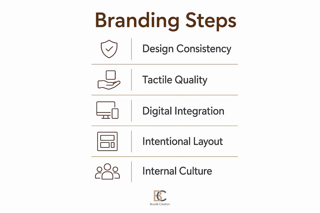
Why tactile quality changes how people perceive your brand
The physical experience of holding a business card is a branding event in itself. Premium paper stock, embossing, foil stamping, and tactile finishes convey emotional tone and build brand authority through touch alone. This is not a subjective observation. Cognitive psychology research on haptic perception consistently shows that physical weight and texture influence judgments of quality and trustworthiness.
Cards printed on at least 350gsm paper are perceived as premium and kept at significantly higher rates than lighter stock. That retention rate matters directly to brand recall. A card that stays in a wallet or on a desk continues working as a brand asset long after the initial meeting.
Different finishes communicate different brand personalities:
- Soft touch matte coating: Signals restraint, sophistication, and modern minimalism
- Foil stamping (gold or silver): Conveys prestige, heritage, and high-end positioning
- Embossing or debossing: Adds depth and tactile interest, reinforcing premium quality
- Spot UV coating: Creates contrast between matte and gloss surfaces, adding visual drama
- Colored or painted edges: Signals creativity and attention to detail, memorable at first glance
A law firm and a creative agency should not hand out the same card stock. The tactile experience should match the brand’s positioning. A firm that charges premium rates for advisory services and hands out a flimsy 250gsm card with a flat finish is sending a contradictory signal. The card should confirm what the price tag implies.
How digital integration extends the reach of physical cards
A physical card and a digital presence are not competing formats. They work together when the card is designed to connect them. QR codes linked to mobile-friendly landing pages transform a static contact card into an active digital marketing touchpoint, directing recipients to portfolios, booking pages, case studies, or video introductions.
Here is how to integrate digital elements without cluttering the design:
- Place the QR code on the back of the card. Back-of-card QR placement keeps the front clean and contact-focused while adding functionality on the reverse.
- Use a custom-branded QR code. Replace the generic black-and-white grid with a version that incorporates your brand color or logo. This keeps the code within your visual identity system.
- Link to a dedicated landing page, not your homepage. A page built specifically for card recipients converts better and tracks engagement more accurately.
- Consider NFC-enabled cards for high-volume networking. Apps like Popl, HiHello, and Linq offer NFC and QR sharing that complement physical cards in sales and conference contexts.
- Test the QR code before printing. Scan it on multiple devices and confirm the destination page loads correctly on mobile.
The goal is not to replace the physical card with a digital one. It is to use the physical card as the entry point into a richer brand experience. The card earns attention. The digital destination earns engagement.
Best practices for designing cards that work as brand tools
The most effective business cards start with a clear brief, not a design template. Before choosing a finish or layout, define what the card needs to accomplish. A card for a financial advisor at a professional services firm has different requirements than one for an independent photographer or a founder at a startup. The card’s design strategy should follow from that goal.
Modern card design favors minimalism with one statement detail, whether that is bold typography, a distinctive cut, or a single foil element. Clutter is the most common failure mode. When a card tries to include every credential, social handle, and service offering, it communicates nothing clearly.
The table below contrasts effective and ineffective approaches across key design decisions:
| Design decision | Effective approach | Ineffective approach |
|---|---|---|
| Information density | Name, title, one contact method, website | Every phone number, five social handles, tagline, and address |
| Typography | One primary font, one accent font, consistent sizing | Three or more fonts, inconsistent weights |
| Back of card | QR code, brand visual, or single call to action | Left blank or overloaded with secondary information |
| Logo treatment | High-resolution vector, correctly scaled | Stretched, pixelated, or inconsistently placed |
| Finish selection | Aligned with brand positioning and audience | Chosen for cost savings rather than brand fit |
Pro Tip: Use the back of the card intentionally. A single strong visual, a QR code, or a short statement gives recipients a reason to turn the card over and spend more time with your brand.
The importance of business cards as brand tools also extends to internal culture. When your team carries cards that reflect a consistent, well-considered identity, it reinforces brand standards across every interaction, not just the ones you control directly.
Key takeaways
Business cards function as physical brand assets that build trust, signal quality, and connect offline introductions to digital engagement, making design consistency and material choice non-negotiable decisions.
| Point | Details |
|---|---|
| Design consistency is non-negotiable | Fonts, colors, and logos must match your full brand system exactly, not approximately. |
| Tactile quality signals brand value | Cards on 350gsm or heavier stock are perceived as premium and retained at higher rates. |
| Digital integration extends card reach | QR codes on the back of cards link recipients to landing pages without cluttering the front. |
| Minimalism outperforms clutter | One statement design detail communicates more clearly than a card packed with information. |
| Card design reflects brand positioning | The finish, weight, and layout should confirm the quality level your pricing already implies. |
Why I still think the business card is the most underrated branding asset
I have worked with a lot of professionals who treat business cards as an afterthought, something to order quickly before a conference and forget about until the next one. That approach consistently produces cards that look like everyone else’s, which is the exact opposite of what a branding tool should do.
What I have observed over years of working on card projects is that the people who treat their cards as a deliberate brand decision, choosing the stock carefully, thinking through the finish, briefing the design with the same rigor they would apply to a website, are the ones whose cards actually get kept. A card that feels different in the hand gets noticed. It gets placed on a desk instead of in a drawer.
There is also something worth saying about the signal a premium card sends internally. When a founder hands their team cards that are clearly well-made, it communicates that the brand is taken seriously at every level. That matters for culture and for how your team represents you in the field.
My recommendation is to treat the card brief the same way you would treat a brand identity brief. Define the audience, the context, the one thing you want the recipient to remember, and then let those answers drive every material and design decision. The card is small. The decision behind it should not be.
— Kostiantyn
Custom business cards built for your brand

If you are ready to treat your business card as the brand asset it should be, Bcardscreation builds fully custom, small-batch cards without templates or automated editors. Every project starts with a design and material consultation, so the card you receive reflects your brand positioning, not a default layout. From luxury foil and fine paper options to clear plastic cards and specialty finishes, each format is chosen to match your brand’s tone and audience. Explore custom business card design at Bcardscreation and see what a card built around your brand actually looks like.
FAQ
What is the role of business cards in branding?
Business cards physically embody brand identity by communicating visual consistency, professionalism, and positioning through design, material, and finish. They function as brand touchpoints that reinforce trust and recall at every in-person interaction.
How do design choices on a business card affect brand perception?
Visual inconsistencies like mismatched fonts, low-resolution logos, or off-brand colors quietly undermine perceived legitimacy before any conversation begins. Consistent use of brand colors, typography, and high-resolution assets signals organizational maturity and credibility.
What paper weight is considered premium for business cards?
Cards printed on at least 350gsm paper stock are perceived as premium and retained at higher rates, which directly supports brand recall after a networking exchange.
Should business cards include QR codes?
Yes, placing a QR code on the back of a card adds digital functionality without cluttering the front. Linking it to a mobile-friendly landing page rather than a homepage improves engagement and allows you to track how recipients interact with your brand after the meeting.
How do physical and digital business cards work together?
Physical cards create the first tactile impression and earn attention. Digital tools like Popl, HiHello, and Linq extend that interaction through NFC and QR sharing, making the two formats complementary rather than competing in different networking contexts.


