

The Role of Business Cards in Client Experience
TL;DR:
- High-quality business cards influence client perceptions through the halo effect and non-verbal trust signals.
- Design consistency, tactile finishes, and digital integration strengthen brand identity, memory, and follow-up rates.
- Effective use involves deliberate timing, matching quality to service level, and embedding cards into broader client experience strategies.
Physical cards are not a relic. They are one of the most concentrated brand signals a professional can deploy in person. The role of business cards in client experience goes well beyond contact sharing. A card communicates quality, intention, and positioning the moment it changes hands. Clients form subconscious judgments within seconds of receiving one, and those judgments stick. This article breaks down the behavioral science, design logic, and practical strategies that determine whether your card builds trust or undermines it.
Table of Contents
- Key takeaways
- The role of business cards in client experience
- How business cards shape client perceptions
- Business cards as brand touchpoints
- Design and material choices that drive recall
- Using cards within broader client experience strategies
- My take on what actually works
- Get a card that matches your brand standards
- FAQ
Key takeaways
| Point | Details |
|---|---|
| Cards trigger the halo effect | High-quality cards shape how clients perceive your overall competence, often before you finish speaking. |
| Consistency across brand touchpoints matters | Your card should visually match your website, proposal, and any other client-facing material. |
| Material choice is a trust signal | Paper weight, finish, and texture communicate professionalism without words. |
| Design hierarchy drives follow-up | Clean layouts with clear information hierarchy increase the likelihood clients act after meeting you. |
| Cards extend into digital interactions | QR codes and NFC integration connect physical card moments to your digital client experience. |
The role of business cards in client experience
When people say business cards are outdated, they are usually thinking about contact exchange. As a standalone function, yes, a phone can do that faster. But that framing misses the actual job a card performs.
The physical exchange of a card creates a sensory anchor that digital sharing cannot replicate. The weight of the card, the texture of its surface, the deliberate act of handing it over — these details register at a subconscious level. Clients hold on to that impression longer than they hold on to a digital contact.
This is not nostalgia. It is behavioral science. And for professionals whose work depends on trust-based client relationships, that distinction changes how business cards should be designed and used.
How business cards shape client perceptions
The halo effect is well-documented in behavioral psychology. It describes how one positive attribute influences how we judge everything else about a person or brand. A high-quality card affects client perception of your overall competence, your attention to detail, and your credibility. All from a 3.5 x 2-inch piece of material.
“A business card acts as a compact billboard that conveys brand identity in seconds, far beyond simple contact sharing.” — ClearBridge Branding
This is why premium materials and tactile finishes function as non-verbal trust signals. When a client receives a card printed on 600gsm duplex cotton stock with debossed typography, they process that quality as evidence of your standards — not just your print budget. The card becomes a proxy for how you do everything else.
Cards that feel cheap send the opposite signal. They suggest corners were cut. That perception travels into the conversation that follows.
Pro Tip: Before finalizing your card design, hold a printed sample next to your brand materials. If the weight, finish, or color feels mismatched, clients will notice, even if they cannot articulate why.
Business cards as brand touchpoints
A card that is well-designed does more than communicate your contact details. It reinforces your brand identity at a moment when the client’s attention is fully on you. That’s a rare and specific opportunity.

Consistent visual branding across your card, website, proposal templates, and digital assets creates a coherent client experience. When everything aligns, clients feel the stability of a professional operation. When it doesn’t, they notice the inconsistency before you do.
Here is what strong brand alignment looks like across a card:
- Typography: Your card uses the same typeface family as your website and documents. Not a similar font. The same one.
- Color: Your Pantone or exact hex values are matched in print, not approximated. Color drift between your brand and your card weakens recognition.
- Layout and white space: The arrangement of elements reflects your brand’s personality. Minimal and structured for a consulting firm. Bold and asymmetric for a creative agency.
- Finish: Matte laminate for understated professionals. Soft-touch for design-forward brands. Foil accents for those positioning in the luxury space.
- Digital integration: A QR code or NFC chip on the card connects the physical moment to your website, portfolio, or booking page without friction.
The last point is worth expanding. Tactile quality combined with digital elements keeps cards relevant across the full client experience. A consultant who hands over a card that links directly to their onboarding form creates a smoother transition from introduction to engagement. The card does active work inside the client experience, not just at the point of exchange.
Design and material choices that drive recall
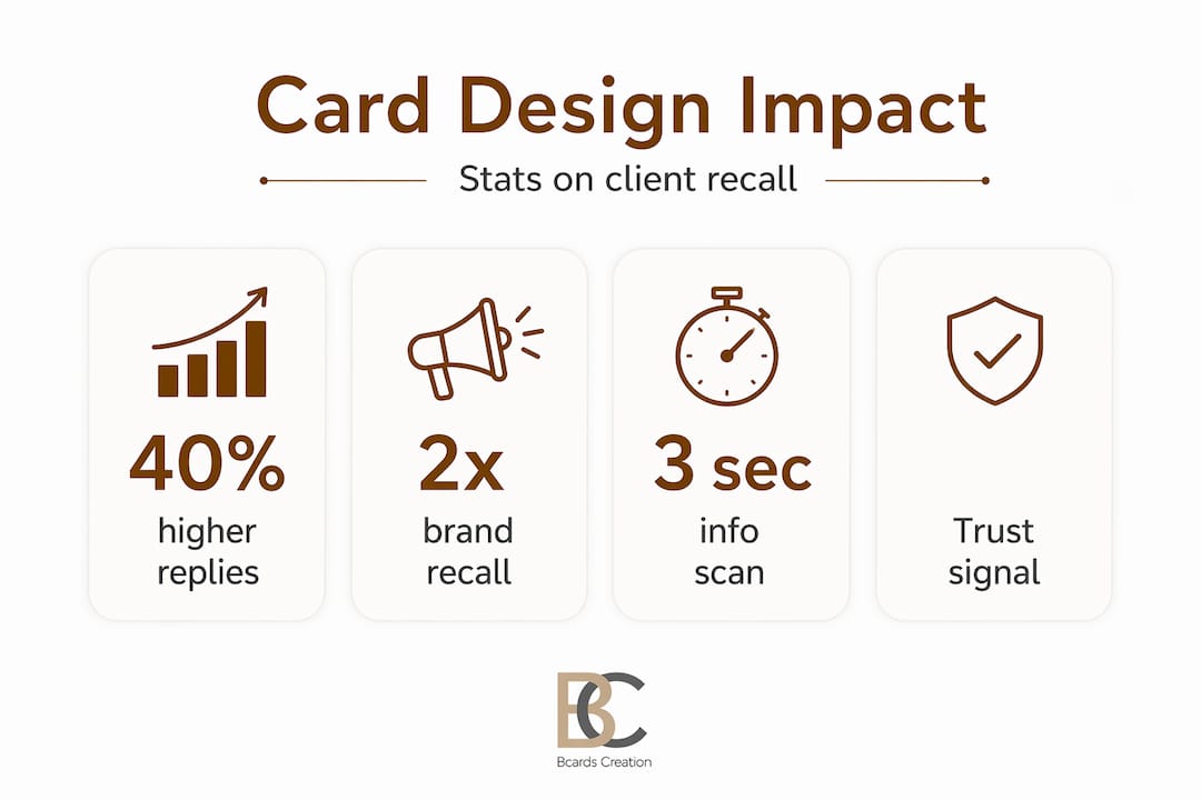
The way information is arranged on a card determines whether clients can use it quickly and whether they remember you. This is not a subjective preference. Minimalist layouts with strategic white space — roughly 30 to 40 percent of the card’s total surface — measurably improve readability and follow-up rates.
| Element | Standard option | Premium option |
|---|---|---|
| Paper weight | 300gsm coated | 600gsm duplex cotton or uncoated |
| Finish | Matte or gloss laminate | Soft-touch, silk, or uncoated natural |
| Typography treatment | Printed flat | Debossed, letterpress, or foil stamped |
| Size and shape | Standard 3.5 x 2 inches | Custom die-cut or square format |
| Digital integration | None | QR code or NFC chip embedded |
A clean, minimalist design can increase follow-up email responses by up to 40% after networking events compared to cluttered layouts. That is a significant return on a design decision that costs nothing extra to implement correctly.
Material choices follow the same logic. Tactile finishes like debossing and embossing increase the time clients spend interacting with a card, which strengthens memory formation. The longer a client engages with your card, the more strongly it anchors to their memory of meeting you.
The hierarchy of information on your card should move from name to role to one primary contact method. Secondary details — a website, a social handle, a physical address — belong at the bottom or back of the card. Clients should be able to reach you in under five seconds of looking at the card. If they have to search, the layout is working against you.
Pro Tip: Ask someone unfamiliar with your work to read your card cold. Time them. If it takes more than four seconds to find your contact method, simplify the layout using a step-by-step design framework before going to print.
Using cards within broader client experience strategies
Business cards as marketing tools work best when they are embedded in deliberate client experience strategies rather than handed out randomly. The moment of exchange matters as much as the card itself.
-
Time the handoff deliberately. At the start of a meeting, a card grounds the introduction. At the end, it reinforces the conversation and prompts follow-up. The best professionals do both — one at the open, one at the close with a specific next step attached.
-
Pair the card with an onboarding sequence. When you give a new client your card, tell them what the QR code leads to. “That link takes you directly to our project intake form.” This connects the physical card to your digital client experience and removes friction from the next step.
-
Match card quality to your service level. If you work with senior decision-makers, a card printed on standard 300gsm stock with digital printing will read as misaligned. The card should reflect the standards clients expect from the service itself.
-
Use cards as leave-behinds in physical spaces. High-end retail spaces, hotel lobbies, waiting areas in professional offices. A well-designed card placed thoughtfully extends your brand presence beyond direct interactions.
-
Include a card in every physical delivery or package. Clients who receive a beautifully packaged product and find a premium card inside get a reinforcement of your brand before they have even used what they ordered.
The ritualized card handoff — presented with both hands, at a slight angle, with a deliberate pause — creates a behavioral anchor that marks the moment as significant. It signals respect and attentiveness. Clients remember it, often without knowing why.
Pairing your card with complementary brand materials also strengthens the overall impression. A cohesive headshot on your card or website, for example, has been shown to build trust and professional credibility faster than text-only profiles.
My take on what actually works
I’ve reviewed a lot of card projects from professionals who genuinely believed their card would do the work their service hadn’t established yet. That rarely plays out well.
What I’ve learned is this: quality cards do not compensate for weak follow-through. Cards are behavioral nudges, not substitutes for operational consistency. They open a door. What the client finds on the other side determines whether the impression holds.
The professionals I’ve seen get the most from their cards are the ones who treat them as one piece of a coherent system. The card matches the website. The website matches the proposal. The proposal matches the service delivery. Every touchpoint says the same thing.
I’ve also noticed that gimmicks rarely age well. A card that spins, lights up, or has an unusual scent creates a moment of surprise. But if your brand is not naturally playful or unconventional, it reads as inconsistent. Clients file that inconsistency away, even when they smile at the novelty.
The best card I’ve ever seen was simple. Heavy stock, one color, letterpress name. Nothing extra. It said everything about the person’s positioning without a single word of copy. That is the standard worth working toward.
— Kostiantyn
Get a card that matches your brand standards
If you’ve read this far, you already understand that a generic, template-based card is not going to reflect the level of work you do.

Bcardscreation works with professionals and brands who treat their card as a strategic asset. Every project starts with a design consultation and material review, not a template selector. From paper weight and finish selection to typography and digital integration, each card is built to match your specific brand positioning and client context. Explore custom business card design to see how the process works, or browse luxury card options with real foil and specialty finishes. The full business card collection is also available for reference.
FAQ
What is the role of business cards in client experience?
Business cards function as physical brand touchpoints that create trust, reinforce brand identity, and anchor client memories at key interaction moments. Their quality signals professionalism and shapes how clients perceive your overall standards.
How do business cards influence client perceptions?
Through the halo effect, a high-quality card positively shapes how clients judge your competence and reliability. Premium materials and tactile finishes serve as non-verbal signals that build confidence before a word is spoken.
What design choices make business cards most effective?
Minimalist layouts with clear information hierarchy, 30 to 40 percent white space, and a single primary contact method improve readability and follow-up rates significantly compared to cluttered designs.
How do business cards work as marketing tools?
Beyond contact exchange, cards extend brand presence across networking events, client onboarding, physical deliveries, and leave-behind placements, making them active tools in a broader client experience strategy.
What material is best for a professional business card?
600gsm duplex cotton or premium uncoated stock with debossing, soft-touch laminate, or letterpress printing communicates the highest level of quality and produces stronger tactile memory than standard coated card stock.


