

How business card design drives effective networking
TL;DR:
- Despite the dominance of digital tools, well-designed physical business cards remain vital for creating memorable professional connections and brand impressions. Thoughtful design elements like color, layout, and material influence networking outcomes by conveying credibility, guiding focus, and sparking conversations. Custom, intentional cards that align with a business’s identity generate better engagement, more referrals, and lasting impressions beyond digital exchanges.
Most people assume digital tools have replaced the business card. They haven’t. A well-designed card handed to the right person at the right moment still creates a connection that no LinkedIn request can fully replicate. Business card design influences professional connections and enduring brand impressions in ways that a screen simply cannot. This guide breaks down exactly how design choices shape networking outcomes, what elements matter most, and how to use your card as a strategic tool rather than a throwaway formality.
Table of Contents
- Why business cards still matter in the digital age
- How design impacts networking outcomes
- Essential design elements for networking cards
- Real-world impact: Networking scenarios and business card success
- What most guides miss about business card design and networking
- Ready to upgrade your networking? Get a business card designed to connect
- Frequently asked questions
Key Takeaways
| Point | Details |
|---|---|
| Design influences networking | A well-designed business card often sparks deeper networking connections than generic cards. |
| Customization drives memorability | Custom elements like unique materials or brand icons make your card stand out at events. |
| Clarity beats clutter | Simple, easy-to-read designs get better results than busy layouts stuffed with information. |
| Intentional choices matter | Every design choice should reinforce your brand and help you be remembered after the exchange. |
Why business cards still matter in the digital age
Digital networking is fast and convenient. But fast and convenient doesn’t always mean effective. When you hand someone a physical card, you create a moment. There’s eye contact, a brief exchange, and a tangible object that represents your business. That moment sticks.
Physical cards carry a sense of credibility that a digital contact often lacks. When someone holds your card, they’re holding a piece of your brand. The weight of the paper, the texture of the finish, the sharpness of the print — all of it communicates something before they even read a single word. Understanding card design importance is the first step toward using cards as a real networking asset.
“A business card isn’t just contact information. It’s a physical representation of your professional identity. Design it like it matters — because it does.”
Here’s why physical cards still hold their ground in a digital world:
- They work without Wi-Fi, a charged phone, or an app download.
- They give the recipient something to keep, pin to a board, or pass along to someone else.
- They create a tactile memory that digital exchanges rarely produce.
- They signal that you take your business seriously enough to invest in presentation.
- They allow for making your business cards stand out in a way that a contact saved to a phone simply cannot.
The bottom line: cards aren’t obsolete. Generic cards are. A card with no design thought behind it gets forgotten. A card with intention gets kept.
With the groundwork laid on business card relevance, let’s break down exactly how design choices influence networking outcomes.
How design impacts networking outcomes
First impressions form fast. Research consistently shows that people make judgments within seconds of meeting someone or receiving something from them. Your card is often the last thing someone sees before you part ways. That means it carries a disproportionate amount of weight in how they remember you.
Business card aesthetics and structure directly shape professional connections, which is why design decisions deserve real attention. Here’s how specific elements play out in real networking situations:
- Color palette. Color communicates brand personality instantly. A bold, high-contrast palette signals confidence. Muted, neutral tones suggest sophistication. The wrong colors create visual noise and make your card harder to read.
- Typography. Font choice affects readability and tone. A clean sans-serif reads as modern and approachable. A serif font can feel established and authoritative. Mixing too many fonts creates confusion.
- Material and finish. This is where cards move from forgettable to memorable. Thick stock, soft-touch laminate, foil stamping, or spot UV coating all create a tactile experience that stands out. People notice the feel before they notice the content.
- Layout and white space. A cluttered card is hard to read and signals disorganization. Clean layouts with intentional white space feel professional and easy to navigate.
- Structure. Standard rectangle cards are expected. Rounded corners, square formats, or die-cut shapes break the pattern and invite a second look.
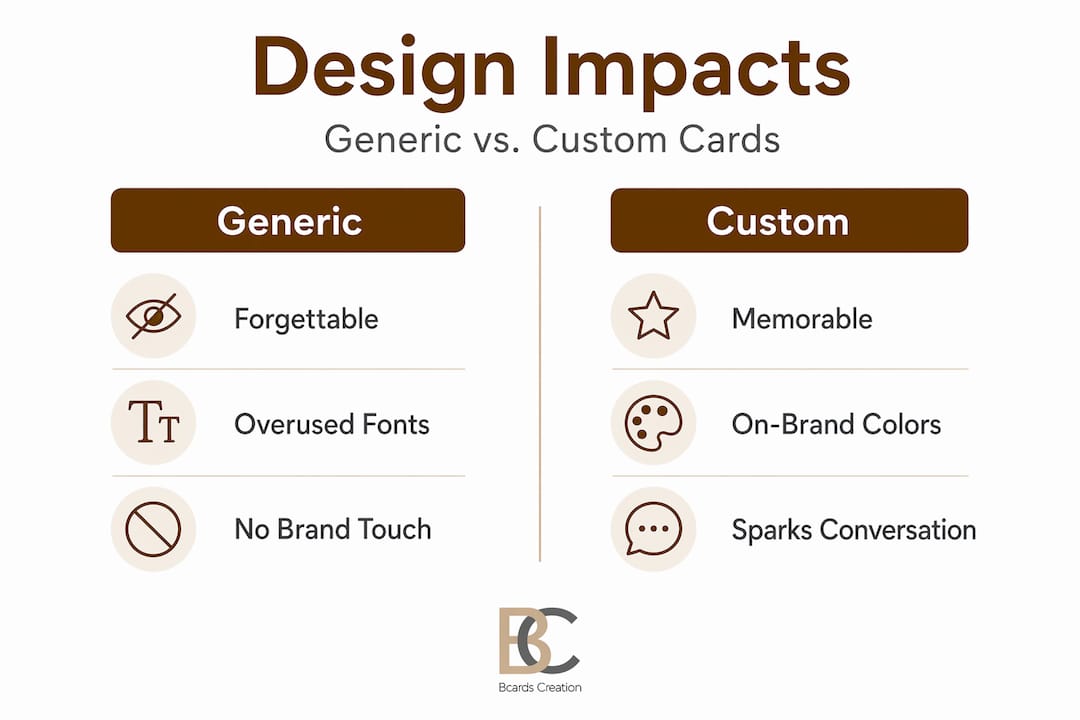
| Design feature | Generic card impact | Custom card impact |
|---|---|---|
| Standard paper stock | Forgettable, bends easily | N/A |
| Premium thick stock | N/A | Feels substantial, signals quality |
| Basic flat print | Reads as low-budget | N/A |
| Foil or spot UV finish | N/A | Creates visual and tactile interest |
| Default template layout | Blends in with others | N/A |
| Custom layout and hierarchy | N/A | Guides the eye, reinforces brand |
| No brand color strategy | Disconnected from identity | N/A |
| Consistent brand palette | N/A | Builds recognition and recall |
Pro Tip: If you’re attending a specific event, consider how your card will look under event lighting. Foil finishes catch light beautifully in dimmer venues and draw attention when cards are spread across a table.
Strong business card brand identity doesn’t happen by accident. It comes from deliberate decisions about every visual element. And unique business card ideas don’t have to mean gimmicky. They mean thoughtful, intentional, and aligned with what your business actually stands for.
Now that you understand design’s power, see how intentional choices create a competitive edge when networking.
Essential design elements for networking cards
Not all design decisions carry equal weight. Some elements are non-negotiable. Others are enhancements that elevate a good card to a great one. And some choices actively hurt your networking results. Knowing the difference saves you time, money, and missed opportunities.
Design principles are tailored for professionals in consulting and service-based roles, but the core framework applies across industries. Here’s what every networking card needs:
Must-have elements:
- Clear hierarchy. Your company name, your name, and your primary contact method should be immediately visible. The reader’s eye should move through the card in a logical order without effort.
- Readable font sizes. Contact details below 8pt are difficult to read. Most information should sit between 9pt and 11pt for comfortable reading.
- Brand-consistent colors. Use the same color palette you use on your website, social profiles, and other materials. Consistency builds recognition over time.
- One primary call to action. Whether it’s a phone number, website, or email, make one contact method the most prominent. Don’t make people guess how to reach you.
- Quality material. The physical feel of your card is part of the message. Thin, flimsy cards undercut even the best design.
| Element | Must-have | Nice-to-have |
|---|---|---|
| Company name and logo | Yes | N/A |
| Your name and title | Yes | N/A |
| Primary contact info | Yes | N/A |
| Brand-consistent colors | Yes | N/A |
| Readable typography | Yes | N/A |
| Premium paper stock | Yes | N/A |
| Foil or spot UV finish | No | Yes |
| QR code to portfolio or website | No | Yes |
| Custom card shape or size | No | Yes |
| Soft-touch laminate | No | Yes |
| Back-side design or content | No | Yes |
Common mistakes that hurt networking results include overcrowding the card with too much information, using fonts that look great on screen but are hard to read in print, and choosing color combinations with poor contrast. Knowing what to avoid on business cards is just as important as knowing what to include.
Pro Tip: Use the back of your card intentionally. A clean tagline, a QR code, or a single strong visual on the back gives the recipient a reason to flip the card over and engage with it longer.
Following a business card design framework helps you avoid guesswork. And if you’re working with a designer, clear communication about your brand goals makes a significant difference in the outcome. Good business card design tips also emphasize that restraint is a design choice. Saying less, but saying it clearly, is almost always more effective than cramming everything onto a 3.5 x 2 inch surface.
With these must-have features in mind, let’s explore how custom cards actively boost networking effectiveness.
Real-world impact: Networking scenarios and business card success
Design theory is useful. But what does it actually look like when a well-designed card changes a networking outcome? Here are three scenarios that illustrate the difference custom design makes in practice.
The trade show table. Imagine a table covered in cards after a busy trade show. Most are standard white rectangles with black text. One card is printed on thick, dark stock with a metallic foil logo and a clean layout. Which one gets picked up and kept? The answer is obvious. Unique card designs fuel memorable professional interactions, and at crowded events, standing out visually is the first filter.
The one-on-one introduction. A consultant meets a potential client at a chamber of commerce event. She hands over a card printed on soft-touch matte stock with a subtle embossed logo. The potential client immediately comments on the feel of the card. That comment opens a conversation about her attention to detail and the quality of her work. The card became a conversation starter without any extra effort.

The referral chain. A small business owner gives a card to a contact who passes it along to a colleague. Because the card includes a clear website and a memorable visual identity, the colleague visits the site and reaches out directly. The original card traveled further than the original handshake.
Here’s what these scenarios have in common:
- The card communicated brand quality before a single word was spoken about the business.
- The design created a reason to engage, comment, or keep the card.
- The follow-up happened because the card made the business easy to remember and easy to contact.
Networking ROI from a well-designed card isn’t just about the moment of exchange. It’s about what happens in the days and weeks after the event. Cards that get kept generate more follow-up calls, more referrals, and more opportunities than cards that get tossed.
A strong presence at standout networking cards level means your card does part of the sales work for you. It keeps your name in front of people who might not be ready to buy today but will remember you when they are.
Having seen the practical impact, let’s critically examine some common beliefs and what most guides overlook.
What most guides miss about business card design and networking
Most articles about business card design focus on trends. Use this color this year. Try this finish. Add a QR code. The advice isn’t wrong, but it misses the point.
Trends change. Your brand shouldn’t.
The real issue with off-the-shelf templates and trend-chasing is that they produce cards that look like everyone else’s. A foil card is only impressive if the foil placement makes sense for your brand. A bold color is only effective if it connects to how you want people to feel about your business. Design choices that aren’t rooted in your specific brand story are just decoration.
We’ve seen this pattern repeatedly. A business owner invests in premium materials but uses a generic layout. The card feels expensive but communicates nothing distinctive. The lasting impact of design comes from alignment, not from any single feature.
The cards that generate real networking results share one quality: every element on the card has a reason to be there. The color connects to the brand. The font reflects the tone of the business. The material matches the level of service offered. The layout guides the reader to the most important information without confusion.
Personal touches matter more than flashy graphics. A card with a subtle design element that sparks a question — a tagline that’s slightly unexpected, a logo that invites a closer look, a texture that feels different — generates more conversation than a card that’s visually loud but conceptually empty.
The uncomfortable truth is that most business cards fail at networking not because of bad printing, but because of generic thinking. You can print a mediocre design on the best paper in the world and still end up forgotten. Intentional, personalized design is what drives results. Everything else is just production.
Ready to upgrade your networking? Get a business card designed to connect
Your next networking event is an opportunity. The question is whether your card is ready to work for you.

At BcardsCreation, every card is designed from scratch, without templates or automated editors. You get direct design guidance, material consultation, and a finished product that actually reflects your business. Whether you need custom business card design built around your brand identity or want to explore creative business cards with specialty finishes like foil and soft-touch laminate, we handle every detail individually. Small batches, premium materials, and a process built around your specific goals. If you’re serious about networking results, start with a card that’s serious about your brand.
Frequently asked questions
What design elements are most important for networking business cards?
Clear contact details, a strong brand logo, and high-quality materials are the most critical elements. Design principles for professionals also emphasize readable typography and a clean visual hierarchy that guides the reader without effort.
Do unique business card materials like foil or transparent plastic help in networking?
Yes, premium materials make your card more memorable and often spark conversations that lead to follow-ups. Unique card designs create a tactile and visual experience that standard cards simply can’t match.
What are the most common mistakes in business card design for networking?
Overcrowding information, poor color contrast, and illegible fonts are the biggest pitfalls. Reviewing what not to put on a card before finalizing your design helps you avoid the most common errors.
Is it better to use a standard template or invest in custom business card design?
Custom designs create stronger networking impressions and reinforce your unique brand identity. Business card aesthetics that are tailored to your brand communicate professionalism and intentionality in a way that templates cannot replicate.


