

Why Double-Sided Business Cards Matter for Branding
TL;DR:
- Most professionals overlook the back of a business card, missing an opportunity to communicate and prompt action.
- Double-sided cards enhance branding by assigning distinct roles to each side, improving clarity and engagement.
Most professionals treat the back of a business card as dead space. That’s the real reason why double sided business cards matter far more than the average networking advice suggests. The back side is not a bonus area for extra phone numbers or a second logo. It’s a second opportunity to communicate, prompt action, and leave a stronger impression. This article covers the strategic reasoning behind double-sided card design, what separates purposeful use from wasted space, and how to make both sides work together as a coherent branding tool.
Table of Contents
- Key takeaways
- Why double sided business cards matter in a digital world
- Core advantages of double-sided cards
- Best practices for double-sided card design
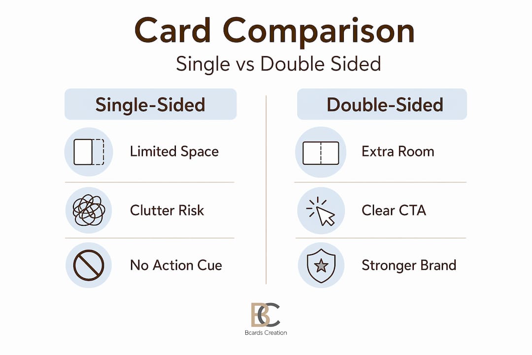
- Single-sided vs. double-sided cards
- How to implement double-sided cards in your brand strategy
- My take on what most professionals get wrong
- Get your double-sided cards designed right
- FAQ
Key takeaways
| Point | Details |
|---|---|
| Double-sided cards serve a strategy | Both sides should have distinct, defined roles — identity on front, action or brand reinforcement on back. |
| Physical cards still drive perception | 72% of people judge a brand’s quality by its business card, making every design decision count. |
| Back side must earn its place | The back side only adds value when it performs a clear function, not when it holds overflow contact details. |
| Design clarity prevents discard | 88% of business cards are thrown away within a week, often due to poor clarity and information overload. |
| Material choice amplifies the message | Tactile quality and finish reinforce the card’s strategic content and shape brand perception before a word is read. |
Why double sided business cards matter in a digital world
Physical cards have outlasted every prediction of their decline. Digital marketing engagement has grown by 350%, yet business cards remain one of the few marketing tools that create genuine, in-person connection. The reason is neurological, not nostalgic.
Physical materials activate multiple sensory pathways at once. When someone holds your card, their brain processes texture, weight, color, and visual layout simultaneously. That multi-sensory input creates stronger memory encoding than a LinkedIn profile or a digital contact exchange ever could. You are not just sharing information. You are creating an experience.
This matters specifically for professionals and entrepreneurs because first impressions in networking are formed within seconds. A card that feels premium signals competence before the other person has read a single word. The halo effect research confirms this directly: positive card impressions carry over into broader judgments about a brand’s trustworthiness and professionalism.
Consider what this means in a competitive context. Two consultants meet the same potential client at an industry event. One hands over a thin, single-sided card printed on standard stock. The other presents a double-sided card on a textured substrate with a matte finish and a clean QR code on the back. The second person has not said more. They have just communicated more, through the card itself. That’s not a minor difference. It’s a positioning signal.
Core advantages of double-sided cards
The benefits of double sided cards come down to one central idea: separation of purpose. When both sides have defined roles, the card becomes a structured communication tool rather than a crowded rectangle of text.
Here’s how that separation typically works in practice:
- Front side holds your core identity: name, title, company, and one primary contact method. Clean, readable, and instantly scannable.
- Back side performs a single, specific function. This could be a QR code linking to your portfolio, an appointment booking prompt, a concise service highlight, or a social handle worth following.
- Visual differentiation between sides signals to the recipient that each side has a distinct purpose. Different background colors, finish types, or layout orientations all achieve this.
- Brand storytelling gets room to breathe. A tagline, a striking image, or a short positioning statement can live on the back without crowding your contact details.
The double sided card advantage is not just aesthetic. A QR code on the back eliminates the friction of manual data entry, which is the single biggest barrier to post-networking follow-up. One scan, and the recipient has your full contact information saved on their phone.
Pro Tip: Treat the back side like a call to action on a landing page. It should have one clear next step, not three competing options. Too many choices on the back side create the same paralysis as a cluttered website.

What you want to avoid is using the back purely as overflow. If your front side is too crowded and you move the excess to the back, you have not solved the problem. You have split a bad design into two pages. The goal is strategic separation, not spatial relief.
Best practices for double-sided card design
Design decisions on a double-sided card should be made with purpose. Each choice, from font size to finish type, affects how the card is read and remembered.
Front side: clarity above everything
Keep the front to five elements or fewer: your name, your title or role, your company name, one phone number or email, and your website or primary social link. That’s it. Limited space forces prioritization, and prioritization creates faster, clearer communication for the recipient.
Back side: one job, done well
The back side should have a singular function. A QR code that links to a curated landing page is the highest-performing option for most professionals because it bridges the physical card to digital content. Alternatively, a well-designed portfolio thumbnail, a short testimonial, or an appointment reminder card format can each serve a specific professional purpose.
Avoid these common mistakes on the back side:
- Repeating information already on the front (company address listed twice, same logo, same tagline)
- Listing every service you offer without context or hierarchy
- Using a font size under 7pt in an attempt to fit more content
- Leaving the back entirely blank, which signals a missed opportunity rather than restraint
Pro Tip: Match the finish on both sides intentionally. A gloss front with a matte back creates tactile contrast that draws attention to the back side and signals that it contains something worth reading.
Material and tactile quality
The quality and deliberate design of a business card create subconscious impressions that inform how recipients perceive your brand before they’ve processed the content. Heavier stock, specialty finishes like soft-touch or linen, and precise die-cutting all communicate investment and attention to detail. These are not cosmetic choices. They are part of the message.
For more depth on finish selection, the guide on business card finishes covers how different textures and coatings affect both perception and print quality.
Single-sided vs. double-sided cards
Here’s a direct comparison to help you evaluate which format suits your professional context.
| Feature | Single-sided | Double-sided |
|---|---|---|
| Information capacity | Limited to essentials | Room for identity plus one action |
| Design flexibility | Minimal | High, with distinct side roles |
| Cost | Lower | Slightly higher |
| Networking impact | Functional | Strategically differentiated |
| Best for | Simple contact exchange | Brand-driven networking |
| Ideal user | Freelancers with minimal offerings | Consultants, founders, creatives |
Single-sided cards work when your brand is well established and your contact details alone carry enough weight. They also work when simplicity is the brand. A minimalist creative or a well-known executive might intentionally choose one side as a statement.
Double-sided cards align with professionals who have more to communicate. That includes:
- Consultants who want to highlight a specific service or result
- Founders whose brand story requires visual context
- Creative professionals whose work benefits from a portfolio thumbnail or visual sample
- Anyone using networking as a primary client acquisition channel
The return on a double-sided card is not just the added space. It’s the added intentionality. A card that clearly uses both sides with purpose signals that you think carefully about how you present yourself. That subconscious signal matters in professional relationships. Authenticity in branding extends to the physical artifacts you use to represent your business, and a double-sided card designed with care is one of the clearest expressions of that.
How to implement double-sided cards in your brand strategy
Knowing what is double-sided business card printing is only the start. Making it work requires aligning the card with your broader brand presence.
-
Define the back side’s job before designing it. Ask one question: what do you want the recipient to do after reading this card? Book a call? Visit your site? Follow you on a specific platform? That answer determines the entire back-side layout.
-
Align materials with brand positioning. If your brand is premium, the card stock must reflect that. A luxury consulting firm printing on thin, uncoated stock sends a contradictory message. Match the physical experience to the brand promise.
-
Use QR codes that link to curated destinations. Do not link to your homepage. Link to a landing page built specifically for networking contacts — one that speaks directly to the context in which you hand out cards. This is where QR codes on business cards become a measurable networking tool rather than a passive element.
-
Standardize across your team. If you have staff who network on behalf of the business, their cards should maintain consistent design logic. The back side message should be consistent even if names and titles differ.
-
Track follow-up rates. The ultimate measure of any business card is whether it generates a follow-up conversation. Use a unique QR code URL for each card version so you can see which networking events or card designs produce actual engagement.
The goal is a card that does specific work inside your sales or relationship-building process, not one that simply exists as a formality.
My take on what most professionals get wrong
I’ve worked with enough clients to recognize a pattern. Most professionals who come to Bcardscreation for a double-sided card have already made one fundamental error before we even start the design conversation: they’ve decided what they want to put on the back before deciding why.
The back side of a card is not a creative exercise. It’s a decision about what you want to happen next. I’ve seen beautifully printed cards that list four social handles, two service categories, a tagline, and a discount code on the back. That card doesn’t prompt action. It creates confusion.
The professionals whose cards actually generate follow-ups treat the back side the same way a good designer treats a call-to-action button: one message, one direction, zero ambiguity. They also understand that card design is inseparable from the card’s strategic function. The visual choices reinforce or undermine the message.
My honest advice: if you cannot clearly state the single thing you want the back of your card to accomplish, you are not ready to print it. Spend more time on that answer. The design will follow naturally.
— Kostiantyn
Get your double-sided cards designed right

Understanding the strategy is one part of this. Executing it in print is another. At Bcardscreation, every double-sided card project starts with a conversation about purpose, not paper size. The team works without templates, developing each card around your brand’s specific goals, materials, and design logic.
If you want a card that performs a real function in your networking, explore custom business card design options at Bcardscreation. For clients who want standout finishing, the luxury card printing options include real foil, specialty coatings, and premium substrates that make both sides of your card count.
FAQ
Why use double-sided business cards instead of single-sided?
Double-sided cards allow you to separate your identity from your call to action, reducing clutter and improving clarity. This separation makes the card more memorable and more functional in professional networking.
What should go on the back of a double-sided business card?
The back side should serve one specific purpose: a QR code, a portfolio highlight, an appointment booking prompt, or a service summary. Avoid using it as overflow space for extra contact details.
Do double-sided business cards cost significantly more?
The cost difference is generally modest. What matters more is whether the additional space is used purposefully. A well-executed double-sided card produces better networking results, which justifies the incremental cost.
How do double-sided cards improve networking follow-up?
A QR code on the back eliminates friction by replacing manual contact entry with a single scan. Reducing that friction directly increases the likelihood of a follow-up action.
What is double-sided business card printing?
Double-sided business card printing means applying distinct design and content to both the front and back of a card. When done strategically, each side serves a different purpose within a single, cohesive brand communication.


