

How to choose the best business card finishes
TL;DR:
- The choice of business card finish influences brand perception, durability, and tactile impact. Selecting the right finish depends on brand identity, target audience, handling, budget, and longevity expectations. Careful verification and subtle detail considerations create memorable, high-end cards that leave a lasting impression.
You hand someone your card and they glance at it for three seconds. That’s often all you get. A thin, flimsy card with a flat finish can signal the wrong things about your brand before you even finish your pitch. Finishes aren’t just decorative. They affect how your card feels, how long it lasts, and what your brand communicates at a glance. This guide walks you through every major finish option, the factors that should drive your decision, and the practical steps to verify your choice before committing to a full print run.
Table of Contents
- Understanding business card finishes and their importance
- Factors to consider when selecting your finish
- Comparing costs and premium options
- Mistakes to avoid when choosing business card finishes
- How to verify your card finish before printing large runs
- Why small details on finishes create standout cards
- Ready to create your perfect custom card?
- Frequently asked questions
Key Takeaways
| Point | Details |
|---|---|
| Match finish to brand | Choose card finishes that reinforce your company’s personality and the impression you want to make. |
| Consider durability | Select finishes like soft-touch or thicker stocks for longer-lasting, professional cards. |
| Balance cost and impact | Premium finishes elevate your card but should fit your budget and business goals. |
| Verify before printing | Always test physical samples to ensure the finish meets your expectations before placing large orders. |
Understanding business card finishes and their importance
A business card finish is the surface treatment applied to the card stock after printing. It changes how the card looks, how it feels in the hand, and how well it holds up to daily use. Choosing the right one is not a style choice alone. It’s a brand decision.
Here are the main finish types you’ll encounter:
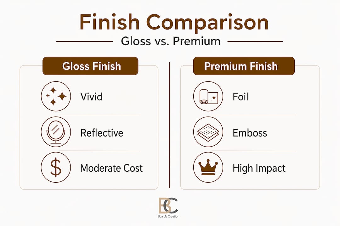
- Gloss: A shiny, reflective coating. Makes colors pop and photos look vivid. Low fingerprint visibility but can feel less refined in formal settings.
- Matte: A flat, non-reflective surface. Feels understated and professional. Slightly more prone to showing scuffs over time.
- Soft-touch: A velvety, rubberized coating that feels premium in hand. Soft-touch finishes offer high fingerprint resistance and durability, making them a strong choice for cards that get handled frequently.
- Spot UV: A glossy coating applied selectively to specific design elements, such as a logo or name, while the rest stays matte. Creates contrast and visual interest.
- Foil stamping: A metallic layer pressed onto the card using heat and pressure. Gold, silver, rose gold, and holographic options exist. Creates a high-end visual impact.
- Emboss: A raised texture created by pressing the card from behind. Bold and tactile.
- Deboss: The opposite of embossing. The design is pressed inward for a subtle, refined look.
Each finish sends a different signal. Gloss says vivid and energetic. Matte says calm and sophisticated. Foil says luxury. Soft-touch says precision and care. Understanding business card materials for brand impact helps you match the right finish to the right message.
Here’s a quick comparison to guide your thinking:
| Finish type | Visual effect | Durability | Brand signal |
|---|---|---|---|
| Gloss | Vivid, reflective | Moderate | Bold, energetic |
| Matte | Flat, calm | Moderate | Refined, professional |
| Soft-touch | Velvety, subtle | High | Precise, premium |
| Spot UV | Contrast, selective shine | High | Creative, detailed |
| Foil | Metallic, striking | Moderate | Luxury, exclusive |
| Emboss | Raised texture | Requires thick stock | Strong, tactile |
| Deboss | Sunken texture | Requires thick stock | Subtle, classic |
Reading about premium business card design explained in detail helps bridge the gap between design intent and material selection.
Factors to consider when selecting your finish
Now that you know what’s possible, here’s how to align those possibilities with your unique needs.
-
Your brand’s visual identity. A law firm projects authority. A creative agency projects originality. A tech startup projects innovation. Your finish should match that energy. A soft-touch matte card with debossing works beautifully for a financial advisor. A spot UV card on thick white stock works better for a branding consultant.
-
Your target audience. Think about who receives your card. Executives in traditional industries often respond better to understated finishes. Creatives and design-forward clients tend to appreciate tactile surprises like foil or soft-touch. Age, culture, and professional norms all play a role.
-
How much your cards get handled. Cards that sit in wallets and get passed around daily need durability. Gloss and soft-touch hold up better than plain matte in high-contact situations. If your card is likely to be stored or displayed, durability matters less than visual impact.
-
Budget. Not every finish costs the same. And not every project requires the most expensive option. Knowing your per-card budget helps narrow the field quickly without second-guessing yourself.
-
Longevity expectations. Are these cards for a single event or long-term distribution? Cards for an annual conference can prioritize wow factor. Cards for ongoing networking need to stay sharp-looking for months.
Gloss works for bold visuals while matte and soft-touch offer subtle sophistication. Similarly, emboss is visible and bold while deboss reads as understated elegance. Neither is better. They serve different goals.
Your guide to premium finishes can give you deeper visual examples of how these combinations work in practice. You can also explore how other brands design a unique business card that stands apart in their category.

Pro Tip: Don’t pick a finish in isolation. Look at your logo, your color palette, and your overall brand materials together. Your card finish should feel like it belongs to the same visual family.
Comparing costs and premium options
Equipped with decision drivers, it’s time to factor in costs and find premium value.
Pricing for business card finishes varies significantly based on the technique, order size, and whether custom dies or setups are required. Here’s a general breakdown:
| Finish type | Approx. cost per 100 cards | Notes |
|---|---|---|
| Basic matte or gloss | $20 to $50 | Most widely available, lowest cost |
| Soft-touch or spot UV | $50 to $100 | Mid-tier; excellent tactile impact |
| Foil or emboss/deboss | $100+ | Premium; custom dies increase cost |
| Small batch or custom | Higher per unit | Less economy of scale |
Cost ranges show foil and emboss at $100 or more per 100 cards, with prices rising for short runs and custom setup fees. That’s a meaningful investment. But context matters.
If you’re a consultant who hands out 25 cards a month to high-value prospects, spending $150 on 100 premium foil cards is a smart investment. If you’re giving away 500 cards at a trade show booth, a mid-tier soft-touch option at $75 per 100 may deliver a stronger return.
The tradeoff between volume printers and premium studios is real. High-volume printers offer lower per-unit costs but often rely on standardized setups, limited stock options, and automated workflows. Premium studios like BcardsCreation work with you on material selection, finish combinations, and design that would be impossible to replicate through a template-based checkout. You get better outcomes because the process is more deliberate.
Brand ROI in focus: One well-designed, premium-finish card handed to a single decision-maker can generate more return than 500 plain cards handed to a general audience. Think about the value of the relationship, not just the quantity.
Explore luxury business card essentials to understand how material choices and finish combinations work together at the premium end of the market.
Pro Tip: When evaluating cost, factor in how the card positions your brand. A $1.50 per-card cost is negligible if it contributes to a $10,000 client conversion.
Mistakes to avoid when choosing business card finishes
Execution is key. Here’s how to steer clear of common missteps for a card you’ll be proud to hand out.
-
Skipping thick card stock for embossed designs. Thick stocks of 30pt or more prevent emboss collapse and ensure the raised texture stays crisp over time. Using a thin stock with embossing results in distortion and premature wear. This is one of the most common and preventable mistakes.
-
Layering too many finishes at once. Foil plus emboss plus spot UV on a single card can feel chaotic. Each element competes for attention. The best premium cards often use one or two finishes with clear intent. Restraint is part of the design strategy.
-
Ignoring how the card will actually be handled. A soft-matte finish looks stunning in photos but can show scuffs quickly when stored in a leather wallet. Think about where your card will live after you hand it over.
-
Ordering without samples. Finishes look different on screen than in person. Soft-touch feels completely different than it photographs. Never commit to a large print run without reviewing a physical proof first.
-
Mismatching finish to ink or design. Some printing techniques, like heavy ink coverage, interact poorly with certain coatings. A gloss UV coat over dark ink can crack or peel. Ask your print partner about compatibility before finalizing the design.
“The card is often the last tangible impression you leave behind. Getting the finish wrong doesn’t just miss the mark. It actively undermines the credibility you spent the meeting building.”
Use a solid professional card checklist to catch these issues before they become expensive problems. It’s also worth reviewing must-have card details to make sure your content and design are as strong as your material choices.
How to verify your card finish before printing large runs
Once you’ve made your selection, don’t skip this vital step to validate your investment.
-
Request a physical sample. Ask your printer or studio for a sample card that uses the exact finish, stock, and coating combination you’ve selected. A digital proof is useful but not sufficient. You need to hold it.
-
Test durability in real conditions. Bend it slightly. Rub your thumb across the surface to check for fingerprints or smudging. Scratch it lightly with a fingernail to test coating resilience. Drop it in your bag with your keys and check it an hour later.
-
Examine it under different lighting. Foil and spot UV look dramatically different under fluorescent office lighting vs. warm ambient lighting. Check your sample in multiple environments to confirm the effect works across contexts.
-
Get a second opinion. Show it to a colleague, a trusted client, or someone in your target audience. You want a real reaction, not just reassurance. Ask them what the card communicates. Their answer should match your intent.
-
Approve only when confident. Don’t rush to production because a deadline feels close. One round of adjustments before printing saves far more time and cost than a reprinting the full run.
Understanding what defines luxury cards helps you calibrate your expectations and ask the right questions during this review stage.
Pro Tip: Keep the approved sample taped to your order confirmation. When the full run arrives, use it as your quality benchmark to check consistency across the batch.
Why small details on finishes create standout cards
Here’s something most guides won’t tell you. The most memorable cards aren’t always the flashiest. They’re the most considered.
We’ve seen clients come to us asking for the maximum. Foil on every element. Emboss plus spot UV. All the premium signals at once. And sometimes, we gently redirect them. Not because the techniques aren’t impressive, but because layering too many effects creates noise. The card stops communicating a brand and starts competing with itself.
What actually gets noticed in a stack of cards isn’t always what costs the most. It’s the card that feels different in the hand before the person has even looked at it. A 32pt soft-touch card with a single debossed logo. A clean matte card with a precise foil monogram. These choices create a pause. A moment of “wait, what is this?”
The professionals who invest in subtle, intentional tactile details tend to see their cards kept rather than discarded. That’s the real metric. Not how impressive the card looks in the first three seconds, but whether it’s still sitting on someone’s desk three weeks later.
Gloss and foil earn the initial reaction. Soft-touch and weight earn the lasting one. The feel of a card carries a brand signal that visuals alone can’t. That’s not decoration. That’s strategy.
Explore luxury card inspiration to see how restraint and precision work together in real-world premium card design. The examples there might shift how you think about what “premium” actually means.
Ready to create your perfect custom card?
If this guide helped clarify what finish fits your brand, the next step is putting it into practice.

At BcardsCreation, every project is built from scratch. No templates. No automated checkout that guesses your brand’s needs. You get material consultation, finish guidance, and hands-on design collaboration. Whether you’re drawn to soft-touch, foil, painted edges, or specialty clear plastic cards, the range is wide and every option is fully customizable. Start with custom business card design to explore what’s possible, or browse the full lineup of creative and luxury business cards to see what premium looks like in practice. Your card should do work for your brand. Let’s make sure it does.
Frequently asked questions
What is the most durable business card finish?
Soft-touch finishes offer high fingerprint resistance and durability, and pairing them with thick card stocks of 30pt or more keeps embossed designs from collapsing over time.
Which finish is best for bold and colorful business cards?
Gloss finishes enhance bold visuals by amplifying color vibrancy and providing a reflective surface that makes photography and bright palettes stand out.
How much do premium finishes like foil or embossing cost?
Foil and emboss finishing starts at $100+ per 100 cards, and costs rise further for small custom runs or designs that require custom die cutting.
Do thick business cards always look more premium?
Thickness adds a tactile sense of quality and helps thick stocks prevent emboss collapse, but the right finish choice is equally important for the card to read as genuinely premium.
Recommended
- Guide to premium business card finishes for max impact – BcardsCreation
- Design a unique business card that sets your brand apart – BcardsCreation
- Defining modern business card materials for brand impact – BcardsCreation
- 7 Essentials for Luxury Business Cards in 2025: Materials, Finishes, a – BcardsCreation


