

Branding Tips for Cards That Build Real Recognition
TL;DR:
- Effective branding on business cards involves limiting content to 6-8 elements, using deliberate design choices, and maintaining consistency across all touchpoints. High-contrast colors, tactile materials, and well-structured layouts create memorable, high-quality impressions that reinforce your brand identity. Integrating these principles ensures your card functions as a strategic tool rather than just a contact sheet.
Branding tips for cards are design and strategic principles that ensure your business card communicates your brand identity clearly, consistently, and memorably. A well-branded card is not a formality. It is a physical representation of how you position yourself in a competitive market. Tools like Krumzi and Canva offer starting points for card creation, but the decisions that matter most — color, typography, material, and layout — require deliberate thinking, not default templates. The goal is a card that someone keeps, not one that ends up in a drawer.
1. Branding tips for cards start with the right information balance

The first branding decision on any card is what to include. Six to eight pieces of information is the proven standard: your name, title, company name, phone number, email address, website, and logo. That list covers everything a contact needs to reach you and recognize your brand. Adding more than that creates visual noise that competes with your branding.
The most common mistake is treating a business card like a resume. Social media handles, multiple phone numbers, fax numbers, and taglines all fight for attention on a 3.5 x 2 inch surface. Every element you add reduces the visual weight of the elements that matter. Prioritize the contact method your clients actually use, whether that is email, phone, or a booking page, and cut the rest.
- Include: name, title, company, one phone number, one email, website URL, logo
- Exclude: multiple social handles, secondary addresses, lengthy taglines
- Keep the back of the card available for design or a single call to action
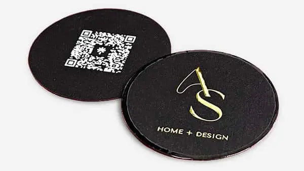
Pro Tip: Use a branded QR code on the back of the card linking to your portfolio or booking page. It adds functionality without cluttering the front, and it can be styled in your brand colors to stay visually consistent.
2. Typography choices that anchor your brand identity
Typography is one of the most direct expressions of brand personality on a card. Use a maximum of two fonts: one for your name and company, one for contact details. More than two creates visual inconsistency that reads as amateur, not creative.
Body text should never fall below 8pt, with contact information sitting between 8pt and 10pt. Your name and company name should be the largest elements on the card, at 12pt or above, to anchor the hierarchy. This is not just a readability rule. It is a branding rule. The largest element gets remembered first.
Fonts carry personality. A geometric sans-serif like Futura signals modern and minimal. A serif like Garamond reads as established and traditional. Neither is wrong, but both must match your brand voice across every other touchpoint, from your website to your email signature.
- Use 2 fonts maximum: one display, one body
- Set contact info at 8pt to 10pt; name and company at 12pt or larger
- Avoid light-weight or low-contrast fonts that disappear on paper
Pro Tip: Test your font choices printed on paper before finalizing. Fonts that look clean on screen often lose definition at small sizes in print, especially on textured or colored stock.
3. Color selection that drives recognition
Color is the fastest brand signal on a business card. Bold colors boost brand recognition by up to 80%, which makes your palette one of the highest-leverage decisions in the entire design process. Use two to three colors: your primary brand color, a secondary or accent color, and one neutral for text or background.
A limited palette of 2 to 3 colors maintains aesthetic clarity and keeps the card from looking busy. The most common error here is choosing colors that look strong on screen but lose contrast when printed. Light gray text on white, pale gold on cream, and pastel-on-pastel combinations all fail in print. High contrast between text and background is non-negotiable for legibility.
Your card colors must match your website, social profiles, and any physical packaging you use. Inconsistency across touchpoints signals a brand that has not thought through its identity. Clients notice this, even when they cannot name exactly what feels off.
4. Materials and finishes that create a tactile brand experience
The physical experience of holding a card communicates brand quality before the recipient reads a single word. Embossing and metallic foil add layers of craft and physicality that standard printing cannot replicate. The moment a client runs their thumb across a raised logo or a foil-stamped name, they form an impression of your brand’s attention to detail.
Card stock thickness matters. A thin, flimsy card signals low investment. A 16pt or 18pt card stock with a soft-touch matte laminate communicates premium positioning without a word. The finish you choose should align with your brand values and the expectations of your clients.
Common finish options and their branding effects:
- Soft-touch matte laminate: Signals luxury and restraint. Popular in creative and consulting industries.
- Spot UV coating: Adds gloss to specific design elements like logos, creating contrast and visual depth.
- Metallic foil stamping: Communicates exclusivity. Works well for gold, silver, or rose gold accents on dark stock.
- Embossing and debossing: Creates tactile texture on logos or borders. Reinforces premium positioning.
- Clear or transparent plastic cards: Signals modern, design-forward brands. High visual impact.
- Colored edge cards: Adds a subtle detail visible only when the card is held from the side. Effective for differentiation without redesigning the face.
Sustainable materials are also a branding statement. Recycled cotton paper, seed paper, or FSC-certified stock communicates environmental values to clients who share them. This is not a trend. It is a positioning decision. You can read more about how material selection affects brand impact before committing to a stock.
Pro Tip: Align your material choice with what your clients expect from your category. A law firm and a design studio can both use premium cards, but the right premium finish for each is very different.
5. Layout and design strategies for standout cards
Layout determines how the eye moves across your card. The most effective cards use a clear visual hierarchy: logo at the top or center as the primary anchor, name below it, and contact details grouped at the bottom. This structure mirrors how people read and ensures your brand identity registers before your contact information.
White space is not wasted space. It is the design element that makes everything else more readable. Cards that fill every available area feel cluttered and reduce the perceived quality of the brand. Restraint in layout signals confidence.
| Layout choice | Best for | Trade-off |
|---|---|---|
| Horizontal orientation | Traditional industries, corporate roles | Standard, less distinctive |
| Vertical orientation | Creative fields, modern brands | Stands out, requires careful hierarchy |
| Double-sided printing | Brands with strong visual identity | Adds 10 to 20% cost, premium result |
| Minimal front, detailed back | Clean branding with full contact info | Requires disciplined front-side editing |
Double-sided cards allow you to keep the front clean and brand-focused while moving all contact details to the back. This is the most effective way to present a strong visual identity without sacrificing utility. The front becomes a brand statement. The back becomes a reference sheet.
Always use vector format logos in SVG or AI format for printing. Pixelated logos signal amateur design and damage brand credibility immediately. No finish or premium stock can compensate for a blurry logo.
Pro Tip: If your logo does not work at small sizes, create a simplified version specifically for card use. Many strong logos have a secondary mark or icon that scales better than the full wordmark.
6. How brand consistency across cards supports your overall strategy
A business card is one touchpoint in a larger brand system. The fonts, colors, and logo treatment on your card must match your website, email signature, social media profiles, and any physical packaging you use. Inconsistency across these touchpoints creates friction in how clients perceive your brand. It signals that the brand is not fully formed.
Branded presentation and unboxing experiences are now recognized as strategic brand moments. Research shows 61% of customers feel more excited by branded packaging, and 41% are more likely to purchase again after a strong unboxing experience. The same logic applies to business cards. How you present and deliver your card is part of the brand experience.
Cards also function as a storytelling tool. The back of a card can carry a short brand statement, a visual element from your brand system, or a texture that reinforces your positioning. This is not about adding more words. It is about using every surface deliberately. Explore how cards support personal branding to understand the full strategic scope of this touchpoint.
Referral potential also increases with consistent branding. When a client passes your card to a colleague, that card must communicate your brand accurately without you in the room. A card that looks and feels like your brand does that work automatically.
Key takeaways
Effective business card branding requires consistent identity, deliberate material choices, and disciplined design decisions that work together across every client touchpoint.
| Point | Details |
|---|---|
| Limit card content | Include only 6 to 8 core elements to keep the design clean and brand-focused. |
| Control your palette | Use 2 to 3 brand colors with high contrast to maximize recognition and legibility. |
| Choose materials deliberately | Card stock, finish, and texture communicate brand quality before the card is read. |
| Maintain cross-touchpoint consistency | Fonts, colors, and logo usage must match your website and all other brand materials. |
| Use layout to direct attention | Place your logo as the primary visual anchor and use white space to strengthen hierarchy. |
What I’ve learned from watching clients get this wrong
Most entrepreneurs come to the card design process thinking about information. They want to fit in their title, their tagline, their three social handles, and their QR code, all on the front. The result is a card that communicates nothing clearly because it tries to communicate everything at once.
The shift I see in clients who get it right is when they stop thinking about the card as a contact sheet and start treating it as a brand object. That shift changes every decision. Suddenly the logo gets more space. The color palette tightens. The font choice gets reconsidered because it has to match the website now, not just look good in isolation.
73% of financial institutions have moved to flat card designs specifically to improve brand storytelling space. That is not a coincidence. Flat, minimal designs force you to make deliberate choices about what matters. The same discipline applies to business cards across every industry.
The other pattern I see consistently: clients underestimate material. They approve a design on screen and then are surprised when the printed card feels thin or the colors look different on uncoated stock. Material consultation is not optional. It is part of the design process. The physical experience of the card is part of the brand message.
Iterative proofing matters more than most people expect. Print a physical proof before approving the full run. Fonts that look sharp on screen can lose definition at 8pt on textured paper. Colors shift between RGB and CMYK. A proof catches these issues before they become a batch of cards you cannot use.
— Kostiantyn
Get cards that match your brand, not a template
Bcardscreation works with entrepreneurs and founders who treat their business card as a positioning tool, not a commodity. Every project starts with a design and material consultation, not a template picker. You choose from specialty papers, plastic cards, foil finishes, and refined production techniques, all developed individually for your brand.
If you are ready to translate these branding principles into a physical card that holds up in any room, explore Bcardscreation’s custom business card design service. For brands that want maximum visual impact, the luxury foil card options are worth a close look.
FAQ
What information should a branded business card include?
A business card should include 6 to 8 elements: your name, title, company name, one phone number, one email address, your website, and your logo. Anything beyond that competes with your brand identity rather than supporting it.
How many colors should a business card use?
Use 2 to 3 colors maximum. Stick to your primary brand color, one accent, and a neutral for text or background. High contrast between text and background is required for legibility in print.
What font size is readable on a business card?
Contact information should be set at 8pt to 10pt minimum. Your name and company name should be 12pt or larger to anchor the visual hierarchy. Never go below 8pt for any printed text on a card.
Does card material affect brand perception?
Yes. The physical experience of a card communicates brand quality before the recipient reads anything. Premium finishes like soft-touch laminate, foil stamping, and embossing signal investment and attention to detail that standard printing cannot replicate.
Should business cards be double-sided?
Double-sided cards are worth the added cost for most brands. The front carries your logo and brand identity; the back holds contact details and optional QR codes. This separation keeps the front clean and makes the card more memorable as a brand object.


