

Clear plastic card design guide: craft a premium card
A clear plastic business card can stop someone mid-conversation. It feels different, looks different, and signals that your brand takes presentation seriously. Yet most clear cards fail before they even get printed, because the design skips critical steps. 55% of recipients refer contacts when they receive a high-quality card, and cards are 10x more likely kept when they are high-quality and colorful. This guide walks you through every stage, from prep to print to final quality check, so your card works as hard as you do.
Table of Contents
- Understand the impact of clear plastic card design
- Gather your tools and design requirements
- Design for clarity and brand impact: best practices
- Printing: one-sided vs. double-sided and cost considerations
- Troubleshooting and testing your clear plastic card
- Get your premium clear plastic cards designed by experts
- Frequently asked questions
Key Takeaways
| Point | Details |
|---|---|
| Clarity drives results | A clear, premium card dramatically increases brand recall and client referrals for your business. |
| Print preparation matters | Select the right thickness, size, and artwork specs to guarantee a professional finish. |
| Design for readability | Use large, bold fonts and contrast with white ink for maximum impact and legibility. |
| Choose print style wisely | Single-sided prints are best for clarity; double-sided needs advanced techniques and extra cost. |
| Test before final print | Order proofs and review in real settings to ensure your design stands out as intended. |
Understand the impact of clear plastic card design
Clear plastic cards are not just a novelty. They carry real weight in how your brand is perceived. The clear plastic business card impact on first impressions is measurable. People hold them longer, pass them around, and remember the person who handed them over.
The why use clear plastic cards question comes down to differentiation. In a stack of paper cards, yours stands out immediately. The tactile feel of rigid PVC or PET plastic communicates durability and quality before anyone reads a single word.
That said, clear cards are not right for every industry. They work best for:
- Luxury brands in fashion, jewelry, and real estate
- Creative professionals like photographers, designers, and architects
- Tech and innovation companies that want a modern edge
- Beauty and wellness brands seeking a sleek, premium look
They are less suited for conservative industries like traditional law firms or government contractors, where a classic paper card may feel more appropriate.
“A clear plastic card is a conversation starter. It tells your contact you invest in your brand before you say a word.”
The luxury branding with clear cards connection is strong. If your brand positions itself as premium, your card should reflect that. Check the full plastic card design guide for a broader overview of what makes these cards effective.
Now that you know what a clear plastic card can do for your brand, let’s identify what you’ll need before starting your design.
Gather your tools and design requirements
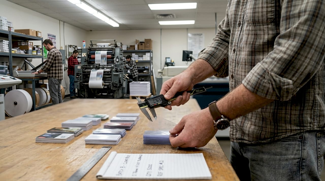
Getting the specs right before you open any design software saves time and prevents costly reprints. Start with the material itself.
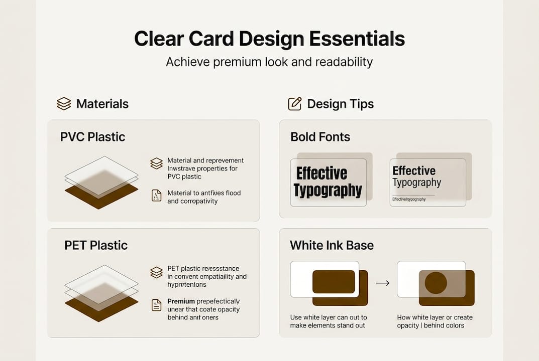
Clear plastic cards are made from 20 to 30 mil thick PVC or PET plastic. This gives them credit-card-like durability and makes them fully waterproof. Thinner stock feels flimsy. Thicker stock feels premium.
Here are the core specs you need before designing:
| Spec | Requirement |
|---|---|
| Card size | 3.5 x 2 inches (standard US) |
| CR80 size | 3.375 x 2.125 inches |
| Bleed area | 0.125 inch on all sides |
| Resolution | 300 DPI minimum |
| Color mode | CMYK only |
| Font format | Vector or outlined |
| Corner style | Rounded recommended |
The standard US card size is 3.5 x 2 inches, with CR80 being the slightly larger format used for professional print setups. Always add a 0.125 inch bleed so your design does not get cut short at the edges.
You will also need:
- Vector editing software such as Adobe Illustrator or Affinity Designer
- A printer that supports white ink (critical for clear card printing)
- CMYK color profiles set up before you start placing colors
- Outlined fonts so no font substitution happens during print
The clear card materials and function page covers how PVC and PET behave differently under various printing conditions, which is worth reviewing before you finalize your material choice.
Pro Tip: Always convert your fonts to outlines before sending files to print. This prevents font substitution errors that can completely change how your card looks.
With your materials and specs gathered, you can move into designing for maximum visual impact and clarity.
Design for clarity and brand impact: best practices
Designing for a clear card is different from designing for paper. The transparency changes everything. What looks great on a white background can disappear or look muddy on clear plastic.
Follow these steps for a strong result:
- Set your white ink layer first. White ink acts as the foundation for any colored or opaque section. Without it, colors print translucent.
- Choose bold, sans-serif fonts at minimum 8pt. Thin or decorative fonts blur on plastic surfaces.
- Use high-contrast color combinations. Dark colors on white ink underlays, or bold colors against the clear background, read cleanly.
- Never place white or fine text directly on the transparent area. It will disappear against most backgrounds.
- Embrace negative space. The clear areas of your card are part of the design. Use them intentionally.
- Keep it minimal. One or two focal points. Your name, your title, your contact. That is enough.
Design requires high contrast colors, bold fonts at minimum 8pt, and white ink underlays for opacity on transparent backgrounds. Avoid small details or white text that blends into the clear surface.
For brands in the beauty or fashion space, the cards for beauty branding article shows how minimalist layouts translate into high-end results. If you are working on a luxury positioning, the design for luxury branding guide goes deeper into color and layout choices.
Pro Tip: Print a test on a clear acetate sheet before sending to production. Hold it against different colored backgrounds, white paper, dark surfaces, and your hand. This shows you exactly how the card will look in real-world conditions.
For more technical printing guidance, the clear plastic printing tips resource covers ink adhesion and surface prep in detail.
With a strong design, you’ll need to decide how best to print your card for maximum impact and durability.
Printing: one-sided vs. double-sided and cost considerations
This is one of the most common decision points, and it affects both your budget and your final result.
| Option | Best for | Cost impact | Risk level |
|---|---|---|---|
| Single-sided | Clean, minimal designs | Base cost | Low |
| Double-sided | Info-heavy layouts | +10 to 20% | Higher |
Single-sided printing avoids show-through and readability issues. Double-sided printing needs white ink backing or solid backgrounds, which increases costs by 10 to 20%.
Single-sided is the safer choice for most clear card designs. The back of the card stays transparent, which actually adds to the premium feel. You see through it. That is the point.
Double-sided works when:
- You have a lot of information to include
- Your back design uses a solid white ink background
- You are working with a printer experienced in clear card production
Common print problems to watch for:
- Mirrored text on the back showing through to the front
- Uneven white ink layer causing patchy opacity
- Misalignment between ink layers on double-sided runs
“The benefits for luxury brands are clearest when the printing is clean. A poorly printed clear card does more damage than a plain paper card.”
After printing, it’s crucial to check your card’s quality and address any potential issues before bulk production.
Troubleshooting and testing your clear plastic card
Ordering a test print is not optional. It is the step that separates a good card from a great one.
Here is what to check when your test print arrives:
- Hold it under different lighting. Office fluorescent, natural daylight, and dim evening light all show different things.
- Check every angle. Text that reads clearly straight-on can blur or disappear at an angle.
- Look for ink show-through. On double-sided cards, ink show-through without backing causes mirrored text and poor opacity.
- Check the white ink layer. Uneven white ink leads to patchy, inconsistent color areas.
- Inspect alignment. Misaligned layers are visible on clear plastic in a way they never are on paper.
- Test the finish. Spot gloss catches fingerprints easily. A matte finish may be more practical for everyday handling.
Pro Tip: Share your test print with two or three people who have never seen your design. Ask them what they read first. If it is not your name or your key contact detail, your layout needs adjustment.
“Avoid thin fonts or fine details that blur on clear plastic. Bold, simple, and high-contrast always wins.”
Get feedback before you commit to a full run. A 500-card order with a layout problem is an expensive lesson. The print onto clear plastic guide covers ink adhesion testing, which is useful if you are working with a new printer.
If you want to see how a refined clear card can elevate your brand presence in 2026, that resource breaks down the positioning value in detail.
With your card thoroughly checked and quality assured, you’re ready to put your premium, custom clear card to work.
Get your premium clear plastic cards designed by experts
Designing a clear plastic card that actually works takes more than good software. It takes material knowledge, print experience, and an eye for what reads well on transparent surfaces. That is exactly what we do at BcardsCreation.

Every card we produce is designed individually, no templates, no automated editors. You get direct design guidance, material consultation, and controlled production from start to finish. Whether you need a single striking design or a small batch for your team, we handle the details so you get a card that represents your brand at its best. Order clear business cards to get started, get custom card design for a fully tailored approach, or explore plastic card options to see the full range of materials and finishes available.
Frequently asked questions
What size and thickness are best for clear plastic business cards?
Choose standard US 3.5 x 2 inches or CR80 format, with 20 to 30 mil thickness for maximum durability and a professional feel that matches a standard credit card.
How do I choose readable fonts and colors for clear cards?
Use bold sans-serif fonts at minimum 8pt with high-contrast colors placed over white ink underlays. This ensures your text stays legible regardless of what background the card is held against.
Are double-sided clear cards worth the extra cost?
Single-sided is the clearest option for most designs. Double-sided increases costs by 10 to 20% and requires expert printing with white ink backing to avoid show-through and readability problems.
What common mistakes should I avoid in clear card design?
Avoid thin fonts, fine details, and white text placed directly on transparent areas. Always use white ink underlays, and check the clear plastic card explained guide for a full list of print edge cases to watch for.
How do I ensure my card stands out?
Keep the layout minimal, use strong color contrast, and leverage the transparent areas as part of your design. Always order a test print before committing to a full production run.
Recommended
- How to make clear plastic cards for luxury branding – BcardsCreation
- How to Make Plastic Business Cards for Luxury Brands – BcardsCreation
- Clear Plastic Business Cards: Strategic Impact – BcardsCreation
- Clear Plastic Business Cards – BcardsCreation
- Digital Business Card Maker | V Card Generator - KODE.link


