

Professional business card design steps for 2026
You spend weeks perfecting your pitch, refining your services, and building relationships, but when you hand over your business card, it falls flat. The design feels generic, the materials look cheap, and instead of reinforcing your brand, it undermines the professional image you worked so hard to create. Creating a business card that truly enhances brand recognition requires more than just printing contact details on cardstock. This guide walks you through expert, step-by-step strategies to design customized, high-quality business cards that make lasting impressions in 2026.
Table of Contents
- Understanding The Problem And Preparing For Design Success
- Step-By-Step Execution Of Business Card Design
- Materials, Printing Techniques, And Final Verification
- Bring Your Professional Business Card Design To Life
- Frequently Asked Questions
Key takeaways
| Point | Details |
|---|---|
| Preparation drives success | Define brand identity, target audience, and budget before touching design software. |
| Strategic execution matters | Layout, typography, color, and white space work together to communicate professionalism. |
| Material selection impacts perception | Premium stocks and finishes like foil or embossing elevate perceived quality significantly. |
| Verification prevents costly errors | Proof checking, sample orders, and quality reviews catch mistakes before final printing. |
Understanding the problem and preparing for design success
Business cards remain one of the most powerful brand communication tools available to professionals. Despite digital alternatives, a physical card creates tangible connections that emails and LinkedIn requests cannot replicate. Effective business cards offer a tangible way to communicate your brand identity and make professional impressions that stick.
Before opening any design software, you need to establish clear foundations. Start by clarifying your brand values and visual elements. What emotions should your card evoke? What distinguishes your services from competitors? Document your brand colors, fonts, and logo specifications to maintain consistency across all materials.
Next, identify your target audience to tailor design choices appropriately. Corporate executives expect different aesthetics than creative professionals or tech entrepreneurs. A lawyer needs understated elegance, while a graphic designer can experiment with bold, unconventional layouts. Understanding who receives your card shapes every design decision.
Budget and scope considerations come next. Determine how many cards you need and what you can invest per card. Premium materials and specialty finishes cost more but deliver substantially higher perceived value. Setting realistic financial parameters early prevents disappointment later when you discover your dream design exceeds available resources.
Gather examples or inspiration for style guidance. Collect cards you admire, noting what makes them effective. Look beyond your industry for fresh perspectives. A restaurant’s textured card might inspire a consultant’s design, while a photographer’s minimalist approach could work for a financial advisor. Create a visual reference file to guide your professional business card design framework.
Key preparation steps include:
- Document all brand assets including exact color codes, approved fonts, and logo files
- Research competitor cards to identify opportunities for differentiation
- Define must-have information versus nice-to-have details
- Establish timeline from design to delivery, accounting for proofing and revisions
- Identify decision makers who need approval before printing
Step-by-step execution of business card design
With preparation complete, execute your design following proven sequential steps. Start by selecting a layout that fits your industry and brand personality. Standard horizontal cards work for most professionals, but vertical orientations can help you stand out. Some industries benefit from square cards or custom die-cut shapes, though these require careful consideration of practicality and storage.
Typography selection balances style with legibility. Your name should be the most prominent text element, followed by your title and company name. Choosing the right typography communicates professionalism and enhances readability on business cards. Avoid using more than two font families. Pair a distinctive font for your name with a clean, simple font for contact details. Ensure all text remains readable at actual card size, not just on your computer screen.
Color schemes must align with your brand while providing strong contrast for readability. If your brand uses light colors, consider how they appear on white cardstock. Sometimes inverting your color scheme for the card creates better visual impact. Test color combinations to ensure phone numbers and email addresses remain clearly legible. Remember that colors appear differently on screen versus printed materials.

White space creates breathing room that prevents cluttered, amateur-looking designs. Resist the urge to fill every millimeter with information or decorative elements. Strategic empty space draws attention to important details and projects sophistication. Professional designers use white space deliberately to guide the eye and create visual hierarchy.
Printing finishes transform good designs into exceptional ones. Foil stamping adds metallic accents that catch light and draw attention. Embossing creates raised textures that engage the sense of touch. Matte coatings project understated elegance, while spot UV creates contrast between glossy and matte areas on the same card. Consider how finishes reinforce your brand message.
Follow these execution steps in order:
- Sketch rough layouts on paper before opening design software
- Create digital mockups with placeholder text to test compositions
- Add actual content, ensuring all information is current and accurate
- Apply brand colors and verify they meet contrast requirements
- Select and apply typography, checking readability at actual size
- Incorporate logo and any graphic elements strategically
- Add white space by removing unnecessary elements
- Choose finishing options that enhance without overwhelming
- Export design files in printer-required formats with proper bleeds
Pro Tip: Test your design proofs under different lighting conditions and at arm’s length to ensure clarity. What looks perfect on a backlit screen might lack contrast in natural light or appear cluttered when viewed as an actual card.
When briefing a designer for business cards, provide comprehensive brand guidelines and clear expectations about finishes and materials. The more specific your input, the closer the first draft will match your vision.
Materials, printing techniques, and final verification
Material selection dramatically impacts how recipients perceive your professionalism and brand quality. Standard cardstocks include matte, glossy, and textured options, each projecting different characteristics. Matte finishes feel sophisticated and modern, reducing glare for easy reading. Glossy stocks make colors pop but show fingerprints easily. Textured papers add tactile interest and premium feel.
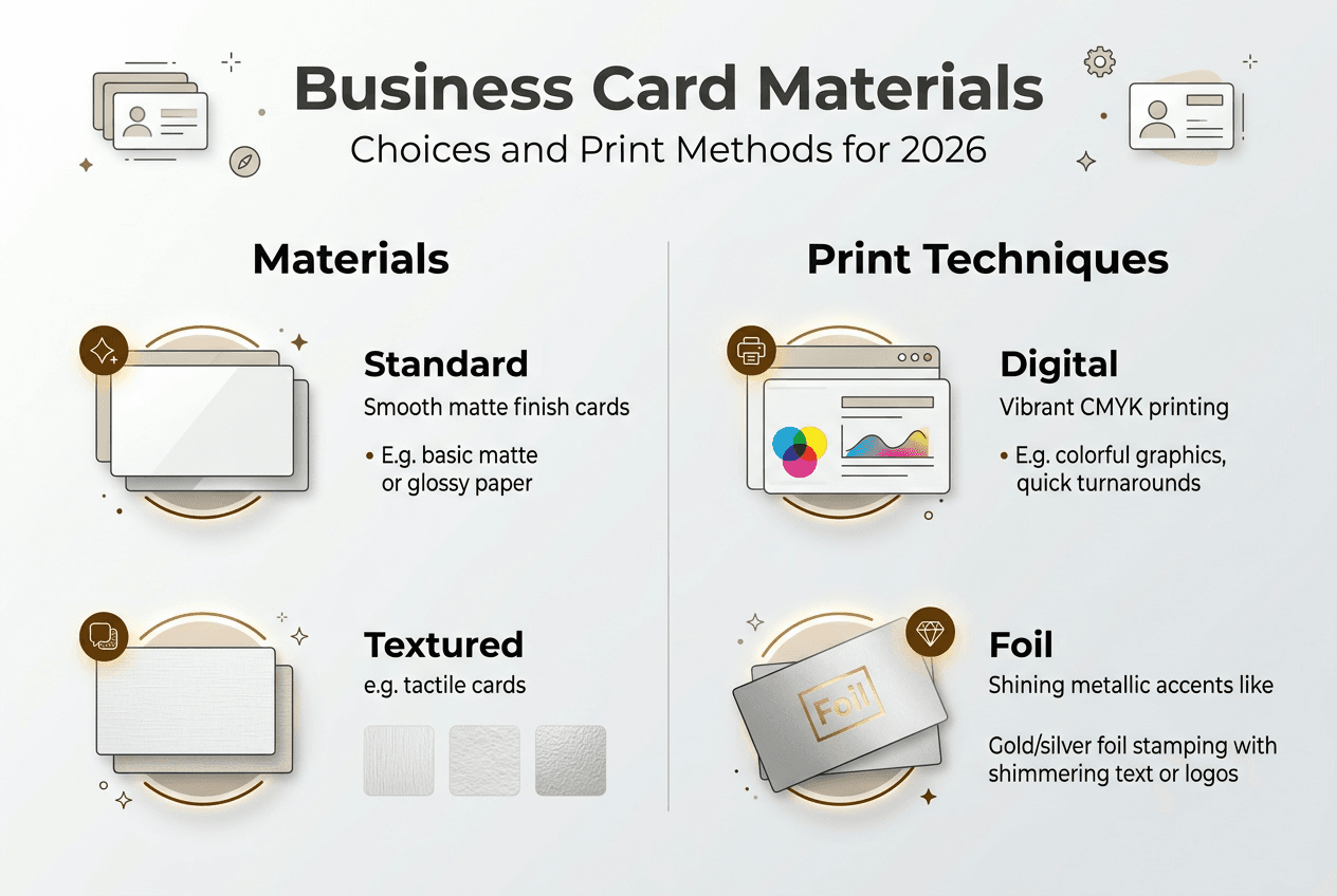
Luxury materials and finishes such as foils and textured papers significantly enhance perceived quality of business cards. Cotton papers offer substantial weight and refined texture. Plastic cards provide durability and unique visual impact. Layered cards with colored cores create striking edge effects when die-cut. Metal cards make bold statements but require specialized printing.
Printing techniques vary in cost, quality, and suitability for different designs. Digital printing works well for small batches and offers quick turnaround, but lacks the color accuracy and finish options of offset printing. Offset printing delivers superior color consistency and supports specialty inks, making it ideal for larger quantities. Foil stamping applies metallic or holographic foils for eye-catching accents. Embossing and debossing create dimensional effects through pressure, adding tactile luxury.
| Printing Method | Best For | Advantages | Limitations |
|---|---|---|---|
| Digital | Small batches under 500 | Fast turnaround, cost-effective for low quantities | Limited finish options, slight color variation |
| Offset | Runs over 500 cards | Superior color accuracy, supports specialty inks | Higher setup costs, longer production time |
| Foil Stamping | Premium accent details | Metallic shine, available in multiple colors | Adds cost, requires separate production step |
| Embossing | Textural brand elements | Creates memorable tactile experience | Works best with simple designs, increases thickness |
Before committing to final printing, complete thorough verification checks. Review digital proofs carefully, checking every detail against your source materials. Verify contact information is current and accurate. Confirm your email address, phone number, website URL, and social media handles are spelled correctly. One typo renders an entire print run useless.
Check color accuracy by requesting physical proofs printed on actual card stock. Colors shift between screen and print, and between different paper types. What looks vibrant on glossy stock might appear muted on matte. Evaluate alignment and ensure text sits properly within safe zones, avoiding areas that might get trimmed during cutting.
Examine bleed areas to confirm background colors or images extend beyond trim lines. Without proper bleed, you risk white edges appearing on finished cards. Review all graphic elements at actual size to catch issues invisible at larger scales.
Common mistakes to avoid include:
- Overloading cards with excessive information that creates visual clutter
- Using insufficient contrast between text and background colors
- Ignoring standard margins and safe zones for critical information
- Selecting trendy fonts that sacrifice readability for style
- Forgetting to convert RGB colors to CMYK for accurate printing
- Skipping physical proof review and relying only on screen previews
Pro Tip: Order a sample batch first to evaluate feel and look in person. Seeing and touching actual printed cards reveals issues that digital proofs miss. You might discover your chosen paper feels too thin, your colors print darker than expected, or your font size appears smaller than anticipated. A small sample investment prevents large-scale disappointments.
When selecting luxury business card materials, balance aesthetic goals with practical considerations like durability and how cards fit in standard wallets or cardholders.
Bring your professional business card design to life
You have invested time learning design principles, material options, and verification processes. Now transform that knowledge into tangible results that elevate your professional presence. Professional services bridge the gap between design concepts and printed reality, ensuring your vision materializes with precision.
BcardsCreation specializes in bringing ambitious card designs to life through custom business card design services tailored for professionals who view cards as strategic branding tools. Every project receives individual attention, combining expert design guidance with material consultation to create cards that truly represent your brand.

Explore options including creative business cards printing and foiling that incorporate specialty finishes, or browse the plastic business cards selection for durable, distinctive alternatives to traditional paper stocks. Expert consultation ensures your final cards align perfectly with brand identity while standing out in competitive markets.
Frequently asked questions
What are the key elements of a professional business card?
Concise contact information, a clear logo, and consistent brand colors form the foundation of effective business cards. Include only essential details like your name, title, company, phone number, email, and website. Avoid cluttering with unnecessary information such as multiple phone numbers, full addresses, or social media icons unless they serve strategic purposes. Choose high-quality materials to reinforce professionalism, as flimsy cardstock undermines even excellent designs. Ensure readability with appropriate font sizes, typically no smaller than 8 points for body text, and maintain strong contrast between text and background colors. Review common business card content mistakes to avoid diluting your message.
How do I choose the right paper and finishes for my card?
Match materials to your brand personality and target audience expectations. Conservative industries like finance or law typically favor understated matte finishes and substantial cotton stocks that project stability and trustworthiness. Creative fields can experiment with textured papers, bold colors, or unconventional materials like plastic or metal that showcase innovation. Balance aesthetic goals with budget constraints to maximize impact within financial parameters. A moderately thick, well-chosen matte stock often delivers better results than cheap glossy cardstock with excessive finishes. Consider how recipients will store and handle your cards when selecting thickness and finish durability. Explore guidance on choosing luxury business card materials for detailed comparisons.
What mistakes should I avoid when designing my business card?
Keep designs clean and focused on communicating key information without visual clutter. Resist adding decorative elements that serve no strategic purpose or cramming every possible contact method onto limited space. Use legible fonts sized appropriately for comfortable reading, avoiding ornate scripts or condensed typefaces that sacrifice clarity for style. Maintain sufficient contrast between text and backgrounds, ensuring phone numbers and email addresses remain readable in various lighting conditions. Stick to standard card sizes, typically 3.5 by 2 inches in the United States, to ensure compatibility with wallets, cardholders, and business card scanners. Review comprehensive lists of business card design mistakes before finalizing your design.
How can I ensure my business cards stand out in a competitive market?
Incorporate distinctive finishes such as foil stamping, embossing, or spot UV coating that create visual and tactile differentiation from standard printed cards. These specialty techniques catch light, engage touch, and signal quality investment in your brand presentation. Use custom shapes, rounded corners, or colored edges for uniqueness while maintaining practical usability. Align every design choice tightly with your brand identity rather than following generic templates or current trends that dilute distinctiveness. Consider unconventional materials like thick cotton stock, plastic, or layered cards with colored cores that feel substantially different from typical business cards. Focus on creating memorable experiences through thoughtful material selection and finishing choices that reinforce your brand positioning and values.
Recommended
- Professional Business Card Design: A Step-by-Step Framework – BcardsCreation
- Master the creative business card design process in 2026 – BcardsCreation
- How to Brief a Designer for Business Cards (Even If You’re Not a Desig – BcardsCreation
- 7 Essential Business Card Design Tips for Creatives – BcardsCreation


