

Guide to premium business card finishes for max impact
TL;DR:
- Business card finishes greatly influence perceived brand value and tactile experience.
- Choosing the right finish depends on industry, design, and durability needs.
- Less is often more; intentional, restrained finishes create stronger, more memorable impressions.
You hand over your card at a high-stakes meeting. The design looks great on screen, but the card feels flimsy, the surface smudges instantly, and the text barely stands out. The other person pockets it without a second glance. The problem was not your logo or your color palette. It was the finish. A premium finish signals that you pay attention to detail, that your brand is worth remembering. This guide walks you through every key finish type, how to pick the right materials, a step-by-step ordering process, and how to avoid the mistakes that waste your budget and your opportunity.
Table of Contents
- Understanding business card finishes
- Selecting the right materials and finishes
- Step-by-step business card finishing process
- Avoiding common mistakes and troubleshooting
- A fresh perspective on premium business card finishes
- Bring your business card to life with professional finishes
- Frequently asked questions
Key Takeaways
| Point | Details |
|---|---|
| Finish drives first impressions | Premium card finishes signal professionalism and help your business stand out instantly. |
| Match finish to material | Choosing the right combination of card stock and finish ensures durability and brand consistency. |
| Follow a proven process | A clear step-by-step approach leads to flawless, impressive business cards. |
| Avoid costly mistakes | Understanding common pitfalls in finishing prevents waste and disappointment. |
Understanding business card finishes
A business card finish is the final coating or treatment applied to the card surface after printing. It affects how the card looks, how it feels in someone’s hand, and how long it holds up over time. Finish is not decoration. It is a functional and visual layer that shapes the entire experience of receiving your card.
Here is a quick breakdown of the most common finish types:
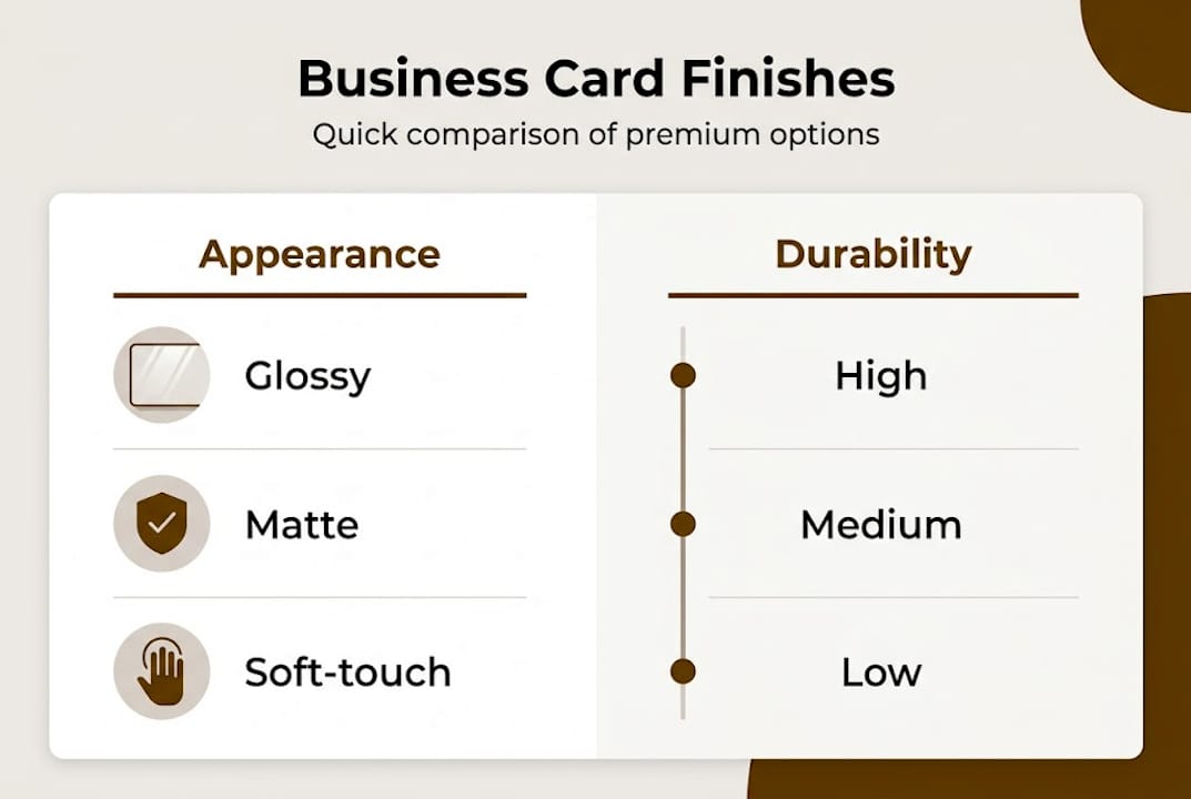
- Matte: Flat, non-reflective surface. Minimal glare. Clean and modern look.
- Gloss: Shiny, reflective coating. Colors appear vivid and saturated.
- Soft-touch: Velvety texture. Feels premium and tactile. Resists fingerprints better than standard gloss.
- Foil stamping: Metallic or holographic film pressed onto specific areas. Adds shine and contrast.
- Spot UV: A clear, high-gloss coating applied to select design elements. Creates contrast against matte backgrounds.
- Embossing and debossing: Raised or recessed areas pressed into the card. Adds a three-dimensional tactile effect.
Each finish serves a different purpose. Gloss works well for photography-heavy cards. Matte reads as understated and professional. Soft-touch is popular in luxury and creative sectors. Foil and spot UV are used to highlight logos or key text. Embossing adds a physical dimension that no digital medium can replicate.
| Finish type | Visual effect | Tactile feel | Best use case |
|---|---|---|---|
| Matte | Flat, no glare | Smooth | Corporate, legal, finance |
| Gloss | Bright, reflective | Slick | Real estate, retail, photography |
| Soft-touch | Subtle sheen | Velvety | Luxury, creative, consulting |
| Foil stamping | Metallic accent | Smooth with texture | Premium brands, executives |
| Spot UV | High contrast gloss | Mixed | Design-forward brands |
| Embossing | 3D raised detail | Raised | High-end, tactile branding |
Why does this matter for professionals? Because high-quality finishes significantly improve perceived brand value. In high-touch industries like law, finance, luxury real estate, or executive consulting, a poorly finished card can undercut an otherwise strong brand. Understanding finishing for brand impact is not optional if you want your card to do real work for your business.
Selecting the right materials and finishes
Understanding finishes is half the story. Next, you will want to match them to the right materials for your needs.
Material choice is as important as finish for lasting impressions. The card stock you choose determines what finishes are even possible, how the card holds up over time, and what message it sends before anyone reads a single word.

Here is a comparison of the three most common surface finishes across key factors:
| Factor | Gloss | Matte | Soft-touch |
|---|---|---|---|
| Appearance | Vivid, shiny | Flat, refined | Subtle, rich |
| Durability | Good | Moderate | High |
| Fingerprint resistance | Low | Moderate | High |
| Cost | Low to mid | Low to mid | Mid to high |
| Best pairing | Coated stock | Uncoated or coated | Thick coated stock |
When it comes to business card materials, the most common options are coated stock, uncoated stock, and specialty materials like plastic or metal. Coated stocks pair well with gloss and soft-touch finishes. Uncoated stocks work best with matte and give a more organic feel. Plastic cards open up options like clear finishes and frosted effects that paper simply cannot achieve.
Environmental considerations matter too. Recycled stock is available and pairs well with matte or uncoated finishes. If sustainability is part of your brand message, the material itself becomes part of the story.
When to use specific finishes:
- Foil stamping: Use when your logo or brand name needs to stand out with metallic contrast. Works best on dark or solid backgrounds.
- Spot UV: Use to highlight a specific element, like a logo or tagline, against a matte background. Creates a striking visual contrast.
- Lamination: Use when durability is the priority. Adds a protective layer that resists moisture and wear.
For a unique card design that actually reflects your brand, the finish and material need to work together as a system, not as separate decisions.
Pro Tip: Match your finish to your industry first, then refine based on your visual brand. A soft-touch matte card with spot UV on the logo is a strong default for most professional service brands.
Step-by-step business card finishing process
Let’s put knowledge into action with a concrete process for achieving the perfect finished card.
A defined process leads to more professional results. Skipping steps, especially proofing, is the most common reason professionals end up with cards that miss the mark.
- Define your brand goals and audience. What impression do you want to make? Who will receive this card? A corporate attorney and a freelance photographer need very different finishes.
- Choose your base material and finish combination. Use the comparison table above as your starting point. Confirm that your chosen finish is compatible with your selected stock.
- Finalize your artwork with finish requirements in mind. If you plan to use foil or spot UV, your design file needs to include a separate layer or mask for those elements. Work with your designer early on this.
- Proof and order samples. Never skip this step. A physical proof shows you exactly how the finish interacts with your design, colors, and text under real lighting conditions.
- Review, approve, and proceed to production. Check every detail: alignment, finish coverage, text legibility, and color accuracy. Only approve when everything looks exactly right.
Using a solid card design framework from the start keeps the process organized and prevents costly revisions. If you want a deeper look at how premium cards are produced from concept to delivery, the luxury card process covers every stage in detail.
Pro Tip: Budget extra time for complex finishes. Foil stamping and embossing require additional production steps and can add several business days to your timeline. Plan accordingly, especially if you have an event or launch date.
Avoiding common mistakes and troubleshooting
The best process can still trip up on common pitfalls. Here is how to avoid them and make sure your cards impress rather than disappoint.
Finishing errors can undermine premium design choices. Even a well-designed card can fall flat if the finish is wrong for the context or poorly executed.
The most common mistakes professionals make:
- Wrong finish for the industry. A heavy gloss finish can feel out of place in conservative industries like law or finance. Know your audience.
- Poor texture selection. Soft-touch is beautiful but can show scuffs over time if handled frequently. Match durability to use case.
- Unreadable foil text. Small text in foil is often illegible. Foil works best on larger elements like logos or brand names.
- Fingerprints on gloss surfaces. Gloss cards show smudges quickly. If your card will be handled often, consider soft-touch or matte instead.
- Design misalignment with finish areas. Spot UV or foil that does not line up with the intended design element looks like a production error, not a premium touch.
“A flawless finish amplifies your brand; mistakes do just the opposite.”
Before you approve your final print run, use this checklist:
- [ ] Finish type confirmed and appropriate for your industry
- [ ] Design file includes correct layers for specialty finishes
- [ ] Physical sample reviewed under natural and artificial light
- [ ] Text legibility confirmed, especially in foil or embossed areas
- [ ] Finish coverage aligns precisely with design elements
- [ ] Card stock weight and feel match your expectations
For more guidance on getting the details right, card design tips covers practical advice for creatives and professionals alike. And if you want to understand why design matters at a deeper level, that context helps you make better decisions at every stage.
A fresh perspective on premium business card finishes
Here is something most guides will not tell you: more finish options do not equal a better card.
We see it often. A brand stacks foil, embossing, spot UV, and soft-touch lamination onto a single card. The result is technically impressive but visually chaotic. The card tries to say everything and ends up saying nothing clearly.
True differentiation comes from intentional choices. One well-placed foil accent on a clean matte card creates more impact than four competing effects fighting for attention. Restraint is a design decision, not a compromise.
The brands that get remembered are not always the ones with the most expensive cards. They are the ones whose cards feel right for who they are. A minimalist architect with a single debossed logo on thick uncoated stock. A luxury consultant with soft-touch matte and a single gold foil line. These cards work because the finish matches the message.
When you explore luxury ideas for impact, the pattern is consistent: clarity and intention outperform complexity every time. Choose your finish like you choose your words. Make it count.
Bring your business card to life with professional finishes
Ready to elevate your brand with the perfect finishing touch? Here is how to get started.

At BcardsCreation, every card is built from scratch, without templates or automated editors. You get direct access to expert design guidance, material consultation, and controlled production from start to finish. Whether you are looking for custom business card design tailored to your brand, creative luxury finishes like foil stamping and raised effects, or clear business card options that make a bold visual statement, we have the materials and expertise to deliver. View sample designs, get a consultation, and take the next step toward a card that actually represents your brand.
Frequently asked questions
What is the most durable business card finish?
Plastic cards and certain laminates provide superior durability, resisting wear, moisture, and fingerprints far better than standard paper finishes in everyday professional use.
How do I choose the best finish for my business card?
Consider your industry, brand values, and how often the card will be handled. Finish selection should align with both your design and the impression you want to leave.
Are premium finishes like foil or embossing worth the extra cost?
Yes, for most professional contexts. Premium finishes are an investment in perception, boosting brand memorability and the overall quality signal your card sends.
How do I proof my business card finish before finalizing?
Order a physical sample and review it under both natural and artificial light. Physical proofs help spot finish alignment issues, color shifts, and legibility problems before you commit to a full print run.


