

Design a unique business card that sets your brand apart
TL;DR:
- Premium, well-designed business cards create stronger impressions and brand recall.
- Selecting quality materials and finishes enhances perceived professionalism and uniqueness.
- Attention to digital design, physical details, and verification ensures a high-impact, memorable card.
You hand someone your card. They glance at it, say nothing, and slide it into their pocket. That moment either builds or breaks a first impression. For creative professionals, a generic card is a missed opportunity. Premium cards signal professionalism to 78% of executives and increase recall by 34% over digital contact methods. A tailored design process changes that outcome entirely. This guide walks you through every critical step, from defining your brand identity to verifying the final print, so your card works as hard as you do.
Table of Contents
- Define your brand identity and goals
- Brainstorm concepts and analyze competitors
- Design your card digitally for impact and readability
- Select premium materials and luxury finishes
- Prepare final files and verify print quality
- Why creative professionals should obsess over business card details
- Premium business card design made effortless
- Frequently asked questions
Key Takeaways
| Point | Details |
|---|---|
| Start with your brand | Align every design element with your professional brand and audience for strongest impact. |
| Use quality materials | Premium stocks and tactile finishes make cards memorable and signal credibility. |
| Prioritize readability | Simple layouts, clear fonts, and sufficient white space outperform cluttered designs. |
| Review before printing | Always inspect final proofs and request corrections to ensure flawless delivery. |
| Stay unique but practical | Unique cards attract attention yet must still fit wallets and function reliably. |
Define your brand identity and goals
Once you understand why your card must make an impression, the first critical step is thoughtful preparation. Before you open any design tool, you need clarity on what your card should communicate and to whom.
Start by listing your core brand attributes. Are you creative and bold? Minimal and premium? Warm and approachable? These descriptors shape every design decision that follows. Write them down. Keep the list short, three to five words at most.
Next, gather your visual assets:
- Logo files (vector format preferred, ideally SVG or EPS)
- Brand colors with exact hex or Pantone codes
- Primary and secondary fonts with licensing details
- Tagline or positioning statement if applicable
Set a realistic budget before you talk to any printer. Premium materials and custom finishes cost more, but they deliver more. Know your per-card ceiling. Also confirm your timeline. Rush orders often limit your material and finish options.
Know your audience, too. Are you handing cards to potential clients, gallery curators, agency partners, or industry peers? Each group responds differently to design cues. A card for a luxury interior designer reads differently than one for a motion graphics studio.
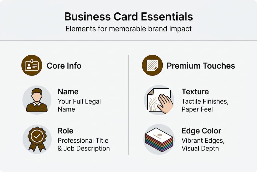
Finally, list every piece of information the card must carry:
| Card element | Required | Optional |
|---|---|---|
| Full name | Yes | |
| Job title or role | Yes | |
| Email address | Yes | |
| Phone number | Yes | |
| Website URL | Yes | |
| QR code to portfolio | Yes | |
| Social media handle | Yes | |
| Physical address | Yes |
As the process for creating unique premium business cards starts with defining brand identity, audience, and budget, skipping this step leads to redesigns and wasted print runs. Understanding why design matters for cards before you start saves time and money. Use a professional card design framework to keep the process structured. The basics of business card design are a useful reference for first-timers.
Pro Tip: Create a one-page brand brief before your first design session. It keeps every decision anchored to your brand, not just your taste.
Brainstorm concepts and analyze competitors
With your objectives laid out, the next step is gathering inspiration and identifying signature features that set you apart.
Start by collecting reference cards. Ask colleagues, visit design blogs, and search platforms like Behance or Dribbble. Pay attention to what catches your eye and, more importantly, why. Is it the texture? The layout? The use of negative space?
Then audit your competitors. Look at cards from others in your industry and note what they all have in common. Those shared features are the ones you want to avoid or reinvent. Here is a quick comparison of common versus distinctive approaches:
| Feature | Common approach | Distinctive approach |
|---|---|---|
| Card stock | Standard 14pt matte | 32pt duplex or cotton |
| Color scheme | Single color or white | Full bleed with brand palette |
| Back of card | Blank or logo only | Portfolio QR, bold pattern, or Printfinity |
| Shape | Standard rectangle | Rounded corners or die-cut |
| Finish | Matte or gloss | Foil stamping, spot UV, or letterpress |
Once you see the gaps, sketch at least three distinct layout options. Do this on paper first. Speed matters here, not precision. Explore different placements for your name, logo, and contact details. Try a vertical layout. Try a minimal front with a bold back.
As researching competitors and sketching layouts is the second critical step, this phase directly shapes how memorable your final card becomes. Use the brand impact workflow to connect your concepts to measurable brand goals. Browse card design inspiration for fresh ideas before committing to a direction.
Here is a simple process to move from inspiration to concept:
- Collect 10 to 15 reference cards you genuinely admire
- Identify three features each reference card uses well
- Note which features appear in more than half your references (these are trends to avoid or subvert)
- Sketch three layout options using your brand assets
- Select one primary concept and one backup
Pro Tip: Add one unexpected element to your card, such as a custom edge color, a QR code linking directly to your best project, or a tactile finish on just one side. Surprise creates memory.
Design your card digitally for impact and readability
After selecting unique concepts, translating these into an effective digital design is essential. This is where your card either comes together or falls apart.
Follow these steps when building your digital file:
- Set your document to the correct card size (3.5 x 2 inches in the US) with a 0.125-inch bleed on all sides
- Choose your primary font for your name and a secondary font for contact details. Stick to two font styles maximum
- Set body text at a minimum of 8pt. Anything smaller becomes unreadable in print
- Apply your brand colors using exact Pantone or CMYK values, not RGB
- Place your most important information (name and contact) in the visual hierarchy first
- Leave breathing room. White space is not wasted space. It guides the eye and signals confidence
As selecting layout and typography with a maximum of two fonts at 8pt or larger, combined with strong color contrast and intentional white space, defines a readable and premium card design. Understanding what makes a design premium helps you make better decisions at this stage. If you plan to use embossing or foil, explore tactile luxury techniques before finalizing your file.
“Test readability at arm’s length and at actual card size. If you squint, something needs to change.”
Digital-physical hybrid cards with QR or NFC boost engagement up to 69%. Adding a QR code that links to your portfolio or booking page is one of the highest-return additions you can make to any card design. Keep it clean and scannable.
Pro Tip: Export a low-resolution mockup and view it on your phone screen. If it looks good at that size, it will look good printed.
Select premium materials and luxury finishes
Once your digital design is ready, the next decision is the card’s physical feel and visual finish. This is where a good design becomes a great card.

Card stock is measured in GSM (grams per square meter) or PT (point thickness). Here is how the options compare:
| Stock type | Thickness | Best for |
|---|---|---|
| Standard coated | 14pt / 250gsm | Budget runs, high volume |
| Premium coated | 16pt / 300gsm | Professional standard |
| Luxury thick | 32pt / 400gsm | Premium positioning |
| Cotton or textured | Varies | High-end creative industries |
| Duplex laminated | 24-32pt | Bold color, rigid feel |
Premium cards use materials like 350 to 400gsm, 16 to 32pt, cotton or textured paper, with finishes like foil, emboss, and spot UV for a luxury feel. Choosing the right card materials is as important as the design itself. Review your options for luxury materials before placing any order. The paper types guide from MOO is a solid reference for understanding stock options.
Finish options to consider:
- Foil stamping: Gold, silver, or custom colors. Best for logos and key text
- Spot UV: Glossy coating on select areas for contrast and texture
- Letterpress: Pressed ink creates a tactile indent. Strong for minimal designs
- Painted edges: Color applied to the card edge. Subtle but distinctive
- Soft touch laminate: Velvety matte surface that feels premium in hand
78% of executives correlate thick and textured cards with professionalism. That number alone justifies the investment in better stock.
“Request physical samples before committing to a large print run. What looks good on screen may feel wrong in hand.”
Avoid non-standard shapes unless your brand strongly supports them. Square cards and oversized formats often do not fit standard cardholders, which reduces how long recipients keep them.
Prepare final files and verify print quality
With design and material choices made, flawless execution in the final stages is critical. A small error at this point can mean reprinting hundreds of cards.
Follow this checklist before submitting your files:
- Export as a vector PDF with all fonts outlined and embedded
- Include 0.125-inch bleed on all sides and crop marks
- Confirm CMYK color mode, not RGB
- Check that no critical text or logos fall within the 0.125-inch safe zone from the edge
- Save a backup copy of your working file before flattening
Once files are submitted, request a hard proof if possible. A physical proof shows you exactly how the card will look and feel before the full run prints. If a physical proof is not available, review the digital proof carefully under different backgrounds and lighting conditions.
Before approving, check these elements:
- Color accuracy: Does it match your brand colors?
- Text clarity: Is every word sharp and correctly spelled?
- Alignment: Are logos and text centered or positioned as intended?
- Finish placement: Is the foil or spot UV exactly where you specified?
- Edge details: Are painted edges or die-cuts clean?
As exporting with bleeds, proofing under varied lighting, and approving print output only after detailed checks prevents costly errors. Use the pre-print checklist as a final reference before submission.
When your order arrives, inspect a sample from the batch immediately. Check for color deviation, smudging, or inconsistent finishes. If something is off, contact your printer right away. Most reputable printers will reprint cards that do not match the approved proof.
Pro Tip: Keep one approved printed card in your files as a physical reference for future reprints. Color can drift between print runs, and having a reference sample helps catch it early.
Why creative professionals should obsess over business card details
Beyond technical steps, a strategic perspective reveals why each detail truly matters.
Conventional wisdom says networking apps have replaced business cards. That view misses something important. For creative professionals, a card is not just contact information. It is a physical sample of your taste, your standards, and your attention to detail. No app replicates that.
The texture of a card communicates before a word is read. A limp, thin card signals low investment. A thick, foil-stamped card signals the opposite. These are not subtle signals. They register instantly and shape how your work is perceived before anyone visits your website.
Rushing the process or cutting corners on materials leads to forgettable cards. And forgettable cards are worse than no card at all, because they actively create a negative impression. Every detail, from finish to font size to QR code placement, is a trust signal. Clients in creative industries are trained to notice these things. They will notice yours. Investing in premium cards for branding is not vanity. It is strategy.
Premium business card design made effortless
Ready to upgrade your business card from functional to unforgettable? Here’s how to start.
At BcardsCreation, every card is built from scratch. No templates. No automated editors. Just expert design guidance, material consultation, and controlled production tailored to your brand.

Explore custom business card design services built specifically for creative professionals who want cards that reflect the quality of their work. Choose from real foil stamping, luxury stocks, and specialty finishes through our creative card printing service. From your first brief to final delivery, we handle every step. Your card should do more than share your number. It should make someone want to call it.
Frequently asked questions
What materials are best for unique business cards?
Cotton, textured, or thick (16 to 32pt) cardstocks are best for premium cards. Premium cards use 350 to 400gsm and specialty papers that feel memorable and sturdy in hand.
Does adding a QR code actually improve networking results?
Yes. Digital-physical hybrid cards with QR or NFC features boost engagement up to 69%, increasing contact follow-ups and portfolio views significantly.
How much do premium business cards usually cost?
Expect to invest between $0.50 and $2.00 per card for high-quality materials and finishes. Premium cards may cost more per unit but deliver stronger recall and brand impact.
What is the main difference between ordinary and luxury business cards?
Luxury cards use thicker stock, premium textures, and custom finishes. Luxury cards use thick and textured stocks with finishes like foil, letterpress, or spot UV that create a distinctive tactile and visual experience.
How do you proof a business card before finalizing?
Review a physical or digital proof under different lighting conditions and backgrounds. Export with bleeds, proof under different lights, and approve only after checking colors, spelling, and alignment.
Recommended
- Unique Business Card Ideas Guide for Strategic Branding – BcardsCreation
- How to Design Business Cards That Elevate Your Brand Identity – BcardsCreation
- Why Invest in Unique Business Cards for Beauty Brands – BcardsCreation
- Why design is crucial for your business cards’ success – BcardsCreation
- 7 kreative Laserdesign Inspirationen für Designer und Kunden – Laserdienstleistungen


