

How business card thickness impacts your professional image
TL;DR:
- Thicker business cards convey credibility and attention to detail through tactile perception.
- pt to 32pt stocks vary in feel, cost, and suitability for different branding and networking goals.
- Choosing the right thickness enhances brand perception and complements design and finish choices.
Most professionals spend hours perfecting their business card design. Font choice, color palette, logo placement. But one factor gets almost no attention: thickness. And that’s a mistake. The physical weight of a card sends a message before anyone reads a single word. Research on tactile perception shows that heavier stock signals credibility and attention to detail. This article breaks down exactly how thickness works, what the numbers mean, and how to choose the right spec for your brand and networking goals.
Table of Contents
- What does business card thickness mean?
- How thickness shapes first impressions and trust
- comparing thickness: standard, premium, and luxury cards
- practical tips for choosing the right thickness
- Why thickness is your brand’s secret weapon (but not always)
- Get premium business cards that fit your brand
- frequently asked questions
Key Takeaways
| Point | Details |
|---|---|
| Thickness communicates quality | Heavier cards instantly signal professionalism and credibility to anyone who receives them. |
| Standard vs premium options | Choose 16pt for modern standard or upgrade to 18pt+ for a luxury brand impression. |
| Not always thicker is better | Balance brand goals and practicality—ultra-thick cards may be memorable but less convenient. |
| Test before you print | Handling real samples is the best way to decide what feels right for your brand. |
What does business card thickness mean?
Thickness isn’t a vague quality judgment. It’s a measurable spec with standard industry terms you can use when ordering.
The two main units are pt (point) and gsm (grams per square meter). Points measure the physical thickness of a card in thousandths of an inch. So 16pt means 0.016 inches thick. GSM measures paper weight by how much one square meter would weigh. The two correlate closely, though not perfectly, because paper density varies by material.
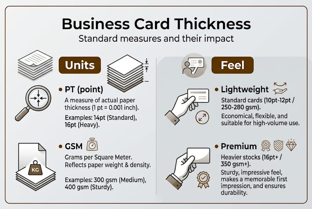
Here’s a quick reference for standard thickness benchmarks:
| PT | inches | approx. GSM | typical use | feel | price range | fit for |
|---|---|---|---|---|---|---|
| 14pt | 0.014" | ~300gsm | Budget, mass distribution | Light | Low | High-volume events |
| 16pt | 0.016" | ~325gsm | Professional standard | Standard | Mid | General business networking |
| 18pt | 0.018" | ~350gsm | Premium | Notable weight | Mid-high | Client-facing professionals |
| 32pt | 0.032" | ~600gsm | Ultra-premium, luxury | Very rigid | High | Executive, luxury brands |
A 14pt card feels like a quality flyer. A 16pt card feels like what most people expect from a professional card. Step up to 18pt and people notice something different, even if they can’t explain it. At 32pt, the card is rigid, dense, and unmistakably intentional. Each step up changes the tactile experience in a way that’s immediate and hard to ignore.
This matters because you can apply premium business card materials and finishing techniques to any thickness, but the base stock sets the tone for everything else. A foil-stamped design on a thin card still feels cheap. The same foil on 18pt feels considered.
- 14pt: Works for trade shows where volume matters more than feel
- 16pt: The reliable baseline most printing services default to
- 18pt: A noticeable step up in feel, pairs well with finishes like soft-touch laminate
- 32pt: Built for maximum impact, not everyday carry
Pro tip: Order samples before committing to a quantity. Physical samples let you test how a card feels in your hand and how it reads against a pocket or wallet. What looks right on screen can feel wrong in real life.
Exploring luxury business card materials alongside thickness specs gives you a clearer picture of how the two work together.
How thickness shapes first impressions and trust
Design is visual. But the first thing someone does with your card is feel it. That tactile moment happens in under a second, and it shapes everything that follows.
When a card has real weight and rigidity, the brain reads it as deliberate. The person holding it registers that someone put thought into this. That feeling transfers directly to how they perceive you and your business. A flimsy card suggests a brand that cut corners. A solid card suggests one that didn’t.
“Industry consensus and tactile perception research indicate that heavier stock signals credibility and attention to detail.” — brand perception research
This isn’t just intuition. It lines up with what branding professionals consistently observe. Cards with more weight stay in people’s memory longer. They’re less likely to be tossed in a drawer and forgotten.
Here’s what a card’s thickness actually communicates to the person receiving it:
- Trust: A sturdy card signals that you invest in quality
- Investment: It says you take your brand seriously
- Long-term thinking: Premium stock suggests you’re not a fly-by-night operation
- distinctiveness: Most cards feel the same. A thick one doesn’t.
The perception shift happens even when recipients aren’t consciously aware of it. That’s the real advantage. You don’t need someone to think “wow, this card is thick.” The impression lands without the analysis.

For professionals who rely on networking, a unique business card design combined with the right thickness creates a compounding effect. The card looks different and feels different. Both signals reinforce each other.
Thickness is also one of the few brand details that works passively. Long after the conversation ends, the card sits on a desk or in a holder. Every time someone picks it up, the weight speaks for your brand again.
comparing thickness: standard, premium, and luxury cards
Now that you understand how thickness signals value, here’s a side-by-side comparison to help you match the right option to your goals.
| Category | thickness | look | feel | best use | price | wallet fit |
|---|---|---|---|---|---|---|
| Budget | 14pt | Standard | Light | High-volume events, wide distribution | Low | Yes |
| Professional | 16pt | Clean | Medium | General networking, corporate | Mid | Yes |
| Premium | 18pt | polished | Heavy | Client meetings, service brands | Mid-high | Usually |
| Ultra-premium | 32pt | striking | Very rigid | Executive, luxury, exclusive clients | High | Often no |
Standard thickness benchmarks show that 16pt is the professional standard for a reason. It’s thick enough to feel substantial without creating storage issues. But the jump from 16pt to 18pt is where most professionals start to feel the difference worth paying for.
Ultra-thick 32pt cards are usually made through duplexing or triplexing, which bonds multiple layers together. This enables finishes like deep embossing and letterpress that simply aren’t possible on thin stock. The trade-off: they may not fit standard wallets or cardholders.
When to choose each:
- Choose 14pt when you’re distributing hundreds of cards at a conference or trade show and cost per card matters more than individual impression.
- Choose 16pt when you want a reliable, professional look without a premium price increase.
- Choose 18pt when you’re meeting clients one-on-one and the card represents your service quality directly.
- Choose 32pt when your brand is positioned as exclusive, premium, or luxury, and every touchpoint needs to reflect that.
Pairing the right thickness with the right finish amplifies the result. Visit the guide on premium card finishes to see how matte laminate, foil, and spot UV interact with different card weights.
practical tips for choosing the right thickness
Choosing thickness isn’t just about what sounds impressive. It’s about matching the card to your brand, your clients, and your workflow.
Start by asking yourself these questions:
- Who receives this card? A cold prospect at a networking event, or a pre-qualified client in a formal meeting?
- Will cards be stored in wallets, cardholders, or left on desks?
- Does your brand lean toward warmth and approachability, or exclusivity and prestige?
- What’s your distribution volume? 50 cards per quarter or 500?
- Do you want special finishes like foil or embossing? Those require heavier stock.
Budget matters too, but it’s worth reframing. The cost difference between 14pt and 16pt on a small batch is usually minor. The difference in perceived quality is not. For most professionals, 16pt is the minimum worth ordering. If you’re meeting clients face to face as a primary growth strategy, 18pt is a smarter investment.
Cost and durability trade-offs do exist at the high end. Ultra-thick cards cost more per unit, require more precise production, and may not work with every card storage system. These are real factors, not reasons to avoid premium stock, just inputs for the decision.
Pro tip: If you’re ordering luxury finishes like foil stamping or blind embossing, confirm with your printer that the base stock is heavy enough to handle the process. Some finishes require 18pt or thicker to execute properly. Understanding the luxury card design process upfront saves you from reprints.
Not sure where to start? Look at printing service comparisons to understand what different providers offer at each thickness level.
Summary steps:
- Define your brand positioning (everyday professional vs. premium service provider)
- Map your typical networking context (event vs. client meeting)
- Request physical samples from at least two thickness options
- Match finish selection to your chosen base stock
- Order a test batch before committing to large quantities
Why thickness is your brand’s secret weapon (but not always)
Here’s the part most thickness guides skip: thicker isn’t always right.
We’ve seen brands go straight to 32pt because it sounds impressive. But if the design doesn’t match the weight, if the brand itself isn’t positioned as premium, the card creates confusion instead of confidence. The physical signal and the visual identity have to tell the same story.
Thickness is a tool. It amplifies what’s already there. A well-designed 16pt card beats a poorly designed 32pt card every time. The brand impact from card materials comes from consistency, not just from specs.
And as the cost and durability data shows, 14pt can be perfectly adequate for high-volume distribution if the finish, design, and paper quality are handled well. In a world where digital interactions dominate, the fact that you hand someone a physical card at all is already notable. What you do with that moment is the real question.
Thickness is one input. Use it deliberately.
Get premium business cards that fit your brand
Ready to make every handoff count? BcardsCreation works with professionals and brands to develop cards that match your positioning, not just your budget.

From 16pt professional stock to ultra-thick 32pt luxury builds, we handle material selection, finish pairing, and custom design from scratch. No templates. No automated editors. If you want custom business card design that actually reflects your brand, we build it with you. See the full range of luxury business card options including foil, embossing, and specialty materials. The difference between a good card and a great one is in the details.
frequently asked questions
What is the ideal thickness for a business card?
Most professionals choose 16pt as the modern standard, but luxury brands and premium service providers often go 18pt or higher for a stronger physical impression.
Does a thicker business card really make a difference?
Yes. Industry consensus and tactile research confirm that heavier stock is perceived as more credible, more memorable, and more premium by the people receiving it.
Are extra-thick cards harder to carry and store?
Ultra-thick 32pt cards are often made by bonding layers together, which makes them rigid and impressive but potentially too thick for standard wallets or cardholders. Plan accordingly.
Is thicker always better for business cards?
Not always. Cost and durability trade-offs are real, and 14pt can perform well for high-volume situations when the finish and design quality are strong. Match thickness to your brand context, not just your preference.


