

The ultimate professional card checklist for premium branding
TL;DR:
- A business card is your first physical impression, and its quality reflects your professionalism and brand intent.
- Effective design balances clarity, hierarchy, and purpose, with materials and finishes reinforcing your brand message.
- Careful proofing, testing, and focused content ensure your card makes a memorable, purposeful impact.
Your business card is often the first physical thing a potential client holds from your brand. One misprint, one cluttered layout, or one flimsy stock choice can undercut months of positioning work in seconds. For small business owners and creative professionals, that stakes are real. A well-built card signals expertise before you say a word. A poorly built one does the opposite. This checklist walks you through every decision point so nothing gets missed before you go to print.
Table of Contents
- Set your brand intent: The non-negotiable essentials
- Design details: Clarity, hierarchy, and creative impact
- Material matters: Paper, weight, and premium finishes
- Proof and print: The last line of defense
- Summary comparison: Checklist at a glance
- Why most “premium” cards fall short: What true pros do differently
- Bring your brand to life with custom-crafted business cards
- Frequently asked questions
Key Takeaways
| Point | Details |
|---|---|
| Clarify your brand intent | Start with your unique value proposition and essential contact details for greater clarity. |
| Prioritize bold, readable design | Use clear hierarchy and high-contrast layouts while keeping creativity aligned with your brand. |
| Choose quality over weight | Stiffness, texture, and finish matter more than card thickness alone. |
| Proof and sample before print | Order physical proofs and have others review your card to avoid costly errors. |
| Use the checklist for every run | Refer back to the checklist to audit each new card design before final printing. |
Set your brand intent: The non-negotiable essentials
Before you touch a design tool or pick a paper stock, you need a clear answer to one question: what do you want this card to do? That sounds basic. Most people skip it anyway.
Your card should reflect your unique value proposition and speak directly to your target audience. A photographer’s card should feel different from a financial consultant’s. The materials, layout, and tone all follow from that positioning. If you haven’t nailed down your brand’s core message, your card design framework will feel scattered regardless of how good the printing is.
Once you’re clear on intent, lock in the non-negotiable information:
- Your full name, exactly as you use it professionally
- Your title or role, kept short and clear
- Your business name, with correct spelling and capitalization
- One primary contact method, whether that’s a phone number, email, or website
That’s it for the essentials. Resist the urge to add more. The must-have card elements that set standout cards apart are rarely about quantity. They’re about precision.
One upgrade worth including: a call-to-action or QR code that points to your portfolio, booking page, or a specific landing page. This turns a passive card into an active tool. But only add it if it leads somewhere genuinely useful. A QR code that goes to a generic homepage wastes the opportunity.
Following best practices for entrepreneurs, you should proofread all information at least twice, order a physical proof before your full run, and avoid stacking multiple contact methods on one card. Two phone numbers, three social handles, and a website address all compete for attention and dilute your message.
Pro Tip: Read your card details backward, word by word. This forces your brain to catch typos it normally skips over during a regular read.
Once you’ve established your business’s intent and absolute essentials, it’s time to dig into the creative choices that set your card apart.
Design details: Clarity, hierarchy, and creative impact
Good design on a business card isn’t about looking impressive. It’s about being instantly readable and memorable. Those two goals often pull in different directions. The best cards find the balance.
Here’s a step-by-step approach to design decisions that hold up in the real world:
- Lead with hierarchy. Your name and title should be the first things the eye lands on. Use font size, weight, and spacing to create a clear reading path. Don’t bury your name in a sea of equal-sized text.
- Choose high contrast. Light text on a light background or dark on dark might look subtle on screen. In print, it’s often unreadable. Test your layout at actual print size before committing.
- Use white space intentionally. Empty space is not wasted space. It gives your key details room to breathe and makes the card feel premium rather than crowded.
- Apply creative finishes with purpose. Foil stamping, embossing, and die-cutting all add visual and tactile impact. But only when they serve the brand. A playful die-cut shape works for a brand designer. It may feel off for a corporate attorney.
- Avoid thin borders. This is a practical trap many designers fall into. Thin borders amplify cutting errors during production. Even a 1mm misalignment makes a thin rule look noticeably off on the finished card.
- Size and test your QR code. Any QR code on your card needs to be a minimum of 0.8 x 0.8 inches to scan reliably across devices. Smaller than that, and you’re creating friction instead of removing it. Always test it with the actual destination URL before going to print.
“A business card is not a portfolio. It is an invitation to learn more. Keep the design focused. Let the work speak once they’ve scanned the code or visited the site.”
For design tips for creatives, the temptation to show everything at once is real. A card with a full illustration, five fonts, and a pattern on both sides rarely lands as intended. What stands out is restraint paired with one strong visual decision. Look at video production card inspiration for examples of how strong visuals and clean layouts can coexist without competing.
One strong image or pattern on the back, clean type on the front. That’s a format that works for almost any creative. If you want to push further, check out how others have built unique card designs without sacrificing legibility.
Design decisions are only as effective as the materials and finishes behind them. Let’s break down your substrate and finishing options for a truly premium presence.
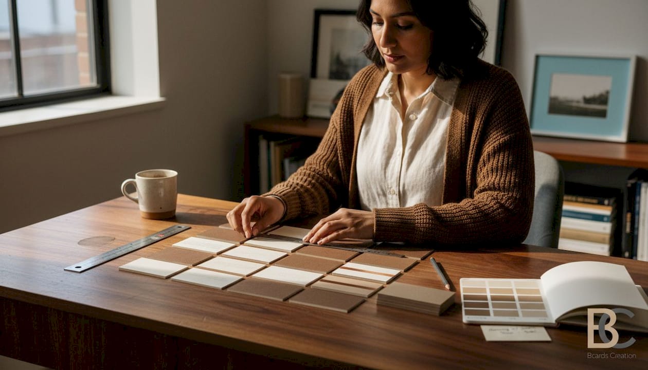
Material matters: Paper, weight, and premium finishes
Most people assume heavier paper automatically means better quality. That’s not quite right. The number that matters more is stiffness, and it doesn’t always correlate with weight.
A 350gsm SBS or Invercote stock can feel dramatically more premium than a 400gsm stock from a lower-quality mill. The fiber composition, coating, and manufacturing process all affect how a card feels in the hand. A limp 400gsm card makes a poor impression regardless of what’s printed on it.
Here’s how key material options compare:
| Material | Feel | Best for | Finish compatibility |
|---|---|---|---|
| SBS/Invercote 350gsm | Stiff, smooth | Luxury, corporate | Foil, soft touch, spot UV |
| Uncoated 300gsm | Natural, textured | Creatives, eco brands | Letterpress, deboss |
| Plastic/PVC | Rigid, unique | Tech, nightlife, premium | Frosted, clear, metallic |
| Cotton paper | Soft, tactile | Artisan, boutique | Letterpress, minimal print |
| Kraft/Recycled | Earthy, rough | Sustainability-focused | One-color, stamp-style |
Finishes add another layer of perceived quality. Soft touch laminate gives a velvety feel that’s hard to forget. Painted or gilded edges add a luxury detail that’s only visible when you hold the card. Spot UV creates contrast between matte and gloss surfaces. Each of these works best when it fits your brand tone.
The rule: don’t stack finishes just because you can. Foil plus soft touch plus painted edges plus emboss is a lot. Pick one or two that reinforce your brand’s feel. More isn’t always more.
Pro Tip: Request a physical sample of your chosen stock before placing your full order. Colors print differently on coated versus uncoated surfaces, and a sample gives you a real-world preview no screen can replicate.
Thicker cards also support specialty finishes better. A thin stock with foil may crack or peel over time. A stiffer card holds the finish and keeps that premium feel intact. When you’re investing in luxury card printing, the substrate is the foundation. Skimping there affects everything above it. For more ideas on what’s possible, browse unique card ideas to see how material choices can become part of the brand story itself.
Quality materials won’t save a card if the info is wrong or forgettable. The next step is perfecting your content and double-checking for costly mistakes.
Proof and print: The last line of defense
You’ve made your design and material decisions. Now comes the step most people rush: the final review before print.
This is where expensive mistakes happen. A wrong phone number. A title that’s outdated. A color that looks great on screen and prints muddy. These are real scenarios that happen every order cycle when the proof step gets skipped.
Run through this pre-flight checklist before approving anything:
- Name and title: exactly right, no abbreviation errors
- Business name: check spelling and capitalization against your official branding
- Contact info: dial the phone number, send a test email to the address, visit the URL
- QR code: scan it on two different devices to confirm it resolves correctly
- CTA text: is it clear, current, and pointing to an active destination?
- Color output: compare a printed proof to your brand color standards, not just your screen
- Alignment: check that text isn’t too close to the card edge, and that borders or bleed elements are positioned correctly
The workflow for final proof matters as much as the design itself. A digital file can look perfect and still print wrong. Screen brightness, color profiles, and monitor calibration all affect what you see versus what comes off the press.
Here’s a quick reference for the most common print errors and how to catch them:
| Error type | How to catch it | Prevention |
|---|---|---|
| Typo in contact info | Read backward, out loud | Two-person review |
| Wrong color output | Physical proof, not screen | Provide CMYK values |
| Bleed misalignment | Check trim marks on file | Use correct bleed settings |
| QR code failure | Scan on multiple devices | Test before file submission |
| Outdated CTA | Visit the URL manually | Update before every order |
Best practices for print consistently point to one fix that catches more errors than anything else: have someone who wasn’t involved in the design review the proof. Fresh eyes catch what yours have trained to miss. Also, review what to avoid putting on your card so you can do a final audit of your content choices before the file goes to production.
Summary comparison: Checklist at a glance
You’ve tackled the checklist from intent to print. Here’s a fast-reference summary organized by impact level for two primary professional types: creatives and executives.
| Checklist step | Impact for creatives | Impact for executives |
|---|---|---|
| Define brand intent | High | High |
| Limit to one contact method | Medium | High |
| Add QR code with CTA | High | Medium |
| Strong visual hierarchy | High | High |
| Avoid thin borders | Medium | Medium |
| Choose stiffness over weight | High | High |
| Order physical sample | High | High |
| Two-person proof review | High | High |
| Use specialty finishes selectively | High | Medium |
| Test QR on multiple devices | High | Medium |
This table can be saved or printed as a pre-order reference. Run through it before every new card order or redesign. The steps that score “High” for your professional type deserve the most attention. Refer to the step-by-step card design guide if you want a deeper walkthrough of any of these areas.
Why most “premium” cards fall short: What true pros do differently
Here’s what we see repeatedly: professionals spend money on foil, emboss, and high-end finishes, then hand over a card that’s hard to read in dim light and feels thin in the hand. The finish got the budget. The foundation didn’t.
The conventional wisdom says premium means expensive finishes. What it actually means is deliberate decisions at every layer, from the fiber content of the stock to the single line of text you chose to leave off. Most people add. The pros subtract.
We’ve seen cards that carry no logo, no tagline, just a name and a URL on 400gsm painted-edge stock. Those cards get kept. They get talked about. Because the restraint itself communicates confidence. That’s a harder sell than foil, but it’s more effective.
The other thing pros do: they treat the proof stage as seriously as the design stage. They print samples. They test every element. They get outside feedback. They don’t approve based on how the PDF looks on their laptop at full brightness. That one habit, taking the proof seriously, is the single biggest gap between a card that lands and one that gets tossed.
Briefing your designer clearly is part of this too. When you walk in with a defined brand intent, a clear audience, and a list of what the card must do, the whole project gets tighter. The designer makes better decisions. You spend less time in revision cycles. The result is a card built around purpose, not preference.
Bring your brand to life with custom-crafted business cards
You’ve worked through the full checklist. Now it’s time to put it into action with cards that actually match your standards.

At BcardsCreation, every project starts with your brief and ends with a card built specifically for your brand. No templates. No automated editors. Just expert design guidance, real material consultation, and controlled production for professionals who expect more. Explore custom business card design tailored to your positioning, browse luxury card printing options including foil and specialty finishes, or view the full card collection to find the right starting point for your next order.
Frequently asked questions
What is the most important information to include on a professional business card?
Your name, title, business, and a primary contact method are the essentials. Following card best practices, you should avoid clutter and keep the card focused on one clear purpose.
How big should a QR code be for reliable scanning?
QR codes should be at least 0.8 x 0.8 inches and always paired with a call-to-action, and you should test them across multiple devices before going to print.
Does heavier paper always mean a more premium card?
No. Stiffness beats weight every time. A 350gsm SBS or Invercote stock often feels and performs better than a flimsy 400gsm sheet from a lower-quality supplier.
Why should I order printed proofs or samples before placing a full order?
Printed proofs reveal true color output, texture, and any alignment issues that a screen preview simply cannot show. One proof can save an entire order from going wrong.
Are too many contact details on a card a bad thing?
Yes. Too many contacts compete for attention and make the card feel cluttered. Stick to one or two methods maximum and let the card direct people to a single clear next step.


