

How to print high-quality cards: luxury brand guide
TL;DR:
- Most business card print projects fail due to poor preparation of files, materials, or finishing processes, damaging brand credibility. Selecting high-quality materials, correct color modes, and incorporating bleed are essential for flawless results, especially for luxury brands. Using professional printing services with proper registration and premium finishing options ensures a tactile and visual impression that elevates brand perception.
Most business card printing projects fail before a single sheet hits the press. You finalize the design, send the file, and receive cards that look flat, feel thin, or show white edges where the background was cut short. For luxury brands, that result is not just disappointing — it is a direct hit to credibility. Knowing how to print high-quality cards means understanding what goes wrong at each stage: file preparation, material selection, printing method, and finishing. This guide covers all of it, in the order you actually need it.
Table of Contents
- Understanding the essentials: materials, file preparation, and printing methods
- Preparing your print-ready file: design, bleed, and resolution best practices
- Executing the printing process: home versus professional options and finishing techniques
- Verifying quality and avoiding common printing mistakes
- The overlooked art of tactile branding: beyond the visual in luxury cards
- Explore premium custom business card solutions at BcardsCreation
- Frequently asked questions
Key Takeaways
| Point | Details |
|---|---|
| Use CMYK and 300 DPI | Always prepare print files in CMYK color mode with at least 300 DPI resolution to ensure color accuracy and sharpness. |
| Include 3mm bleed | Incorporate a 3mm bleed around your card design to prevent unsightly white edges after trimming. |
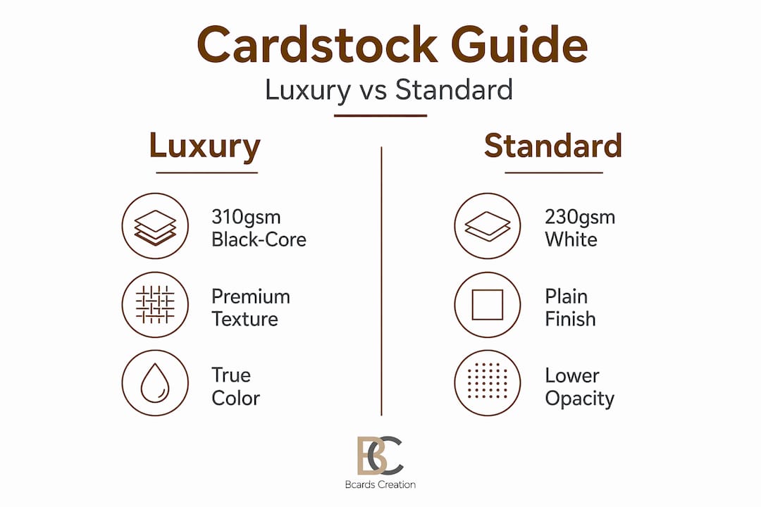
| Select premium 310gsm stock | Choose black-core 310gsm cardstock for complete opacity and a luxurious, durable feel. |
| Prefer offset printing for volume | For runs over 500, offset lithography provides superior color fidelity and cost efficiency. |
| Test prints on plain paper | Always perform test prints on plain paper to verify alignment and color before printing on costly cardstock. |
Understanding the essentials: materials, file preparation, and printing methods
Getting the foundation right saves you from reprints, wasted budget, and cards that underdeliver. Every decision here affects the final product.
Start with the right cardstock. For luxury business cards, 310gsm black-core stock is the standard worth knowing. The black core layer between the outer sheets ensures complete opacity. Even under direct light, neither side bleeds through. That matters especially for dark or full-bleed designs. When choosing luxury card materials, weight and core construction are your first decisions, not your last.
Color mode and resolution come next. Files must be in CMYK color mode at 300 DPI minimum for high-quality offset printing. RGB causes color shifts like dull blues and greens that are nearly impossible to fix after printing. Convert early in your design process — not right before export. The difference between an RGB file corrected at the last minute and a properly built CMYK file is visible on press.
Choose your printing method based on volume and quality needs. Offset lithography suits 500+ luxury cards per 2026 guides, offering up to 2400 DPI and Pantone matching at $1.50 to $3.00 per unit. Digital printing for business cards using HP Indigo technology works well for runs under 1000 cards with faster turnaround. Neither option is universally better — the right choice depends on your run size and color requirements.
| Feature | Offset lithography | Digital (HP Indigo) |
|---|---|---|
| Resolution | Up to 2400 DPI | Up to 812 DPI |
| Color fidelity | Pantone matching | Near-Pantone accuracy |
| Minimum run | 500+ units | 1 to 1000 units |
| Cost per unit | $1.50 to $3.00 | $3.00 to $6.00 |
| Turnaround | 5 to 10 business days | 2 to 5 business days |
| Best for | Luxury runs, exact color match | Samples, small batches |
Always include a 3mm bleed. Set your artwork to extend 3mm beyond the trim line on every side. Cutting machines are precise but not perfect. Without bleed, even a 1mm shift creates a visible white edge. That is not a minor flaw on a luxury card — it signals a production error. Review top printing techniques to understand how bleed fits within a full pre-press checklist. Good design system principles account for print production constraints from the start.

Pro Tip: Ask your printer for a physical proof before approving the full run. A PDF proof cannot show you how ink sits on uncoated stock or how foil reflects under office lighting.
Preparing your print-ready file: design, bleed, and resolution best practices
With materials and printing method selected, the next step is building a file that survives the production process without errors. Most quality problems trace back here.
Follow these steps to prepare a print-ready file correctly:
- Set document size to standard trim dimensions. For business cards, that is typically 3.5 x 2 inches (US) or 85 x 55mm (international). Confirm with your printer before starting layout.
- Add 3mm bleed on all four sides. Bleed is the most important concept in business card production. Slight cutting misalignments without 3mm bleed create unprofessional white edges that cannot be corrected after printing.
- Set a 3mm safe zone inside the trim line. Keep all critical text, logos, and design elements inside this boundary. Anything closer risks being clipped during cutting.
- Use vector formats for logos and icons. Vector files scale without quality loss. If you are using raster images, they must be 300 DPI or higher at the actual print size, not at a scaled-down version of it.
- Embed or outline all fonts before export. Missing fonts get substituted by the printing software. The result can be entirely different typefaces, spacing errors, and layout shifts.
- Export as a high-quality PDF. Use PDF/X-1a or PDF/X-4 formats. These standards are designed for commercial printing and ensure color data is preserved correctly.
- Run a test print on plain paper first. Before touching your cardstock, print at 100% scale on plain letter paper. Verify alignment, margins, and that your bleed markers fall where expected. This step catches positioning errors that are invisible on screen.
Testing design prototypes professionally before committing to a full run is a production discipline, not optional caution. Review your card printing workflow tips to keep this process repeatable across multiple projects.
Pro Tip: When you design unique luxury cards, keep decorative elements like borders and background patterns well inside the safe zone or well into the bleed. Elements sitting exactly on the trim line almost always look wrong after cutting.
Executing the printing process: home versus professional options and finishing techniques
Your file is ready. Now you need to decide where and how it gets printed.
Home printing is for prototyping only. Home printing for prototypes uses 270-300 GSM cardstock on inkjet printers set to “heavyweight” or “cardstock” at 100% scale, with test prints on plain paper first, taking 24 hours for ink cure. That curing time is not optional. Handling freshly printed cards smears pigment ink, especially on uncoated stock.
Allow 24 hours for ink to fully cure before handling home-printed cards. Rushing this step causes smudging that cannot be undone, particularly with gloss or pigment-based inks.
Professional commercial printing changes the outcome significantly. Offset lithography for runs over 500 cards delivers color consistency that inkjet simply cannot match. Pantone color accuracy at 2400 DPI means the exact brand color you specified in your design system appears on every card in the run, not an approximation of it. See the full luxury card printing process for a walkthrough of how commercial production handles color and cut quality.
Double-sided cards require registration control. For double-sided luxury cards, print fronts and backs separately then adhere or use precise registration correction for printer offsets. Visible front-to-back misalignment on a premium card is one of the most noticeable quality failures.
Finishing elevates everything. The premium finishes guide covers this in full detail, but the core options worth knowing are listed below.
- Soft-touch lamination. Adds a velvety matte surface that feels noticeably different from standard laminate.
- Linen texture. A pressed pattern that adds tactile interest without visual clutter.
- Spot UV coating. Gloss applied to selected areas only, creating contrast between matte and shiny surfaces.
- Foil stamping. Real metallic foil bonded to the card surface, available in gold, silver, rose gold, and more.
- Edge painting. Color applied to the card’s edges, visible only when viewed from the side. Understated but distinctive.
| Method | Print quality | Cost range | Volume suitability | Finishing options |
|---|---|---|---|---|
| Home inkjet | Low to medium | Low | 1 to 25 cards | Limited |
| Digital commercial | Medium to high | Medium | 25 to 1000 cards | Lamination, foil |
| Offset lithography | High | Low per unit at scale | 500+ cards | All options available |
Pro Tip: Always use cotton gloves when handling matte-finished or uncoated cards. Fingerprints on soft-touch laminate are visible and extremely difficult to remove.
Verifying quality and avoiding common printing mistakes
After printing and finishing, a final quality check protects everything you have invested in the design and production process.
These are the most common mistakes that damage card quality and how to catch them before it is too late:
- Ignoring bleed. The most frequent error in DIY high-quality card printing. Without 3mm bleed, cutting produces thin white edges on colored backgrounds.
- Using RGB color mode. Designers often make this mistake, along with ignoring margins and bleed, causing cards to look unprofessional. Always verify CMYK before sending files.
- No safe zone. Text or logos placed too close to the trim line get clipped. Keep critical content at least 3mm inside the trim.
- Low resolution images. A logo that looks sharp on screen at 72 DPI prints blurry at full size. Use vector formats or 300 DPI raster images.
- Thin borders. Borders thinner than 5mm amplify any cutting deviation. A border that is 2mm wide on one side and 1.5mm on the other is immediately noticeable.
- Insufficient test proofs. One test print is not enough. Run multiple iterations, especially when adjusting alignment for double-sided cards.
On the final batch, inspect a sample from the run before accepting delivery. Check cut sharpness, verify the trim is consistent across cards, and confirm that colors match your approved proof. When choosing printing services, ask what quality control steps they perform on each run.
Pro Tip: Hold a finished card at eye level under a lamp to check for cutting deviations. The light catches uneven edges that are invisible when the card lies flat on a desk.
The overlooked art of tactile branding: beyond the visual in luxury cards
Most printing tutorials stop at visual quality. That misses a significant part of what makes a luxury card work.
When someone picks up your card, they feel it before they read it. The weight, rigidity, and surface texture register in under a second. Luxury pros select black-core 310 GSM stock for complete opacity in double-sided designs, preventing show-through even under light. That is a non-obvious specification, but it is the difference between a card that feels exclusive and one that feels like a heavier version of standard stock.
Tactile material choice is the silent salesman. It communicates brand value before a single word is read, and it can either reinforce or quietly contradict everything your design says.
Linen texture and raised foil add dimensionality that flat matte or gloss surfaces cannot replicate. A finger tracing across embossed text registers as quality in a way that no visual design element achieves. Sound also plays a role. A rigid 400gsm card placed on a glass table makes a different sound than a flimsy 250gsm card. These sensory cues are processed subconsciously and contribute directly to brand memory.
The practical implication is that budget decisions about luxury card materials insight deserve the same attention as decisions about logo design or color palette. Choosing the least expensive cardstock that still looks acceptable is not a neutral trade-off. It is an active choice to undercut your brand’s perceived value at the exact moment someone is forming their first impression.
We often see clients arrive with beautiful designs that lose their impact because the substrate was chosen by price. The visual work survives, but the tactile experience undermines it. Getting both right is not harder or dramatically more expensive. It just requires asking the right questions earlier in the process.
Explore premium custom business card solutions at BcardsCreation
Understanding how to print high-quality cards is one thing. Executing it flawlessly across material selection, file preparation, and finishing is another. That is where having the right production partner makes a real difference.

At BcardsCreation, every project is built individually — no templates, no automated editors. We work with custom business card design from the ground up, aligned to your brand identity and positioning. Our materials include multi-layered fine papers, black-core cardstock, and real metallic foils. Our luxury creative business cards combine expert design guidance with controlled production at every stage. For clients looking for the full package, our fine paper double layered cards with real gold and silver foils deliver the tactile and visual quality that luxury brands require.
Pro Tip: Reach out before your design is finalized. Early material and finish consultation saves revision cycles and ensures your file is built correctly from the start.
Frequently asked questions
What file format and color mode should I use to print luxury business cards?
Use high-resolution PDF files designed in CMYK color mode at 300 DPI minimum, with all fonts embedded or outlined to prevent substitution errors. RGB color mode causes visible shifts in printed blues and greens.
Can I print high-quality luxury cards at home?
Home printing suits prototypes only, using 270-300 GSM cardstock with a 24-hour ink cure time. Achieving professional color fidelity and premium finishing requires commercial offset or high-end digital printing.
Why is bleed important when designing business cards?
Bleed extends artwork 3mm beyond the trim line so that slight cutting misalignments do not produce unprinted white edges. It is the most commonly skipped step in DIY card printing and the most visible when it is missing.
What finishing options best enhance a luxury business card?
Linen texture, soft-touch lamination, spot UV coating, real foil stamping, and edge painting all improve tactile impression and communicate quality before the card is read. Foil stamping and soft-touch lamination together are among the most effective combinations for luxury positioning.
How do I avoid misalignment on double-sided business cards?
Print fronts and backs separately with precise front-to-back registration correction for any printer offset, or use a professional service with registration controls built into their production process. Visible misalignment is one of the most damaging quality signals on a premium card.


