

How to Optimize Startup Business Cards for Maximum Impact
TL;DR:
- Physical business cards build trust and memorability better than digital formats.
- Premium materials and simple, consistent design convey professionalism and brand value.
- Combining high-quality cards with strategic QR codes creates an effective hybrid networking tool.
You hand over your card after a great conversation, and then nothing. No follow-up. No connection request. Just silence. That moment is where most startup founders lose business without ever knowing it. A generic card signals a generic brand. But a well-designed, optimized business card can do the opposite. It can make contacts remember you, trust you faster, and reach out first. This guide walks you through exactly how to design, build, and verify a startup business card that works as hard as you do in the room.
Table of Contents
- Understanding the role of business cards in startup branding
- What you’ll need: Materials and design essentials
- Step-by-step guide: Designing and optimizing your business card
- Common pitfalls and how to verify card effectiveness
- Our take: The hybrid approach startups can’t ignore
- Upgrade your cards: Next steps for impactful business cards
- Frequently asked questions
Key Takeaways
| Point | Details |
|---|---|
| Physical cards boost trust | Handing over a premium card increases the likelihood of future business connections. |
| Color and finish matter | White cards and high-quality finishes are statistically trusted and remembered. |
| Hybrid is the new standard | Combine physical luxury with digital access through QR codes for better results. |
| Avoid common mistakes | Cluttered layouts and missing vital info reduce your card’s effectiveness. |
Understanding the role of business cards in startup branding
Now that we’ve outlined why making a lasting impression matters, let’s see exactly how business cards affect branding and networking.
Physical cards still carry serious weight. In a world full of digital noise, a card you can hold, feel, and keep creates a moment of connection that a LinkedIn notification simply cannot replicate. For startup founders, this matters more than most realize. You’re not just sharing contact details. You’re making a brand statement in a few seconds.
The numbers back this up. According to Adobe business card survey data, recipients are 62% more likely to do business with someone who hands them a quality physical card. That same research shows that 70% feel more personal than a LinkedIn connection. And when it comes to color choices, white cards build the most trust among professionals, with 54% favoring them. These aren’t minor differences. They represent real conversion opportunities at every event, meeting, and pitch.
Here’s how physical and digital cards compare on the metrics that matter most:
| Feature | Physical card | Digital card |
|---|---|---|
| Trust building | High | Moderate |
| Brand recall | High | Low to moderate |
| Data capture | Manual | Automatic |
| Personalization feel | Very high | Low |
| Shareability | Limited | High |
| Tactile experience | Yes | No |
Both formats have a role. But for startups focused on business card branding and early relationship building, the physical card wins on trust and memorability. Digital cards work well when you want to track interactions or send something ahead of a meeting.
Strong boost brand visibility efforts work best when your offline presence matches your online presence. A polished card reinforces everything you’re building on social and in search.
Key reasons optimized cards drive better results:
- They signal professionalism before you say another word
- They create a physical memory anchor that digital formats can’t replicate
- They give recipients a simple action: pick it up and reach out
- They reflect your brand’s values through texture, color, and finish
- They survive meetings, pockets, and desk drawers for weeks
The goal isn’t just to hand out a card. It’s to hand out something worth keeping.
What you’ll need: Materials and design essentials
Once you understand the unique value of physical cards, the next step is to gather the right materials and design essentials.
The quality of your materials communicates something immediately. Before anyone reads your name, they feel your card. A thin, flimsy card suggests a startup still figuring things out. A thick, textured card with a sharp finish says something very different. It says you’re serious.
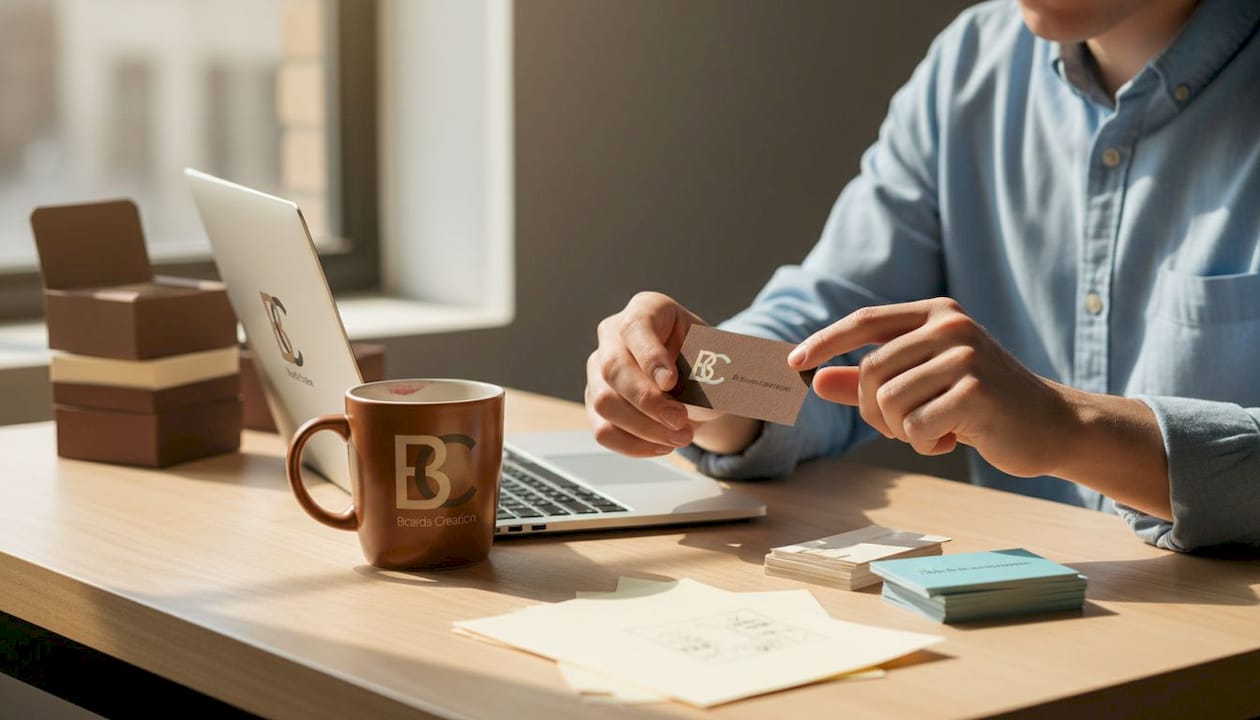
Here’s a quick reference for materials and their impact:
| Material or finish | Effect on perception |
|---|---|
| 400gsm paper stock | Substantial feel, premium signal |
| Foil stamping | Luxury, attention to detail |
| Spot UV coating | High contrast, modern edge |
| Colored card edges | Distinctive, memorable detail |
| Matte lamination | Understated sophistication |
| Textured linen stock | Approachable, refined feel |
| Clear plastic card | Innovative, tech-forward brand signal |
Finishes aren’t just cosmetic. They change how people interact with your card. Someone who rubs a soft-touch matte card between their fingers is already engaging with your brand on a sensory level. That physical engagement is one reason premium cards outperform standard ones in recall.
Card color psychology plays a major role in perception. Colors trigger associations instantly. Navy blue signals stability. Black signals exclusivity. Green can suggest innovation or health. And according to the Adobe business card survey, white cards are most trusted by 54% of professionals. If your brand colors are bold, white can still work as a base to anchor those colors without overwhelming the eye. For more detail on choosing the right palette, the color guide for startups is a solid starting point.
Essential information to include on every card:
- Your full name and title
- Company logo (vector format for clean printing)
- Phone number and professional email
- Website URL
- QR code linking to your portfolio, booking page, or social profile
- Physical address (only if relevant to your business model)
Pro Tip: Keep your QR code linked to a landing page specific to your card, not just your homepage. This gives you a way to track how many people actually scan it after meeting you.
Minimalist layouts tend to perform better than cluttered designs. White space isn’t wasted space. It’s what makes your name and logo stand out. When in doubt, remove rather than add.
Step-by-step guide: Designing and optimizing your business card
With your materials ready, it’s time to put it all together. Here are the exact steps to design and optimize your card.
Step 1: Lock in your brand style
Before touching layout, confirm your brand colors, logo version, and primary font. These must match everything else in your visual identity. A card that uses different colors than your website creates confusion. Consistency builds trust.
Step 2: Place the essential information in the right order
Visual hierarchy matters. Your name should be the largest text. Your role comes next. Contact details and website go lower on the card, in a smaller but still readable size. Don’t go below 8pt font for any text. If it strains the eye, it won’t get read.
Step 3: Choose your finishes deliberately
Don’t pick finishes at random. Each one should serve a purpose. Foil on your logo signals premium quality. Colored edges make the card stand out in a stack. Textured stock invites people to hold the card longer. Think about the first impression you want your industry contacts to have, then match the finish to that feeling. Check out these card design tips for more guidance on finish choices.
Step 4: Add your QR code strategically
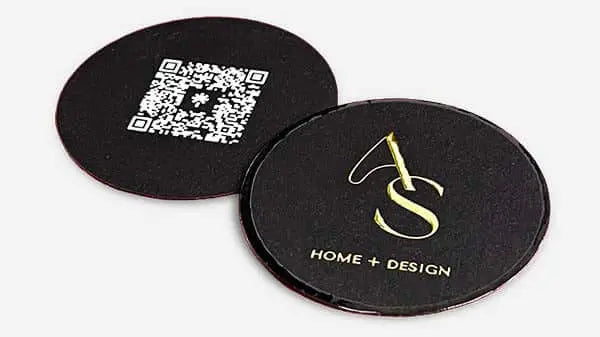
Place the QR code on the back of the card. Make it large enough to scan easily, around 1.5 to 2 cm minimum. Link it to a landing page designed for people who’ve just met you. Include a short headline and one clear call to action on that page. As the Adobe business card survey confirms, a QR code bridges digital and physical networking seamlessly. More on using QR codes for business cards effectively is covered in depth elsewhere.
Step 5: Review layout before sending to print
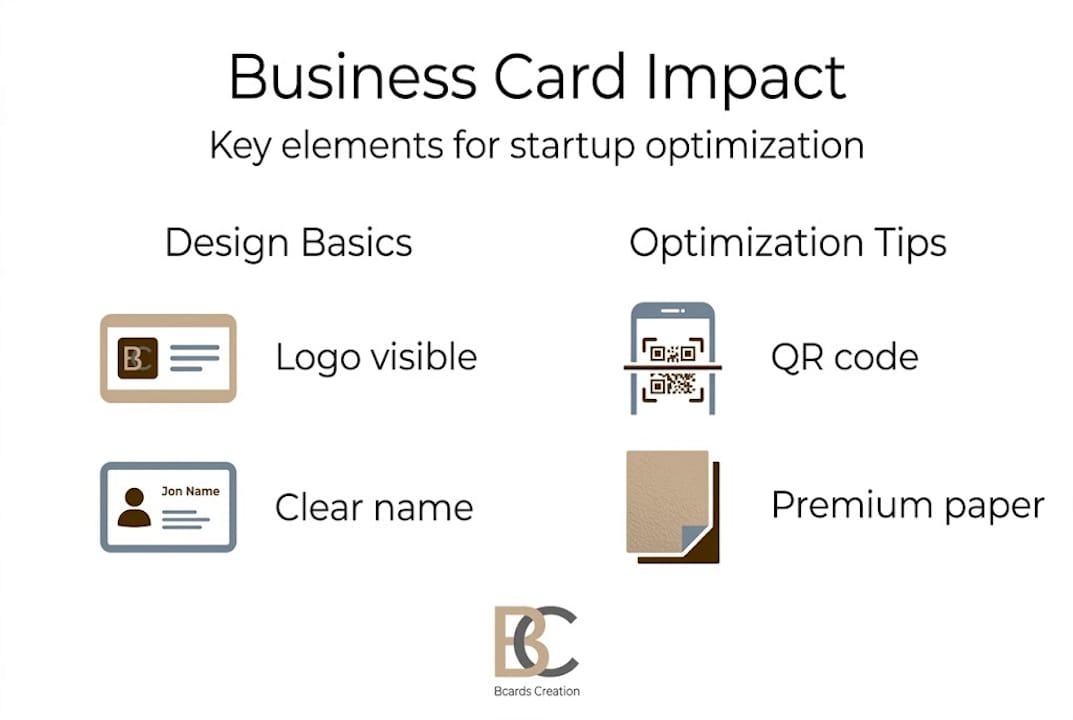
Use the design framework as a checklist. Confirm that margins are consistent, all text is within safe zones, and no important element is near the edge. Print a test at home to check readability in real conditions, not just on screen.
Step 6: Order a small test batch first
Don’t print 500 cards before you’ve held one in your hand. Order a run of 25 to 50 cards. Take them to one event. See what response you get. Then refine and scale.
Pro Tip: When you receive your test batch, ask three people who don’t know your business to describe what your card says about your brand. Their answers tell you more than any screen preview ever will.
Common pitfalls and how to verify card effectiveness
Even with the best design, it’s easy to miss small details that undercut your card’s impact. Let’s look at common pitfalls and how to ensure your card delivers results.
The most common mistake is clutter. Founders want to include everything. Two phone numbers, three social handles, a tagline, and an address. The result is a card that communicates nothing clearly. Less information means what’s there gets read.
Common design mistakes to avoid:
- Poor contrast between text and background (gray on gray, light font on light paper)
- Missing or incorrect contact details (always proofread twice)
- Low-resolution logo or artwork that looks blurry in print
- Inconsistent fonts or colors compared to your other brand materials
- Cheap paper that bends, tears, or discolors quickly
- No whitespace, resulting in a card that feels crowded
“The best business card isn’t the one with the most information. It’s the one that makes the recipient want to find out more.”
Visual branding for startups is a full discipline, and your card is the smallest but often most tactile expression of it. Getting it wrong is costly, even if the printing cost was low.
How to verify your card is working:
- Track QR code scans. Use a URL shortener or a dedicated tracking link. If scans are low, your card isn’t prompting digital follow-through.
- Ask for honest feedback. After events, ask two or three contacts what they remember about your card. Memorable details mean it’s doing its job.
- Log new contacts per event. Compare events where you used different card versions. Patterns will emerge.
- A/B test card variants. Print two versions with different finishes or layouts. Use each at different events and compare results.
Research confirms that 62% more likely responses occur with physical card holders. That gap is real. But only if the card meets a basic quality threshold. Poor design erases the advantage.
For a focused look at what belongs and what doesn’t, check out what not to put on cards. For inspiration on standing out, unique card design approaches offer practical direction.
Our take: The hybrid approach startups can’t ignore
With common mistakes and verification covered, it’s worth sharing a key strategic insight we’ve seen play out with hundreds of startup founders.
The debate between physical and digital cards is a distraction. The real opportunity is in combining both. We see founders fall into one of two camps: those who stick entirely to physical cards and miss easy digital follow-up, and those who go fully digital and lose the trust-building power of something tangible.
A premium physical card with a QR code solves both problems at once. The card builds instant trust. The code enables immediate digital action. As the Adobe business card survey shows, this hybrid approach is already how effective networkers operate.
Premium materials matter more in this model, not less. When someone scans your QR code, they’re transitioning from physical to digital. That moment of transition works because the card made a strong enough impression to prompt action. A forgettable card doesn’t get scanned. It gets discarded.
Explore how QR code strategies integrate naturally into premium card design. The startups winning at networking aren’t choosing one format. They’re using both.
Upgrade your cards: Next steps for impactful business cards
If you’re ready to take action and upgrade your business cards for real startup impact, here’s where to start.
Your business card is often the first physical thing a potential partner, investor, or client holds from your brand. It should reflect your positioning, not undercut it.
At BcardsCreation, every card is designed individually. No templates. No automated editors. Just expert design guidance, material consultation, and controlled production from start to finish. Whether you’re looking for custom business card design tailored to your brand identity, creative luxury cards with foiling and specialty finishes, or striking clear business cards that signal a modern, innovative brand, we build cards that do real work for you. Founders who invest in premium cards don’t just look more credible. They close more conversations.
Frequently asked questions
Why do physical business cards still matter in 2026?
Physical cards create trust that digital formats struggle to match. Research shows recipients are 62% more likely to do business with someone who hands them a well-designed physical card.
What is the best color for building trust with new contacts?
White cards are the most trusted choice. According to the Adobe business card survey, 54% of professionals trust white cards most.
Should startup cards include QR codes in 2026?
Yes. A QR code bridges offline and online networking in one action, making it simple for new contacts to follow up digitally immediately after meeting you in person.
How can I tell if my business card design is effective?
Track QR scans, log new connections from each event, and ask contacts directly what they remember about your card. Consistent feedback and rising scan rates signal the design is working.


