

Minimalist card designs that elevate your brand identity
TL;DR:
- Minimalist business cards communicate confidence and premium positioning through deliberate design choices. Successful designs rely on grid alignment, intentional whitespace, clear hierarchy, and consistent style, often enhanced by textured materials or finishes. To create a memorable card, focus on one sensory-rich element and tailor the format to your brand and audience expectations.
Standing out in a crowded room is hard enough. Doing it with less is the real challenge. Minimalist business cards are no longer just a design trend. They signal intention, confidence, and premium positioning in a way that cluttered, template-based cards simply cannot. For creative professionals and entrepreneurs, the card you hand over speaks before you do. This article walks you through what makes minimalist cards work, six real-world design examples worth studying, a side-by-side comparison of finishes and styles, and a practical framework for picking the right option for your brand.
Table of Contents
- What makes a minimalist card design successful?
- Six inspiring minimalist card designs (with real-world features)
- How premium minimalist cards compare: Features and finishes
- Choosing the right minimalist card for your brand
- Why minimalist doesn’t mean boring — what most designers miss
- Ready for your own standout minimalist card design?
- Frequently asked questions
Key Takeaways
| Point | Details |
|---|---|
| Structure is key | Great minimalist cards rely on typography, grid layout, and whitespace for instant recognition. |
| Premium cues matter | Material and finish choices communicate credibility in subtle but powerful ways. |
| Variety inspires | Diverse minimalist examples reveal creative ways to match your brand’s personality. |
| Match brand to style | Choose a card style based on your brand’s core values, audience, and industry. |
| Minimal isn’t plain | Intentional minimalism enhances memorability—when done right, it’s never boring. |
What makes a minimalist card design successful?
Not every plain card is a minimalist card. That distinction matters. True minimalism is the result of deliberate decisions, not just removing elements until the card looks sparse. The goal is to focus attention, not eliminate it.
The most successful minimalist cards share four core traits. Understanding each one helps you avoid the common trap of “minimal but forgettable.”
-
Grid-based alignment. Every element sits in a deliberate position. Nothing floats. According to good visual design principles, a well-structured layout aligns typography and graphic elements to a grid, establishes clear visual hierarchy through size and weight, and relies on consistency and whitespace to guide the eye. On a business card, this means your name, title, and contact info each have a fixed, intentional home.
-
Whitespace as a design element. Empty space isn’t wasted space. It’s what creates breathing room and signals confidence. Cards with generous margins and open areas feel premium. Cards without them feel rushed.
-
Clear visual hierarchy. Your name should dominate. Your contact info should follow. A tagline, if included, should sit clearly below. The reader’s eye should travel through the card in one smooth path, not jump around looking for context.
-
Consistent style. Font pairing, color palette, and finish should all reinforce the same identity. One serif typeface and one clean sans-serif, for example, deliver more personality than three mixed fonts at different weights.
Exploring luxury business card materials shows how paper weight, surface coating, and substrate choice can do most of the “work” that busy designs typically handle through volume. A 600gsm cotton paper stock, for instance, communicates premium quality without a single extra graphic element.
“Minimalism doesn’t mean plain. It means every choice is intentional. Every inch of the card earns its place.”
Pro Tip: If your card design feels too empty but you don’t want to add more text, upgrade the material. Textured paper, soft-touch lamination, or an uncoated natural finish add richness that visual elements cannot.
When creating a unique card design, the biggest gains often come from restraint. Cutting one unnecessary element, tightening the spacing, or switching to a single accent color can transform a good card into a great one.
Six inspiring minimalist card designs (with real-world features)
With the criteria clear, it’s time to examine real-world designs that embody minimalist principles and deliver standout brand value.
-
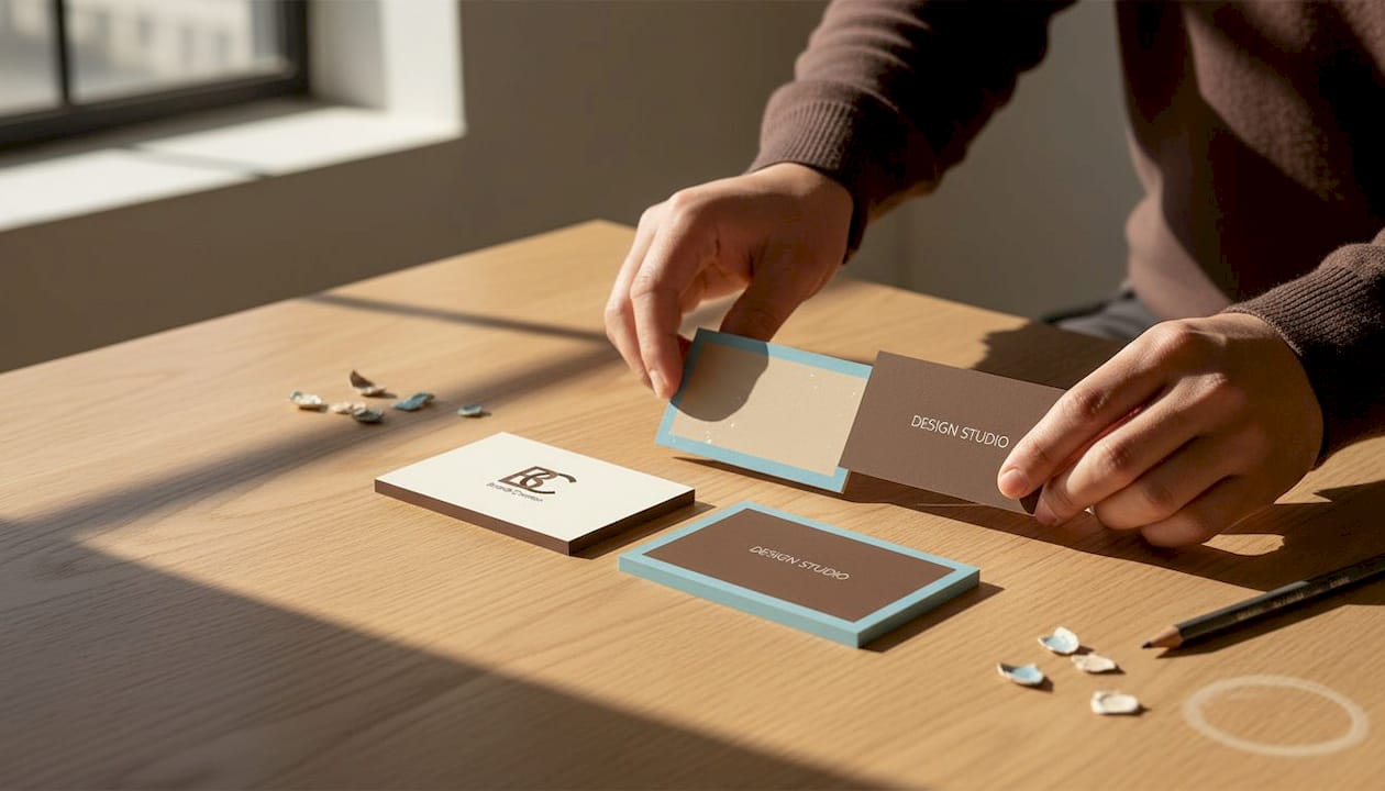
Monogram card. A single oversized initial centered on thick cotton stock. No logo, no tagline. Just initials in a refined serif font, with contact details printed in a small, muted typeface on the reverse. Works brilliantly for consultants and attorneys who want to project authority. The monogram becomes the brand mark.
-
Letterpress grid card. A cream uncoated stock with contact info pressed into the surface using traditional letterpress printing. The indentation creates tactile depth that makes the card impossible to ignore. The layout follows a strict two-column grid. No color except the pressed indentation itself. This is the format that a minimalist name-centric approach can use to drive credibility and memorability to their peak.
-
Clear transparent card. A frosted PVC substrate printed with white and black ink only. Because the card is see-through, whitespace becomes literal transparency. Architects, interior designers, and photographers use these to signal a modern, forward-facing brand without saying a word. The card itself is the brand statement.
-
Photo-minimal card. A single full-bleed black-and-white portrait photo on the front, name and title only. Nothing else. On the back, a sparse contact block in a monospaced font. This format works well for creative directors, photographers, and speakers who want to attach a face to a name in a memorable, uncluttered way.
-
Luxury foil accent card. A matte black card with a single thin line of gold foil framing the name. No borders, no patterns. Just a measured foil accent that adds contrast and catches the light. This format signals premium positioning across nearly every creative industry. Check out inspirational card ideas for more foil accent combinations worth considering.
-
Grid-aligned flat card. A classic 3.5 x 2 inch card on uncoated white stock. Every element is aligned to a six-column grid. The name in a large weight sans-serif anchors the left column. Contact info sits in a smaller weight on the right. Nothing else. This format is the most adaptable and suits brand strategists, copywriters, and digital consultants who want to project precision.
“The best minimal cards don’t feel designed. They feel inevitable.”
Pro Tip: You don’t need a custom foil job to get a premium effect on a smaller budget. A single spot gloss UV coating over your name on a matte stock delivers a strong contrast at a fraction of the cost of full foil. For practical direction on this, design tips for creatives breaks down the tradeoffs between finish options clearly.
How premium minimalist cards compare: Features and finishes
After seeing individual designs, let’s directly compare features and benefits to help guide your selection.
| Card style | Best use case | Perceived luxury | Typical cost range | Finish and feel |
|---|---|---|---|---|
| Name-centric monogram | Consultants, attorneys | Very high | $$$ | Cotton stock, letterpress or foil |
| Grid-aligned flat | Strategists, writers | Moderate | $$ | Uncoated, matte, or soft-touch |
| Clear transparent | Architects, designers | High | $$$ | Frosted PVC, silk-screen ink |
| Photo-minimal | Photographers, speakers | Moderate to high | $$ | Gloss or matte lamination |
| Luxury foil accent | Creative directors, agencies | Very high | $$$$ | Matte + spot foil or hot foil |
| Letterpress grid | Lawyers, brand founders | Very high | $$$ | Thick uncoated or cotton stock |
A few patterns stand out from this comparison. First, perceived luxury tracks closely with tactile experience, not just visual design. Cards you can feel, like letterpress impressions or soft-touch lamination, consistently outperform flat printed alternatives in how recipients respond to them. Second, cost doesn’t automatically correlate with complexity. A grid-aligned flat card with premium uncoated stock and clean typography can feel more expensive than a foil card with poor layout.
Real project galleries, not just template libraries, are where you see these differences in action. Behance’s curated results for premium minimalist card projects surface actual layout decisions, material calls, and finish combinations that templates never show. Studying real work teaches you what “resolved” looks like versus “almost there.”
Matching card type to industry matters more than most professionals realize. A frosted transparent card is a natural fit for architecture or industrial design. A letterpress monogram card fits law, finance, or brand consulting. A photo-minimal card serves the creative industries directly. When the format matches the brand archetype, the card does its job before anyone reads a single word.
For a deeper look at what separates good finishes from great ones, the business card finishes guide covers the technical and aesthetic tradeoffs across every major finish option. For substrate choices, modern card materials gives you a practical overview of what’s available and where each material performs best.
Choosing the right minimalist card for your brand
Now that you’ve seen the options and how they compare, here’s exactly how to pinpoint the best minimalist card type for your brand.
This is a three-step process. Short, actionable, and repeatable every time you rebrand or refresh your cards.
-
Identify your core brand trait. Pick one word. Precise. Bold. Warm. Disruptive. Whatever that word is, it filters your options immediately. A “warm” brand doesn’t pick matte black with gold foil. A “precise” brand doesn’t pick a full-bleed photo card. Your brand trait points directly to a format and finish combination before you’ve opened a single design tool.
-
Map your audience context. Where will you hand this card? At a conference, over a boardroom table, at a gallery opening? Each context carries expectations. A frosted clear card will wow an audience at a design event. The same card might feel out of place at a legal conference. Context shapes format.
-
Define the impression you want to leave. Not the message you want to send. The impression. Cards are tactile, physical objects. The goal isn’t information transfer. The goal is a lingering feeling that makes the recipient hold the card longer and remember you specifically. Use that desired impression to choose finish and material before you choose color or typography.
As good visual design principles reinforce, the layout structure and hierarchy should serve the goal. The visual experience should feel obvious, not effortful, for the reader. Your card should communicate your core brand trait in under three seconds, without the recipient reading a single word.
Pro Tip: Don’t choose your card format based on what you like. Choose it based on what your best client will respond to. Their context, their expectations, and their definition of “premium” should drive the decision, not your personal aesthetic preferences.
For anyone starting from scratch or looking to upgrade their current cards, luxury card essentials for 2025 and beyond is the most practical starting point. And if material choice feels overwhelming, premium card materials simplifies the tradeoffs into clear, usable guidance.
Why minimalist doesn’t mean boring — what most designers miss
Here’s a perspective most minimalist card articles skip entirely. They talk about what to remove. Almost none of them talk about what to add back with intention.
The conventional wisdom around minimalism frames it as subtraction. Take things away until nothing unnecessary remains. That framing is technically correct but practically misleading. Because in the rush to strip things out, most professionals end up with cards that feel empty rather than focused. There’s a real difference. Focused cards have presence. Empty cards have absence. One commands attention. The other gets forgotten.
What separates average minimalist cards from exceptional ones is a commitment to one specific area of richness. Not visual richness. Sensory richness. The card that feels different the moment it lands in someone’s hand. The one with a pressed letterpress impression you can trace with your fingertip. The one where the matte lamination catches a soft, velvety light. These sensory details do more for brand recall than any additional graphic element ever could.
The creative professionals who get this right take bold risks in one area while holding everything else flat. A completely white card with oversized embossed typography is a risk. A transparent card with a single white-ink name is a risk. These approaches feel minimal but they are intensely deliberate. The risk is controlled and pointed.
The professionals who miss the mark try to minimize everything equally. Every element gets reduced at the same rate. The result is a card that feels half-finished, not refined. True minimalism requires you to commit fully to one moment of impact, then step back from everything else.
If you want practical guidance on taking that kind of creative risk with your card design, advanced card design tips gives you the framework to do it with confidence rather than guesswork.
Ready for your own standout minimalist card design?
Having explored and compared the top minimalist card styles, it’s time to bring your new vision to life.
Every design framework in this article, from grid alignment and tactile finish selection to format matching for your industry, reflects exactly how we approach projects at BcardsCreation. No templates. No automated editors. Every card is developed individually, with material consultation, expert design guidance, and controlled small-batch production.

Whether you’re drawn to a letterpress monogram card, a clear transparent format, or a grid-aligned flat design with a premium finish, our team can build it from scratch to match your brand. Start with custom business card design for a fully guided design process, or explore luxury business card printing if you’re ready to move into production. Either way, your card gets the individual attention it deserves.
Frequently asked questions
What are the best materials for minimalist business cards?
Premium paper stocks, letterpress-specific cotton substrates, and translucent PVC are the strongest material choices for minimalist designs. They deliver texture and finish as primary brand signals, aligning directly with the structured layout approach that makes minimal cards effective.
How can I make my minimalist card memorable without clutter?
Bold typography, high-contrast palettes, and specialty finishes like letterpress or spot foil create strong recall without adding visual noise. As research on name-centric card approaches confirms, a single prominent element paired with premium finishing consistently outperforms busy, information-heavy layouts.
Are transparent or clear cards considered minimalist?
Yes, clear and frosted PVC cards with restrained layouts and limited printed elements are a strong form of minimalist design. Real-world design galleries show repeatedly that transparent substrates, used with consistency and selective information, are one of the most visually resolved minimalist formats available.
What is the biggest mistake professionals make with minimalist cards?
Over-stripping every element equally, which produces cards that feel unfinished instead of refined. The goal is one deliberate focal point with everything else held back, not uniform reduction across the entire design.


