

What is tactile business card design: a guide
TL;DR:
- Tactile business card design uses texture and materials to create a memorable physical experience that reflects a brand’s personality. It influences perception, enhances memory, and helps a professional stand out in networking situations. Choosing the right finish, material, and application reinforces brand identity and adds lasting value to the contact exchange.
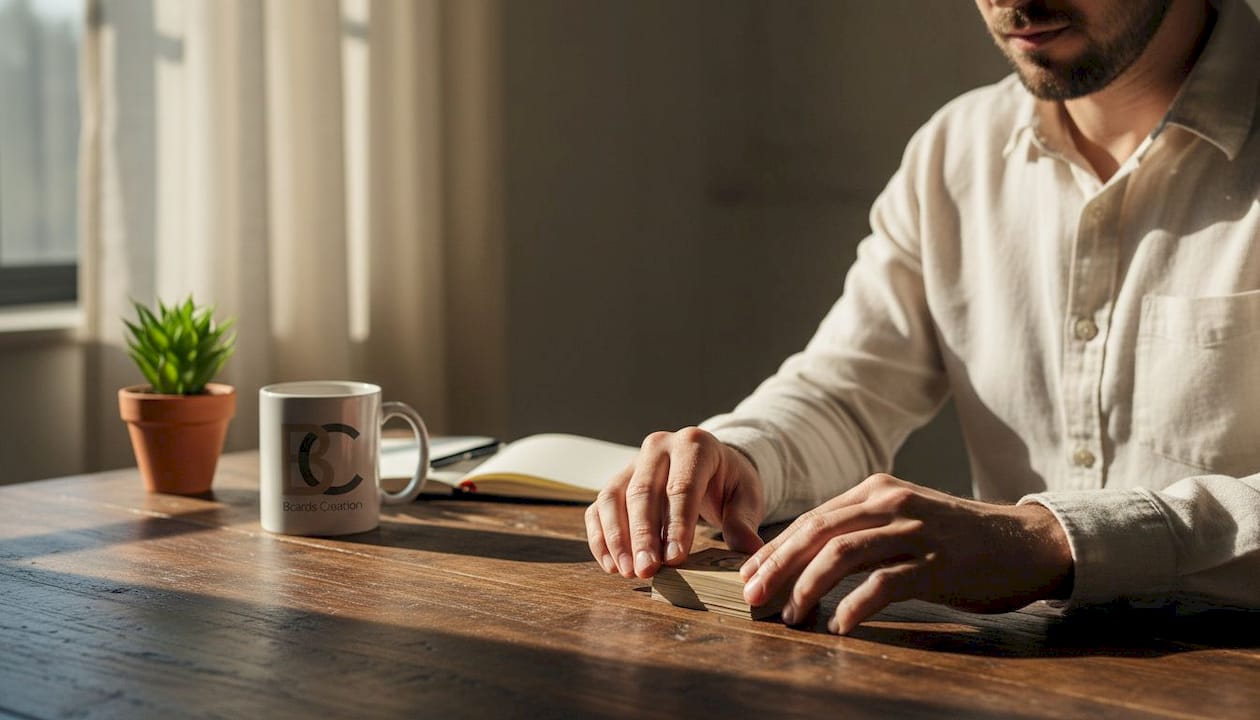
Most professionals treat business cards as a contact delivery tool. Print your name, your title, your email, hand it over. Done. But tactile business card design flips that thinking. It treats the card itself as a brand experience, one your hands register before your eyes finish reading. This guide breaks down what tactile design is, which materials and finishes create it, how to choose between them, and how to apply the concept in a way that actually serves your brand positioning.
Table of Contents
- What is tactile business card design and why it matters
- Exploring common tactile materials and finishes for premium business cards
- Matte vs. suede soft touch: which tactile finish suits your brand?
- Incorporating tactile design elements into your business card strategy
- Why tactile business card design is an underestimated branding tool
- Explore premium tactile business card design options at BcardsCreation
- Frequently asked questions
What is tactile business card design and why it matters
Tactile business card design is the intentional use of material, texture, and finish to create a physical sensation when someone holds your card. It goes beyond what a card looks like. It shapes what a card feels like. That distinction matters more than most professionals realize.
Touch is a powerful memory trigger. When someone picks up a card with an unusual weight, a soft velvety surface, or a raised texture, their brain pays attention differently. The sensory input adds another layer of encoding. Your name becomes associated with a feeling, not just a font. As one widely shared framing puts it, your business card is a handshake in print, and how your card looks and feels can shape how people remember you.
This is the core value of tactile business cards. They do not just carry information. They carry a signal about who you are.
Here is what tactile design actually controls:
- Material weight. A thick 32pt card feels substantial. A flimsy card feels forgettable, regardless of the design on it.
- Surface texture. Smooth, soft, rough, coated, uncoated. Each sends a different message about your brand personality.
- Lamination and coating. These affect both the feel and the durability of the card, which also shapes perceived quality.
- Finish type. Matte, suede, gloss, spot UV. The choice changes how light and touch interact with the surface.
If you are thinking about designing unique business cards that stand apart from standard print runs, tactile elements are where that differentiation becomes physical and lasting.
Exploring common tactile materials and finishes for premium business cards
Understanding your material options is the first step in making a tactile choice that works for your brand. The good news: you do not need dozens of options to make an impact. A handful of well-understood materials and finishes covers most professional needs.
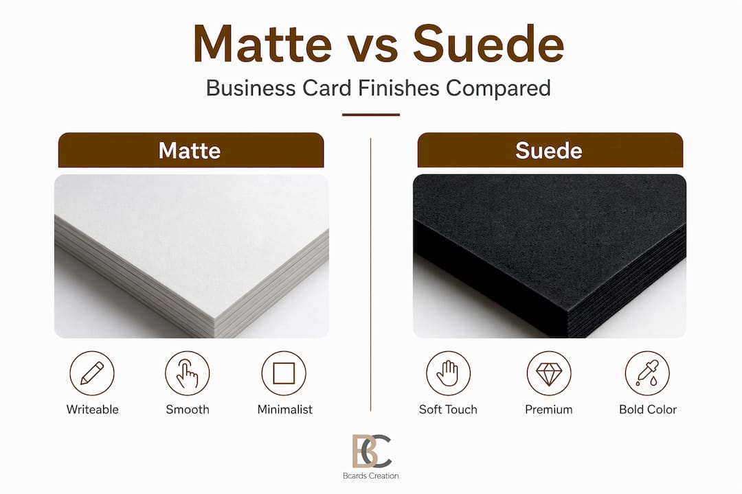
Matte finish
Matte cards have a smooth, non-glossy surface that gives them a clean, modern look. They are practical. You can write on them easily, which matters if you tend to jot a note or appointment time when you hand one over. They print large quantities reliably and suit professionals who want something direct and polished without being flashy.
Suede soft touch finish
Suede soft touch cards use a 1.5mil soft-touch laminate applied on each side of a 16pt card, producing a total thickness of 19pt. The result is a velvety texture that people notice immediately. It signals quality and thoughtfulness without saying a word. Architects, consultants, creative directors, and luxury service providers tend to lean toward this option.
Other key tactile factors
Beyond these two primary finishes, the following elements shape the overall tactile experience:
- Card thickness. Standard cards run around 14pt to 16pt. Going to 32pt or higher creates a noticeably heavier feel that reads as premium.
- Uncoated paper. Slightly textured and raw to the touch, uncoated stock suits brands that want an organic or artisanal feel.
- Specialty materials. Metal, wood veneer, and plastic substrates each create a completely different hand feel. See luxury business card materials for a closer look at these options.
- Lamination type. Soft touch, gloss, and matte laminations each change both durability and surface feel.
Understanding how business card material impacts brand perception helps you make informed choices before committing to a print run.
| Finish type | Surface feel | Best for |
|---|---|---|
| Matte | Smooth, non-reflective | Professional, minimalist brands |
| Suede soft touch | Velvety, premium texture | Luxury, creative, consulting |
| Gloss | Shiny, firm | Bold visuals, photography |
| Uncoated | Slightly rough, natural | Artisan, eco-conscious brands |
| Spot UV | Contrast of matte + gloss | Accent features, logos |
Pro Tip: Order samples before committing to a full print run. Seeing a finish on screen tells you almost nothing about how it feels in your hand. The decision should be made physically, not digitally.
Matte vs. suede soft touch: which tactile finish suits your brand?
These two finishes come up most often because they cover a wide range of professional needs. Choosing between them is not about which is better overall. It is about which one fits what your brand is communicating.
When matte works best
Matte is reliable and easy to reproduce consistently. It holds color accurately without the distortion gloss can create. It is a practical choice if you hand out a high volume of cards at trade shows or conferences. It also works well if your brand personality is clean, direct, and no-frills. Lawyers, financial advisors, and corporate consultants often find matte suits their positioning.
- Easy to write on
- Clean, modern appearance
- Lower cost per unit
- Consistent print quality across large runs
- Suits straightforward, professional brand personalities
When suede soft touch works best
Suede creates an immediate physical reaction. People rub the card between their fingers. They comment on it. That moment of physical engagement is a branding moment. If you want your card to stand out in a stack, suede soft touch is a strong choice. It suits brands that want to communicate polish and care.
- Instantly memorable hand feel
- Signals premium quality
- Thicker overall card structure (19pt)
- Works well with dark or deep color palettes
- Suits luxury, creative, and consulting professionals
The choice also depends on networking context. If you work in environments where relationships are built quickly and first impressions carry weight, the feel of your card is part of that impression. Knowing the impact of tactile design on brand perception can help you make that call with confidence.
Pro Tip: If you regularly attend events in the same industry, look at what cards others hand out. Choosing a finish that contrasts with the norm makes your card easier to remember, not because it looks unusual, but because it feels different.
| Factor | Matte | Suede soft touch |
|---|---|---|
| Writeable surface | Yes | No |
| Premium feel | Moderate | High |
| Thickness | Standard (14pt to 16pt) | Thicker (19pt) |
| Cost | Lower | Higher |
| Best volume | Large runs | Small batch |
Incorporating tactile design elements into your business card strategy
Knowing what tactile options exist is only part of it. Applying them in a way that serves your brand requires a clear process. Here is how to approach it:
-
Define your brand position first. Before choosing any material or finish, be clear on what your brand communicates. Premium service? Creative work? Technical expertise? Your tactile choices should reinforce that, not contradict it. A handmade jewelry brand and a cybersecurity firm might both benefit from tactile cards, but the right finish for each looks completely different.
-
Match materials to your audience. Think about who you are handing your card to and where. A suede card at a luxury real estate event fits. A thick uncoated card at a craft fair fits. Context shapes how tactile cues are received. Professional design steps walk through how to align these decisions with your overall design direction.
-
Use tactile elements to highlight key features. Spot UV coating on just your logo. Raised printing on your name. A metallic foil element that also adds texture. These combinations let you control what the finger finds first. See business card feature ideas for practical examples of how to layer these elements.
-
Choose small-batch production. Large runs lock you into one tactile choice. Small-batch printing lets you test different materials and refine your approach. It also allows you to create multiple versions for different networking contexts without overprinting cards you do not use.
-
Treat the card as a complete object, not a flat surface. Edge painting, card thickness, and even the sound a card makes when set on a table are all part of the tactile experience. The best tactile business cards are considered from every angle.
Your card is a physical extension of your professional identity. As the framing holds, how your card feels can shape how people remember you. That is worth taking seriously at the strategy stage, not just at the design stage.
Pro Tip: Pair your tactile finish with a color palette that complements it. Dark colors on suede soft touch, for example, create a depth that matte or gloss simply cannot replicate. The visual and tactile elements work together.
Why tactile business card design is an underestimated branding tool
Here is something most brand conversations miss. Professionals spend significant money on websites, logos, and digital presence. They agonize over font choices and color systems. Then they hand out a standard, template-printed card that undercuts all of it in three seconds.
The tactile experience of your card is the only part of your brand that someone physically holds. That makes it uniquely powerful. A website is experienced through a screen. A card is experienced through the hands. That distinction creates an opportunity that most professionals leave unused.
Touch influences emotional response in ways that visual design alone cannot replicate. When someone holds a well-made card, they form an impression of the person who gave it. That impression is largely unconscious. It happens before they read your title or your website. Your material choices signal brand quality before a single word is processed.
There is also a longer-term dimension. Cards that feel interesting get kept. They end up on desks, in wallets, or pinned to boards. The standard glossy rectangle goes into a drawer and stays there. A thoughtfully crafted tactile card becomes a small, ongoing brand reminder. A card that feels premium communicates care and quality that digital touchpoints simply cannot replicate.
The investment required is not large. A small-batch order of suede or specialty cards costs more per unit than a mass-produced run, but it is still a fraction of what most professionals spend on other brand assets. The return, measured in impressions made and relationships started well, is disproportionate to the cost.
Explore premium tactile business card design options at BcardsCreation
BcardsCreation works with professionals who want business cards built around their brand, not adapted from a template. Every project starts with a material and design consultation, so your tactile choices are intentional and aligned with what your brand communicates.

Whether you want a suede soft touch finish, a specialty paper stock, or something more distinctive, the studio handles each project individually. Small-batch production means you get exactly what your brand needs without committing to a mass run. Options range from custom business card design built from scratch to luxury foiled creative cards and premium plastic card formats. Each option is produced with controlled quality and expert input from start to finish.
Frequently asked questions
What does tactile business card design mean?
Tactile business card design means intentionally selecting materials, finishes, and textures to create a physical experience when someone holds the card. As one concise framing notes, your business card is a handshake in print, and the feel of it shapes how people remember you.
What are the main tactile finishes used for business cards?
Matte and suede soft touch are the most widely used tactile finishes. Matte cards offer a smooth, non-glossy surface suited for practical professional use, while suede provides a velvety, durable texture that signals premium quality at first touch.
How can tactile design improve networking success?
Tactile design engages sensory memory at the moment of exchange, making your card more likely to be noticed, handled, and kept. How your card feels directly influences how the person receiving it perceives your brand and professionalism.
Is tactile design suitable for all professional industries?
Yes. Tactile design is flexible enough to work across industries because the finish and material choices can be matched to any brand personality. A law firm and a design studio will make different tactile choices, but both benefit from cards that communicate quality through touch.


