

Why photographers need unique business cards for branding
TL;DR:
- Physical business cards outperform digital exchanges by creating lasting tactile impressions and enhancing in-person networking.
- Using premium materials and strategic design, they reflect a photographer’s artistic identity and build credibility with clients.
Most photographers assume that a well-maintained Instagram profile or a sleek digital portfolio does the heavy lifting when it comes to new clients. But in real-world, in-person networking, physical cards outperform digital exchanges when it comes to tactile memory and lasting first impressions. A card that someone physically holds, feels, and tucks into a pocket stays in circulation in a way a phone number saved to contacts often doesn’t. This article covers why unique business cards matter for photographers in the USA, what materials and finishes work best, how to balance creativity with clarity, and how to use physical cards alongside your digital presence.
Table of Contents
- The photographer’s secret weapon: Why unique business cards matter
- How premium design and materials elevate your reputation
- Physical cards in a digital world: The networking edge
- Balancing creativity and clarity: Crafting cards that work
- The uncomfortable truth: Why most creative cards fail (and how to avoid it)
- Upgrade your first impression: Where to get truly unique cards
- Frequently asked questions
Key Takeaways
| Point | Details |
|---|---|
| Stand out visually | A unique business card showcases your brand personality and artistic vision, making a lasting impression. |
| Build credibility instantly | Premium materials and sharp design project professionalism and reliability from the first interaction. |
| Enhance in-person networking | Physical cards make connections memorable and bridge gaps for clients who prefer tangible contact. |
| Blend creativity with clarity | Balance bold visuals with clear information to ensure your card gets kept and followed up. |
| Leverage tech-savvy design | Integrate QR codes or NFC to seamlessly blend the charm of print with the reach of digital engagement. |
The photographer’s secret weapon: Why unique business cards matter
Let’s first tackle why physical business cards remain irreplaceable for visual creatives.
Photography is a visual industry. Before a client hires you, they’re already forming opinions about your taste, your eye, and your attention to detail. Your business card is part of that first conversation. It’s a mini-portfolio in your client’s hands before they’ve visited your website.
Unique cards reflect artistic vision and brand identity, separating you from other photographers in a crowded market. When you hand someone a card that feels different, looks different, and carries your visual fingerprint, it does work that a quick phone number exchange simply can’t.
Here’s what a strong business card communicates without saying a word:
- You take your brand seriously
- You pay attention to quality and detail
- You’re established and professional
- You offer something distinct from the competition
“Your business card is often the first physical representation of your brand that a potential client encounters. Make it count.”
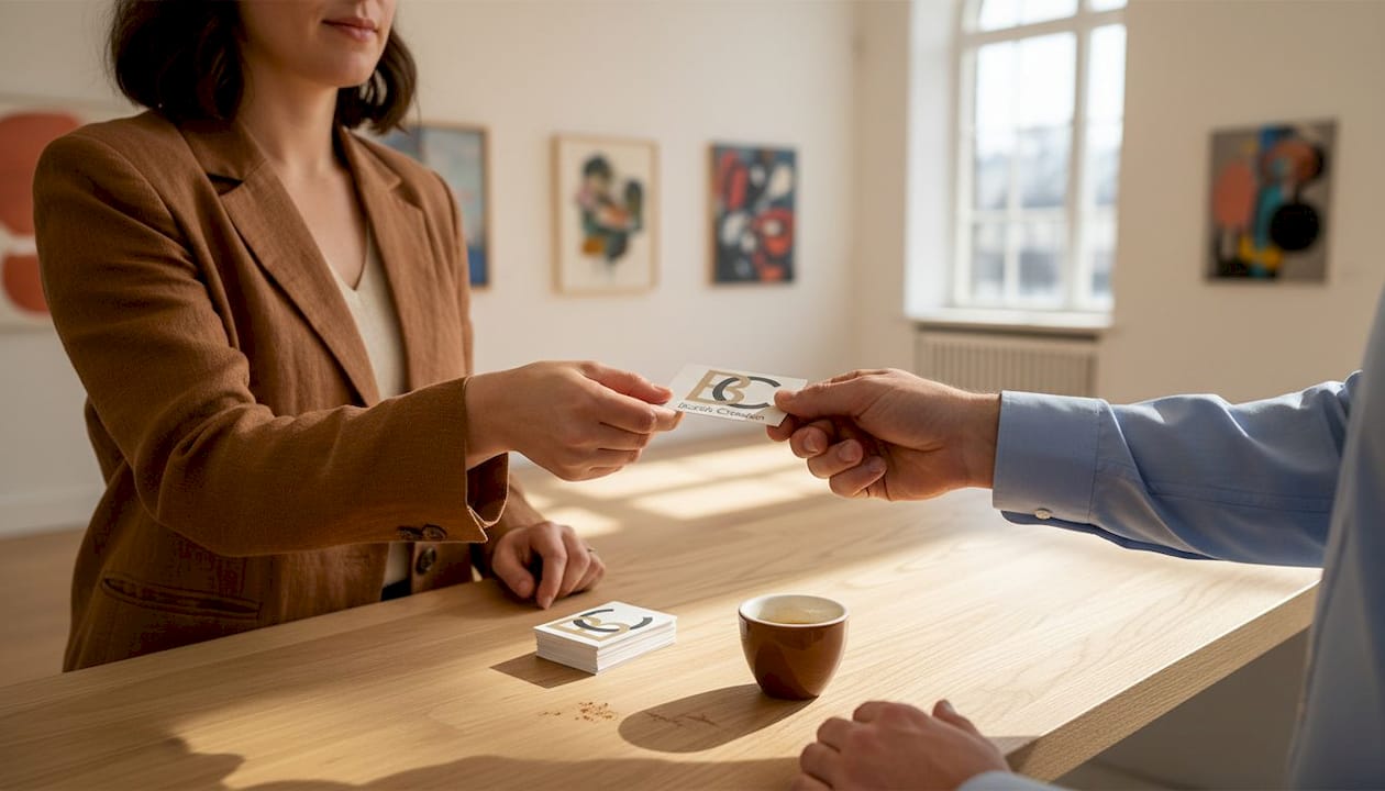
Physical cards also enhance networking in a very real, tangible way. At trade shows, gallery openings, corporate events, and wedding expos, pulling out a thoughtfully designed card is a confident, professional move. It signals that you prepared for this moment.
Think about unique business card differentiation from a practical standpoint. If you and five other photographers attend the same bridal expo, and four of you hand out plain white cards while you hand out a thick matte black card with gold foil and a striking portfolio image on the front, whose card gets saved? Yours. That’s not an accident. That’s strategy.
Understanding business cards’ role in creative industries goes beyond aesthetics. Cards facilitate word-of-mouth referrals. A satisfied client who keeps your card in their wallet can pass it along to a friend months after your first meeting. Digital contacts don’t travel the same way.
How premium design and materials elevate your reputation
A memorable card isn’t just about looks. It’s about feel, materials, and craftsmanship.
When a potential client touches your business card, that physical sensation communicates something instantly. A flimsy card signals a cut-rate operation. A thick, textured card with a specialty finish says the opposite. It says you’ve invested in quality, and that’s exactly what clients want to hear from someone who will be photographing their wedding, their product line, or their executive headshots.
Premium materials convey professionalism and credibility, making strong first impressions before you’ve said a single word. Here’s a practical look at how common materials and finishes stack up for photographers:
| Material or finish | Visual impact | Tactile quality | Best suited for |
|---|---|---|---|
| Standard matte paper | Low | Minimal | Budget printing only |
| Thick cotton stock | High | Soft, premium | Portrait and fine art photographers |
| Soft-touch laminate | Medium-high | Velvety, smooth | Wedding and lifestyle photographers |
| Foil stamping | Very high | Metallic sheen | Luxury brand photographers |
| Clear plastic (PVC) | Very high | Rigid, modern | Commercial and product photographers |
| Raised UV spot | High | Textured, tactile | Any premium photography brand |
Each material tells a story about your brand. A clear plastic card with a full-bleed photo printed on it is a statement. A thick duplex card with a raw, uncoated back feels editorial. Your material choice should mirror your photographic style.
Pro Tip: Don’t max out every design element at once. A card with foil, embossing, a full photo, and five different fonts reads as chaotic. Pick one or two standout features and let them breathe. Legibility is non-negotiable.
Color and layout decisions matter just as much. If your photography style is clean and minimal, your card should be too. If your work is bold and dramatic, your card can reflect that energy. The key is coherence. Your card, your website, your Instagram, and your portfolio should all feel like they belong to the same visual universe.
Exploring premium business card materials helps you understand what works for your specific niche. A newborn photographer and a commercial product photographer have very different audiences and very different visual identities. A one-size card does not fit all.
When you design a unique business card intentionally, you’re not just making something pretty. You’re making a tool that builds trust and opens doors. And if you’re still on the fence about whether the investment is worth it, learning more about premium business cards for branding can help you see the return on investment clearly.
Physical cards in a digital world: The networking edge
So, when and why does a tangible card have more staying power than a LinkedIn connect?
The short answer: in every real-world scenario that involves a face-to-face interaction.
Physical cards enhance networking by creating a moment. Handing someone a card is a gesture. It’s intentional. It communicates, “I want you to have my information, and I’ve prepared something worth keeping.” That moment is hard to replicate with a phone tap or a QR scan.
Here’s where physical cards consistently outperform digital-only sharing:
- Bridal expos and trade shows: Potential clients collect several cards and review them later. A standout card gets remembered.
- Gallery openings and art shows: Fine art photographers can use their card as a miniature print, leaving a visual impression that lasts.
- Corporate client meetings: A premium card signals that you operate at a professional level, not just as a freelancer.
- Referral situations: A satisfied client who still has your card in their wallet can hand it directly to someone else.
Now, some audiences still prefer tangible exchanges. Not every potential client is comfortable with digital-only contact methods. Older clientele, community event organizers, and small business owners who hire photographers locally may not use LinkedIn or have a reliable way to scan a QR code on the spot. A physical card removes that friction entirely.
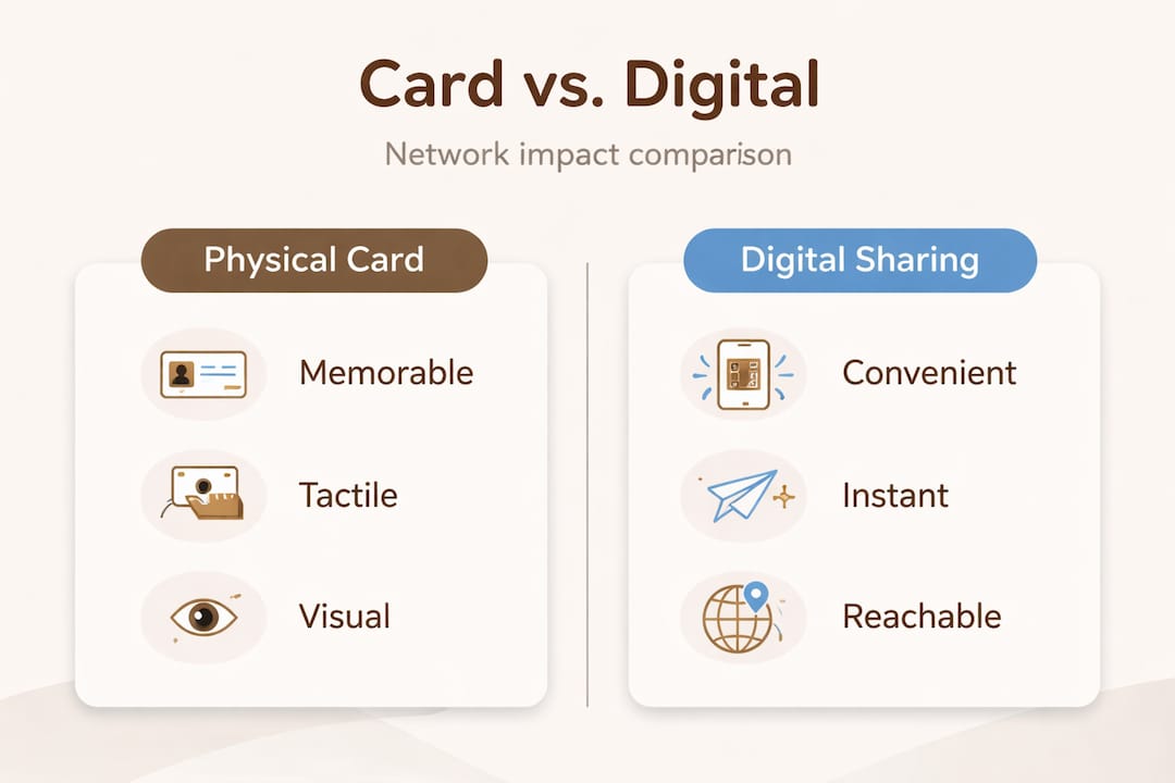
Here’s a quick comparison of physical vs. digital contact sharing for photographers:
| Factor | Physical card | Digital sharing (QR, NFC, app) |
|---|---|---|
| Memorability | High (tactile and visual) | Lower (easily forgotten in app) |
| Works without tech | Yes | No |
| Referral-friendly | Very easy | Difficult to pass along |
| First impression | Immediate and tangible | Depends on screen quality |
| Customization | High | Limited by platform |
| Long-term visibility | Stays in wallets and drawers | Buried in contacts quickly |
That said, digital and physical don’t have to compete. Hybrid business card design is a smart approach. A well-designed card that includes a QR code linking to your portfolio, or an NFC chip that opens your contact page on a phone tap, gives you the best of both worlds. The tactile impression stays. The digital connection is just a tap away.
To understand the full picture of what physical cards bring to the table, it helps to look at the advantages of unique business cards beyond just standing out. These cards drive referrals, reinforce brand recall, and serve as a credibility signal that no app notification can replicate.
Photographers who work in event and wedding photography especially benefit from physical card exchanges. The vendor and planner ecosystem at a wedding is full of referral opportunities. A beautiful card handed to a florist, a venue coordinator, or a wedding planner can result in ongoing business relationships.
Balancing creativity and clarity: Crafting cards that work
To design a card that gets you calls and gigs, focus on both impact and information.
A visually striking card that nobody can read is a wasted opportunity. A legible card with no personality gets tossed. The goal is a card that’s immediately impressive and immediately usable.
Balance creativity with readability, and consider hybrid QR or NFC features as a digital bridge. This principle is one of the most practical pieces of design guidance out there for photographers.
Here’s what your card needs to include, no exceptions:
- Your full name or your studio name
- Your photography specialty (wedding, commercial, portrait, etc.)
- Your primary contact method (phone or email)
- Your website or portfolio URL
- A QR code linking directly to your portfolio or booking page
Every piece of information should be easy to find within two seconds of picking up the card. Anything longer and the card fails its basic job.
Follow these steps to balance artistry with function:
- Start with your strongest visual. Choose one image or one design element that represents your work. This could be a signature photo, a texture, or a color palette.
- Choose a readable font. Script fonts look beautiful but can be impossible to read at small sizes. Use a clean serif or sans-serif for contact details.
- Keep the back of the card working. Use the front for visual impact, the back for information. Or reverse it. Just don’t waste the space.
- Test with non-photographer eyes. Show your card to a potential client type, not another photographer. Ask them if they can find your phone number in five seconds.
- Add your QR code as a design element, not an afterthought. A well-placed QR code looks intentional. A randomly placed one looks like you added it last minute.
Pro Tip: Platforms like Prezumi can help you create a polished digital landing page that your QR code points to, giving clients a seamless move from physical card to online portfolio.
For photographers considering specialty formats, clear card design considerations around one-sided vs. double-sided printing are worth reviewing before you finalize your order. Clear cards in particular require careful thought about ink placement and legibility.
If you want to sharpen your creative instincts for card design, reviewing design tips for creatives gives you a solid framework to work from before you commit to a final layout.
The uncomfortable truth: Why most creative cards fail (and how to avoid it)
Here’s the thing most articles won’t tell you. The biggest mistake photographers make with their business cards isn’t using bad materials or ugly fonts. It’s designing the card for other photographers instead of for their actual clients.
We see this pattern often. A photographer spends weeks obsessing over a design that would impress their creative peers at a portfolio review. The result is an artistically ambitious card that confuses or alienates the very clients they’re trying to attract. A corporate HR director looking for headshots doesn’t need to be wowed by experimental typography. They need to trust you instantly.
Flashy design doesn’t close deals on its own. Brand coherence, legibility, and information hierarchy do. The card needs to match what clients expect from you based on everything else they’ve seen, your website, your social media, your in-person presence. When the card matches the brand, it reinforces credibility. When it doesn’t match, it creates doubt.
Tactile extras do move the needle, but only when they serve a clear purpose. A soft-touch laminate on a portrait photographer’s card makes sense because it signals care and warmth. A metallic foil finish on a commercial photographer’s card makes sense because it signals precision and premium quality. Choosing a finish because it looks impressive without connecting it to your brand story is a missed opportunity.
Here’s the practical test we recommend: take your card and set your card apart by asking one simple question before printing. “Does this card tell the right story to the right client?” If you hesitate, revise. If you answer yes confidently, you’re ready to print.
Test your card design with real potential clients. Not friends. Not other photographers. Show it to someone who matches your target client profile and watch their reaction. A hesitation or a squint tells you something. A confident nod and an instinctive look for your contact information tells you something better.
Upgrade your first impression: Where to get truly unique cards
Ready to apply what you’ve learned and take your brand visuals to the next level?
At BcardsCreation, we work directly with photographers who want business cards built around their specific visual identity, not pulled from a generic template. Every project is handled individually, with real design guidance and material consultation tailored to your photography niche.

Whether you’re looking for a custom business card design built from scratch or you want to explore our range of luxury creative cards with specialty foiling and premium finishes, we have options made for visual creatives who take their brand seriously. We use specialty papers, clear PVC, raised UV, soft-touch laminates, and foil stamping across small-batch orders. No templates. No automated editors. Just controlled production and real results.
Frequently asked questions
Why are unique business cards better than digital-only networking for photographers?
Unique physical business cards create a lasting tactile impression and outperform purely digital exchanges in in-person settings. Physical unique cards outperform digital in tactile memory and first impressions, making them essential for photographers’ brand-building in the USA.
What makes a photographer’s business card truly memorable?
Memorable cards combine premium materials, unique visual design, and clear information to reflect a photographer’s artistic brand. Cards that reflect artistic vision differentiate photographers from competitors in a visual industry.
Should I add QR codes or NFC to my business card?
Yes, adding QR codes or NFC bridges physical and digital contact, allowing easy access to your portfolio or contact info. Balancing creativity with readability and adding a hybrid digital feature makes your card function on two levels at once.
When is a physical card preferable to digital sharing?
Physical cards are essential for in-person events and with non-tech-savvy clients where digital methods may not work. Digital sharing is impractical in many event photography and community-based networking situations.
How do I balance creativity with professionalism on my card?
Use design elements to highlight your style, but keep your name and contact details legible and easy to find. Expert guidance on balancing creativity with readability consistently points to clear information hierarchy as the deciding factor between a card that works and one that doesn’t.
Recommended
- What Makes a Business Card Truly Unique – BcardsCreation
- Design a unique business card that sets your brand apart – BcardsCreation
- 7 Advantages of Unique Business Cards (Beyond Standing Out) – BcardsCreation
- Why Invest in Unique Business Cards for Beauty Brands – BcardsCreation
- Apie mane - Vestuvių fotografas Mantas Janavičius


