

Double-sided business cards: 2x the branding impact
TL;DR:
- Double-sided business cards maximize space for branding and creative messaging.
- Effective design assigns clear roles to each side, emphasizing communication and visual impact.
- Thoughtful back design signals professionalism and enhances brand memorability.
Most professionals hand over a business card and never think twice about the blank space on the back. That’s a missed opportunity. A double-sided business card uses both faces of the card to carry your brand, your message, and your contact details in a way that a single-sided card simply cannot. For entrepreneurs and professionals who treat their cards as a branding tool rather than a formality, the difference is significant. This article covers what double-sided cards are, why they work, how to design them well, and when they make the most sense for your brand.
Table of Contents
- What is a double-sided business card?
- Key benefits of double-sided business cards
- How to design an effective double-sided business card
- Common pitfalls and how to avoid them
- When to choose single-sided vs double-sided cards
- The overlooked strategic edge of double-sided cards
- Bring your double-sided business card vision to life
- Frequently asked questions
Key Takeaways
| Point | Details |
|---|---|
| Double-sided definition | Both sides of the card are used for strategic branding and communication. |
| Design benefits | Extra space increases creativity and makes your brand more memorable. |
| Best practices | Test alignment before printing, use professional services, and opt for consistency. |
| Pitfalls to avoid | Don’t overcrowd either side—clarity always wins over information overload. |
| When to choose | Select double-sided for rich storytelling, single-sided for minimalist simplicity and when on a tight budget. |
What is a double-sided business card?
A double-sided business card, sometimes called a duplex card, is printed on both the front and the back. That sounds simple. But the design intent behind each side is what separates a well-executed card from a cluttered one.
The front typically carries your core contact information: name, title, phone, email, and website. The back is where strategy comes in. It can hold your logo at scale, a tagline, a QR code, a service list, or a visual that reinforces your brand identity. As noted in this double-sided printing guide, the back side is not just extra space. It is a second chance to make an impression.
Here is what a double-sided card is not:
- It is not a card with the same information repeated on both sides
- It is not a way to cram more text onto a card
- It is not a substitute for a clear, focused front side
- It is not automatically better than a single-sided card without intentional design
“A well-designed double-sided business card treats each face as a distinct communication layer. The front informs. The back persuades.” This is the standard serious professionals hold their print materials to.
Professionals choose double-sided cards when they have more to communicate than one side allows, or when they want the back to do creative work. Creatives, consultants, real estate agents, and brand-focused entrepreneurs are among the most common users. The duplex format gives you a structured way to separate information from identity.
A common misconception is that double-sided cards are only for people with a lot of contact details. In reality, many of the best double-sided cards use the back for less text, not more. A bold logo, a single line of copy, or a striking visual can make the back more powerful than any list of phone numbers.
Key benefits of double-sided business cards
Now that you know what a double-sided card is, here is why they are worth considering for your brand.
The most obvious benefit is space. You get twice the surface area to work with. But the real value is in how you use that space strategically.
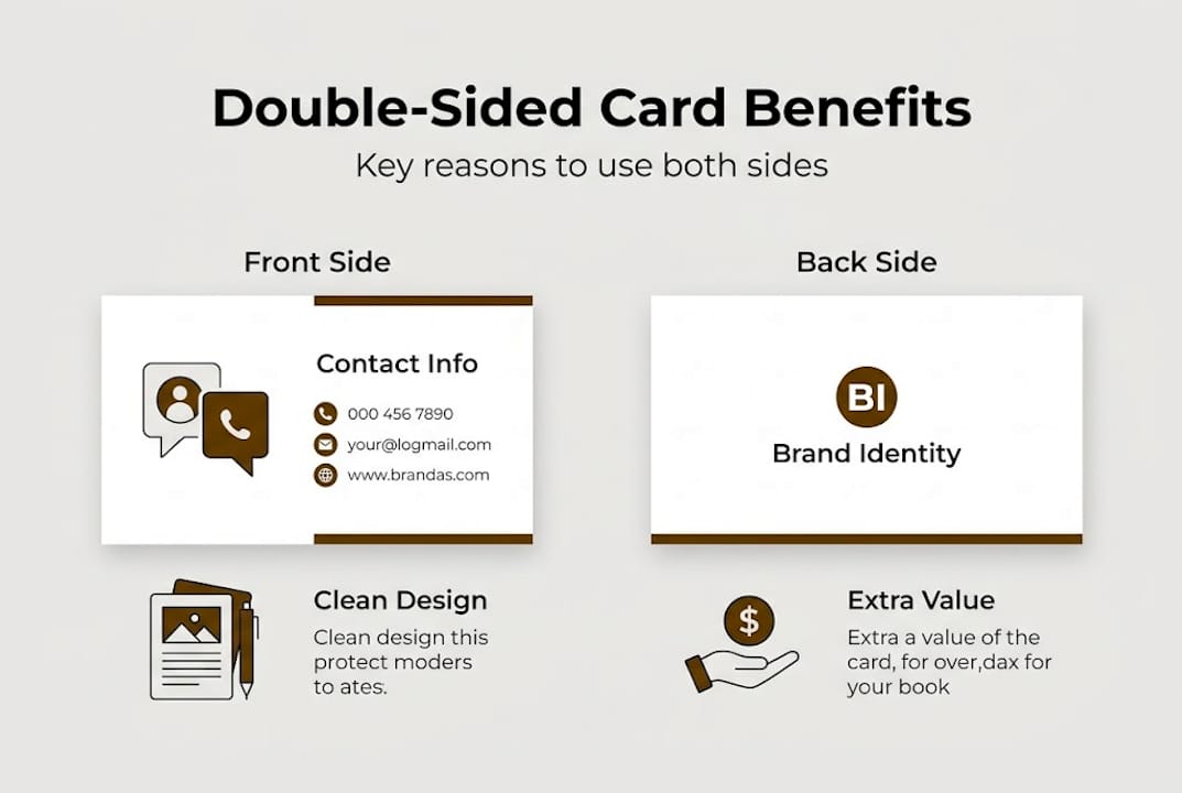
More room for branding. The front carries your details. The back carries your identity. That separation lets each side do its job without competing for attention.
Higher memorability. Cards that use both sides tend to be held longer and looked at more carefully. Strong card design creates a more memorable brand impression than single-sided cards, especially when the back features a visual or a message that prompts a reaction.
More creative options. The back side opens up possibilities:
- A full-bleed brand image or pattern
- A QR code linking to your portfolio or booking page
- A short tagline or brand promise
- A map or appointment reminder
- A secondary service or product highlight
Functional value. When someone keeps your card because the back has useful information, your brand stays in their wallet longer. That is a practical advantage.

Pro Tip: Keep your front side clean and focused on contact details. Use the back for one strong brand statement or a single functional element. Trying to do too much on the back undermines the whole card.
For professionals building a unique business card design, the back side is often where the most distinctive work happens. It is the side that gets shown to others, photographed, and remembered.
How to design an effective double-sided business card
Good design does not happen by accident. Here is a practical framework for getting it right.
- Define the role of each side. Before you open any design software, decide what each face needs to accomplish. Front: contact and identification. Back: brand reinforcement or functional value.
- Brief your designer clearly. A strong briefing process saves time and avoids costly revisions. Include your brand colors, fonts, logo files, and a clear description of what you want each side to do.
- Check alignment and bleed. Both sides must align correctly when printed. Misaligned backs are one of the most common print errors. Use test alignment advice to verify your files before sending to print.
- Choose your finish. Matte finishes resist fingerprints and look refined. Gloss finishes make colors more vivid. Soft-touch laminate adds a tactile quality that people notice. The right business card features depend on your brand style and how the card will be used.
- Avoid common design mistakes early. Contrast issues, font sizes that are too small, and inconsistent brand colors are all easier to fix before production than after.
Pro Tip: Print a test sheet on plain paper and fold it to simulate the card. Hold it, flip it, and check whether both sides feel intentional together. This simple step catches layout problems before they become expensive.
| Feature | Double-sided workflow | Single-sided workflow |
|---|---|---|
| Design files needed | 2 (front and back) | 1 |
| Alignment check required | Yes | No |
| Branding flexibility | High | Moderate |
| Production complexity | Moderate | Low |
| Perceived value | Higher | Standard |
Common pitfalls and how to avoid them
Even with the best intentions, many professionals make common mistakes. Here is how to avoid them.
Crowding both sides. Adding too much information to each face defeats the purpose of having two sides. If both sides are dense with text, neither side gets read properly. Prioritize ruthlessly.
Poor contrast and readability. Dark text on a dark background, or thin fonts on a textured surface, are readability problems that look worse in print than on screen. Always check your design at actual card size before finalizing.
Brand inconsistency. If the front uses one color palette and the back uses another, the card feels disjointed. Both sides should feel like they belong to the same brand. Review design mistakes that professionals commonly overlook.
Clashing information. Putting your personal email on the front and a different business email on the back creates confusion. Keep contact details consistent and centralized.
Common pitfalls to watch for:
- Fonts smaller than 7pt (hard to read in print)
- Ignoring safe zones and bleed areas
- Using low-resolution images on the back
- Skipping a physical proof before the full print run
- Listing things that don’t belong on a business card at all
Cheap printing. Low-cost printing often means poor color accuracy, thin stock, and misaligned backs. For a card that represents your brand, the printing quality matters as much as the design.
Pro Tip: Always request a physical proof before approving a full run. What looks good on screen can look very different on card stock, especially with dark backgrounds or metallic finishes.
When to choose single-sided vs double-sided cards
Not sure if you need both sides? Here is how to decide.
Single-sided cards work well when your brand is minimal by design, when budget is a real constraint, or when the card’s purpose is purely functional. Some brands are strong enough that a single side with a bold logo and clean contact details says everything needed.
Double-sided cards are the better choice when you have a brand story to tell, when you offer multiple services, or when you want the card to do more than just carry your phone number. They also work well for professionals in visual industries where the back can serve as a mini portfolio piece.
Key format considerations include:
- How much information you genuinely need to include
- Whether your brand benefits from a strong visual element
- Your target audience and their expectations
- Whether the card will be used in formal or casual networking settings
| Attribute | Single-sided | Double-sided |
|---|---|---|
| Cost | Lower | Slightly higher |
| Brand impact | Standard | Elevated |
| Information capacity | Limited | Expanded |
| Best use case | Minimal brands, tight budgets | Brand-forward professionals |
| Perceived quality | Good | Higher |
For professionals exploring unique card ideas, the double-sided format consistently offers more room to differentiate. The decision comes down to what your brand needs to communicate and how much that communication matters to your positioning.
The overlooked strategic edge of double-sided cards
Here is something most articles on business cards do not say directly: the back of your card is not just extra space. It is a signal.
When you hand someone a double-sided card with a thoughtfully designed back, you are telling them something about how you operate. You planned ahead. You invested in the details. That signal lands before they even read a word.
Successful professionals use the back as a mini portfolio. A photographer puts one strong image there. A consultant puts their core value proposition in a single sentence. A brand agency puts a pattern that is instantly recognizable. These are not accidents. They are deliberate design strategies built around how people actually process information in a networking context.
The contrarian view worth considering: sometimes a single-sided card with exceptional material quality outperforms a double-sided card with average design. As noted in duplex card production, format alone does not guarantee impact. Execution does. The best double-sided card is one where both sides feel necessary, not just filled.
Bring your double-sided business card vision to life
You now have a clear picture of what makes double-sided business cards work. The next step is turning that knowledge into a card that actually represents your brand at the level it deserves.

At BcardsCreation, every card is designed from scratch. No templates, no automated editors. Our custom design services cover both sides of your card with the same level of attention, from layout and typography to material selection and finishing. If you are ready to invest in a card that does real brand work, explore our luxury business cards or browse the full business card collection to find the right fit.
Frequently asked questions
What information should go on the back of my double-sided business card?
The back works best with one strong element: a logo, tagline, QR code, or brand visual. Check these impactful card features for specific back-side ideas that add real value without cluttering the design.
Can I use both sides for contact information?
You can, but it is not the best use of the space. Keep contact details on the front and use the back for branding or a single functional element, as outlined in this one or double-sided guide.
Will double-sided cards cost more to print?
Yes, double-sided printing typically costs slightly more than single-sided due to the additional production step, but the perceived value and brand impact often justify the difference.
What finish should I choose for a double-sided card?
Matte is popular for its clean, professional look and fingerprint resistance. Gloss works well when you want colors to stand out. Your print finish choice should match your brand’s visual style and the card’s intended use.


