

What makes a business card unique and unforgettable
TL;DR:
- Most business cards are discarded within a week because they look and feel the same. Using premium materials, unique shapes, and thoughtful design can significantly increase memorability and retention. Incorporating interactive features like QR codes or NFC enhances engagement and follow-up opportunities.
88% of business cards are discarded within a week. That means most cards you hand out never make it past the trash. The problem isn’t the card itself. It’s that most cards look and feel exactly the same. Standard size, white stock, basic font. Nothing to hold onto. But some cards get kept, pinned to bulletin boards, or photographed. The difference comes down to a few specific choices in materials, shape, design, and function. This guide breaks down exactly what separates a forgettable card from one that works.
Table of Contents
- The power of premium materials and finishes
- Shape, size, and dimensions: Breaking the mold
- Design principles that drive memorability
- Turning cards into engagement tools: Functional and digital features
- What most pros miss when designing unique business cards
- Bring your unique business card vision to life
- Frequently asked questions
Key Takeaways
| Point | Details |
|---|---|
| Premium materials matter | Thick stock, soft touch, and special finishes make a card more memorable and signal brand quality. |
| Creative shape boosts retention | Non-standard shapes and vertical designs are remembered more, but must stay practical for wallets. |
| Design clarity is essential | Whitespace, hierarchy, and legible fonts help cards stand out while keeping information accessible. |
| Digital features drive action | Cards with QR codes or NFC links see higher follow-up and engagement rates. |
| Practicality beats flash | A unique card should balance creativity with usability to truly make a lasting impression. |
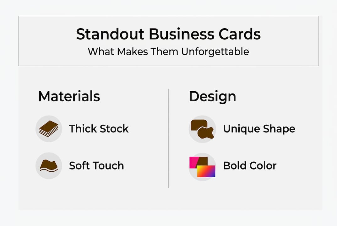
The power of premium materials and finishes
With that challenge in mind, let’s start with the most tangible aspect: material quality. What a card feels like matters just as much as what it says. People form opinions fast. In fact, 78% of recipients judge a brand’s quality by the feel of its card alone. And using premium materials can boost retention by 25% compared to standard stock.
So what counts as premium? It starts with thickness. A heavier card stock signals confidence. Thin, flimsy cards feel disposable because they are. But material goes beyond weight. Texture, coating, and finish all shape how someone experiences your card the moment they touch it.
Here’s a quick look at popular finishes and what they communicate:
| Finish type | Feel and effect | Best for |
|---|---|---|
| Soft touch coating | Velvety, matte surface | Creatives, luxury brands |
| Spot UV | Glossy raised areas on matte base | Bold contrast, logos |
| Foil stamping | Metallic shine on specific elements | High-end, premium positioning |
| Painted edges | Color on card edges | Distinctive, artistic look |
| Textured paper | Linen, felt, or cotton feel | Classic, tactile appeal |
Thick stocks, soft touch, foil, UV, and painted edges all raise the perceived value of a card significantly. These aren’t just decorative choices. They’re signals. A soft touch card with foil lettering tells the recipient something before they read a single word.
You can learn more about how specific materials affect brand perception in our premium materials guide. For a deeper look at high-end options, check out our breakdown of luxury card materials.
“The card is a physical extension of your brand. If it feels cheap, that impression transfers.”
When choosing a finish, match it to your audience. A law firm benefits from clean, weighty stock with minimal embellishment. A photographer or designer can push further with tactile finishes and bold color. The goal is alignment, not novelty for its own sake. Explore stand-out finishes that fit your brand before committing to a direction.
Pro Tip: Order samples before finalizing your card. What looks great on screen can feel wrong in hand. Always test the physical product.
Shape, size, and dimensions: Breaking the mold
Material and finish aren’t the only ways to make an impression. Shape can speak volumes. The standard 3.5 x 2 inch card is familiar for a reason. It fits wallets, cardholders, and rolodexes. But familiar also means forgettable.
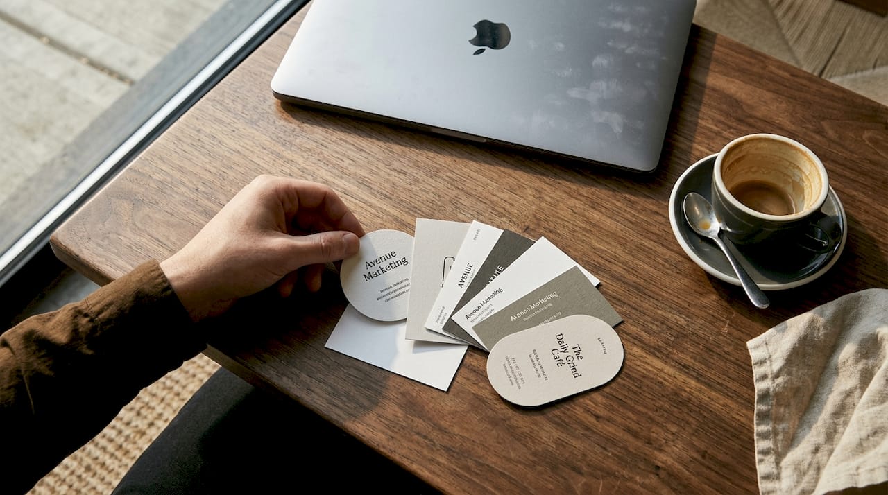
Unique shapes and vertical cards boost retention by 35% compared to standard horizontal formats. That’s a meaningful jump. But there’s a trade-off. Cards that don’t fit in a wallet often get left behind or lost.
Here’s a comparison of common versus creative card formats:
| Format | Size or style | Retention boost | Practical fit |
|---|---|---|---|
| Standard horizontal | 3.5 x 2 in | Baseline | Excellent |
| Vertical | 2 x 3.5 in | High | Good |
| Square | 2.5 x 2.5 in | High | Moderate |
| Mini card | 3.5 x 1 in | Moderate | Good |
| Die-cut custom | Variable | Very high | Low to moderate |
Die-cut cards (custom shapes cut from the card material) work especially well for creative professionals. A photographer with a camera-shaped card or a florist with a leaf silhouette makes an instant visual connection to their work. You can find more unusual shapes inspiration to see what’s possible across different industries.
For more creative direction, our unique card ideas guide walks through formats that work for different professional contexts.
When does it make sense to break the mold? Consider these factors:
- Your industry: Creative fields support bold formats. Finance and legal lean traditional.
- Your networking context: Trade shows favor standout cards. Corporate meetings may not.
- Your budget: Custom die-cuts cost more. Make sure the investment fits your volume.
- Your audience’s habits: If they carry card cases, an oversized card will be left behind.
The biggest mistake with non-standard shapes is prioritizing looks over usability. A card that can’t be stored is a card that gets tossed. Balance creativity with practicality.
Design principles that drive memorability
Once you’ve chosen materials and shape, design is where the card comes alive. A well-designed card doesn’t just look good. It communicates clearly and quickly, because most people spend less than ten seconds scanning a new card.
Whitespace, hierarchy, contrast, and 8pt+ fonts are the core principles that make a card readable and professional. Whitespace (the empty space around elements) gives the eye room to breathe. Without it, a card feels cluttered and hard to scan. Hierarchy means your name and role are immediately obvious, followed by contact info in a logical order.
Contrast is equally important. Dark text on a light background, or light text on a dark one, makes information easy to read in any lighting. Poor contrast is one of the most common design mistakes. And font size matters: anything below 8pt becomes difficult to read, especially for recipients who may be viewing the card quickly or in dim light.
Here’s a practical design checklist:
- Use no more than two fonts on the card.
- Keep your name and title as the visual anchor.
- List only essential contact details (phone, email, website, one social handle).
- Leave at least 3mm of clear space around all edges.
- Use your brand colors consistently.
- Test readability in black and white before finalizing.
For help avoiding common layout errors, see our guide on business card mistakes. And if you’re deciding on color direction, our article on choosing colors covers the psychology behind effective palettes.
For additional expert design tips, it helps to see real examples of how layout choices affect perception across different card styles.
Pro Tip: Design your card at actual size (3.5 x 2 in at 300 DPI) and print a test copy on regular paper. Hold it in your hand. That quick check reveals spacing and legibility issues that screen previews miss.
Turning cards into engagement tools: Functional and digital features
Even the most beautiful card can do more when it drives interaction and action. A static card gives someone your name and number. An interactive card gives them a reason to act right now.
QR codes are the most accessible starting point. A QR code on the back of your card can link to your portfolio, a booking page, a video intro, or a contact form. QR and NFC features boost engagement by 30-45% and generate 3.2 times more follow-ups compared to cards without digital integration.
NFC (near-field communication) chips take it further. An NFC-enabled card lets someone tap it with their phone to instantly open a link, no camera required. These are particularly effective for tech-forward professionals or anyone in a fast-paced networking environment.
Here are some practical ways to make your card interactive:
- QR code to portfolio: Ideal for designers, photographers, and consultants.
- QR code to scheduling link: Removes friction from booking a call or meeting.
- NFC chip: Tap to open a digital business card or website.
- Back-side offer: A discount code, free resource, or limited-time offer.
- Social handle with QR: Direct link to your most active platform.
For a broader look at how premium card features fit into a larger brand strategy, our guide on luxury business essentials covers what’s working in 2026. You can also browse digital features inspiration to see how different professions are using interactive cards.
The key is relevance. A QR code that links to a dormant social page does more harm than good. Whatever you add should be current, functional, and worth the recipient’s time.
What most pros miss when designing unique business cards
Now let’s step back: what do most small business owners and creatives get wrong about uniqueness? The most common mistake is chasing visual novelty without thinking about context. A die-cut card shaped like a guitar looks great at a music industry event. At a corporate finance meeting, it reads as unprofessional.
The best unique cards match the expectations of the room, then exceed them in one specific way. Maybe it’s the weight of the stock. Maybe it’s a single foil element. That one detail is enough to be remembered.
Another overlooked mistake: over-minimalism. Minimalist design works when your name already carries weight. For an unknown freelancer, a nearly blank card gives the recipient nothing to hold onto. You need enough information and visual interest to spark curiosity.
Physical premium cards outperform digital in tactile recall by 34% in high-value networking scenarios. That’s not a small margin. When the stakes are high, a tangible card with real material presence beats a digital exchange. Our design process insights go deeper into how to match card decisions to your positioning goals.
Invest in premium features when the people you’re meeting can recognize and appreciate them. That’s when the return is real.
Bring your unique business card vision to life
Ready to stand out with a tangible brand tool?

At BcardsCreation, every card is built from scratch. No templates. No automated editors. Just expert design guidance, material consultation, and hands-on production. Whether you need a custom card design that reflects your brand identity, creative foil cards that catch the light and the eye, or plastic card options built for durability and a premium feel, we have the materials and expertise to make it happen. Each project is handled individually, with real attention to what makes your brand distinct.
Frequently asked questions
What is the most important factor for a unique business card?
Premium materials boost retention and are noticed by 78% of recipients, making material choice the single biggest driver of perceived quality and memorability.
Do creative shapes and sizes work for all industries?
Die-cut and odd shapes work best for creative roles but can be less practical or even off-putting in conservative or high-volume networking industries where standard formats are expected.
How can my business card drive engagement or leads?
Adding QR codes or digital integrations boosts engagement by 30-45% and increases follow-ups by 3.2 times compared to cards without any interactive features.
Will colored backgrounds really make my card kept longer?
Yes. Cards with colored backgrounds are kept up to 10 times more often than plain white cards, making background color one of the easiest ways to improve retention.


